Web Design Critique #90: MOO.com
Every week we take a look at a new website and analyze the design. We’ll point out both the areas that are done well in addition to those that could use some work. Finally, we’ll finish by asking you to provide your own feedback.
Today’s site is Moo, an awesome service for printing business cards, postcards, greeting cards and more. Let’s jump in and see what we think!
2 Million+ Digital Assets, With Unlimited Downloads
Get unlimited downloads of 2 million+ design resources, themes, templates, photos, graphics and more. Envato Elements starts at $16 per month, and is the best creative subscription we've ever seen.


If you’d like to submit your website to be featured in a future Design Critique, it just takes a few minutes. We charge $49 for critiquing your design – considerably less than you’d pay for a consultant to take a look at your site! You can find out more here.
About MOO
“MOO was born out of a love of beautiful, high-quality print. Printing has been around for centuries, and we’re certainly not the first printer on the web. But, whilst many other printers have chosen to use new technologies to simply reduce the costs of printing (and often the quality), we strive to make print not only cost-effective but better than ever before.”
“We want to set a new standard for print, with remarkable new products that bring great design and uncompromising, high standards to the web. We’re only young, but when we grow up we want to be the best printer on the internet.”
Here is a screenshot of the homepage:
First Impression
Right away, there’s a lot to love about MOO. The site is very attractive and features a clean, minimalistic design that really highlights the big beautiful product shots. Within seconds I can clearly see that, if I’m looking to get business cards printed, I’ve come to the right place. As business cards are no doubt a huge chunk of MOO’s business, they’re featured very prominently throughout the design.
As I look around for the first time, I really like what I see. My only real complaint is the lack of a solid mobile experience. Granted, I’m probably not going to attempt to design business cards on my phone, but I can easily imagine a situation where a colleague hands me a new business card and tells me that it came from MOO, causing me to reach for my phone to check out their pricing and products.
What I’ll get in this scenario is the plain old full sized site. A little responsive tweaking would go a long way here. The actual card design and ordering process involves the use of a custom Flash app, which is fine for now, but there’s no reason to not present an optimized experienced to mobile users who just want to check out the site.
Other than that, the site looks pretty great. Let’s jump in and do our standard goals-based analysis of the design.
My Questions as a User
Considering the nature of this site, I think some of the goals for the design would be to provide answers to a series of questions that I’m going to have when I load up this site in my browser. Here’s a pretty typical flow of questions that will take someone from curiosity on through to ordering:
- What is MOO?
- What do they sell?
- How much will it cost?
- How long will it take?
- How do I get started?
If the design succeeds in answering these questions in a quick, easy and attractive fashion, then it’s doing its job. If not, some improvements will need to be made. Let’s have a look at each.
What is MOO?
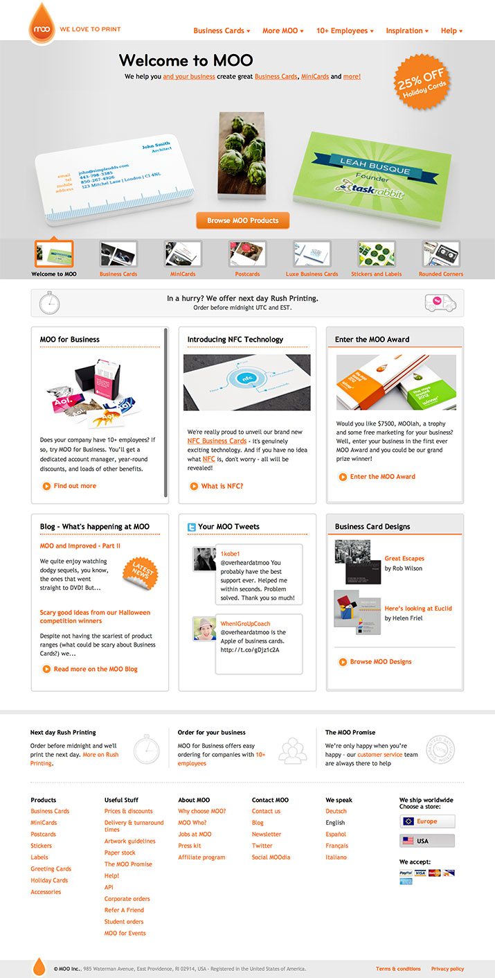
The first and foremost question of course relates to just what the heck MOO.com does, given that the domain isn’t particularly descriptive, this is important! Fortunately, one of the first things I see on the site is this big banner.
“We help you and your business create great Business Cards, MiniCards and more,” it doesn’t get much more straightforward than that. Combine this with a huge image depicting a couple of stacks of business cards and you have zero room for doubt as to what MOO does.
One of the biggest mistakes you can make when designing a website is assuming that your visitors know what you’re all about. Never hesitate to be completely straightforward and explain your business (verbally and visually) so that even a child could understand.
What Do They Sell?
This is really a sub-point of the previous question: MOO sells business cards, we get it. But that’s not all they sell, so how easy is it for me to learn about all of their products?
As you can see, the first two navigation menu items cover the full gamut of products. Even if this is my first time on the site, I can pretty quickly find what I’m looking for, whether its rounded corner business cards or stickers.
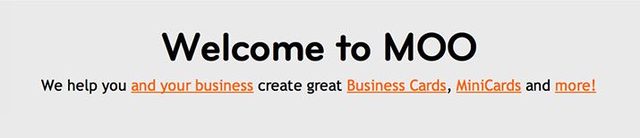
On top of this is my favorite feature of the homepage: the main image area is actually one large slider that cycles through the various products sold by MOO.
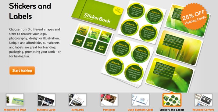
This is awesome and really sells me on the business. The one thing that I’d recommend here is to make those thumbnails even larger (and possibly the text as well). As an example, MOO competitor Vistaprint has nice large boxes that take me through the different types of products that they sell:
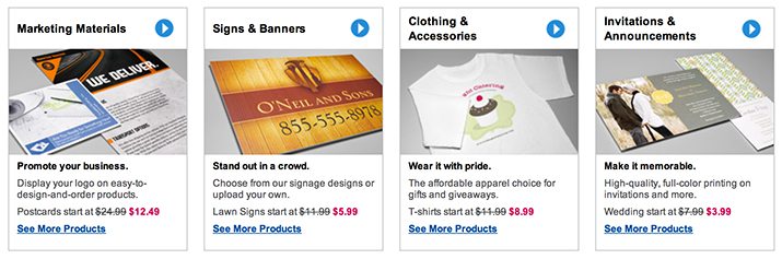
MOO’s design is far more attractive, but it’s a little easier to quickly find what you’re hunting for on Vistaprint (MOO does this on a separate page here).
How Do I Get Started and How Long Will It Take?
Both of these questions are answered right away on the home page as well. There’s a big button on every tab of the slider that takes you to the “make” step: make business cards, make minicards, etc.
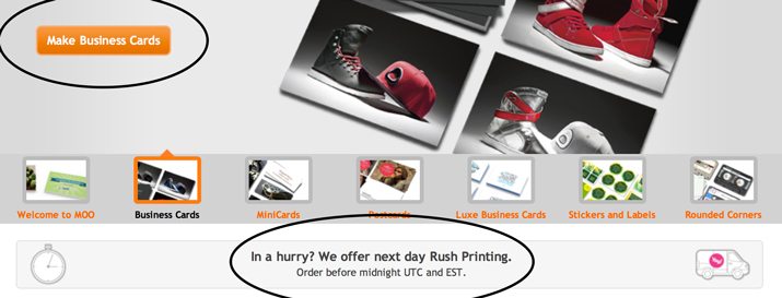
There’s also a big banner that informs you that next day rush printing is available. Let’s be honest, printing business cards is something that we all put off until mere days before we need them, so this no doubt helps them snag more than a few last minute sales.
What Does It Cost?
This is the one answer that I can’t find on the home page. It’s going to be, without a doubt, one of the most significant questions that any potential customer will have. From MOO’s perspective, I can see the logic behind getting people invested into the design phase before pulling out the pricing, but from a user’s perspective, I feel like I should at least get a small taste of what their pricing structure is like.
To be fair though, it’s still extremely easy to find pricing on anything. It’s shown clearly in the first step of the design process before you upload or create anything:
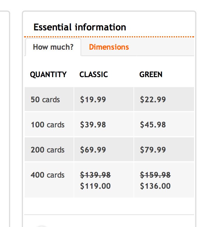
There are too many products with too many variations to detail it all on the home page, but perhaps just calling out that you can get fifty cards for $20, or some other price point that they’re proud of, would provide users with the quick perception of value that they need to push them towards proceeding.
The Design Process
This isn’t the place to walk through the entire process of ordering products on MOO, but it should be said that their design process is really slick and easy. You can choose from awesome design templates, start your own design from scratch or upload a pre-built design.
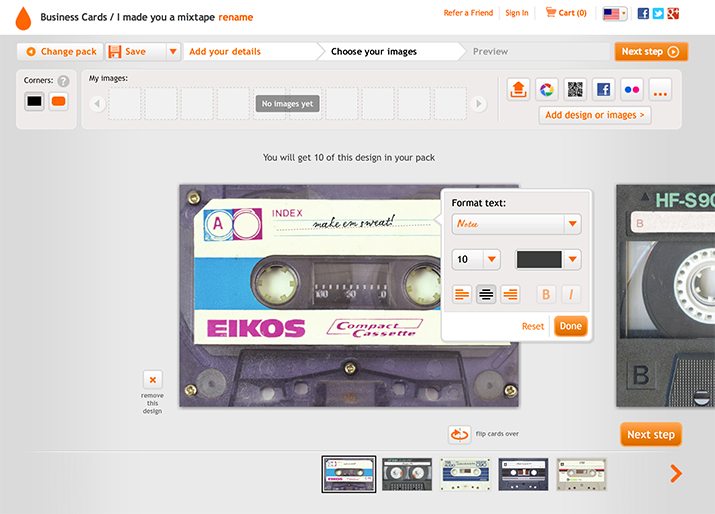
I actually personally order my cards through MOO so I know firsthand that this system works very well, no matter which route you choose to go. Even if you’re a complete design novice, their system really holds your hand with type graphics placement so that your end result will look professional.
Again, it is Flash, so it might be nice to one day see something a little more mobile friendly here. I’m tempted to say that no one would design a business card on an iPad or smartphone, but the truth is that we’re quickly reaching a point where you fully expect to be able to perform content creation tasks on mobile devices.
Random Thoughts
On the whole, the MOO site is pretty fantastic. We’ve covered all of the major stuff, but here are some random praises and critiques that I have.
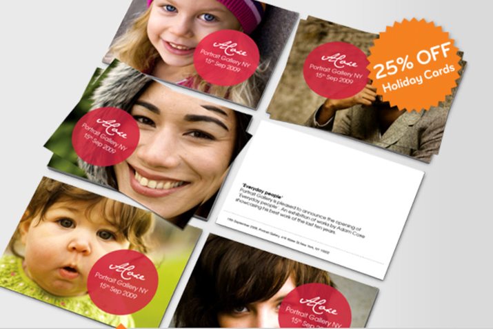
Holiday Card Burst
There’s currently a callout on the home page for a holiday card sale, which is great… except for the fact that there are zero holiday card graphics on the whole page. At the very least, toss in an extra slide, right now the burst is just slapped over the other non-holida-card slides, which can be a little confusing.
No Printfinity Love?
MOO does this awesome thing where you can print your cards with as many different back-side designs as you want (Printfinity). It’s a really cool feature that seems like it would distinguish them well, but I don’t see any mention of it on the home page. Perhaps they’ve decided that it’s not a popular choice among customers. If that’s not the case, I think it’s worth a homepage graphic.
The Accordions are Awesome
All throughout the site, vertical accordions are used as a primary UI element. These are a really nice touch as they allow you to store a ton of content in a really small space and are highly usable.
Consider More of a Human Presence
One thing that I notice as I look around the home page is that it’s all so sterile and clean, which is great, but a little bit of a human touch goes a long way. If you wait long enough to see the postcards tab in the slider (shown in the pic above), you see a whole bunch of smiling faces. This is really nice and I think some more content like this would really help friendly the place up a bit.
In the design world, faces are magic. We can’t help but be drawn to them. I’m not saying that there should be a cheesy stock photo guy on the home page with his thumbs up, but perhaps some photographer business cards with a few people on them somewhere.
Your Turn!
Now that you’ve read my comments, pitch in and help out by giving the designer some further advice. Let us know what you think is great about the design and what you think could be stronger. As always, we ask that you also be respectful of the site’s designer and offer clear constructive advice void of any harsh insults.