Build an Adaptive CSS Modal Window
This tutorial is yet another fun CSS project that helps you build something that you may have thought was only possible with JavaScript. We’re going to create a modal window that can be shown and hidden with a click that’s powered by a CSS checkbox.
To sweeten the deal, we’re also going to use a media query to ensure that the modal screen adapts well to smaller screen sizes. Let’s jump in and see how it all works!
Live Demo: Click here to launch.
Getting Started
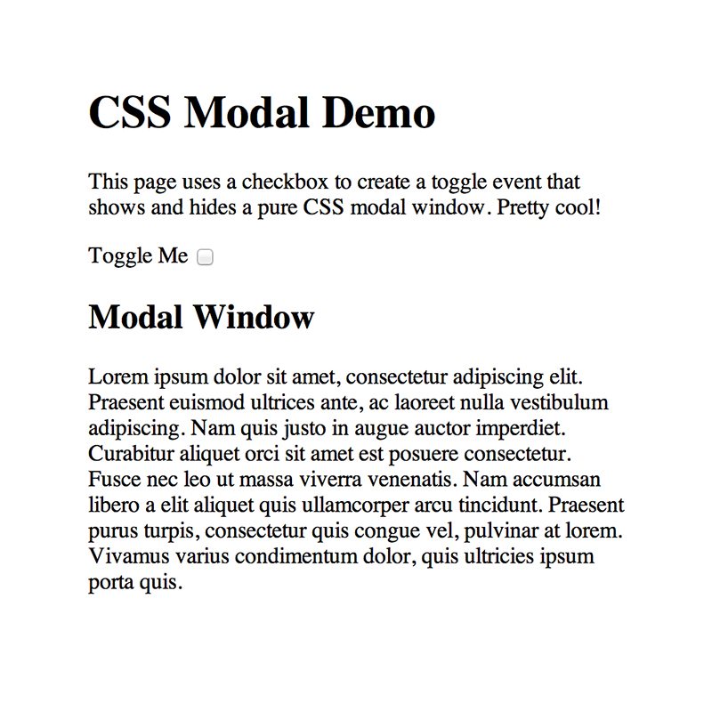
To begin, we’ll need some generic content that is always visible on the page. We don’t need anything fancy, just some text for now. I used a basic heading and a paragraph:
<div class="container">
  <h1>CSS Modal Demo</h1>
  <p>This page uses a checkbox to create a toggle event that shows and hides a pure CSS modal window. Pretty cool!</p>
</div>
So far so good, now let’s move onto the button that will toggle our modal window off and on.
Toggle HTML
In this article, commenters voted to see more tutorials on how to override checkboxes to create pure CSS click events, so that’s exactly what we’re going to do here!
How this works is fairly simple. We start with an input with a type of “checkbox” with a basic text label attached like so:
<div class="container">
  <h1>CSS Modal Demo</h1>
  <p>This page uses a checkbox to create a toggle event that shows and hides a pure CSS modal window. Pretty cool!</p>

  <label for="toggle">Toggle Me</label>
  <input type="checkbox" id="toggle" />
</div>
As you can see, the “label for” section matches the ID of the input. This is important! The neat functionality here is that, even if we hide the actual checkbox, which is exactly what we’re going to do, that label can serve as a clickable item that toggles the checked state of the box.
Modal HTML
Now it’s time to finish up our HTML by adding in the actual modal window code. After the checkbox, create a div with a class of “modal”. Inside this div, you can place anything you like. I went with another simple heading and paragraph setup.
<div class="container">
  <h1>CSS Modal Demo</h1>
  <p>This page uses a checkbox to create a toggle event that shows and hides a pure CSS modal window. Pretty cool!</p>

  <label for="toggle">Toggle Me</label>
  <input type="checkbox" id="toggle" />

  <div class="modal">
    <h2>Modal Window</h2>
    <p>Lorem ipsum...</p>
  </div>
</div>
With that, we’re all finished with our HTML. If we open up our page in a browser, there’s really not much to see. However, all of the key elements that we need are in place and ready to be styled.
Body & Container CSS
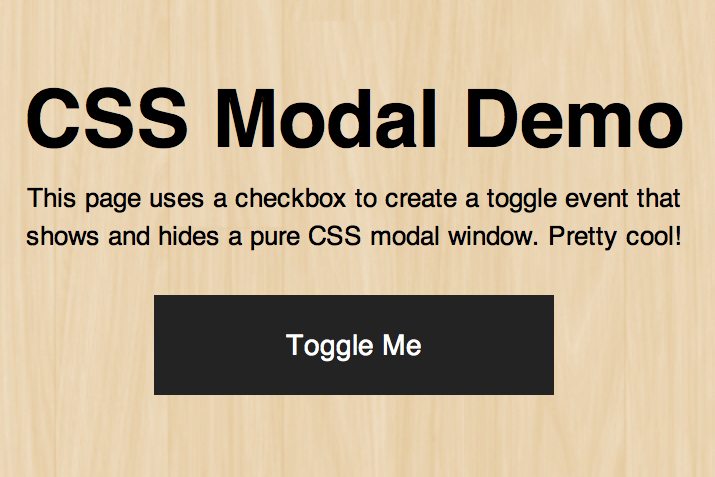
Now that we have our HTML finished, let’s jump over to our CSS and start making this thing look a little better. The first thing that I’m going to do is toss in a repeating wooden background image to make our page a little more attractive.
body {
  background: url('bkg.jpg');
  /*Src: http://subtlepatterns.com/retina-wood/*/
}
As you can see, this image comes courtesy of SubtlePatterns. Next, we’re going to style our container. First, start off with some margin, padding, and sizing, then proceed with the text.
.container {
  margin: 10px auto;
  padding: 20px;
  width: 350px;
  text-align: center;
}

.container h1 {
  font: bold 40px/1.5 Helvetica, Verdana, sans-serif;
}

.container p {
  font: 13px/1.5 Helvetica, Verdana, sans-serif;
}
As you can see, we used CSS shorthand to declare the font styling for our heading and paragraph. This is a succinct way to declare your weight, size, line-height and font-family. Notice that my line-height is set to 1.5 with no unit type specified. This is a great little trick that allows you to declare your line-height as a ratio to font-size.
Checkbox CSS
Now that we’ve styled our generic page content, it’s time to attack the label and checkbox. The first step here is to style the label so that it looks more like a button and less like a simple piece of text.
label {
  display: block;
  margin: 20px auto;
  width: 200px;
  height: 50px;
  background: #232323;
  color: #fff;
  text-align: center;
  font: 14px/50px Helvetica, Verdana, sans-serif;
}

label:hover {
  background: #444;
  cursor: pointer;
}
If we change the label to a block-level element, we can declare a height, width and background color, which helps us achieve the button look that we’re going for. Also notice that I setup a hover style to change the color and cursor so that it behaves more like a link.
With our label looking the way we want, we can now ditch the actual checkbox. To do this, simply change the position to absolute and push it off the canvas.
input#toggle {
   position: absolute;
   top: -9999px;
   left: -9999px;
}
With this code, our page is looking pretty awesome. Here’s a peek:
Modal CSS
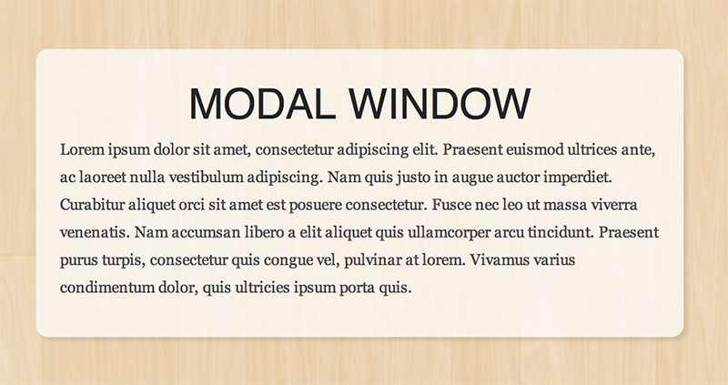
The static page content is marked up and styled. Our next task is to make the last chunk of HTML actually look like a modal box. We do this with a pretty hefty chunk of CSS. Let’s take a look at it and then I’ll walk you through it.
.modal {
  position: absolute;
  top: 0;
  right: 0;
  bottom: 0;
  left: 0;
  z-index: -100;
  margin: auto;
  padding: 20px;
  width: 500px;
  height: 200px;
  border-radius: 10px;
  background: rgba(255,255,255,0.7 );

  -webkit-box-shadow: 3px 3px 3px rgba(0,0,0,0.1);
  box-shadow: 3px 3px 3px rgba(0,0,0,0.1);
  opacity: 0;
  -ms-filter: "progid:DXImageTransform.Microsoft.Alpha(Opacity=0)";
  filter: alpha(opacity=0);

  -webkit-transition: opacity 1s ease;
  -moz-transition: opacity 1s ease;
  -ms-transition: opacity 1s ease;
  -o-transition: opacity 1s ease;
  transition: opacity 1s ease;
}
There’s a lot going on here, so let’s break it up. The first goal was to center the box on the page. This is pretty tricky given that we’re using the full viewport and therefore don’t know the dimensions of our parent. By using absolute positioning, auto margins and reset positioning values though, we effectively automatically center our item on the screen.
Notice that I also set the z-index to a negative value. This is because the modal window, even when hidden, can block other items on the page. You won’t see it, but it could potentially prevent a click or hover, thus we toss it to the bottom of the stack.
The rest of the code is visual flair. We gave it the works: a slightly transparent background, box-shadow, transition and rounded corners. Notice that I have the opacity set to 0 by default. This is because we only want the modal window to pop up when we click the button.
Modal Type
We have our box styled, but don’t forget the type inside. We’ll use styles similar to but slightly different than the other text on the page. Remember to style both the h2 and the paragraph.
.modal h2 {
  color: #232323;
  text-transform: uppercase;
  font: 35px/1.5 Helvetica, Verdana, sans-serif;
}

.modal p {
  color: #444;
  text-align: left;
  font: 13px/1.8 Georgia, Times, sans-serif;
}
Checked State
input#toggle:checked + .modal {
  opacity: 1;
  z-index: 1;
}
Make it Work!
The modal box is looking good now, but you would never know because it’s hidden. Let’s make it so that it appears when the label/button is clicked.
input#toggle:checked + .modal {
  opacity: 1;
  z-index: 1;
}
Here we targeted the input with the “toggle” class and a checked sate, then looked for an adjacent sibling with a class of “modal”. Next, we bring the opacity and z-index of the modal window up to one so that it becomes fully visible.
Adaptive CSS
Our modal box is nearly finished! Everything is working properly and styled up nicely. However, I noticed that things don’t quite look right when the viewport size is reduced. A tiny bit of adaptive styling here goes a long way, so let’s put in the effort.
@media all and (max-width: 767px) {
  .modal {
    width: 300px;
    height: 250px;
  }

  .modal h2 {
    font: 30px/1.5 Helvetica, Verdana, sans-serif;
  }

  .modal p {
    font: 12px/1.8 Georgia, Times, sans-serif;
  }
}
As you can see, I simply set up a single media query at 767px and reduced the size of a few things: the dimensions of the box, the h2 and the paragraph. Now the modal box has two different states that make it look great on small or large screens.
See it In Action
With that, we’re all finished! To test out the page for yourself, visit the demo below.
Demo: Click here to launch.

What Do You Think?
There you have it, a pure CSS modal window that adapts to small and large screen sizes. As always, there are some semantic concerns when he hijack a checkbox for something like this, but I didn’t feel like this was a job for :target, so this seemed like the way to go.
Leave a comment below and let me know what you think. What would you change? How would you make it better?