Design a Business Card That Won’t Get Thrown Away
It’s an almost unavoidable part of doing business – the business card. While more people are beginning to ditch traditional paper cards for digital counterparts, the business card is still an integral part of doing business.
Cards are almost as commonplace as the handshake, and it’s something you’ll always want to have ready to hand when you meet a potential new client.
So what makes your card stand out from the pack? How can you design a card that won’t get thrown away minutes after the meeting? And how can your card best illustrate the style of your work?
Let’s delve into some suggestions and tips today.
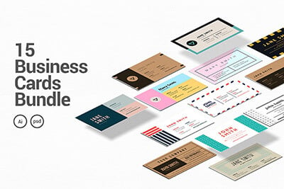
1 Million+ Business Cards, Resume Templates and Design Resources With Unlimited Downloads
Download hundreds of stunning business card templates, resume templates, cover letters, and design assets with an Envato Elements membership. It starts at $16 per month, and gives you unlimited access to a growing library of over 2,000,000 design templates, themes, photos, graphics, and more.

Make It Different
Sometimes the key to standing out can be having something different. With all of the business card options out there, it’s difficult to decide what will work best for you. So, what route to take?
First, it depends on your business. The card should match the feel of the company – and often, a traditional card shape (3.5 by 2 inches) does work best. Why? Because it fits easily in a pocket or wallet; oversized cards do not, and sometimes smaller cards can get lost.
But for the others, there are some fun design options, including using different shapes for cards. My favorite is the half-size card. The mini card is great if you want to really stress a key point, such as a web address. Design these tiny cards with simplicity in mind – showcase your work on one side and include contact info on the other.
Drench your business card in your personal style and design approach. It should immediately let someone know how you work as a designer.
Make It Fun & Trendy
Another trend in business card design is to include a gimmick. Turn your card into a sticker or magnet – real estate agents have used this trick for years – or consider a game or web elements.
Another popular tool right now is to design a card that looks like a popular website, such as Facebook or the iPhone model above. Be cautious with gimmicks though, because they can fall out of fashion pretty quickly. Don’t go ordering a thousand cards!
Think about ways to add interactivity to the traditional paper card. Use a QR code or custom URL. Tell people why the links are worth visiting right on the card: “For a full resume, visit” or “Scan the QR to view my portfolio.”
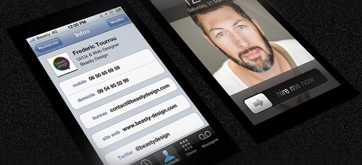
Remember that many potential clients may never meet you in person first. Make sure your “card” includes a digital version – especially if you are in a web-related design field. (You can read more about digital business cards in a previous Design Shack article.) Check out free digital business card sites such as about.me or flavors.me. Apps that digitize cards – Bump, CardMunch, Shoeboxed and CardFlick — are also gaining popularity, making it even more important to think about scan-ability in the design process.
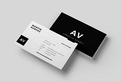
Think Minimal Design, Strong Text
Speaking of making a card easy to scan digitally, a minimalistic design scheme can really help.
Lots of negative space – but it does not have to be white – and simple type can go a long way. The KISS (keep it simple, stupid) design philosophy is often one of the best when it comes to small spaces. Use this when designing a business card – it is the ultimate printed small space.
The best thing to pair with a simple design scheme? Strong text.
The most important aspect is the words. Make sure everything is clearly readable. Dark text on a light background is a time-tested business card option for the simple reason that it is easy to read. Light text on a dark background can also be easy to read and striking but make sure to invest in a good-quality print so every work is crystal clear.
Font size in important. Generally text on a business card is between 8 and 15 points, with your name (or company name) as the largest element on the card and contact information that is slightly smaller. Try to avoid text is that below 8 points and opt for even larger text if using a novelty or condensed typeface. The key is for the card to be readable.
Include Key Information
There are some elements every business card just needs to include: Your name and contact information, and company information and logo for corporate cards.
For freelance or contract designers, take that a step further and make sure the card says what you do. This is especially important if you do not have a company name or other identifying information.
Some will make the argument that a super-cool card with just a URL will be attention-grabbing enough to make people visit your site. Don’t bank on it. While having a few of these cards in your arsenal may be ok, it is imperative to have an identifying card for potential clients. The whole point of a business card is so that your contact can reach you. Make it easy for them.
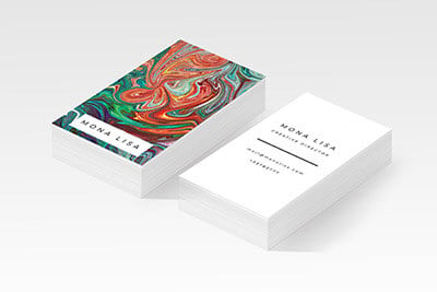
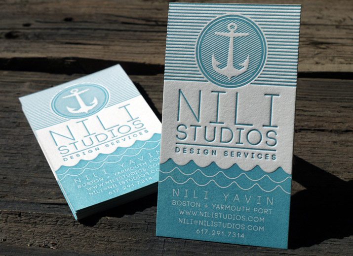
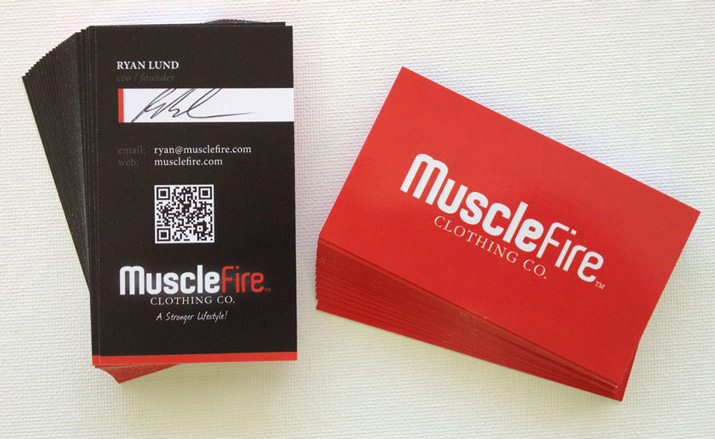
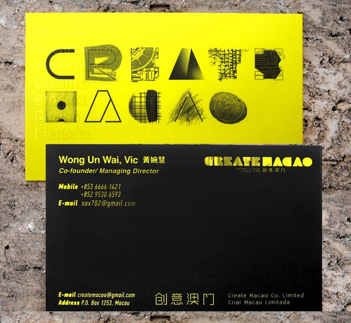
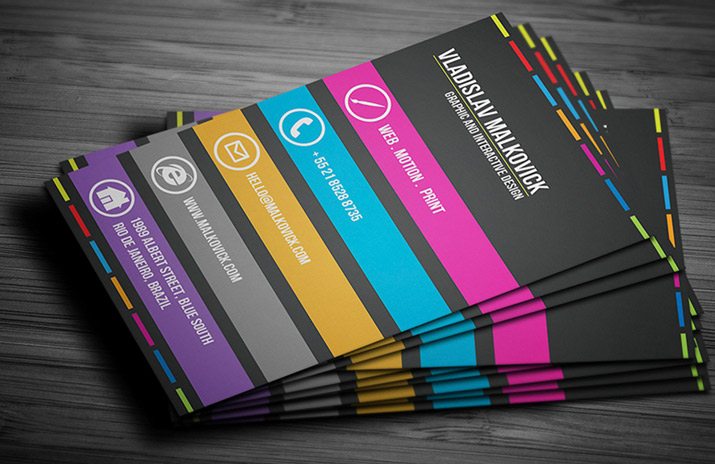
Use Color and Images
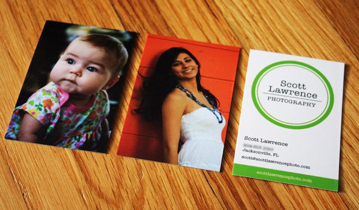
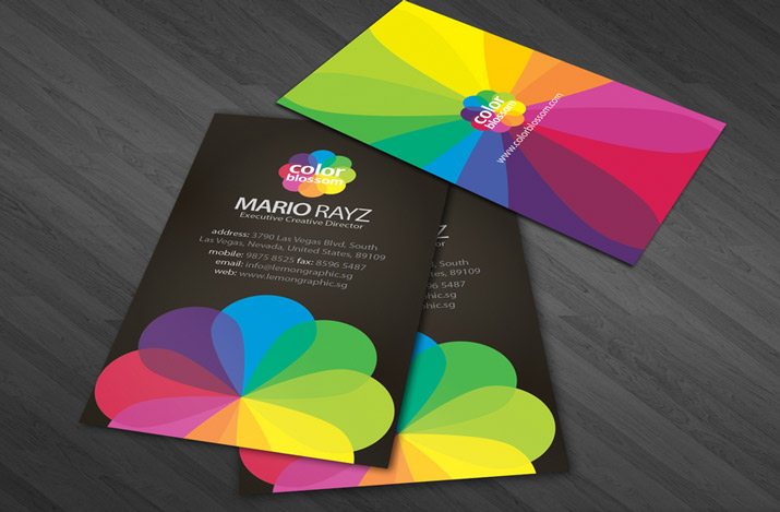
Color and images are an important part of any design scheme and can play an equally important role in business card design. One of the best and simplest ways to get your work out there is to show it off and you can use your business cards to do just that.
Two-sided printing can be a great way to combine both images and simplicity. Use one side of the card to show off your work (and consider multiple card images as well) and the other side as a point-of-contact. By using a pop of bright color or a great photo, your card will stand out in a stack of beige and black cards, and it says something extra about your work.
Go For Top Notch Printing
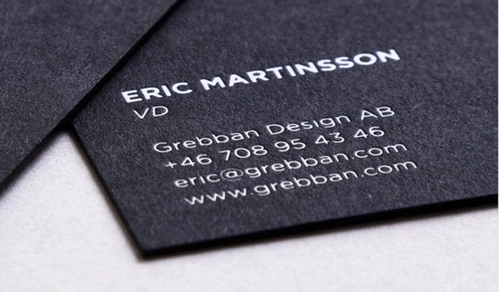
Nothing is quite like the feel of a high-stock business card. They don’t crumple and fold like flimsier counterparts and they make a nice first impression. Using a good stock can send the message that you care about quality.
Consider your options when it comes to printing versus copying as well. Printed cards include some textured ink – you can feel raised letters, for example — while copying is an even lay of ink on the card. Printing has a feel to it, with raised lettering and colors, and the ability to switch between finishes. Copying is more of a flat option and is typically only a fraction of the cost. Printing is a great option when simplicity is key – a run of cards that are all the same. Copying is a great option for a large number of cards that are different – say you are using multiple photos or color schemes.
Letterpress takes print-quality to another level entirely. These cards feature sunken type on a high-stock, and often textured, paper. The technique – which involves pressing inked letters or artwork into a thick, soft paper – dates centuries and has an elegant look and feel. But letterpress isn’t for everyone. They can be expensive and color options are limited; they can also be difficult to use as two-sided cards.
Conclusion
The most important part of your business card is that it represents you and your work.
As a designer, a poorly designed card can give potential clients the wrong impression of your work. Use images, text and graphics that really showcase what you and your design portfolio is all about. What is your design style? Minimalistic, colorful, lively, modern, classic? That’s a good starting place for your cards.
But remember when designing a card why you have it in the first place – to make connections and further your business. Make sure your card is easy to read and connects to your work online, through a URL or QR code. And make it part of your brand identity – your card, and your work should be clearly identifiable when a potential client tries to find you.
Image Sources: osde8info, Beasty Design, Sisa Quadros, Lori Boos for Scott Lawrence Photography, Emil Karlsson, RDL Digital for MuscleFire , Lemongraphic, Jorge Lima, Print & Grain, room122, Murat ErtA1/4rk, Ck Cheang, and Michael Verdi.