Design Critique #8: Pointillé Comunicação
Every week we take a look at a new website and analyze the design. We’ll point out both the areas that are done well as well as those that could use some work. Finally, we’ll finish by asking you to provide your own feedback.
Today’s site is Pointillé Comunicação, a branding and design firm.
2 Million+ Digital Assets, With Unlimited Downloads
Get unlimited downloads of 2 million+ design resources, themes, templates, photos, graphics and more. Envato Elements starts at $16 per month, and is the best creative subscription we've ever seen.


If you’d like to submit your website to be featured in a future Design Critique, it just takes a few minutes. We charge $24 for critiquing your design – considerably less than you’d pay for a consultant to take a look at your site! You can find out more here.
Pointillé Comunicação
Normally I start these posts off by telling you a little bit about the company, but this website isn’t in English so I haven’t got a clue what it says. For those of you that are much smarter than me and have taken the time to learn multiple languages, here’s a quote:
“Com 10 Anos de mercado, a Pointillé é uma agência que respira em seu dia-a-dia Branding, Design, Publicidade e Comunicação. São esses elementos mais a experiência que formam nosso pensamento, sempre voltado para a geração de valor no desenvolvimento das marcas de nossos clientes.” (Translate via Google)
And here’s the home page of the site:
My initial impression of the site is positive overall. The designer has done a bang up job and I really like his style.
The Good
Let’s start off by looking at the portions of the site that were designed really well. As I said, it’s a good looking site so there’s plenty of positive comments that can be made.
That Crazy Graphic

I’m not sure what it is or what it’s supposed to represent, but that exploding lotus thing definitely grabbed my attention as soon as I loaded the site (I think the lines may tie into the name of the site). It looks a little 90s to be sure but it’s definitely unique and sets the stage for the whole site. I’m sure some won’t like it but I say keep this graphic right where it is.
The Background Texture and Color Scheme

The colors on the site all work fairly well together. I like the mixture of dark and light shades of teal and the pop of a brighter orangey yellow on the button in the footer. I’d like to see this color repeated somewhere else though so it doesn’t seem so random.
More than the color though I like the subtle background texture. It adds depth to the page and carries on the square theme started by the flying cubes. Breaking up the monotony of a solid background with a barely noticeable texture is a great designer’s trick to keep up your sleeve when your page is looking boring.
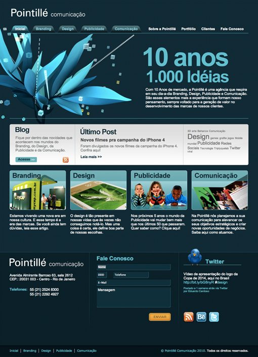
The Footer
The footer for the site is nicely designed and laid out. There are three clearly separate columns, each with a designated purpose. It’s also a nice touch to have the twitter icon break the line at the top of the footer. Any time you setup a rigid layout, it’s fun to relax it a little with an intentional violation.
Areas to Improve
Now that we’ve see a couple of the areas that work well, I’ll point out a few ideas that I have for improving the overall experience and design of the site.
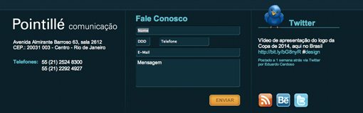
Hierarchy
Most of my problems with the site lie in the area shown above. It’s hard to explain, but sometimes design is more about how something feels than about solid expressible principles.
This area feels like it needs work to me. For starters, in the context of the whole page, the four boxes on the bottom are given more visual prominence than the large rectangle above them. They’re styled more and seem weightier. As you’re scrolling down the page, the boxes demand your attention and cause you to skip over the blog area.
However, the large rectangle is given a hierarchical prominence by it’s higher location on the page. It needs to be decided which of these two areas is more important and then the design should be changed to reflect that decision.
My instinct is that the blog area could be moved down and restyled so that the entire section doesn’t seem so boxy. Perhaps all of this content can be integrated in one single larger area that ties together better.
Finally, the four boxes could use a little work. The stroke that’s applied to them looks a little clunky (consider using CSS for this instead) and it’s quite awkward that the paragraph below each box is a link, but the images themselves aren’t. Not many users will expect an entire paragraph to link somewhere. The logical and instinctive solution here is to apply a hover effect to each image and have them link instead of the text.
Your Turn!
Now that you’ve read my comments, pitch in and help out by giving the designer some further advice. Let us know what you think is great about the design and what you think could be stronger. As always, we ask that you also be respectful of the site’s designer and offer clear constructive advice devoid of any harsh insults.
Interested in having your own site critiqued? You can find out more here.