Web Design Critique #10: Creative Ad Awards
Every week we take a look at a new website and analyze the design. We’ll point out both the areas that are done well as well as those that could use some work. Finally, we’ll finish by asking you to provide your own feedback.
Today’s site is Creative Ad Awards, a showcase for well designed advertisements.
The Ultimate Designer Toolkit: 2 Million+ Assets
Envato Elements gives you unlimited access to 2 million+ pro design resources, themes, templates, photos, graphics and more. Everything you'll ever need in your design resource toolkit.


If you’d like to submit your website to be featured in a future Design Critique, it just takes a few minutes. We charge $24 for critiquing your design – considerably less than you’d pay for a consultant to take a look at your site! You can find out more here.
Creative Ad Awards
“Creative Ad Awards is one of the best advertising archive, serving all the advertising fan and others who need it. Worrying about experiencing Ads with poor quality? You will feel comfortable here, because we are keeping to providing you with the world’s most creative and sophisticated ads. ”
Here is the site’s homepage:
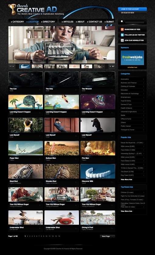
Overall it’s a really great looking site. Below I’ll pick apart each piece and convey my thoughts about what’s working well and what could be improved.
Background Texture

I really like the floral wallpaper look. It’s sort of been done to death over the past 5 years but that doesn’t stop it from looking really nice here.
I like that the texture is subtle and that the gradient to black is nice and gradual rather than harsh.
Colors

The color palette here is very attractive. The blue really stands out nicely against the black and the overall dark feel of the site makes it seem classy.
Another good thing about the colors here is that they’re consistent. The page is mostly blacks and grays with blue highlights for important areas, which is then repeated with gray links and blue hover effects.
Header

The header design is by far my least favorite section of the page. First of all, the logo instantly brings down what would otherwise be perceived as a high quality professional site. The trophy seems clip arty and the typography is straight out of a 90s Terminator movie. Also, the site is called “Creative Ad Awards” but for some reason the logo reads “Awards Creative Ad.” This should be consistent.
The color swooshes were well intended and I can see how the concept was solid, but the execution is less that satisfactory. They’re just not working against the wallpaper background. I recommend either eliminating them altogether or going with something much bolder.
Slideshow
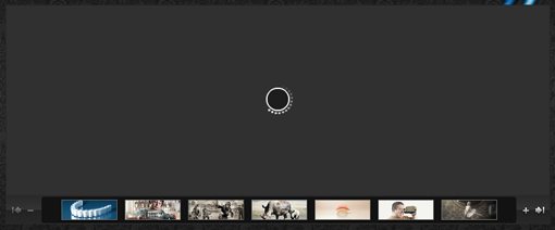
I’m a sucker for a good slideshow. It’s an excellent way to show off a lot of content in a little space and bring life to a static page.
However, I couldn’t get this one to work in either Firefox or Safari. I can click on a thumbnail and have that pop up just fine, but the autostart feature seems to just give a never ending progress spinner (I think there might be an issue with that first image).
I’m as geeky as they come when it comes to updating extensions and software so odds are if the slideshow isn’t working on my computer properly, it won’t work on a large portion of your audience’s computers either.
Navigation
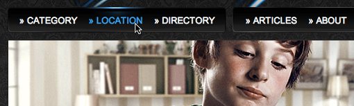
The navigation menu is really sharp. It fits right into the site’s theme and I love the illumination effect that occurs when you hover over a link.
However, I’m not quite sure about the little arrows in front of each link. I don’t know what these are for but they’re a little awkwardly aligned and feel like they should only be on the links that contain a dropdown menu.
Thumbnails
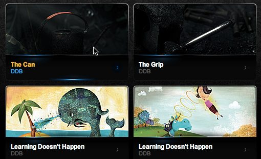
The ad thumbnails are awesome. I love that they’re wide rectangles instead of squares to give you more of a preview and that the entire image area is a clickable link rather than just the word (everyone usually gets that wrong). It’s also nice to see the illuminated hover effect carried over from the navigation area. Proper use of repetition really brings finesse to a design.
My favorite part about the thumbnails though is the metallic looking border and rounded corners with a slight inner shadow. This really shows an attention to detail and looks absolutely superb.
Your Turn!
Now that you’ve read my comments, pitch in and help out by giving the designer some further advice. Let us know what you think is great about the design and what you think could be stronger. As always, we ask that you also be respectful of the site’s designer and offer clear constructive advice devoid of any harsh insults.
Interested in having your own site critiqued? You can find out more here.