Web Design Critique #18: Two Chaps
Every week we take a look at a new website and analyze the design. We’ll point out both the areas that are done well as well as those that could use some work. Finally, we’ll finish by asking you to provide your own feedback.
Today’s site is Two Chaps Branding a Baltimore based web design and marketing firm.
2 Million+ Digital Assets, With Unlimited Downloads
Get unlimited downloads of 2 million+ design resources, themes, templates, photos, graphics and more. Envato Elements starts at $16 per month, and is the best creative subscription we've ever seen.


If you’d like to submit your website to be featured in a future Design Critique, it just takes a few minutes. We charge $24 for critiquing your design – considerably less than you’d pay for a consultant to take a look at your site! You can find out more here.
About Two Chaps
“Here at TwoChaps we believe that a brand is more than a pretty logo and a mission statement loaded with the latest industry buzzwords. We believe that a brand is the story of a company, a story that defines its past, present and future relationships with its customers and clients. We believe that a brand is more than how you wish to be perceived, it is how you are actually perceived. Whether ignored or nurtured – your brand defines you.”
Here is the Two Chaps homepage:

The overall design is very attractive. The aged theme is executed well across colors, type and textures and the layout is simple yet powerful. The alignment is very tight with the majority of the content comprising a clearly defined column.
Let’s break down some of the aspects of the design and look at them in a more in-depth manner.
The Logo
I really like the work they’ve done in the logo. The bowler and mustache are a perfect visual message to the “Two Chaps” name. Likewise, the strong serif typeface is spot on for the time period the designers are shooting for.
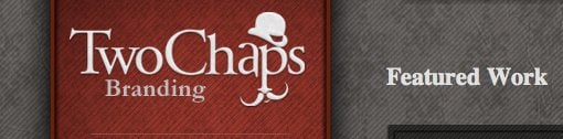
Though I like the logo just fine how it is, I can’t help but wonder if it would be stronger sans the mustache. Right now there are two competing graphical elements in the logo and reducing it to a single might improve the piece. I realize the mustache, letters and hat are together suggesting a face, but it still reads more like letters with a mustache and a hat.
As the main graphic, the bowler could then be used elsewhere as a standalone element independent of the rest of the logo.
The Headline
The headline is my favorite thing about the site. Though it appears on the right, it’s one of the first you look at when the page loads because of its size and boldness.

The letter sizes have been perfectly structured to create a cohesive unit that catches your attention and make for a quick read. Notice how the less important words (the, of) have been reduced in size to give room for the more important words (true art).
Since this is a graphic and not live type, I would definitely recommend taking the time to work on the kerning of the text here. Some letters, such as the “T” and “r” in “True,” are oddly far apart while others are a little squished together.
It’s easy to forget this step when you’re designing but if typography is going to be a main feature in the design you always want to be sure your letter spacing is as close to perfect as you can get it.
Image Thumbnails
The images on the homepage have been given an excellent border treatment. The shadowing really gives the images a lot of depth as it creates three separate levels.
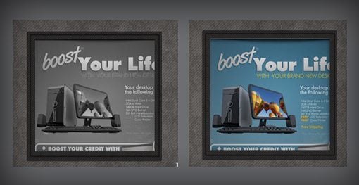
By default the images are grayscale but if you hover over them they drop down a pixel or two (intentional?) and become full color. This is a nice effect that’s fun to play with if you’re checking out the site for the first time.
The Sidebar
As you can see, the sidebar is a vertical ribbon that holds the logo, navigation, a couple social buttons and some legal info. If you check out the live site you’ll see that the footer conveniently stays stationary as the site scrolls. This provides easy access for changing pages no matter where you are in the site.
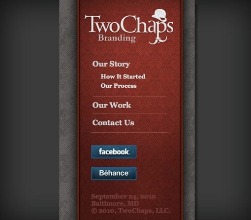
I love the boldness of the red and how much it stands out from the rest of the design. I also like the treatment and colors used for the Facebook and Behance buttons. It is a little odd though that the letters in “Facebook” have such a hard shadow while those in “Behance” don’t.
The navigation sections of the sidebar expand and contract with a smooth animation as you click on the headers. The key here is that all of the items are still perfectly accessible with JavaScript disabled, the menus are simply all shown in the open position and you wouldn’t even know you were missing anything.
It’s always good to go the extra mile and make sure that your site works for the browsers that support your little visual treats as well as those that don’t.
Footer
The footer holds the call to action for hiring the firm and is yet another nicely-designed spin on the aged theme.
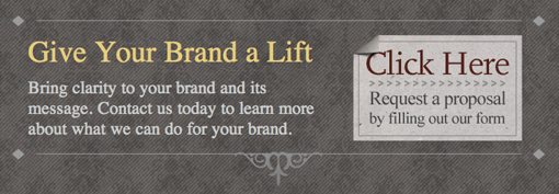
The lines on the top and bottom are a nice touch as well as the little “Click Here” sign with a page curl. This section does seem a little like some SEO “experts” got ahold of it as the word “brand” appears an awful lot of times for such a small bit of text.
Readability
As I stated above, overall I really like the design of the site. It’s unique, bold, attractive and quite functional. However, I do think that the site’s usability is suffering because of the text. Check out the image below from the “Our Story” page.

As you can see, neither the large colored headline next nor the white body text are very readable on the textured background. This is worsened by the fact that the background stays in place as the text scrolls, creating a really complex and busy visual effect as you browse the site.
In the end, the nice textured background may be doing more hard than good. It’s a good idea to experiment with dropping its opacity or scrapping it altogether in favor of something simpler. That may be unpleasant to hear but if it increases the readability the text across the entire site it’s worth the effort.
Your Turn!
Now that you’ve read my comments, pitch in and help out by giving the designer some further advice. Let us know what you think is great about the design and what you think could be stronger. As always, we ask that you also be respectful of the site’s designer and offer clear constructive advice devoid of any harsh insults.
Interested in having your own site critiqued? You can find out more here.