Web Design Critique #20: The Inspiration Blog
Every week we take a look at a new website and analyze the design. We’ll point out both the areas that are done well as well as those that could use some work. Finally, we’ll finish by asking you to provide your own feedback.
Today’s site is The Inspiration Blog, a site very similar to this one dedicated to visual design inspiration.
2 Million+ Digital Assets, With Unlimited Downloads
Get unlimited downloads of 2 million+ design resources, themes, templates, photos, graphics and more. Envato Elements starts at $16 per month, and is the best creative subscription we've ever seen.


If you’d like to submit your website to be featured in a future Design Critique, it just takes a few minutes. We charge $24 for critiquing your design – considerably less than you’d pay for a consultant to take a look at your site! You can find out more here.
About The Inspiration Blog
There isn’t much biographical information on the site aside from individual author bios, but the header at the top of the homepage sums it all up nicely: “A blog completely dedicated to visual inspiration and sweet product round-ups.”
Here is a section of the homepage (a few posts in the stack were removed to make the image shorter):

Overall Design
Right off the bat, I like what I see. We’ve got a nice, newspaper-inspired theme with a strong minimalist influence and plenty of whitespace. Notice how simple lines have been used heavily throughout the design using techniques similar to those we pointed out in a recent article.
The design is very clean and structured without being boring. As with many of the sites that we look at, the critiques below will be more on the level of slight tweaks than wide-sweeping design changes. It’s an attractive page and needs very little to inch it closer to perfect.
I think if a redesign were ever in the works, it might be nice to make a bolder statement in the header via a big graphic of some sort. This would add both some branding and visual interest to the page.
The Logo
The first thing I noticed is the handwritten style used in the blog’s logo. I like the font choice and think that it brings a unique element to a site with lots of standard looking fonts.
However, script fonts can be quite hard to read when they’re shown at such a small size. The kerning here seems a little tight and when combined with the small font size definitely makes it a little difficult to read the word “Inspiration.”
To start, I would suggest spacing out the letters just a bit. If this doesn’t increase the readability enough, scale up that font a few points.
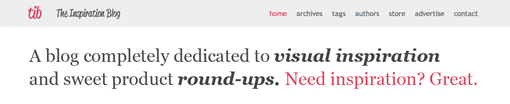
Headline
I like the Georgia headline. It’s nice and big with bold letters and a simple message. The last part of the headline, “Need inspiration?”, actually acts as a link to bring up a random post. This is a neat feature that’s subtle but fun once you realize it’s there.

My issue here is that when you load the page and look at the headline, it’s not an instant read. Rather, it’s a large block of copy that readers might or might not take the time to actually read through.
One thing that I was constantly challenged with in the six years that I did retail advertising design was creating attractive headlines that served as visual element that people could instantly take in. What this means on a practical level is that you need to emphasize the important words so that even if the majority of your viewers browse over the headline without actually reading it, they still get the gist, almost purely by accident.
You can add emphasis with color (which you’ve done), size, boldness, italics, etc. As an example, here’s a quick mockup with a few areas of selective bolding.
Now when you scan over the headline, the key aspects of the site jump out at you. This could even be an opportunity to repeat the script used in the logo.
Post Previews
I like how the post previews are structured. Each is a clearly individual unit with plenty of spacing between the separate posts and nice large 200 by 200 pixel preview images.

Again, I’m probably starting to sound like a broken record but I think the only problem I have here is the readability of some of the text (admittedly, it’s a text-heavy theme so there’s not much else to discuss). The problem in this area lies in the text at the top of the post preview (Ex: Posted on 30th Spetember…). This text is shown in italic, all capital letters that almost look void of spaces between words. It all runs together into one big long line that you have to work to mentally separate.
The Sidebar
As with most blogs, the sidebar houses the advertising, social network links, tags, search box, and other miscellaneous items. I like this area pretty much how it is. Each section is nicely spaced and aligned and fits perfectly with the rest of the theme.

One optional thing that you might want to consider is upping the contrast between the default and hover states on the tags. I consulted a colorblind friend and he was unable to differentiate between the two states. A simple fix might be to remove the underline on hover (the reverse of what you see on many links on the web).
One last annoyingly tiny thing I noticed about this area is the “Subscribe ‘n’ Follow” text. The second apostrophe seems oddly placed to me. Going on “Steak ‘n Shake” as an example, I think this should be changed to “Subscribe ‘n Follow.” It’s possible that I’m wrong entirely. Either way, it’s definitely nothing major.
The Footer
The last area we’ll look at is the footer. Like everything else on the site, it’s nice and simple. If you’re looking to pick up some extra work, they’re looking for writers so be sure to stop by the site and apply.

I find it a little strange that the social network section is duplicated exactly here rather than in a simpler form, but the icons probably increase the click-through rates so ultimately I’m fine with it.
Your Turn!
Now that you’ve read my comments, pitch in and help out by giving the designer some further advice. Let us know what you think is great about the design and what you think could be stronger. As always, we ask that you also be respectful of the site’s designer and offer clear constructive advice devoid of any harsh insults.