Web Design Critique #25: Highwire
Welcome to our 25th design critique! Every week we take a look at a new website and analyze the design. We’ll point out both the areas that are done well in addition as those that could use some work. Finally, we’ll finish by asking you to pitch in and provide your own feedback. Vote in the poll at the bottom of this page and/or leave a comment with your thoughts!
Today’s site is Highwire.com, a personalized online store platform.
2 Million+ Digital Assets, With Unlimited Downloads
Get unlimited downloads of 2 million+ design resources, themes, templates, photos, graphics and more. Envato Elements starts at $16 per month, and is the best creative subscription we've ever seen.


If you’d like to submit your website to be featured in a future Design Critique, it just takes a few minutes. We charge $24 for critiquing your design – considerably less than you’d pay for a consultant to take a look at your site! You can find out more here.
About Highwire
“Creating your own eCommerce store has never been as easy and affordable. Sign up for a free trial today and start building your store in just minutes!”
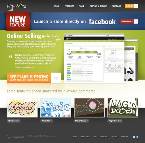
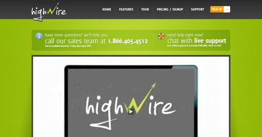
Here is a screenshot of the homepage:
Overall Impression
If you stopped by today to hear me rip on bad design, you’re going to be disappointed. I think this might just be the best website design submitted yet for a design critique.
Highwire is simply a gorgeous site and is so well done that we’ll be forced to use it as more of a positive teaching tool than a negative one. Keep reading because there’s a ton that we can learn by analyzing this design. And don’t worry, there are a few small things I’ll suggest improving along the way.
Color Palette
The boldest statement made on this site is color. The quality of the imagery is excellent but it’s the color that really grabs your attention as soon as you load the page. The basic colors used here aren’t exactly breaking the mold: green, red, blue, gray and a little orange, but they’re mixed in a very attractive manner.
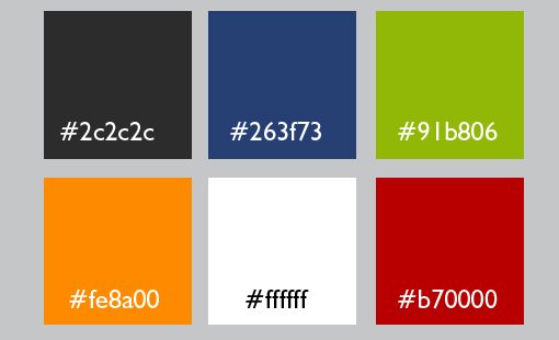
Notice though that they’ve chosen a super bright shade of each color that really jumps right off the page. A mixture of radial and linear gradients make the colors seem that much more vibrant and alive while bringing a subtle suggestion of texture.
Layout & Alignment
The layout of this site is rock solid and really utilizes proper use of whitespace and visual weight distribution. Notice in the modified image below how strong vertical lines have been established to make sure everything is nice and tight.
Also notice that the designer chose a left alignment and stuck to it. All of the text is left-alined and even the buttons under the thumbnails follow this trend. Your designs tend to look much more cohesive and consistent when you avoid switching alignments at random inervals throughout the design.
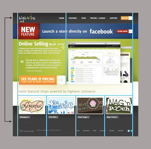
Despite being different sections of the code, the header and the footer use the same gradient so that you get the illusion of a continuous background that the content floats above. This feels like they’ve merely styled the body tag but has the semantics benefit of actually maintaining a strong header and footer.
Shadows and Reflections
Reflections, gradients and soft shadows have lately been giving way to solid color and often hard, non-feathered shadows. As we begin to leave the beaten and abused web 2.0 look behind and move onto our next victim, it’s still nice to see someone pull of the style the way it was meant to be.
Both the shadows and reflections here are quite subtle and have been structured with care to look realistic and just plain beautiful. If you’re going to add visual flair to an element, it’s worth taking the time to tweak and experiment until you get something that really adds finesse and shine to a page as opposed to a sloppy coat of makeup.
The Burst: Evolved
One thing you learn when you design for a major marketing firm is that marketers absolutely love bursts. Something big and pointy that violates the design and therefore grabs the attention of the customer. If marketing departments, and indeed many designers had their way, everything would look like this:
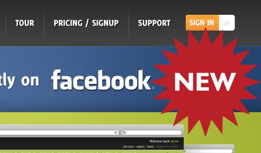
Just so you know, from a design perspective, this is cliche, ugly, overdone, outdated and every other negative adjective you can imagine. As a general rule of thumb, never put a starburst on anything.
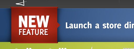
This designer fortunately understood this rule and came up with a much more modern and attractive solution, shown below. This 3D ribbon wraps around a bar describing the new feature. It significantly violates the design enough to capture your attention, but not enough to cheapen the look of the entire page.
Suggested Improvement
As I’ve said multiple times already, this is such a great design that it’s hard to find anything wrong with it. However, there are a couple of things I would consider improving.
For starters, the site uses Cufon for the custom typography. I complained about this in our last critique and will continue to make the same argument wherever I see Cufon being used. @font-face is a better solution, period. @font-face text is fully selectable, Cufon isn’t. @font-face uses pure CSS, Cufon requires JavaScript to be enabled. As I pointed out last time, when the Cufon website suggests using @font-face instead, you know it’s time to throw in the towel and jump on board.
The other thing that bugs me is the Facebook bar at the top. If you draw a line through the center of the text in this bar, as I have done below, you can see that the Facebook logo is awkwardly off-center. I’m not sure if this was intentional or an accident, either way, I would bump it up close to the center.

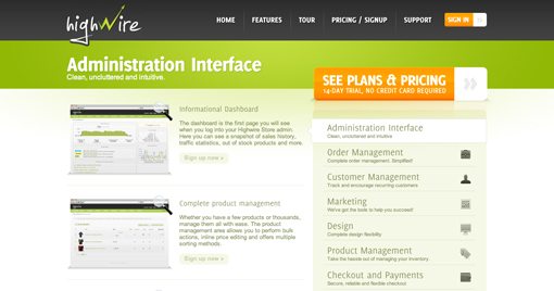
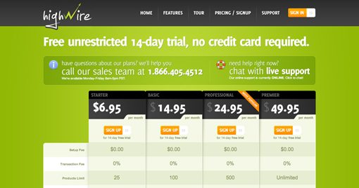
Other Pages
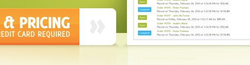
We’ll close off by giving you a quick look at some of the other pages on the site. As you can see, they’re equally attractive and all very well designed. I particularly like the pricing tables!
Your Turn!
Now that you’ve read my comments, pitch in and help out by giving the designer some further advice. Let us know what you think is great about the design and what you think could be stronger. As always, we ask that you also be respectful of the site’s designer and offer clear constructive advice devoid of any harsh insults.