Web Design Critique #3: Firefly
Our web design critiques have been a hit both with customers and commenters. Keep up the great work providing quality ideas and suggestions!
Today’s site is Firefly, the home page of a social work recruitment agency based in the UK.
The Ultimate Designer Toolkit: 2 Million+ Assets
Envato Elements gives you unlimited access to 2 million+ pro design resources, themes, templates, photos, graphics and more. Everything you'll ever need in your design resource toolkit.


If you’d like to submit your website to be featured in a future Design Critique, it just takes a few minutes. We charge $24 for critiquing your design – considerably less than you’d pay for a consultant to take a look at your site! You can find out more here.
Firefly
By their own definition, “Firefly is a recruitment consultancy that specialises in sourcing, placing and managing social work professionals in public and private sector roles throughout London and its neighbouring counties. Our approach to recruitment is personal and consultative.”
Here’s the home page of their website:
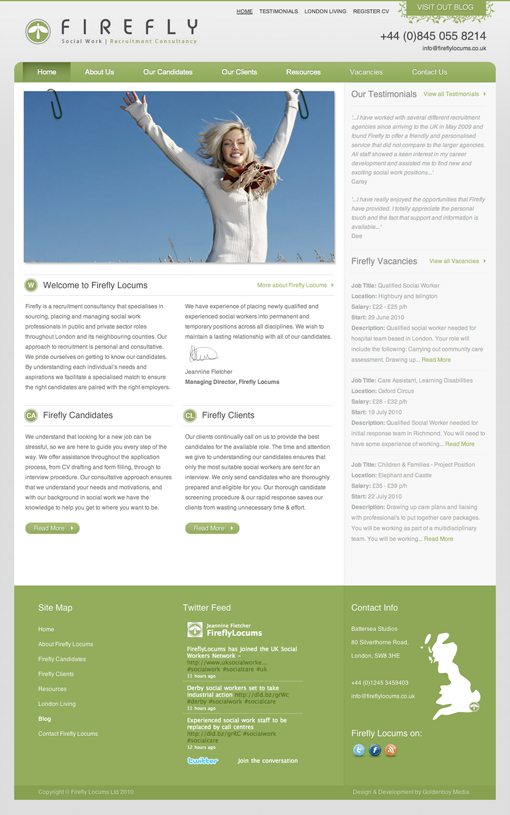
Overall, the site design is really nice and I have I have a lot of good things to say about it. Let’s look at a few of these in-depth.
Color Scheme
First of all, I really like the color palette at work here. It uses all light colors that are easy on the eyes and look beautiful together.

The boldest color here is the green and the designer used it in perfect amounts. It’s scattered fairly heavily over the top of the site, only in key places throughout the content, and makes a big appearance as the main color of the footer (in three variations!).
Attention to Detail
There are lots of little bits of design scattered throughout the page that are just nice touches. It shows the designer was taking the time to go slow and get the interface right instead of rushing just to get something published.
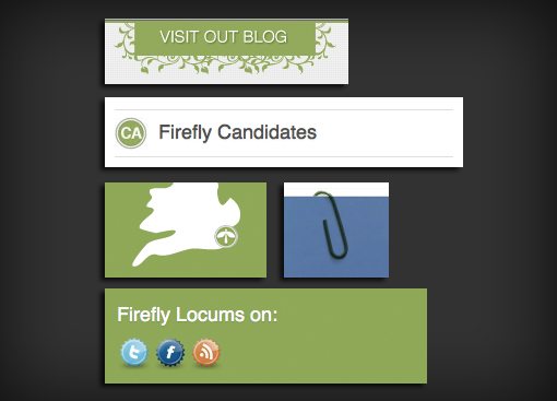
Repetition
Repetition is one of the key aspects of a design and a principle that is either misunderstood or completely unknown to many web designers. This designer used it masterfully not only through the repetition of the green as mentioned above but also through the use of the circle element from the logo.

Repeating an element across a page like this makes the design seem more cohesive. It also gives the eye something familiar to spot as it browses the page.
Layout
The designer chose to implement a three column layout and stuck with it the entire length of the site. The alignments are strong and the columns are executed very well. The visual separation of the far right column through the use of a darker background color is an excellent touch as it helps highlight the main content and break up the monotony of a large white page.
Things to Improve
Overall, the design is one of the strongest we’ve seen yet for a critique. However, there are a few small adjustments that could be made.
Image Resolution
Because I have a background in print, I tend to be a resolution nazi. The logo at the top left not only represents the brand of the company, it’s also one of the first things a user sees when landing on the page. For this reason, you want to make sure it’s nice a crisp.
I’ve blown up the logo a little to show you what I mean. This admittedly makes the problem even worse but it’s a good illustration of what to look for on a smaller level when saving images.

Watch closely for image artifacting and degradation. This logo is fairly small and shouldn’t bog down the site if it were to be saved at a higher resolution.
Text Heavy
Perhaps the worse visual problem with this page is that it’s just so text heavy. It’s simply a lot of information to throw at someone when they first land on your site. This much reading can be time consuming and intimidating and can actually lead to the user ignoring the text altogether.
I’d consider trimming this down to the bare necessities and placing any non-crucial information on a supporting page rather than giving it prominence here.
Usability
There’s a slight usability problem with some of the text on the page. I’m not sure what’s causing it, but in Safari the text in the Welcome column isn’t selectable.
I know it sounds picky but the entire point of having live text is so you have clean, crisp, and fully-selectable (and therefore copy paste-able) copy on the page.
I recommend taking a look at your code to see what’s causing this error.
Two Paperclips
As I stated above, repetition is a good thing in design. However, as I also pointed out, it’s often misunderstood or misused. The paperclip is a nice graphical element and would’ve been great to repeat somewhere else on the page, but putting two of them this close to each other makes this section suffer from a Photoshop clone syndrome.
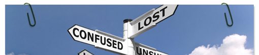
I think using just one paperclip here would make a stronger statement. If you really want to stick with two, make sure that they aren’t identical. Rotate one or flip it around to provide a little variation.
Your Turn!
Now that you’ve read my comments, pitch in and help out by giving the designer some further advice. Let us know what you think is great about the design and what you think could be stronger. As always, we ask that you also be respectful of the site’s designer and offer clear constructive advice devoid of any harsh insults.
Interested in having your own site critiqued? You can find out more here.