Web Design Critique #38: Domains4Less
Every week we take a look at a new website and analyze the design. We’ll point out both the areas that are done well in addition to those that could use some work. Finally, we’ll finish by asking you to provide your own feedback.
Today’s site is Domains4Less, an Australian domain name company.
2 Million+ Digital Assets, With Unlimited Downloads
Get unlimited downloads of 2 million+ design resources, themes, templates, photos, graphics and more. Envato Elements starts at $16 per month, and is the best creative subscription we've ever seen.


If you’d like to submit your website to be featured in a future Design Critique, it just takes a few minutes. We charge $34 for critiquing your design – considerably less than you’d pay for a consultant to take a look at your site! You can find out more here.
About Domains4Less
“At Domains4Less we offer the cheapest .au domain names. Register or transfer your domain name to us and get the best price backed by fast, friendly support. Domain name registration with Domains4Less is fast, easy and efficient. Simply enter your domain, select the extensions you wish to check and click “search”.”
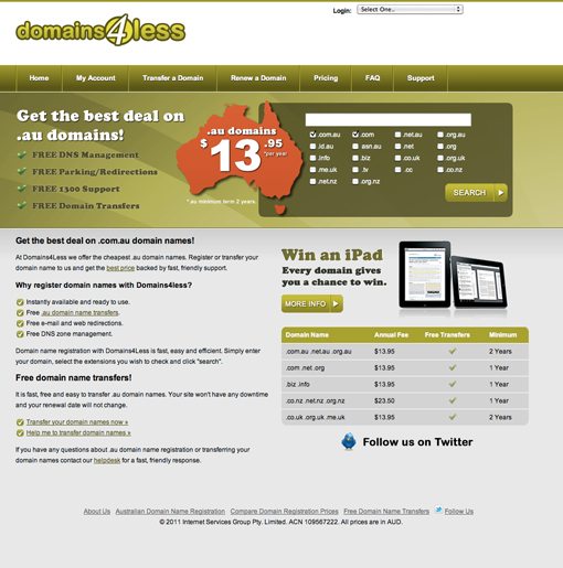
Here is a screenshot of the homepage:
Initial Impression
Domains4Less, like many of the sites that we critique, definitely has both merits and downfalls. These come into play both from an aesthetic point of view and from a functional standpoint.
There should be plenty to discuss so let’s jump in and dice it up piece by piece to see what we can learn.
The Header
The header is probably my least favorite part about this website. The utilization of whitespace here is quite awkward, especially on the right site where the login feature is stuck up way at the top.
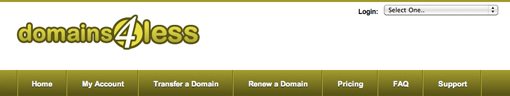
Further, with this section being white, it doesn’t seem to fit with the rest of the site. What you currently have is three separate horizontal stripes making up the content on the page. These sections don’t tie together very well visually. One possible suggesting for fixing this is to give the bottom section and the top section the same background color. This will pair them together as a visual unit with one other content area running through the middle.
Another possible but extreme idea is to ditch this big header altogether. To be honest, I like the site much better with this area completely cropped off. Obviously, you’d have to incorporate the elements from the header into the rest of the design somewhere, but since there are only two things it shouldn’t be that difficult.
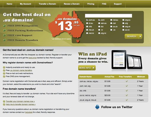
Featured Area
The next section of the site is fairly attractive. The green really draws your eye in from the comparatively plain colors on the rest of the page. I really like the big Australia outline as it reinforces your message about selling .au domain names in a very visual manner.
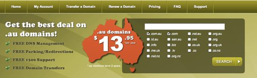
That said, there are definitely some major improvements that could be made. For starters, there are some contrast issues. In my opinion, the bulleted list of features doesn’t stand out well at all from the background due to the similar colors. The green on green simply isn’t allowing this to stand out and be easily read at a glance, the same goes for the checkmark graphics.
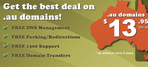
Further, I think the text here could be easily selectable. It’s not 100% always the case that you must have selectable text instead of image-based text, but as a general rule you should try to do so when possible. I’m not crazy about the Cooper Black font and I suspect that it’s the reason you went with an image. Swapping it out to something more standard would allow you to make this live text. Even if you want to keep a similar font it would be quite easy. The Google Font Directory has a font called Corben that looks almost identical and can be embedded into your page in seconds. In fact, this font is featured along with full instructions in our recent article 10 Great Google Font Combinations You Can Copy.
Finally, I think the alignment of the box on the right could stand to be improved. One of the trickiest parts of page layout is to watch out for accidental near-alignments. What I mean by this is try to to lay things out so that they almost align, but don’t. We can see this with the two boxes on the right side of the page.
These boxes are almost the exact same size, but are slightly offset from each other. If they varied in size greatly and were obviously not attempting to line up in any way, this might be acceptable, but here they’re close enough that they just look haphazardly placed. I suggest moving the top box over to line up with the bottom box. This would make extra room for the “Get the Best Deals” headline, which could be increased.
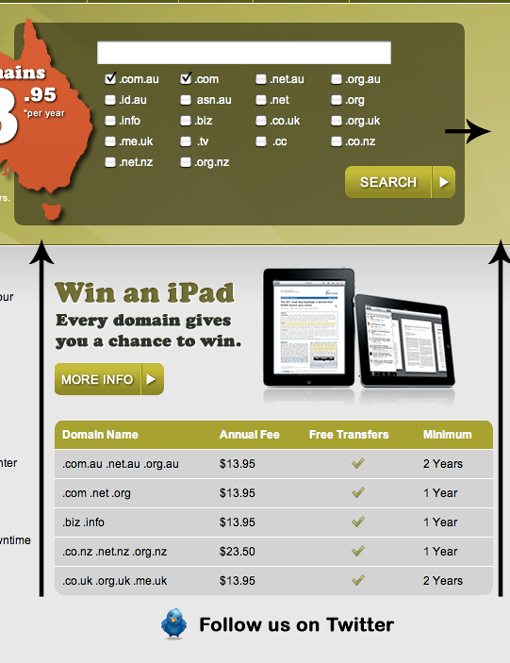
Bottom Section
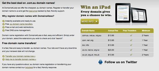
On the bottom section, I like the treatment of the iPad area. It’s visually distinct and eye-catching while still fitting with the theme. It also has a genuine HTML table used as an actual table and styled with CSS, which is great.
The left side however, could definitely use some better organization. As it stands, there’s just a big chunk of text over there that I’d wager very few people ever take the time to read. If we just over to Network Solutions’ website, another popular domain name provider, we see that they’ve gone about organizing their information in a very different manner.
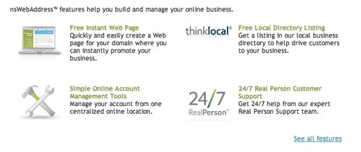
Here, instead of a huge block of text, everything has been divided up into clearly digestible chunks with icons to help break of the monotony of so much text. This actually isn’t original at all and is an extremely popular way to present features online simply because it works so well. I think the bottom half of Domains4Less could benefit from a similar treatment.
Your Turn!
Now that you’ve read my comments, pitch in and help out by giving the designer some further advice. Let us know what you think is great about the design and what you think could be stronger. As always, we ask that you also be respectful of the site’s designer and offer clear constructive advice void of any harsh insults.