Web Design Critique #4: Anthem Design Group
Every week we take a look at a new website and analyze the design. We’ll point out both the areas that are done well and those that could use some work. Finally, we’ll finish by asking you to provide your own feedback.
Today’s site is Anthem Design Group. Anthem is a small award-winning creative and interactive design agency located in Atlanta, Georgia USA
2 Million+ Digital Assets, With Unlimited Downloads
Get unlimited downloads of 2 million+ design resources, themes, templates, photos, graphics and more. Envato Elements starts at $16 per month, and is the best creative subscription we've ever seen.


If you’d like to submit your website to be featured in a future Design Critique, it just takes a few minutes. We charge $24 for critiquing your design – considerably less than you’d pay for a consultant to take a look at your site! You can find out more here.
Anthem
“We are a friendly, hard-working group of creative and technical people with super-high standards that love making awesome websites, apps, games, and art. Our work is award-winning, attractive and finely-crafted. We love to work with any size business, and are proud of our diverse and fantastic group of clients.”
Here’s the home page of their website:
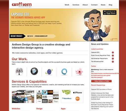
It’s a fairly strong design with three primary columns plus a sidebar (so basically four columns). The large image up top is an image slider with a basic fading transition.
Let’s examine a couple of the things that are really nice about this design.
Easy to Navigate
There’s a lot going on here for a single page, but for the most part it’s laid out logically and is easy to sort through. The homepage seems to serve as a nice overview of everything you’ll find on the site. Several of the pages accessible through the navigation are represented here on the page with a little bit of content.
Any time you’re clueless as to how to fill the homepage of a large site, remember that it should often serve as a gateway to everything else. Inserting bite-sized previews of the rest of the site here allows the user to quickly become acquainted with what you’re offering and will also serve to aid the process of finding specific content.
Breaking the Lines
This site has some fairly strict alignments and containment devices that are good for keeping everything clean and organized. However, we see in the footer that it’s often good to take a design like this and break it in a few places.

Here we see the logo and contact information placed into a box that violates the harsh lines setup by the footer and content separation. I’d like to see something at the top of the page pick up this idea as well to ease the rigidness of the design.
Areas to Improve
Now let’s dive into the critique. Below are a few issues I personally believe should be addressed regarding the design.
Interactive?
I see the word “interactive” in several places on the page regarding what Anthem does, but aside from the image slider, the site simply doesn’t feel very interactive. One of the key areas I think is suffering is the link hover effects, or lack thereof.
In the navigation, the difference in the color of the link on the non-hover and hover states is a bit too subtle and perhaps impossible for colorblind users to even notice on such small text. Further, aside from those in the sidebar, nearly all the other links on the page have absolutely no hover effect at all. If your browser’s cursor didn’t automatically change for links, users probably wouldn’t even know there were any present on the page.
Again, this ties closely in with the notion of “interactive.” Adding items that change with interaction at various points throughout the page will make the site feel much more alive and active. These elements don’t have to scream at your users, but they should at least not be hidden.
Adding Links
Along the same vein as bringing the current links to life, I think a few more should be added. As I said before, I like how the home page content and navigation tie together. For instance, there is a services link in the navigation, and a services section on the page. However, the text that says “Services and Capabilities” in the content section isn’t enabled as a link to the “Services and Capabilities” page.
Always seek to make things ridiculously easy on your users. If they see a headline that matches the place they want to go, they should be able to click it to go there rather than hunting around for the right link.
Spacing
There are a couple of places on the page that split the content up into three columns, each with their own header. The problem is that the header and the column are spaced so far apart, it’s not immediately apparent that they belong together.
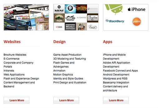
I recommend removing about half of the spacing here so that users can instantly tell that these two areas should be interpreted as a single unit.
Alignment & Overflow
There are two key areas where I’m spotting issues with small items not lining up properly. The first is in the sidebar. The Twitter feed here seems to be overflowing out of the containment box.
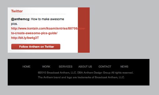
The second is the legal copy and navigation links in the footer. They don’t really share any sort of an alignment and appear to just be floating randomly in the space. I recommend giving them both a strong left alignment and perhaps pushing them over near the logo area on the left.
Your Turn!
Now that you’ve read my comments, pitch in and help out by giving the designer some further advice. Let us know what you think is great about the design and what you think could be stronger. As always, we ask that you also be respectful of the site’s designer and offer clear constructive advice devoid of any harsh insults.
Interested in having your own site critiqued? You can find out more here.