Web Design Critique #40: FanExtra
Welcome to our 40th design critique! Every week we take a look at a new website and analyze the design. We’ll point out both the areas that are done well in addition to those that could use some work. Finally, we’ll finish by asking you to provide your own feedback.
Today’s site is FanExtra, a fantastic resource site for designers.
The Ultimate Designer Toolkit: 2 Million+ Assets
Envato Elements gives you unlimited access to 2 million+ pro design resources, themes, templates, photos, graphics and more. Everything you'll ever need in your design resource toolkit.


If you’d like to submit your website to be featured in a future Design Critique, it just takes a few minutes. We charge $34 for critiquing your design – considerably less than you’d pay for a consultant to take a look at your site! You can find out more here.
About FanExtra
“This all started with a long summer over two years ago, and a passion for design. After enjoying some of the Photoshop tutorials being posted at the time I decided to write a few of my own. I set up a blog for the purpose (PSDFAN.com) and started using it as my creative outlet. I wanted to offer more for our growing community, and be able to evolve PSDFAN to something bigger. The idea for FanExtra was soon born! The FanExtra network is a place for designers from all over the world to come together and explore their ideas and creativity. You can join in the discussions over at our forums or really further your learning through our FanExtra membership program.”
Here is a screenshot of the homepage:
Initial Impression
FanExtra is one of the most interesting cases for a Design Critique that we’ve had yet. The reason for this is that it’s actually a really attractive page, but one that I would recommend be almost completely rethought.
Every section on the page, from the logo to the thumbnails, looks great. However, when you take in the page as a whole, there are some genuine problems with the flow of each section in addition to the largest issue, which is the clarity of the communication of the primary message.
This problem is quite common and arises due to a very dirty word in web design: assumption. Here the designer is likely close to the project and therefore naturally has trouble seeing that a visitor might not understand what’s going on. The assumption is that a visitor finding this page will know what “FanExtra” is, which is definitely not something that should be assumed here.
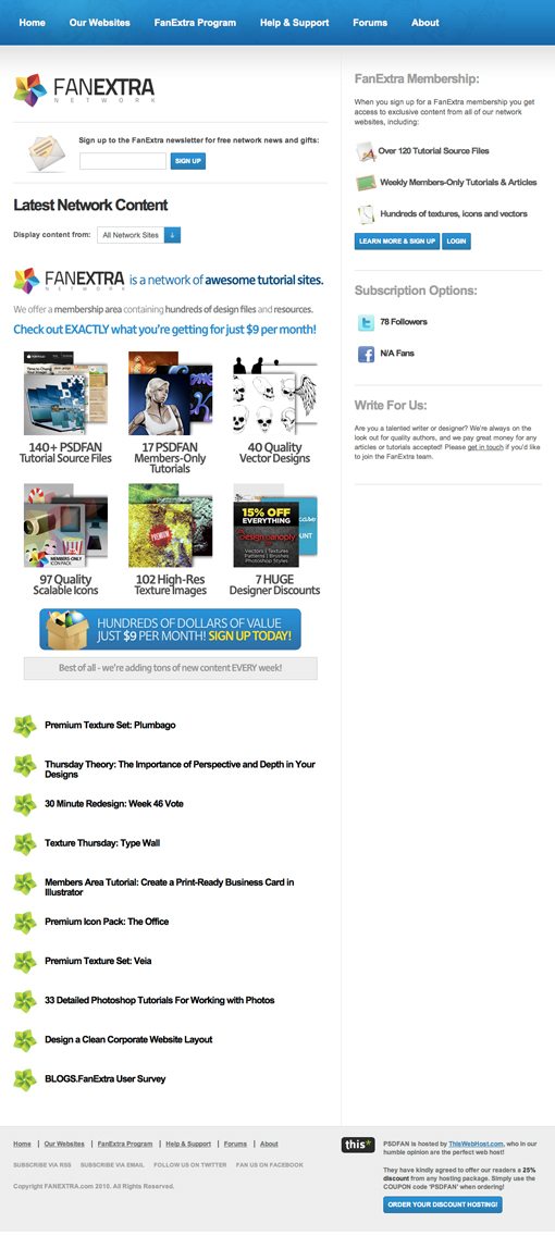
The Communication
When you land on a web page, you instinctively analyze the header area in the same way that you would analyze the menu board at a fast food restaurant. Possible questions include: Where am I? What does it cost? What will they give me for my money? Do they serve Coke or Pepsi products? Ok, maybe that last question doesn’t apply here.
My point is, when you look at this site’s header, it’s not adequately addressing all of these crucial questions:
We see what the site is called (FanExtra) along with a big field for some sort of sign up. Will this mean I’m signed up for the network? So is this a free service? On the right we see something that hints at “tutorials”, which gets us on the right track, followed by words like “textures” and “vectors”, which represent pretty specific jargon.
If I’m a designer, at this point I’ve probably figured out what’s going on to a certain extent, but is that really the goal here? Should the visitor have to find clues and use them interpret what the site is?
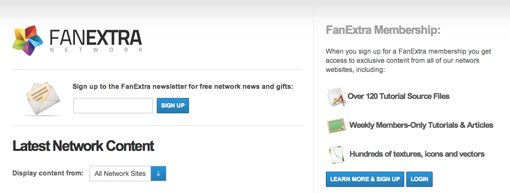
The Mystery Is Revealed
When we get down to the middle of the website, the mystery is revealed:
Now we can see that FanExtra is “a network of awesome tutorial sites” offering memberships for $9 per month. This is the single most important piece of communication on the page, and yet it’s tucked away half way down the page. This should be the first thing the user sees.
In fact, I think this message could be even clearer. The phrase “awesome tutorial sites” is still pretty vague if you think about it from an outsider’s perspective. Something like “awesome tutorial sites for creative professionals” would really take this statement much further. Right away you’ve pegged your target audience right on the nose so that when I find this page, I see a nice warm greeting informing me that this site is specifically for people like me.
Visual Contrast vs. Visual Clutter
Another issue I see with the messaging is how it’s structured from a visual standpoint. Let’s take a look at the primary communication as it currently stands:

Here we see a stack of three lines, each using different color text and slight variations of the same font in terms of both boldness and size. I can and have written entire articles on contrast in design, but what it boils down to is best said in a piece of advice from design author Robin Williams, “don’t be a wimp.” By this she means, that in order to use contrast effectively, the elements really have to stand apart from each other in a big way, otherwise the result is simply visual clutter.
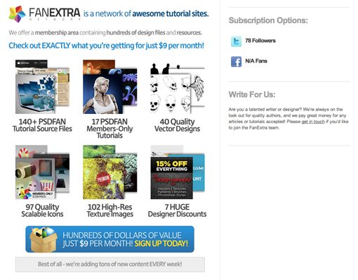
Check out how another popular design membership program, Think Vitamin, structures the primary message on their page.
Here we see huge, massively overstated contrast between the headline and subhead. The result is beautiful and clear communication that reads perfectly. People browsing the page read the headline nearly by accident, and if they’re interested further they can take the time to read the subhead.
The Features
The page ends with a massive set of bullet points running down the left side. This is quite an awkward use of the space and makes for an uncomfortable gap on the right side.
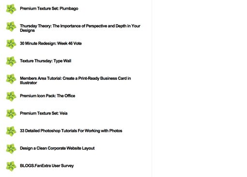
The quick fix for this is simply to break up the bullet points into two separate stacks:
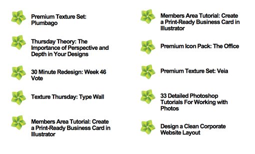
This is ultimately a band-aid though and I think the page could actually use some major surgery. We’ll briefly address this in the next section.
My “Big Picture” Recommendations
Honestly, I don’t think the unbroken double column setup is working for this site. It’s too rigid and actually disrupts the natural flow of communication rather than facilitating it, which is the goal of a structured layout.
My recommendation is to toss this layout completely. First, ditch the rigid double column structure. Next, move the primary communication to the top of the page. Make a large “featured” box that spans the entire page width and highlights some of the content that you then breakdown later (140+ files, 40 vectors, etc.). Make sure the headline uses strong contrast, crystal clear phrasing and targeting, and at most two colors that look great together.
Finally, after you’ve created this awesome header area that perfectly nails what the site is, who it’s for and the basics of what it includes, then you can focus on organizing your other information underneath, possibly in a two or three column format.
Your Turn!
Now that you’ve read my comments, pitch in and help out by giving the designer some further advice. Let us know what you think is great about the design and what you think could be stronger. As always, we ask that you also be respectful of the site’s designer and offer clear constructive advice void of any harsh insults.