Web Design Critique #49: MacroDreams
Every week we take a look at a new website and analyze the design. We’ll point out both the areas that are done well in addition to those that could use some work. Finally, we’ll finish by asking you to provide your own feedback.
Today’s site is MacroDreams, the personal portfolio of Deepak Chakravarthy.
2 Million+ Digital Assets, With Unlimited Downloads
Get unlimited downloads of 2 million+ design resources, themes, templates, photos, graphics and more. Envato Elements starts at $16 per month, and is the best creative subscription we've ever seen.


If you’d like to submit your website to be featured in a future Design Critique, it just takes a few minutes. We charge $34 for critiquing your design – considerably less than you’d pay for a consultant to take a look at your site! You can find out more here.
About MacroDreams
My name is Deepak Chakravarthy J. and I’m an independent web designer and front end developer with 9+ years of experience in Web and Graphic design. I strive to create clean, search-engine-friendly and visually appealing websites based on the latest web standards and usability guidelines in order to achieve the best possible solution.
Here is a screenshot of the homepage:
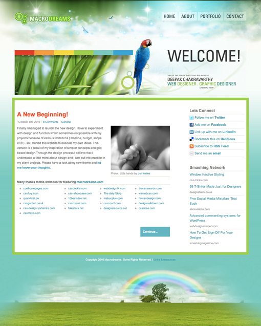
Initial Impression
MacroDreams features a nature-inspired design that is quite attractive, particularly in the header area. The idea is fairly fantastical and mixes birds and grass with space graphics and abstract swirls.
The home page is fairly simple, featuring only a simple blog post, and acts as a gateway to other pages such as a portfolio section. The grammar throughout is fairly rough but since I can only speak one language, my hat is off to anyone who can even attempt to write in a tongue that is foreign to his own. I will therefore focus on this site from a design perspective.
With this in mind, there is praise to be given and constructive criticism to be offered. I like some aspects but strongly feel that improvements can be made. Let’s start with the header.
Too Much of a Good Thing?
When you first load the page, the thing that catches your attention is the header art. From a purely aesthetic point of view, it’s a little crazy but actually really attractive.

As you look at the page, it comes to life. The grassy area contains a water droplet animation that I find quite mesmerizing, the parrot flutters and blinks and the birds at the top have a hover-driven parallax animation with the clouds.
I occasionally rag on tricks like these but to be honest I think all three effects were pulled off really nicely here. The problem is that I think each effect is nice as a freestanding individual element. On it’s own, the water droplets are cool, on it’s own, the bird animation catches your attention, etc.
When you combine so many animations on one page though, the effect is disconcerting. There’s simply too much happening. In the Pixar movie “The Incredibles”, the goal of the villain is to make everyone special, because the net result would be that no one is special. As cheesy as it is to turn this into a lesson about design, I constantly think about that movie when I see sites like this.
Remember that the key to good web design is to capture the viewer’s attention and then direct it where you want it to go. When you have several items that compete for attention, your eyes don’t quite know where to land and the message tends to get lost.
As difficult as it may seem after putting all this effort into the project, I recommend choosing only one of these animations and ditching the rest. You could even recycle them on other pages throughout the site if you weren’t crazy about tossing them completely.
Main Content
The rest of the page is taken up by the large box of content shown below. It’s a simple two-column layout that works quite well and places obvious emphasis on the important content.
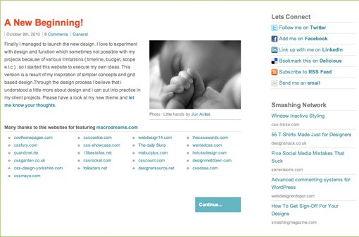
My problem with this area is that it sort of seems like the designer didn’t really know what to do with it. In fact, a huge portion is dedicated to outgoing links. The awkwardly large thank you area below, the social links, and the Smashing news feed all take you away from this site. Granted, these are things that almost every design blog has, this one included, but the problem here is that there isn’t really much to get you to stick around.

The blog post is from October, which gives you the feeling that this is an abandoned project. Further, there’s no blog section in the navigation so this feature of the site is a little vague and undefined anyway.
What needs to happen here is a reevaluation of the goals of this site. Since there’s only one post, and it’s an old one, I would say the primary purpose here is for the designer to show off his portfolio. However, aside from a link in the navigation, this is not at all reflected in the content of the page.
If you take a look at the portfolio page, you see that this designer actually has a ton of great work to show off, everything form websites to logos and print work. I vote that you ditch the blog layout of the home page and migrate some of the portfolio content over there. The portfolio can stay where it is, but the purpose of the homepage should be to introduce the site/designer and to lead people to either the portfolio page or the contact page (a must if you want people to hire you).

Conclusion
It’s obvious that this designer has some solid Photoshop and web development skills. As is often the case, my advice is to simplify and refocus. Bring down the activity on the page so that the experience is less distracting and redirect the homepage so that it shows off your work and brings people to the portfolio page.
Your Turn!
Now that you’ve read my comments, pitch in and help out by giving the designer some further advice. Let us know what you think is great about the design and what you think could be stronger. As always, we ask that you also be respectful of the site’s designer and offer clear constructive advice void of any harsh insults.