Web Design Critique #6
Every week we take a look at a new website and analyze the design. We’ll point out both the areas that are done well as well as those that could use some work. Finally, we’ll finish by asking you to provide your own feedback.
Today’s site is Screenfluent, a web design inspiration gallery.
2 Million+ Digital Assets, With Unlimited Downloads
Get unlimited downloads of 2 million+ design resources, themes, templates, photos, graphics and more. Envato Elements starts at $16 per month, and is the best creative subscription we've ever seen.


If you’d like to submit your website to be featured in a future Design Critique, it just takes a few minutes. We charge $24 for critiquing your design – considerably less than you’d pay for a consultant to take a look at your site! You can find out more here.
Screenfluent
“Screenfluent is dedicated not only for web designers as a source of inspiration but also for regular users who are not engaged in creating and designing web pages. In addition to good quality design, you’ll find here fresh portion of interesting websites to explore on daily basis.”
Here’s the home page of the site:
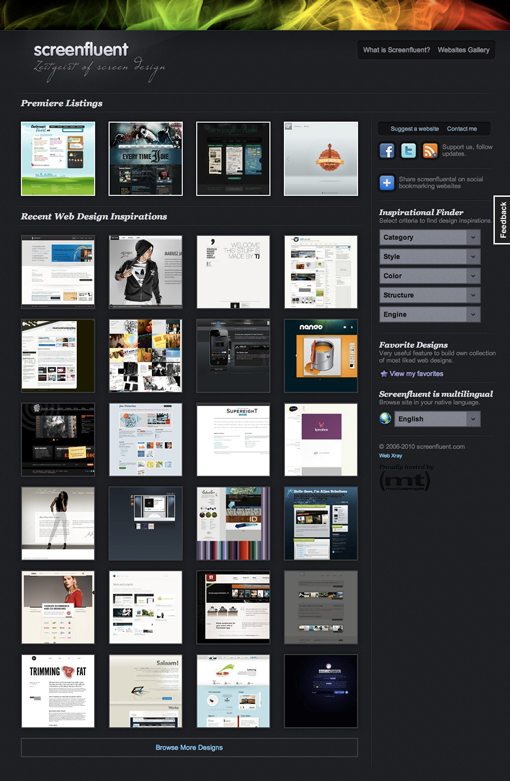
The Good
Screenfluent is definitely an attractive site with a nice dark theme that really sets the stage for the sites being displayed.
Header Graphic
The flaming wispy header graphic is nice and attention-grabbing and the division between the graphic and the main background is handled well. It does seem a bit random as the only element on the page with this look. I’d like to see something similar somehow integrated on another part of the page. This could be as simple as grabbing the one of the brighter colors from the graphic and applying it to links or headers.
Sidebar

I really like the look of almost everything in the sidebar. The nice think headers, rounded corner social icons, inset areas and dropdown menus are stylistically spot on for the site’s theme.
Section Divisions

One last thing that I really like about this design is the subtle lines that break up the content on the page. They’re fairly simple: one dark pixel and one light pixel stretched into a line and faded out at the edges. The effect is a carved in look that adds a hint of realism to the design.
Areas to Improve
One the whole, the site is quite usable with no serious glitches. When you click an image, you see a large preview and each thumbnail has a nice animated transition for the hover effect.
One slight change that I might recommend is a link to bypass the large image in favor of visiting the site directly. The preview is nice for those who want it, but sometimes I find that I really like to just go straight to the site. This is more of a matter of preference than solid usability principles.
Below we’ll look at a couple areas of the design that could use a little tweaking.
The Script

The particular font selection for the tagline above seems a bit off for the site. It’s a little too thin and hard to read and doesn’t flow well with the Vag Rounded-esque font in the headline. I generally try to avoid sticking two unique display fonts in a logo to avoid clashing. Try grabbing a plainer more traditional font for the tagline.
The “Browse More Designs” Link

The link at the bottom of the grid has a border that stretches the width of the entire column but only the small area of text in the middle is clickable. This area just seems a little plain and unfinished and could easily be converted into a large button that matches the aesthetics of the sidebar a little better.
Generic Scroll Bars

In a completely custom design such as this one where every element has been meticulously styled, I always cringe when I see something that breaks the spell by using a default browser UI element. It’s not that the default scroll bars are necessarily ugly or unattractive, they just don’t fit with the design.
It’s sort of like getting a glimpse at the man behind the curtain right when you start to believe all the magic or finding a piece of trim that was left out in a newly painted house. The special environment that has been created is marred by the realization of what’s underneath.
Your Turn!
Now that you’ve read my comments, pitch in and help out by giving the designer some further advice. Let us know what you think is great about the design and what you think could be stronger. As always, we ask that you also be respectful of the site’s designer and offer clear constructive advice devoid of any harsh insults.
Interested in having your own site critiqued? You can find out more here.