Web Design Critique #61: Undead Kit
Every week we take a look at a new website and analyze the design. We’ll point out both the areas that are done well in addition to those that could use some work. Finally, we’ll finish by asking you to provide your own feedback.
Today’s site is Undead Kit, an invaluable resource for surviving an undead invasion.
2 Million+ Digital Assets, With Unlimited Downloads
Get unlimited downloads of 2 million+ design resources, themes, templates, photos, graphics and more. Envato Elements starts at $16 per month, and is the best creative subscription we've ever seen.


If you’d like to submit your website to be featured in a future Design Critique, it just takes a few minutes. We charge $49 for critiquing your design – considerably less than you’d pay for a consultant to take a look at your site! You can find out more here.
About Undead Kit
Undead Kit isn’t very different from your typical survival kit. It contains such items as a knife, matches, band-aids, etc. However, the spin is that this survival kit is specifically geared towards surviving the zombie apocalypse. We all know it’s coming, so you might as well prepare while you still have the chance! This novel and zany product is very real and has become so popular that it’s currently backordered for three weeks!
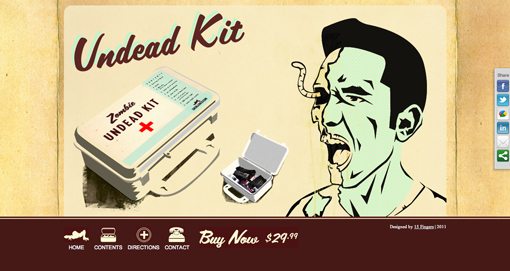
Here is a screenshot of the homepage:
Initial Impression
Seeing as how I’m your typical male (i.e. I love anything related to killing zombies), I think this site is fantastic. Aside from the great concept, the site is very attractive and features lots of custom design and artwork.
As far as the overall design and theme of the site, I wouldn’t change a thing. There are a few tiny tweaks and fixes that I would make though so let’s go over what’s working and what isn’t.
Goals
One of the primary ways to measure the success of a design is to outline specific goals as your first step, then return to those goals after the design is finished to see whether or not they were met. Now, we don’t really know what goals they laid out for this site but it’s pretty clear what needs to be accomplished here.
First, the site needs to communicate that there is a product for sale. Any time you’re selling something, this is a top priority goal. It sounds painfully obvious but you’d be surprised how many designers miss the mark completely here. Next, you need to adequately tell people about the product: What does it include? How do I use it? These questions are essential to something unique like this where the answers are fairly unpredictable.
Also, and simultaneously, the site needs to convey its concept. This isn’t your typical survival kit, it’s an Undead Kit. It’s good to approach this in a lighthearted manner so people immediately see the novelty and gift potential.
Last but not least, you should easily be able to proceed to the purchase stage. This site goes through PayPal so we know that should work fine and won’t discuss it too much. Let’s see how well those other goals are addressed though.
The Product
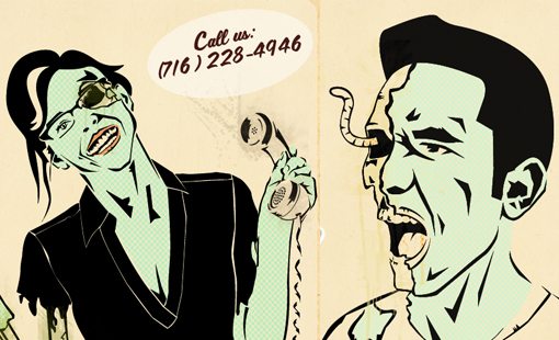
The first thing you likely see on the homepage is a zombie with a worm sticking out of its eye, we’ll get to that in a minute. The second thing you see is the image of the product and its title: The Undead Kit.
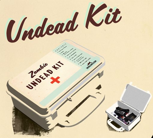
Normally, I wouldn’t really have any idea what an Undead Kit was, but this simple image takes the complex concept and makes it clear in an instant. The box looks like a first-aid kit, so when it’s combined with an image of a zombie I can immediately guess that the kit will probably include basic emergency resources.
They could have a six paragraph sales pitch here that no one would ever read, but they don’t. Instead they rely on the visual design to tell you all you need to know, and it does!
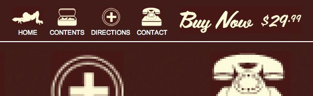
Two Important Questions
If you’re going to pay thirty bucks for something, you’re going to want to know what’s in it. By jumping over to the “Contents” page, you can see exactly that. Going further, the “Directions” page then shows you how to use the kit. The latter of these likely isn’t absolutely necessary (you know what a flashlight is for) but it really helps the hilarity and theme of the site and I definitely think it should stay.
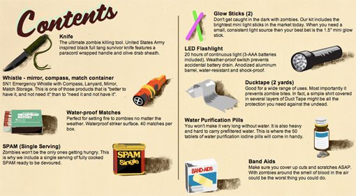
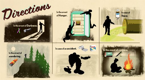
These two pages are my favorite part of the site. The artists here really nailed the appropriate illustration style. It feels like something out of a boy scout survival manual. They could’ve easily gone with product photography but the effect definitely wouldn’t have been as good.
I also like how much they’ve simplified the Directions page. Notice that there are actually nine products but they’ve condensed them into six panels with single-sentence messages like “in the event of coldness.”
Interestingly enough, laziness can occasionally be a good thing in design. Finding shortcuts and quicker solutions can often result in simpler designs that also make for a faster read for the viewer.
The Concept
The parts that we’ve already gone over drive home the concept of the site remarkably well. You definitely can’t miss the idea behind the site. As further reinforcement though there are simplified zombie line drawings that really round out the site nicely.
These are a very different style than the previous illustrations, but the two complement each other well and don’t look like random zombie images found on a stock art site. I’m not sure if they’re completely custom or not, but they feel like it and that’s what’s important.
Two Things I Would Change
Thus far, this critique has been more of a praise. The site is great as it is so I simply don’t have much feedback to give. That being said, here are two areas that I think could be better.
Navigation
The first problem I have with the site is the navigation. The CSS background fill here is a slightly different color than the background color on the images for the buttons. This would be fine if it were clearly intentional but here it looks like an accident.
The result is a sloppy-looking navigation area that brings down the aesthetic quality of the site. Fixing this issue should only take a few minutes so there’s no good reason not to address it.
Social Icons
My final thought about the site is that the social bar really kills the overall visual theme. So much work has been put towards making the site look consistent through textures, colors, illustrations, typography, etc. This is then completely ruined by a social media widget that was no doubt simply pasted into the code. It’s quite attractive on its own merit but just doesn’t fit here.
I don’t have any issues with the concept of the bar, I’m all for social media. However, the site would work much better with some simple silhouette logo icons or maybe even something grungy like the background graphic.
Your Turn!
Now that you’ve read my comments, pitch in and help out by giving the designer some further advice. Let us know what you think is great about the design and what you think could be stronger. As always, we ask that you also be respectful of the site’s designer and offer clear constructive advice void of any harsh insults.