Web Design Critique #62: Influentials Network
Every week we take a look at a new website and analyze the design. We’ll point out both the areas that are done well in addition to those that could use some work. Finally, we’ll finish by asking you to provide your own feedback.
Today’s site is Influentials Network, a political news aggregator and filter.
The Ultimate Designer Toolkit: 2 Million+ Assets
Envato Elements gives you unlimited access to 2 million+ pro design resources, themes, templates, photos, graphics and more. Everything you'll ever need in your design resource toolkit.


If you’d like to submit your website to be featured in a future Design Critique, it just takes a few minutes. We charge $49 for critiquing your design – considerably less than you’d pay for a consultant to take a look at your site! You can find out more here.
About Influentials Network
“IN continuously monitors and collects the most viral and important political news stories across all media. IN automatically filters the 10 most relevant political personalities and/or issues into a single, dynamic, and easy-to-scan page.”
Here is a screenshot of the homepage:

First Impression
To be honest, there’s not a lot about the design of this site that really seems to work well. The overall three column layout is decent, but the visual theme and overall aesthetic could use a pretty drastic update.
Plenty of people who want a critique really just want a pat on the back, but I’ve spoken with the designer and developer behind IN and he expressed a genuine desire to hear open and honest feedback regarding the site. He knows there’s room for improvement and is looking for clear advice on how to do it. With that in mind, let’s get started!
Thoughts on News Aggregator Design
News aggregators are very strange beasts to a web designer and I fully confess that the rules governing their success seem to relate to anything but aesthetic beauty.
For instance, one aggregator that I visit quite often is Hacker News. Check out their design:
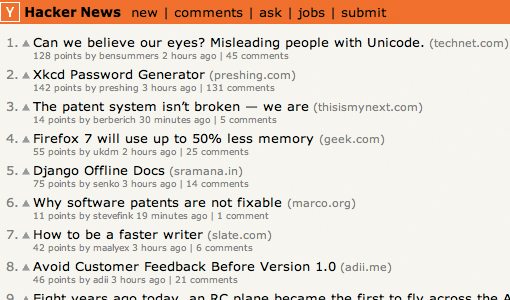
As you can see, this isn’t exactly a picture of modern web design. It’s not even a good example of modern minimalism, it’s really just a list of links with a background fill! Despite this, I still love to stop by and see the latest from the nerd world. Other popular aggregators such as Reddit aren’t just simple, they’re downright ugly.
All that to say, my first instinct is to approach designing IN like any other site, but that may in fact not be the best way to go about it.
The Look of IN
Even given the current state of aggregator design, I still think that IN could use some work in the visual department. For starters, I’m not a fan of the backgrounds used on each section. I feel like the site is really gradient-heavy. Always be wary of finding a design trick and abusing it through overuse.
Also, the primary content has a medium gray background and is flanked by a light strip on each side. This feels a little awkward for some reason. The two colors are likely far too similar. There’s not any real color contrast to help the main content stand out, just a slight and confusing color shift. Honestly though I think it’s just adding unnecessary visual complication and recommend just flooding the entire background with the gray that currently occupies the background of the primary area in the center. One of our mail goals for this site will be to simplify the fairly busy design.
Another thing that I think instantly brings down the visual appeal of the page is the ugly thumbnail sizing. The photos are being stretched and squeezed to fit into preset box sizes. This result is a really clunky-looking design that immediately suggests a “good enough” mentality from the designer.

There are likely plenty of JavaScript plugins to fix this issue, even some clever CSS could improve the situation.
Header

The primary issue I have with the header is the flow of communication. Currently, I think it contains all the information it needs to, but maybe not in the right order.
Here’s how I would redesign it. In the top left, where there’s currently a box containing a description of the site, I would place the site name and logo nice and big so people immediately know where they are. Then, I would move the description to the box under the navigation.
Further, the “In fluenced” line isn’t working. It’s in a strange place that’s throwing off the layout of the site and it’s worded in such a way that it feels off. I would make it a sub tag to the site logo and take out the spaces. Influentials Network: INfluenced, INformed, INspired.
As far as the navigation, this is one of my favorite parts of the page simply because the black brings some much needed contrast to the page. I’d consider looking for other places to repeat this theme.

Widgets
Flanking the main content on either side are sidebars containing various widgets and sections of content like the following:

Overall, each of these could use a little more tweaking and finesse. For instance, the “What the Hill” section above could use a brief descriptor explaining what the section contains. The text also feels quite squished here, some additional line-height might go a long way.
Further, each of the widgets contains the little up and down arrows at the top, allowing you to click to browse through the content. This might look more minimal, but a simple scroll would function much better.
Another widget that needs a lot of work is the photos section. This is just a big empty space that doesn’t seem to functioning properly.

IN 10 Column
The last section that we can go over is what I would consider the primary content on the page. We’ve already mentioned the photo sizing issue and other than that, this area looks pretty decent.

One thing that you might consider changing here is the hover effect. It currently shifts everything right a few pixels, but the movement is so slight that it almost feels like a bug. Either increase the amount that the content is shifted or switch to something else such as a color change.
Also, the sharing buttons look too inconsistent. Try making them each the same size and shape.
Conclusion
I think this site needs a lot of work, but I also think that it’s perfectly doable. My recommendation is to take it in chunks. Focus on the header for a week and really spend some time making as good as you possibly can. Then move onto another section and spend another week refining that until it’s perfect. Right now the site’s main issue is that it feels rushed, like it wasn’t quite ready to launch but was launched anyway.
As a long term goal, think about how you can simplify the content. Stop adding features and start stripping features. Highlight the primary content better and eliminate all but the most essential secondary content. Any time you have doubts about cutting something, look at Hacker News again and think about how simple it is!
Your Turn!
Now that you’ve read my comments, pitch in and help out by giving the designer some further advice. Let us know what you think is great about the design and what you think could be stronger. As always, we ask that you also be respectful of the site’s designer and offer clear constructive advice void of any harsh insults.