Web Design Critique #7: Web Icon Set
Every week we take a look at a new website and analyze the design. We’ll point out both the areas that are done well as well as those that could use some work. Finally, we’ll finish by asking you to provide your own feedback.
Today’s site is Web Icon Set, a web design inspiration gallery.
2 Million+ Digital Assets, With Unlimited Downloads
Get unlimited downloads of 2 million+ design resources, themes, templates, photos, graphics and more. Envato Elements starts at $16 per month, and is the best creative subscription we've ever seen.


If you’d like to submit your website to be featured in a future Design Critique, it just takes a few minutes. We charge $24 for critiquing your design – considerably less than you’d pay for a consultant to take a look at your site! You can find out more here.
Web Icon Set
The site seems like it is still in the early stages of its launch period but it already has a few really nice looking icon sets free to download and use in your next project.
Here’s the home page of the site:
The Good
Let’s start off by looking at the portions of the site that were designed really well. It’s definitely an attractive start so there are plenty of style points to hand out.
The Icons
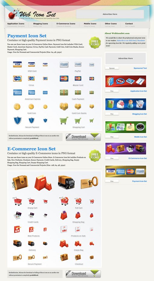
This site is all about icons so the most important question is: are they any good? The answer is yes. The icons are thoughtfully designed, meaning they’re actually useful to designers, and they look great too. Right now there are only a few sets available but I look forward to seeing more added in the future.
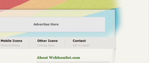
The Navigation
I like the 3D wrap around effect on the navigation bar as well as the subtle letterpress effect on the subcopy for each item. When you hover over an area, the text turns blue so you definitely know these are links. It would be nice to see this area stand out a bit more but overall I like the direction here.
The Sidebar
The sidebar is a nice quick reference for the available icons. This will really come in handy when the site has more icon sets to browse through. The graphical previews here are bright and colorful and really grab your attention as you’re browsing the contents of the page.
Areas to Improve
Now that we’ve see a couple of the areas that work well, I’ll point out a few ideas that I have for improving the overall experience and design of the site.
Typography
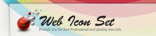
I think the mixture of font styles on the site is clashing. The big odd one out is the sort of cliche 90s brush script used in the logo for the site. If only one thing gets changed on this site, I recommend that it be this. If you’re looking for some quality free fonts, try FontSquirrel and resist the temptation to choose the craziest font you can find. There are plenty of really nice and highly readable options that still provide you with a unique look.
Background Graphic
I don’t mind the swooshy rainbow thing going on in the header but I think it ends far too abruptly. I recommend just continuing the graphic and curving it out the top of the site or at least giving it a much more gradual fade out. The harsh cutoff has a quick fix feel to it and feels a little like seeing duct tape on a leaky pipe.
Grammar and Spelling
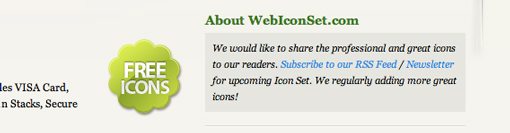
I’m no English professor so I usually avoid pointing out issues like this lest you all start attacking my sentence structure. However, the site really is suffering from the clunky wording on a few of the copy points. For instance, “We regularly adding more great icons!” should be changed to something like “We’ll be regularly adding more great icons!”
Further, the logo states “Provide you with the best professional and quality icon sets.” This could be tweaked to read “Providing you with the best professional quality icon sets.”
Finally, there are several typos in the keywords for each icon set: “inclides” instead of “includes,” “Porducts” instead of “products,” etc.
Your Turn!
Now that you’ve read my comments, pitch in and help out by giving the designer some further advice. Let us know what you think is great about the design and what you think could be stronger. As always, we ask that you also be respectful of the site’s designer and offer clear constructive advice devoid of any harsh insults.
Interested in having your own site critiqued? You can find out more here.