Web Design Critique #83: Tech Cores
Every week we take a look at a new website and analyze the design. We’ll point out both the areas that are done well in addition to those that could use some work. Finally, we’ll finish by asking you to provide your own feedback.
Today’s site is Tech Cores. Let’s jump in and see what we think!
The Ultimate Designer Toolkit: 2 Million+ Assets
Envato Elements gives you unlimited access to 2 million+ pro design resources, themes, templates, photos, graphics and more. Everything you'll ever need in your design resource toolkit.


If you’d like to submit your website to be featured in a future Design Critique, it just takes a few minutes. We charge $49 for critiquing your design – considerably less than you’d pay for a consultant to take a look at your site! You can find out more here.
About Tech Cores
“We have spent long nights and drank countless cups of coffee to bring you our out of the box take at a technology blog. As always, feel free to read up on our staff as well as browse the fruit of all our labor.”
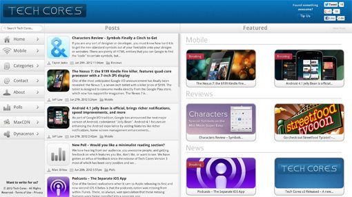
Here is a screenshot of the homepage:
First Impression
My first impression of Tech Cores is a little mixed. On one hand, it’s a very clean design that has a solid layout. It feels almost like a news app rather than a news website (in a good way). The wide, three column UI with categories on the left, a feed in the middle and individual articles on the right definitely feels like the Reeder for Mac model applied to the web.
Also contributing to this feeling of cleanliness is the lack of ad clutter, or really ads of any sort. It’s strange to see someone invest time into a site like this these days without an ad-driven profit model.
All that being said, despite the fact that the layout is solid, I think the actual visual styling of the page, the icing if you will, feels quite generic. With the mixture of smooth gray and blue gradients, it almost looks like something that the iOS SDK just spit out.
This isn’t necessarily a horrible thing, it’s just something to consider. As a former print guy, I care a great deal about branding and nothing about the look of this site seems “own-able,” meaning that there’s nothing about the design that’s distinct to Tech Cores.
That aside, I think that overall, the site will still look quite attractive to the average visitor. I’d much rather see a site stray towards generic than the typical mess of clutter that tech blogs throw at us.
Responsive Layout
A major goal for this layout was obviously to be very flexible and responsive to different viewport sizes. As the page narrows, the first step on this road is to drop the third column, leaving the somewhat fluid news feed as the widest portion.
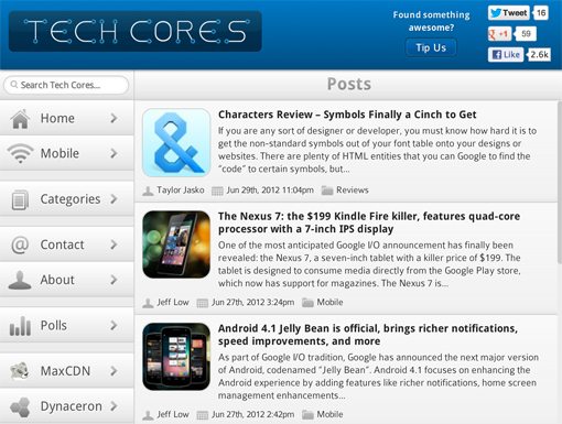
On a desktop, the layout doesn’t respond very well to shifts in sizes, things get messy fast when you hit around 700px wide. However, taking a look on my iPad, it looked just fine in both the horizontal and vertical orientations. This means that they spent more time focusing on specific device widths than arbitrary viewport sizes, a strategy that I don’t necessarily agree with. The responsive behavior also seems a tad buggy, I didn’t get a screenshot, but I did once have an issue with the wrong column collapsing on the homepage.
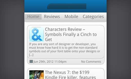
Bringing up the site on a mobile device, I noticed that, while the feed responds decently to the super narrow width, the header with the logo has completely been destroyed.
Still, Well Done!
This section sounds like harsh criticism, but it’s not. I want to make this clear, responsive design is still very new and everyone is still trying to wrap their mind around how to do it best. For crying out loud, the site you’re currently reading isn’t responsive at all (yet) so we can’t be too quick to judge others.
The fact that Tech Cores has taken steps towards optimizing their experience for various very different devices is no small feat for a homegrown news site and I give them major credit for how much they have accomplished.
Branding and Message
I’ve already ranted a little bit about how the site as a whole could be more unique from a branding perspective. Beyond the color scheme, there are other places that this same problem arises as well.
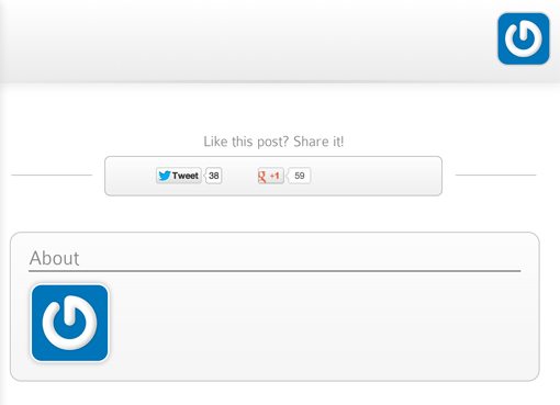
For starters, I’m not particularly fond of the logo:
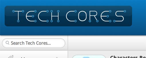
I really don’t have much to say about it other than that it’s just not doing it for me. I can see an idea in there that could be turned into something really cool in the hands of a talented logo designer, but this has an amateur look to it that feels a little thrown together.
More importantly than even the logo is what your site tells me about itself. Imagine that I somehow stumble upon this site, what do I see? The word “tech” gives me a hint and I see lots of images of mobile phones, so do you review mobile apps? Upon closer inspection I find a Mac app review, though Mac OS is neither mentioned in the title nor on any of the associated tags.
My point is, don’t make me work for it, just tell me what’s up with this site. There’s a mile of empty space at the top just begging for a tagline of some kind. Even just inserting something into the browser’s page title bar would go a long way. For example, Gizmodo’s title bar says “Gizmodo, the Gadget Guide.”
This isn’t longwinded and overly targeted, it only uses a few well chosen words to tell me what all of the content on the site is focused on.
Usability
To wrap this up, I’d like to talk about some of the various, scattered usability-related issues that I have with the site and how it works.
The site uses a lot of Ajax techniques, so content loads without feeling like a complete page refresh. This is sort of nice and sort of annoying at times due to problems that arise. For instance, if I go to the home page and click on one of the featured stories on the far right, then hit the back button, it gives me some random, generic post instead of actually taking me back to where I wanted to go.
I’m also not crazy about the main news feed. None of the text content is live and selectable, a trait which carries across to the pop up windows such as the About section. The feed also has no sort of hover effect or cursor change to indicate that anything in it is clickable.
Further, like it or not, users are going to expect the logo to be a second home page link. I clicked on it a dozen times over the course of this critique and was constantly frustrated by the fact that nothing happened.
Lastly, I think the “tip us” button is a little confusing. It might not be a big deal, but when I saw it, my brain instantly said “they’re asking for money” and I ignored it. Only after a second or third look did I notice that you were actually asking for tech related tips and not a donation of some kind.
Summary
To sum up, Tech Cores is a well structured tech news site that could use a lot of tweaking. That core architecture is often the most difficult part of a major redesign so I think from here, incremental changes won’t be as rough as they sound. Consider a facelift of color and texture, tinker with the media queries, and make sure the site has a clear brand, both aesthetically and from a messaging perspective.
Your Turn!
Now that you’ve read my comments, pitch in and help out by giving the designer some further advice. Let us know what you think is great about the design and what you think could be stronger. As always, we ask that you also be respectful of the site’s designer and offer clear constructive advice void of any harsh insults.