Web Design Critique #9: Wallpapa
Every week we take a look at a new website and analyze the design. We’ll point out both the areas that are done well as well as those that could use some work. Finally, we’ll finish by asking you to provide your own feedback.
Today’s site is Wallpapa, a site offering free desktop wallpaper downloads.
2 Million+ Digital Assets, With Unlimited Downloads
Get unlimited downloads of 2 million+ design resources, themes, templates, photos, graphics and more. Envato Elements starts at $16 per month, and is the best creative subscription we've ever seen.


If you’d like to submit your website to be featured in a future Design Critique, it just takes a few minutes. We charge $24 for critiquing your design – considerably less than you’d pay for a consultant to take a look at your site! You can find out more here.
Wallpapa
“We love high quality images and cool desktop wallpapers. On the Internet there are many sites that can help solve this problem, but all of them have some shortcomings. We have designed and produced a convenient, versatile and of course a useful service, which we hope you approve. To achieve our goals, we looked at the problem from both sides. From the artists who want to share their work with other people and get feedback, as well as from the users who also are concerned about our problem.”
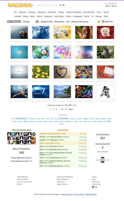
Here’s the home page of the site:
First Impressions
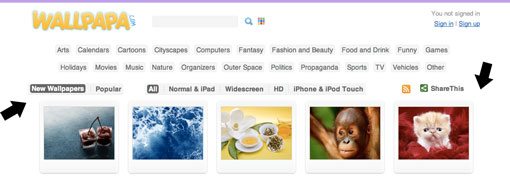
Overall, Wallpapa is not a bad looking site. The name is catchy, the basic design is nice and bright and minimal enough to place emphasis on the thumbnails.
There are plenty of obvious ways to search for wallpapers such as the search bar and categories in the header and the tag cloud in the footer. There are even some more advanced options like searching by color or device (iPhone, iPad, etc.)

Alignment
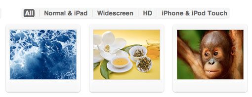
As I look around the site the key mistake that I notice is poor alignment. The page is trying to be center aligned, but everything is slightly off. If the grid is the main center of balance, then anything that hangs off the left should equally hang off the right. The screenshot below shows how this is simply not the case.
Alignment issues like the one above can be seen all across the page and should be adjusted if the center alignment is to be honored.
Now with that said, I rarely agree with center justifying all the content on a page. In basic design theory you learn that center alignments are the weakest, mostly because there’s no hard solid edge for your eyes to follow.
That doesn’t mean center alignments should never be used, just that they should be applied carefully. In my opinion, center alignments work best when you have a large page and very little to place on it. This however is a fairly content heavy page and could use a little more structure.
If you do change the alignment, find one and stick to it. By this I mean apply it to the categories, the header elements, the tags, the extra footer content; all of it.
Hover Effects
When you hover over a thumbnail, the preview is blacked out and you are given a link to download the image. It’s a nice effect but the link only applies to the little snippet at the bottom of the thumbnail, not the entire picture area.
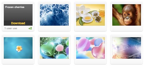
This is a bit confusing and bad for usability. Users will expect to be able to click the thumbnail of the image they want to see, being forced to hunt for the right place to click is a quick way to get them to move on to a different site.
The Big Picture
The suggested changes above are fairly minor, but I think there’s a much larger problem here regarding how the content on the site is presented.
When a user visits this site for the first time, they are given a bunch of thumbnails and tags. From the name of the site and the page title (which many users are likely to miss) they have to interpret exactly what’s going on and what you want them to do.
As designers we often think that some things are so obvious they don’t need to be said. However, our viewpoint is completely biased because we are the ones creating the site. In this case, the designer probably said something like “well any idiot can see that it’s a wallpaper site!” But that’s not the point.
Just because a user can figure out what the site is doesn’t mean they should be forced to. Hitting them over the head with a plain and simple statement is a tried and true marketing method. If you’re offering free wallpaper downloads, your site should say it loud and proud.
Furthermore, I don’t think that it’s ideal that the first thing you see are thumbnails. This feels like a content page, not a welcome page. This makes it feel like you’re walking into the middle of something rather than starting at the beginning.
The thumbnails also provide a page with no clear focus. Again, this is fine for a content page but not for a welcome page. You want something to suck in users and make them stick around. You’ve typically only got about a second to convince a user that your site is what they want. If nothing grabs their attention within that second, they’ll move right on to their next open tab.
The Solution
Since this site’s primary focus is attractive imagery, it makes sense to use some of it to grab people’s attention and showcase your product at the same time. Consider the quick and dirty mockup below:

Now we have a clear point of focus! There’s a big attractive picture near the top of the page screaming for attention. I imagine this as a jQuery image slider that cycles between featured downloads. This allows you to showcase a lot of content in a relatively small space.
Notice that I also included the suggestions from above. Everything here, with the exclusion of the “next” button, strongly adheres to the alignment of the main grid. More importantly, there’s a nice big message informing people that you’re giving away free premium content. This immediately informs visitors that you have something of value that you’d like to share with them.
On each page you design always try to imagine that you’re seeing it for the first time. Would you know what the site is? Would you want to stick around? Ask a few people around you to take a look without telling them about the site and then ask a few questions about anything that you feel should be obvious from a user’s perspective.
Also pay close attention to whether or not you’re making a value statement. Like it or not, the Internet is a fiercely competitive place and if you want traffic to come to your site you have to become a salesman. A designer’s job is to sell the site in under a second. This almost always takes a bold statement, whether through words image or both.
What’s your statement?
Your Turn!
Now that you’ve read my comments, pitch in and help out by giving the designer some further advice. Let us know what you think is great about the design and what you think could be stronger. As always, we ask that you also be respectful of the site’s designer and offer clear constructive advice devoid of any harsh insults.
Interested in having your own site critiqued? You can find out more here.