Web Design Critique #93: Surfcamp Portugal
Every week we take a look at a new website and analyze the design. We’ll point out both the areas that are done well in addition to those that could use some work. Finally, we’ll finish by asking you to provide your own feedback.
Today’s site is Surfcamp Portugal, a site from Rapture Camps. Let’s jump in and see what we think!
The Ultimate Designer Toolkit: 2 Million+ Assets
Envato Elements gives you unlimited access to 2 million+ pro design resources, themes, templates, photos, graphics and more. Everything you'll ever need in your design resource toolkit.


If you’d like to submit your website to be featured in a future Design Critique, it just takes a few minutes. We charge $49 for critiquing your design – considerably less than you’d pay for a consultant to take a look at your site! You can find out more here.
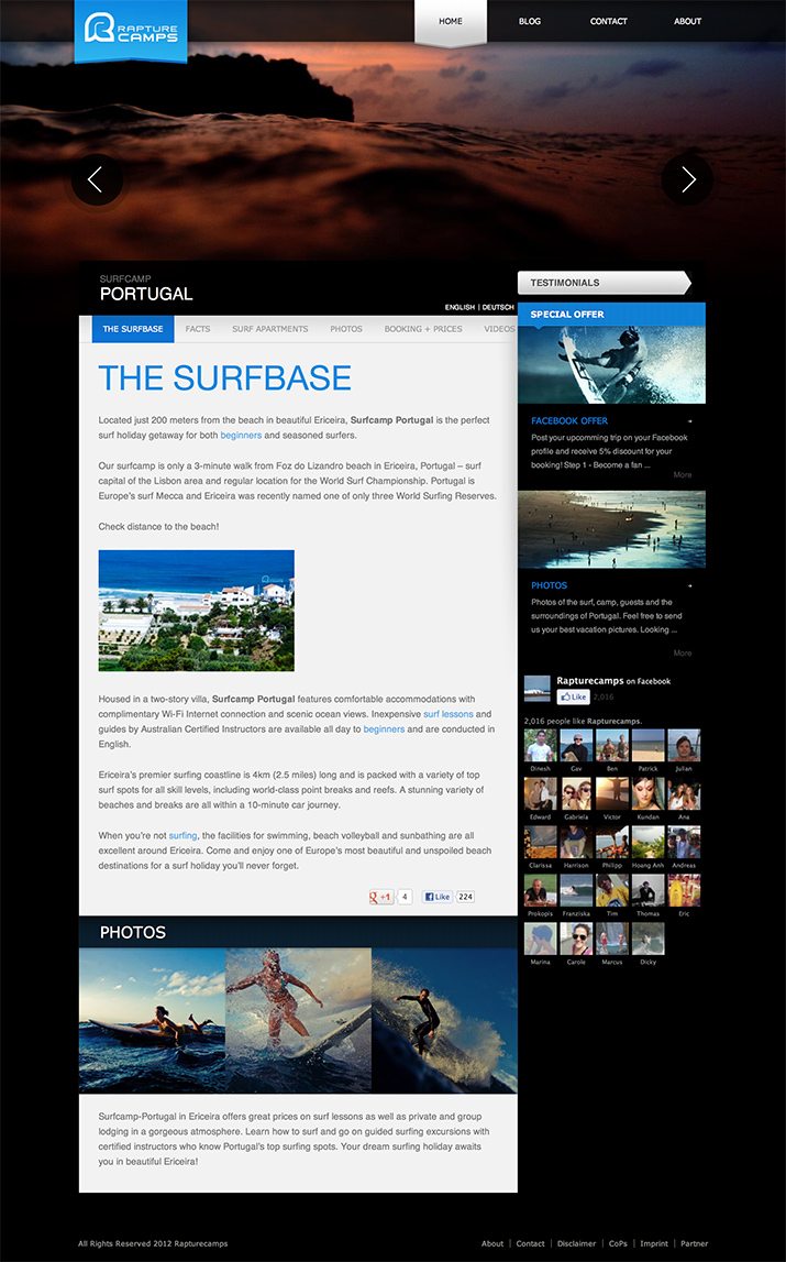
About Surfcamp Portugal
“Located just 200 meters from the beach in beautiful Ericeira, Surfcamp Portugal is the perfect surf holiday getaway for both beginners and seasoned surfers. Our surfcamp is only a 3-minute walk from Foz do Lizandro beach in Ericeira, Portugal – surf capital of the Lisbon area and regular location for the World Surf Championship. Portugal is Europe’s surf Mecca and Ericeira was recently named one of only three World Surfing Reserves.”
Here is a screenshot of the homepage:
First Impression
Can you imagine anything better than a week on a beautiful beach in a far off country, learning to surf and meeting people from all over the world? Me neither. It sounds pretty fantastic. Unfortunately, I’m just the guy critiquing this site and will not be enjoying the amazing adventures.
As far as the site goes though, I think it’s super attractive. From the layout to the photographs and on through to the colors and type, this is a really well-designed experience. Let’s take a closer look and see why.
The Photography Sucks You In
There are a lot of things that went right in this design, but there’s one particular thing that really drives it towards success: great photography. It starts with that big, beautiful header that swaps out the photo every few seconds and continues all throughout the site.
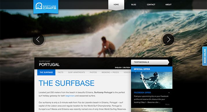
The goal of this site is simple, to sell you on the idea of a surfing vacation. The absolute best way to do this is to show me how awesome it’s going to be, and these photos do just that. Beautiful oceanside landscapes, awesome action shots and a bunch of people sitting around a fire just having a good time.
I’ll let you in on a little secret, I’ve never surfed a day in my life and I looked at the price page not from a design critique perspective, but because I was genuinely interested in checking this camp out!
This tells me something extremely important: this design works. Even a desk jockey like myself can’t help but want to join in the fun when this page loads up.
Colors and Type
The color palette here really drives the aesthetic of the site. Never underestimate the power that colors have to communicate an emotion, feeling or mood to your users.

Here the palette is a night time blue with blacks and grays. This gives the site a sophisticated and adult feel. Black can be a very serious color, but here it doesn’t suck the fun out of the page, instead it gives it a maturity.
For the type, we have a typical Helvetica Neue font stack. The headlines are nice and thin with all caps, an attractive and minimal choice that blends into the page well.
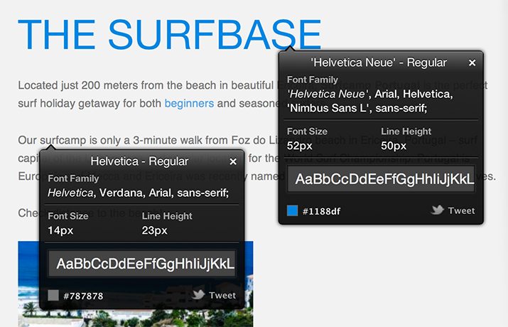
I also really like the generous amounts of line-height in the paragraphs. I hate it when people squish their lines all together, let your type breathe! It increases the readability and makes the page feel less cluttered.
Repetition
Let’s return to our basic design education for a moment and remember that repetition is one of the most powerful weapons in a designer’s arsenal. When wielded properly, it brings consistency and personality to a design. With good repetition, everything feels similar, but maybe not the same; it just feels right somehow.
We see this in lots of ways on the Surfcamp site. One of the examples that I see pushed heavily is the use of hard lines and arrows:
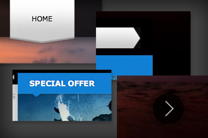
As you can see, the designer didn’t just throw in a single instance of a random idea, instead a general theme idea was developed and implemented in a way that really makes the design feel refined and well-planned.
Information Structuring
So the aesthetic is good and the design succeeds in earning my interest. The big question is, once it has my attention, can it keep it and answer the important questions that I’m going to have?
If I see a site about a surf camp, I’m going to have the following questions:
- Where is it?
- How much does it cost?
- How long?
- What’s it like?
- Where will I stay?
Fortunately, the site designers anticipated and clearly presented answers to all of these questions and more. They’re all easily found in the navigation just above the content area:
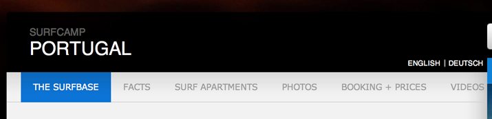
I really like that the information is all very straightforward. They don’t hide the prices or have you sign up to get more information. Instead, they list out prices for every scenario, show you photos of where you’ll be staying and provide awesome testimonials from people who have participated in the camp before.
Feedback: Push Bookings
Overall, this is a really stellar site and I commend the designers for doing such a great job. I don’t really have much in the way of constructive feedback, but I did notice one particular thing that could be rethought.
I think there needs to be a clearer path to booking. There is a booking page, but admittedly, it took me a second to figure out where I was supposed to be when starting on the home page.
To encourage those ever important signups, I think there should be a sizable “Book Now” button at the top of the sidebar, visible from every page. No matter where I am when I make the impulse decision that this is for me, you want to be there to turn that into a conversion.
Your Turn!
Now that you’ve read my comments, pitch in and help out by giving the designer some further advice. Let us know what you think is great about the design and what you think could be stronger. As always, we ask that you also be respectful of the site’s designer and offer clear constructive advice void of any harsh insults.