Web Design Critique #95: WPMU DEV
Every week we take a look at a new website and analyze the design. We’ll point out both the areas that are done well in addition to those that could use some work. Finally, we’ll finish by asking you to provide your own feedback.
Today’s site is WPMU DEV, a marketplace for WordPress Themes and Plugins. Let’s jump in and see what we think!
2 Million+ Digital Assets, With Unlimited Downloads
Get unlimited downloads of 2 million+ design resources, themes, templates, photos, graphics and more. Envato Elements starts at $16 per month, and is the best creative subscription we've ever seen.


Submit Your Site!
If you’d like to submit your website to be featured in a future Design Critique, it just takes a few minutes. We charge $49 for critiquing your design – considerably less than you’d pay for a consultant to take a look at your site! You can find out more here.
About WPMU DEV
“WPMU has the best WordPress, Multisite and BuddyPress plugins and themes on the web. Award winning, loved by 145,436 members, kicking it since 2004. It’s the only place you are going to find great Multisite themes, the famous 133-theme pack, amazing network home pages and 100% BuddyPress compatibility.”
Here is a screenshot of a section of the homepage:
First Impression
Last year, we took a look at another site in this same network/family: WPMU.org. That site felt a little plain. It looked decent, but very much like something out of a generic template. Further, the layout needed work and certain aspects of the aesthetic, such as the logo, were a bit off.
After the critique, the hardworking folks at WPMU completely redesigned that site, incorporating many of the suggestions that I made in the critique. The result is a gorgeous new blog that addresses every problem that I had with the old one. The layout is fantastic (perfectly responsive to boot), the aesthetic is beautiful and custom, even the logo has been redesigned to feel more modern. They really upped their game and knocked version two out of the park.
When they asked me to take a look at WPMU DEV, I knew as soon as I saw it that these guys were all about making great design a top priority now. Like the new WPMU.org, WPMU DEV is a beautiful site with a responsive layout and tons of great little touches that are enough to make this designer smile. Let’s jump in see what makes it so awesome.
Header
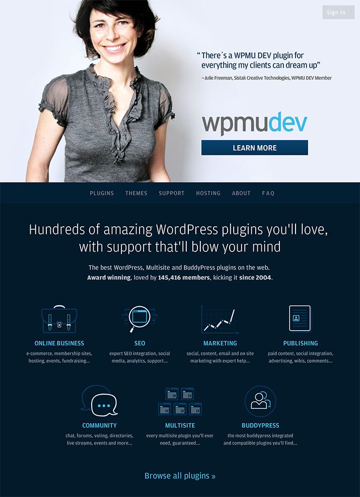
We’ll start at the top and move down the page. When you load in the page, this is the graphic that fills your screen:
I love that the first thing that I see is a big photo of an attractive and friendly person. It doesn’t have that overly posed and formal stock photo feel but instead seems more genuine and believably casual. Right next to the image of the woman is a positive client quote, which brings context to the photo of the woman.
Right off the bat, they’ve hit on some of my favorite tactics: smiling faces and real client praise. This site, and consequently WPMU DEV, seems friendly, approachable and reliable to me as a visitor, and I’ve only been here for a few seconds!
All of this is backed up with a solid call to action: learn more. At this point, this is likely exactly what I want to do. This link takes you to a different, equally awesome page though, for now, we’ll stick to this one and scroll a bit.
Navigation
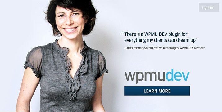
Before we move on to the next section, let’s talk about the page structure a little bit. For the most part, this is a single page site. The links in the navigation bar don’t take you to separate pages but rather jump you to different sections of this same page. Speaking of the navigation bar, it’s actually a really slick piece of development and design work:
Initially, the navigation appears directly below the photo of the woman from the last section. However, as you scroll down the page, it actually clings to the top of your viewport. As it does so, a logo pops in and the text reduces its size in a fluid transition. This is the kind of stuff that I really geek out over so the navigation gets two thumbs up from me.
This isn’t mere eye candy mind you, what the navigation bar is doing is adapting to where it’s being used. At the top of the page, there’s already plenty of branding, so the logo isn’t needed. As you scroll down though, the logo pops up to remind you where you are and serves as a quick link to jump to the top of the page. Extremely functional. Extremely attractive. It’s a win, win.
Plugins Section
From here, you simply jump from one section to the next as you scroll down the page. Each section is unique and great looking in its own right while tying into the greater design aesthetic that governs the whole page. Here’s the first section:
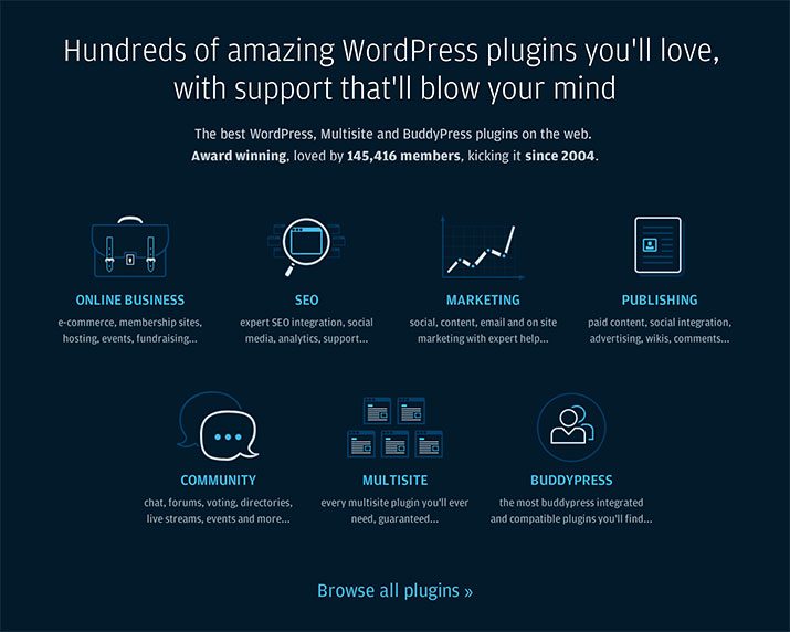
As you can see, these other sections reverse the color scheme that we saw in the header (dark background, light highlights), which makes for some really nice use of both contrast and repetition. When you hover over one of the icons in this area, the headline and even portions of the graphic become bright yellow, which yet again leverages contrast well.

I love the way these icons look. They’re not the same set of minimal icons that you see in a thousand different iterations across half the sites on the web. They feel much more custom and have some personality to them.
Membership Slider
Next, we’re going to jump down a few sections and look at a really neat piece of UI that helps you decide on a membership plan.
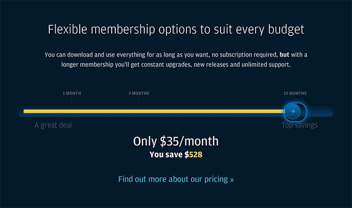
Here we have a nice, big slider that stretches all the way across the screen. As you move the slider from one month to three months and then on to twelve, the price at the bottom updates along with your savings. It’s a great point of interaction that has the ability to increase engagement. It also works really smoothly, allowing you to drag the slider or simply click anywhere to update the price. No matter where you release the slider, it’ll jump over to the closest stopping point.
Developers
The last section of this page that I want to look at shows shots of the staff and supporting devs/designers for WPMU. At a glance, it looks pretty unremarkable. Just a grid of thumbnails, right?
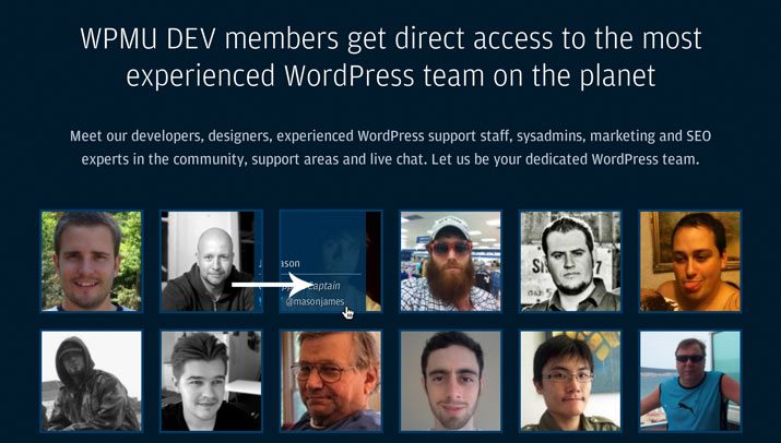
It turns out these guys made even this section awesome. When you hover over a picture, you see a little overlay that shows the person’s name and position. Move your cursor away and the overlay slides out. The cool part though is that it slides in/out in whatever direction your cursor is headed. This means if you slide your cursor left out of one photo and into another, it looks like the overlay follows you. It’s a great illusion that I had to play with for a solid thirty seconds before moving on.
Responsive Layout
Before we finish, it’s definitely worth noting that the site is fully responsive. Below you can take a look at the desktop, tablet and mobile versions:
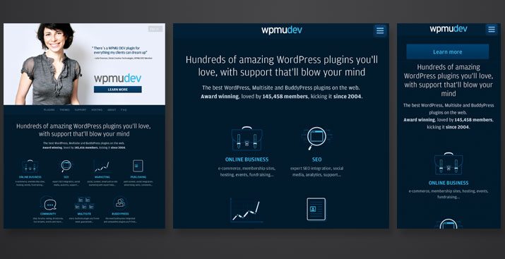
Notice how well the design adapts to the device viewing it. As you move down, the core message is maintained, but non-essential extras are scrapped in favor of layout efficiency.
Great Work!
As far as I’m concerned, this site is top-notch. The design is perfect, the layout responsive and the messaging spot on. I can quickly tell what WMPU DEV is all about and have ready sources of information for any questions that I have.
I looked around for a long time trying to find something to complain about and frankly, there’s almost nothing. The one thing that concerns me is the effort that it takes to actually sign up. There’s no “Sign Up Now” button anywhere on the home page. Once I click the “Learn More” button, I’m taken to the plans and pricing page. This page is attractive, but I have to scroll for miles before I get to the bottom where I can finally choose a plan and proceed.
Always be mindful of the barriers that you’re placing between your users and a conversion. If I come to this site with the intention of signing up, I’m your best possible visitor and you want to make dang sure that I have an easy, clear route to give you my money.
Your Turn!
Now that you’ve read my comments, pitch in and help out by giving the designer some further advice. Let us know what you think is great about the design and what you think could be stronger. As always, we ask that you also be respectful of the site’s designer and offer clear constructive advice void of any harsh insults.