3 Quick Ways to Show Attention to Detail in Web Design
With today’s current design trends I’m of the view that attention to detail is perhaps the most important part of any design, be it web or print.
In this article, I’m going to exhibit a few examples of designs on the web that lack that little bit of detail that would make the websites a much more pleasant place to explore.
2 Million+ Digital Assets, With Unlimited Downloads
Get unlimited downloads of 2 million+ design resources, themes, templates, photos, graphics and more. Envato Elements starts at $16 per month, and is the best creative subscription we've ever seen.


Disclaimer
I must point out that I’m not criticizing anything anyone has done in the past, I’m merely telling you what I’d do to make the design more detailed and a better experience for the user when they use the site. By no means am I saying that I’m perfect, I’m still learning and these techniques may not even be the absolute best fixes, but little touches here or there will show you’ve made the effort to make the site as good as you think it could be!
For example:
The comments section of Dribbble doesn’t have a maximum width so you can manipulate the look of the website with no trouble. I know it’s only a small detail but I do think attention to detail is the most important aspect of the design.
Like the article? Be sure to subscribe to our RSS feed and follow us on Twitter to stay up on recent content.
Text Areas
Text areas were the first element that caught my eye and gave me the idea to write this post so I’ll start here.
This example is somewhat ironic as it comes from the popular design sharing website, Dribbble.
If you go on any player’s shot on the site you’ll see a comment box at the bottom. Now because I’m a bit of a fiddler, I always play around with elements on websites when I first discover them and I noticed that I could “break” this one:
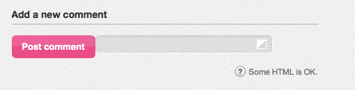
The Fix
With the textarea element, the best practice is to use min/max-width & min/max-height. The code currently in use is:
textarea {
width: 424px;
height: 100px;
}
I would convert this to:
textarea {
min-width: 424px;
max-width: 424px;
min-height: 100px;
height: 100px;
}
This code then keeps the width of the comment box fixed at 424px at all times but allows the user to increase the height of box depending on how much they write in there.
Thanks to Chris Allwood who directed me to the ‘Textarea Tricks’ post by Chris Coyier of CSS Tricks on the textarea element on the different things you can do to manipulate it.
Hover & Active States on Links
Hover and active states are probably the easiest bit of detail and functionality you can add to a design.
When it comes to links, designers usually change the colour on hover, add an underline or make it bold. Using these simple techniques will be a good fit for certain designs but there are a couple of other details I don’t think get used often enough.
The Fix
Indent from left:
a:hover {
padding-left: 10px;
}
Adding a background:
a:hover {
background: #06c;
color: #fff;
text-decoration: none; /* Obviously only use this if there was an underline on the link to begin with */
}
Push down on click:
a:active {
position: relative;
top: 1px;
}
Bonus Tip
All of the details I mentioned above can be made ever so slightly nicer with the use of CSS3 transitions. I often use the following code to animate the effect slightly which is a pleasant bit of detail:
a {
-webkit-transition: all 0.3s ease-out;
-moz-transition: all 0.3s ease-out;
-ms-transition: all 0.3s ease-out;
-o-transition: all 0.3s ease-out;
transition: all 0.3s ease-out;
}
There are a number of different variables that you could use, this is just the main property that I use on a regular basis. NetTuts+ has a good article on fundamental CSS3 transitions that is very useful.
If you really want to go the whole hog, I recommend you check out Dan Eden’s Animate.css. I used it on Cardinal Menswear and think it makes a big difference to the experience when viewing the site.
Watch Out for Negative States
When designers use negative hover and active states.
Harry Roberts of CSS Wizardry wrote an article on negative hovers in 2011 which made me think about some of the details that I’d applied to sites I’ve worked on in the past. I realised that I was guilty of creating a :link with an underline and then on :hover I’d remove that underline and after reading Harry’s article it occurred to me that this could be confusing to a visitor.
Text & Image Selection Colour

Even though this is a very minor detail, it is super easy to do so I always think it shows the designer cares when he/she adds this bit of code for the people that are going to notice and appreciate it.
The Fix
::selection { background: #06c; color: #fff }
::-moz-selection { background: #06c; color: #fff }

img::selection { background: #06c }
img::-moz-selection { background: #06c }
Conclusion
I hope you’ve learned a trick or two from this article, I’ll certainly be keeping my eye out for new, little details that I can apply to my designs in the future.
Have you got any tips or tricks that you think I’ve missed or should consider using? We’re always learning as designers and I think it’s important to keep eachother on our toes so that the users of our websites get the best experience possible!
Please, leave a comment below with any suggestions for snippets of code you’ve used in your designs.