Super Sweet CSS 3D Text Effects With Sass and LESS
I was recently discussing the merits and various features of CSS preprocessors with a colleague. We covered all of the basics: how it’s great to have variables and how mixins can save you an incredible amount of coding time. When the conversation turned to some of the more obscure features though things got interesting. When I brought up the various color operations, my colleague boldly proclaimed that no “real designer” could ever find a legitimate excuse for using this feature and not picking his own colors manually.
In the words of Barney Stinson, “challenge accepted!” Today we’re going to create an awesome faux 3D text effect with pure CSS and then see why it’s a lot easier to do it with the color operations in Sass or LESS.
2 Million+ Digital Assets, With Unlimited Downloads
Get unlimited downloads of 2 million+ design resources, themes, templates, photos, graphics and more. Envato Elements starts at $16 per month, and is the best creative subscription we've ever seen.


Let’s Build Some 3D Text
There’s not really a great way to apply a 3D effect using CSS. There’s no “text-extrude” property, though that would in fact be pretty awesome. Instead we have to fake it. One of the most popular ways to do this is to set up a whole heap of text-shadows (effect shown off by Mark Otto here). As with CSS backgrounds, text-shadows can be stacked repeatedly to achieve some really interesting results.
Tip: IE hates web designers so it doesn’t support anything cool like text-shadows. Use Modernizr to compensate.
The Foundation
Let’s start slow and build the basic HTML and CSS foundation that we’ll need to create a nice big text object to work with. All we need for the HTML is an h2 with some text and a single class applied.
<h2 class="threedee">3D Text</h2>
Now for some CSS. For now, simply target the h2 and apply some basic styles. I transformed the text to uppercase and used some shorthand to apply a bunch of font properties in one go: weight size/line-height font-family.
h2 {
  text-transform: uppercase;
  font: bold 100px/1 Helvetica, Verdana, sans-serif;
}
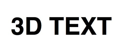
With that, you should have a simple chunk of text that’s pretty much unimpressive in every way. Fear not, we’ll make it jawdroppingly cool with the next few steps!
Applying a Text-Shadow
To begin the 3D-ification process, choose a color that you like and apply it to the threedee class. Then apply a slightly darker shade of the color as a text shadow. I’ve indicated how the syntax works with a comment. Notice that both the horizontal offset and the blur are set to zero. We want a hard shadow that’s due south of our text.
.threedee {
  color: #d93a36;
  text-shadow: 0 10px 0 #aa2421; /*x-offset y-offset blur color*/
}
If you need a good, fast way to find different shades of a given color, check out 0to255, a super handy free web app that I use all the time.

After this step, you can clearly see the effects of the text-shadow. As you can see, one shadow doesn’t quite cut it. We’re approaching a 3D effect, but right now it really just looks like a shadow. We need to fill in those gaps.

Going 3D
To fill the gaps, all we have to do is add in some more text shadows. It won’t really create a seamless transition, but your eyes are lazy and they’ll tend to perceive the separate shadows as a single entity unless you really look closely.
To apply multiple shadows, simply separate each with a comma. Make sure that each is a little bit more offset than the last so we get that nice extruding effect.
.threedee {
  color: #d93a36;
  text-shadow:
    0 2px 0 #aa2421,
    0 4px 0 #aa2421,
    0 6px 0 #aa2421,
    0 8px 0 #aa2421;
}
After this, you should have a really nice 3D effect beginning to take shape. The letters really do look extruded!

Notice that all of my shadows are the same color. This results in a very flat, cartoony 3D effect. If that’s what you’re going for, great, but we want something with a tad bit more realism. To achieve this, we can make each consecutive shadow a little bit darker.
.threedee {
  color: #d93a36;
  text-shadow:
    0 2px 0 #aa2421,
    0 4px 0 #8e1e1b,
    0 6px 0 #711816,
    0 8px 0 #551210;
}
There’s a little bit of a tradeoff here. It’s much easier to see the individual shadows this way, but I tend to like the darkening effect better than the flat look.

Finishing Touches
We’re still not quite to the realistic stage. The problem that I see now is that the three dimensional text isn’t having and effect on its background. Let’s fix this with a few more shadows, this time with some blur and transparency.
.threedee {
  color: #d93a36;
  text-shadow:
    0 2px 0 #aa2421,
    0 4px 0 #8e1e1b,
    0 6px 0 #711816,
    0 8px 0 #551210,
    3px 8px 15px rgba(0,0,0,0.1),
    3px 8px 5px rgba(0,0,0,0.3);
}
With that, we’re all finished! It’s by no means as sharp as what we could achieve with Photoshop and an hour to kill but given that it’s pure CSS, it’s pretty impressive!

The Problem With This Method
The main problem that I have with this method is that it’s not very flexible. Since we’re using a total of five different variations of a color, that means changing the color of the 3D text is a real pain!
For instance, let’s say I wanted to change the text to blue. Not only do I have to choose my primary blue, I then have to apply each of the shadows while gradually darkening that blue.
.blue {
  color: #c8d2da;
  text-shadow:
    0 2px 0 #b4c1cd,
    0 4px 0 #a0b1bf,
    0 6px 0 #8ca0b2,
    0 8px 0 #778fa4,
    3px 8px 15px rgba(0,0,0,0.1),
    3px 8px 5px rgba(0,0,0,0.3);
}
Sure, it’s not the most difficult thing in the world, but after toying around with a few color variations to rep for this article I can definitely say that it’s a time consuming task. I hate that all my work isn’t reusable. I wish I could just apply the 3D effect, pick a single color and have the rest just happen automatically.
Sass To The Rescue
As you’ve no doubt surmised by now, this is one situation where the Sass color operations would prove to be extremely helpful. Yes, I’m a real designer. Yes, I prefer to choose color schemes manually. However, this process isn’t rocket science and really feels like it should be automated. As long as I get to choose the starting color, I don’t mind letting Sass take care of the rest.
Creating the Mixin
This is where things are going to get pretty fancy, so if you haven’t done your homework on Sass, I recommend that you check out the official tutorial.
We’re going to wrap this entire 3D process up into a nice little mixin that can be applied with very little effort. To do this, we use the “@mixin” syntax, then name our mixin. Here’s the structure of the starting code block:
@mixin threedeetext() {
}
Passing In Parameters
Since we want this to be something that we can initiate on the fly, we need to be able to pass in a color. To do this, we create a variable and place it inside the parentheses. Note that Sass variables begin with the dollar sign.
@mixin threedeetext($color) {
}
Setting the Main Color
Now it’s time to put this mixin to work. We want it to take the color passed to it and apply it to the color property. This is done just like in normal CSS, only we use our variable instead of actually typing in a color code.
@mixin threedeetext($color) {
  color: $color;
}
Darkening the Color
Before we go on to create the shadow, we have to learn how one of Sass’ color operations works. As we saw above, our shadow needs to get incrementally darker with each implementation. Sass can easily pull this off for us with the darken operation.
darken($color, 10%);
Here I initiated the darken operation, passed in the variable that we set before and gave it a value of 10%. This will return a color that is 10% darker than whatever $color is set to.
Creating the Shadows
Now that we know how it all works, it’s time to put it together and build our text-shadows. Here’s the full mixin snippet. We create the mixin, pass in a variable, set the text color to that variable and then build our shadows with darker variations of that variable.
@mixin threedeetext($color) {
  color: $color;
  text-shadow:
    0 2px 0 darken($color, 14%),
    0 4px 0 darken($color, 16%),
    0 6px 0 darken($color, 18%),
    0 8px 0 darken($color, 20%),
    3px 8px 15px rgba(0,0,0,0.1),
    3px 8px 5px rgba(0,0,0,0.3);
}
Implementing The Mixin
That little snippet above allows us to create fancy 3D text using any color with hardly any work. All we have to do is run the include command, state the name of the mixin and pass in a color. It’s a beautiful thing.
.threedee {
  @include threedeetext(#d4daa8);
}
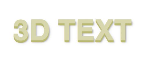
How easy is that? Now if we decide that we want a new color, changing it is quick and painless.
.threedee {
  @include threedeetext(#c8d2da);
}

Try Changing the Font
Keep in mind that this is done with live, fully selectable/editable text. This opens up lots of great possibilities. For instance, try combining it with a Google Web Font like Medula One for a really impressive effect.

Live Demo
Click here to see and fiddle with the Sass version of our threedee mixin.
Now With LESS
I used to be a LESS man, but I’ve been won over by the depth and power of Sass. However, I still think LESS is an awesome tool and don’t want to discourage you from using it in any way. Both preprocessors have their merits so if you like LESS better, use that instead. They both output pure CSS in the end so how you get there is up to you.
I happen to know from previous articles that several of our readers are LESS fans so I didn’t want anyone to miss out on this awesome effect. LESS actually shares the Sass color operations so we can easily build a similar mixin with this syntax. In fact, the LESS version is actually more concise because we can scrap the @mixin/@include syntax that Sass requires.
.threedee(@color) {
  color: @color;
  text-shadow:
    0 2px 0 darken(@color, 14%),
    0 4px 0 darken(@color, 16%),
    0 6px 0 darken(@color, 18%),
    0 8px 0 darken(@color, 20%),
    3px 8px 15px rgba(0,0,0,0.1),
    3px 8px 5px rgba(0,0,0,0.3);
}

.threedeetext {
  .threedee(#c8d2da);
}
As you can see, the two versions are very similar. Notice that Less uses the @ symbol for variables and that mixins actually mirror classes in form, which is both convenient and a little confusing.
Conclusion
Ultimately, I agree that you shouldn’t turn to a CSS preprocessor to do your design work for you. Color palettes should be carefully built after weighing several factors. However, that doesn’t mean that automatic color operations are useless. Hopefully, I’ve demonstrated a clear example where the darken operation combined with a mixin creates an infinitely better workflow for pulling off a great 3D CSS effect. I’d love to hear your thoughts on other ways to use color operations in a legitimately useful workflow.
If you’re looking to implement some 3D text into one of your projects, keep an eye on Design Curate, our awesome downloads site. We’ll be posting some really great resources there soon that are based on this tutorial.