Achieving Multi-Step Animations With CSS Transitions
Multi-step CSS animations are easy with keyframes, but what if we want to use plain old transitions to achieve a similar effect? Further, how do we take a single hover event and translate that into multiple animations on different elements?
The answer lies in using buried hovers, a simple and effective trick you should definitely try out.
2 Million+ Digital Assets, With Unlimited Downloads
Get unlimited downloads of 2 million+ design resources, themes, templates, photos, graphics and more. Envato Elements starts at $16 per month, and is the best creative subscription we've ever seen.


Inspired By Actual Events
Chris Coyier from CSS-Tricks serves more frequently as the inspiration for my articles than perhaps any other author. The man knows a ton about CSS and I always learn a lot from his articles.
Recently, he published a piece on CSS that usually confuses beginners and in it he very briefly explained what he referred to as “buried hovers”. I honestly hadn’t ever really considered using a hover effect quite like this before and was eager to explore the implications. The following is the result of that exploration.
What Is a Buried Hover?
The concept behind a buried hover is fairly simple. The general idea is that we typically change the item that is hovered over. Here’s an example:
.container a {color: #fff}
.container a:hover {color: #eee}
Here we have a simple link that changes color upon hover. However, it turns out that we don’t necessarily have to change the item that we’re hovering over but can in fact choose instead to change one of its descendants. Let’s see how this looks:
.container:hover a {color: #eee}
Here the declaration looks almost the same but has a dramatically different effect. When the user’s mouse enters anywhere into the parent container, all of the links within that container immediately change color.
It’s important to note that IE6 doesn’t support non-link hovers. It’s also important to note that IE6 is a dirty, no-good excuse for a browser these days and doesn’t really concern me much as far as teaching goes.
Simulating a Keyframe Animation
Now, upon realizing that the above was possible, my brain immediately started towards the most complicated implementation of this scenario that I could come up with.
Simple use cases for this method are practical, but you can probably come up with them yourself. Instead I wanted to do something fun. The result is fairly impractical and doesn’t have the best browser support, but meets the goal of really getting you thinking about creatively applying buried hovers.
The basic idea that I came up with is simulating a webkit-keyframe-animation with simple transition-based CSS3, which has much better support. The result will be a complex, multi-step animation that is set off by a hover event. Why? Because we’re all nerds here and it’ll be fun to build, that’s why.
Getting Started: The HTML
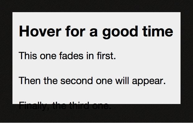
We hardly need any HTML for this project. All I did was create a container with one header and a few paragraphs. Our goal will be to trigger several animations when the user hovers over the div.
<div class="container">
	<h2>Hover for a good time</h2>
	<p>This one fades in first.</p>
	<p>Then the second one will appear.</p>
	<p>Finally, the third one.</p>
</div>
Basic CSS
These styles are mostly arbitrary and can be changed as you please. I set a nice dark background graphic, created a visible box and defined the style of the text.
* {
	padding: 0;
	margin: 0;
}

body {
	background: #f5f5f5 url(darth_stripe.png); /* source: http://subtlepatterns.com */
	}

.container {
	background: #eee;
	color: black;
	font: 2em/2.5em "Helvetica Neue", Helvetica, Arial, Geneva, sans-serif;
	height: 255px;
	margin: 50px auto;
	padding: 20px;
	width: 500px;
}
At this point, the live preview looks like the image below. As you can see, our text is overflowing the box but that’s completely fine as we’ll be changing this up in a minute.
Styling the Header and Paragraphs
Here’s the basic outline of our animation: the header sits alone vertically centered in the container. On hover, the header disappears and the paragraphs fade in one at a time.
To make this happen we first need to position the header absolutely. This will allow us to put the header where we want it without affecting the three paragraphs below it.
Notice that setting the line-height equal to the height of the container centers the header vertically within the div.
/*Header styles*/
.container h2 {
	font-size: 1.2em;
	line-height: 225px;
	position: absolute;
}
Next we want to hide our paragraphs from view. We’ll be fading them from invisible to visible so I used the opacity property to accomplish this.
/*Paragraph Hidden styles*/
.container p {
	opacity: 0;
}
The result should be something like that shown below, with only the header visible inside the container at this point.

Defining the Animations
Now that we’ve got everything lined up in addition to having our visibility states squared away, it’s time to finish up by making the animations work.
We’ll start by defining our header transition using the various browser prefixes. Next, we use our first buried hover! Again, the idea is that when the container is hovered over, the animations starts. With this in mind, we use container:hover h2 to create an event that only applies to our header.
Once we have our header targeted, we shoot it up and fade its opacity to zero.
/*Header styles*/
.container h2 {
	font-size: 1.2em;
	line-height: 225px;
	position: absolute;
	-moz-transition: all 0.4s ease-in-out 1s;
	-webkit-transition: all 0.4s ease-in-out 1s;
	-o-transition: all 0.4s ease-in-out 1s;
}

.container:hover h2 {
	opacity: 0;
	line-height: 0px;
}
Animating the Paragraphs
Here comes the tricky part. We have three different paragraphs and want to fade them in one at a time. What we need to do then is target each individually and fade them in at different speeds.
Since we didn’t give any of the paragraphs a special ID or class, we’ll use nth-child to grab each of them individually. Since the animations aren’t supported by IE anyway, this won’t be a problem.
The specific lengths of the animations are a little strange. I pretty much had to fiddle with the way the header faded out and these faded in until I found something I liked. These numbers seem to work well:
/*Paragraph Hidden styles*/

.container p {
	opacity: 0;
}

.container :nth-child(2) {
	-webkit-transition: opacity 1s ease-in-out 0s;
}

.container :nth-child(3) {
	-webkit-transition: opacity 2s ease-in-out 0.5s;
}

.container :nth-child(4) {
	-webkit-transition: opacity 2s ease-in-out 2s;
}
When the user hovers over the container, we want the paragraphs to appear, so, the final step is to use another buried hover to target the paragraph tags. We use .container:hover p to target the paragraphs on hover and bring their opacity up. The animations that we set up in the previous step will cause the transition to be nice and gradual.
/*Paragraph Visible styles*/
.container:hover p {
	opacity: .8;
}
One thing that’s nice about all these animations is that they look just as good in reverse when you take your mouse out of the div. The paragraphs fade out and the header slides back in. Pretty neat!
Take a Look
The live demo is a bit more complicated but it uses the same technique as the example above. Sorry Internet Explorer users, as always, no fun for you.
Live Demo: Click here to launch.

Conclusion
With the help of buried hovers, we can achieve a lot of really interesting and unique CSS techniques that you may have struggled with before. This article used a buried hover to trigger multiple CSS animations on different elements to showcase how the complexity of effects that you can implement.
Leave a comment below and let us know how and if you use buried hovers.