CSS Button Tutorial: How to Code Buttons in 5 Simple Steps
Here at Design Shack we like to feature a full range of tutorials, from expert PHP projects to very simple CSS tips. Today’s tutorial is targeted at those still in the beginner stages of CSS.
One of the most frequent questions I get from CSS beginners is, “How do I create a button?” It’s a simple question with a complicated answer. There are quite a few ways to go about it and unfortunately there are also quite a few ways to go wrong. When I first started out in CSS, figuring out all the button syntax was one of the most persistent troubles I faced, it seemed like I was always doing it wrong. Today we’re going to walk through a very simple and flexible process that you can apply to any button you create. More important than the end result is the in-depth explanation at each point outlining why we do it that way.
2 Million+ Digital Assets, With Unlimited Downloads
Get unlimited downloads of 2 million+ design resources, themes, templates, photos, graphics and more. Envato Elements starts at $16 per month, and is the best creative subscription we've ever seen.


Step 1: The HTML
Believe it or not, this is one of the trickiest parts. To an experienced coder, it seems so simple. To a beginner though, knowing where to start with a button can be quite difficult. Should you use the “button” HTML tag? Or perhaps a paragraph tag? Which parts should the link wrap around?
It turns out that the simplest and most widely used syntax is just to implement a plain old anchor tag (form buttons often use “input”). From a functional standpoint, all we’re really trying to create is a link that, when clicked, takes us somewhere new, which is exactly what a basic HTML link does. Often in web design, the choice to turn something into a button is merely an aesthetic one and doesn’t necessarily indicate any special functionality.
Here’s a widely used snippet of HTML that gets the job done perfectly while staying nice and succinct:
<a href="https://designshack.net/" class="button">Click Me</a>
If You Don’t Need a Div, Don’t Use One
One problem that I used to come across when I first started coding is that I would often think that I needed a div to create anything. Using this flawed logic, I would wrap my anchor in a div and then apply most of the styling to the div.
This is completely unnecessary though and can create problems with both the click and the hover. In the above example, our entire element will be the link. If we wrapped this in a div and styled that, only the text part of the button would be a link, meaning that the user could conceivably click the button with no result.
Why Use a Class?
Perhaps the most important thing to notice about this snippet of code is that we’ve added a class, which I’ve generically labeled “button.” There are a couple of reasons for this.
First of all, we need a way to target and style this button in our CSS without necessarily targeting all of the anchor tags on the page. It’s almost never the case that you’ll want every single link to be an identical button. However, it is feasible and quite likely that you will in fact want to reuse the button style at some point. For this reason we apply a class instead of an ID. That way, whenever we want to convert a plain text link to a nice button, we simply apply our “button” class and we’re done!
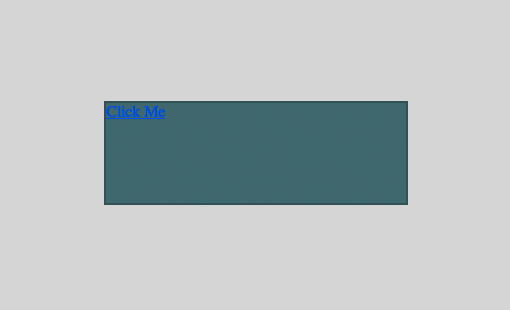
Step 1 Preview
At this point you should only have a plain text link with default styling.

Step 2: Basic Button Styles
Now that we’ve got our HTML all ready to go, it’s time to jump over to the CSS. Remember that we set up a “button” class for the express purpose of CSS targeting so be sure to use it for this step:
.button {/* Code Here */}
The first thing we want to do in our CSS is define the basic box that will make up our button shape. Here are the styles that I used. Note that my color choices and dimensions are completely optional, feel free to use whatever you like.
.button {
	display: block;
	height: 100px;
	width: 300px;
	background: #34696f;
	border: 2px solid rgba(33, 68, 72, 0.59);
}
The most important thing I did here was to set “display” to “block”. This will allow us to turn our text link into a larger box with a defined width and height. After that I simply set my size and background color, then added a border. I’ll be using “rgba” quite a bit, if you want to make this a little more friendly to older browsers, check out this article on declaring rgba fallbacks.
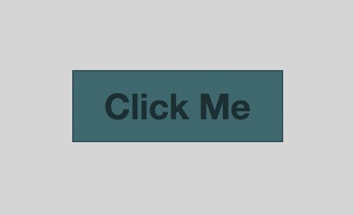
Step 2 Preview
After step two you should have a fairly boring looking box with some impossible to read text inside.
Step 3: Text Styles
Next up, it’s time to attack that ugly text. To make sure you can keep up with each step, I’ll simply keep adding to what we’ve previously built with comments to help you see each step:
.button {

	/*Step 2: Basic Button Styles*/
	display: block;
	height: 100px;
	width: 300px;
	background: #34696f;
	border: 2px solid rgba(33, 68, 72, 0.59);

	/*Step 3: Text Styles*/
	color: rgba(0, 0, 0, 0.55);
	text-align: center;
	font: bold 3.2em/100px "Helvetica Neue", Arial, Helvetica, Geneva, sans-serif;
}

/*Step 3: Link Styling*/
a.button {
	text-decoration: none;
}
Here we see that I’ve added in a text color that’s essentially a darker shade of the button color. This trick is accomplished by setting the text color to black and reducing the opacity via rgba. Next, I center aligned the text and declare a bunch of stuff using font shorthand.
Font Shorthand
CSS shorthand is a neat way to declare a bunch of CSS properties and styles in one line. First, I declared the weight (bold), then font-size/line-height and finally the font-family. Notice that the line-height is set exactly to the button height. This is a simple way to make sure your text is vertically centered.
For more information on CSS Shorthand, check out 6 CSS Shorthand Tricks Every Developer Should Know.
Step 3 Preview
After step three your button should actually start to look like a button!
Step 4: Fancy CSS3 Styles
The previous step gets us to a nice, functioning button that doesn’t look half bad. Unfortunately, it is quite boring. The important part though is that this button should look perfect in most browsers, so we can now proceed to add some newer CSS goodness without worrying too much about leaving older browsers behind. Ultimately, I don’t really mind if IE decides to ditch these next styles because my button should work just fine for those users in its current state.
We can easily get carried away and write fifty lines of CSS to make our button shining and pretty, but I’ll keep it really simple for today’s purposes:
.button {

	/*Step 2: Basic Button Styles*/
	display: block;
	height: 100px;
	width: 300px;
	background: #34696f;
	border: 2px solid rgba(33, 68, 72, 0.59);

	/*Step 3: Text Styles*/
	color: rgba(0, 0, 0, 0.55);
	text-align: center;
	font: bold 3.2em/100px "Helvetica Neue", Arial, Helvetica, Geneva, sans-serif;

	/*Step 4: Fancy CSS3 Styles*/
	background: linear-gradient(top, #34696f, #2f5f63);
	border-radius: 50px;
	box-shadow: 0 8px 0 #1b383b;
	text-shadow: 0 2px 2px rgba(255, 255, 255, 0.2);

}

/*Step 3: Link Styling*/
a.button {
	text-decoration: none;
}
Each of these can be tricky to read so let’s go through them one by one. First, I added a gradient that uses the color we already had in place and fades to something a tiny by darker. I left in my previous background color above that section to act as a fallback.
Next up is the border radius. I decided to go with a really heavy rounded corner that will give the button a pill shape. Since I want all my corners to be the same, I simply declare one value and it gets applied uniformly.
Finally, I threw in some shadows. Both the box and the text shadow that I used are a little peculiar. For the box shadow, a gave it a vertical offset but no horizontal one and also left the feathering at 0. This will give a nice little faux 3D effect that doesn’t require too much work or code. For the text shadow, I also applied a vertical offset and set the color to white at 20% opacity. This is a super easy way to create a letterpressed effect and make the text appear as if it sinks into the button.
Use Prefixr for Browser Prefixes
Notice that the code above isn’t cross-browser compatible at all. In the initial stages of experimentation, I hate mucking up my code with half a dozen browser prefixes and often forget whether or not a given browser has a unique syntax.
Once I’ve got things looking the way I want in Espresso (my IDE of choice) using basic syntax, I can toss all of that code into a little free tool called Prefixr, which will process it and spit out my code with all of the correct available browser specific versions automatically added.
.button {

	/*Step 2: Basic Button Styles*/
	display: block;
	height: 100px;
	width: 300px;
	background: #34696f;
	border: 2px solid rgba(33, 68, 72, 0.59);

	/*Step 3: Text Styles*/
	color: rgba(0, 0, 0, 0.55);
	text-align: center;
	font: bold 3.2em/100px "Helvetica Neue", Arial, Helvetica, Geneva, sans-serif;

	/*Step 4: Fancy CSS3 Styles*/
	background: -webkit-linear-gradient(top, #34696f, #2f5f63);
	background: -moz-linear-gradient(top, #34696f, #2f5f63);
	background: -o-linear-gradient(top, #34696f, #2f5f63);
	background: -ms-linear-gradient(top, #34696f, #2f5f63);
	background: linear-gradient(top, #34696f, #2f5f63);

	-webkit-border-radius: 50px;
	-khtml-border-radius: 50px;
	-moz-border-radius: 50px;
	border-radius: 50px;

	-webkit-box-shadow: 0 8px 0 #1b383b;
	-moz-box-shadow: 0 8px 0 #1b383b;
	box-shadow: 0 8px 0 #1b383b;

	text-shadow: 0 2px 2px rgba(255, 255, 255, 0.2);

}

/*Step 3: Link Styling*/
a.button {
	text-decoration: none;
}
Step 4 Preview
After step four, your button should look much sharper than before. Almost finished!
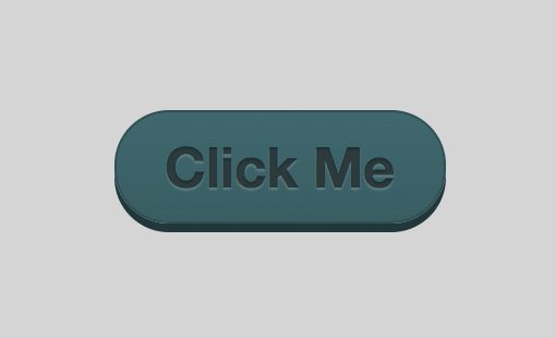
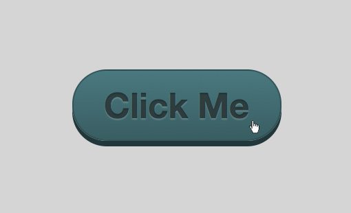
Step 5: Hover Styles
The final step in our button process is to define the hover behavior. When the user hovers over the button, it’s always nice to get a little visual feedback that’s more than the default cursor change. Once again, we could go all out with this but I’ll keep it simple and just lighten up the gradient a little:
.button {

	/*Step 2: Basic Button Styles*/
	display: block;
	height: 100px;
	width: 300px;
	background: #34696f;
	border: 2px solid rgba(33, 68, 72, 0.59);

	/*Step 3: Text Styles*/
	color: rgba(0, 0, 0, 0.55);
	text-align: center;
	font: bold 3.2em/100px "Helvetica Neue", Arial, Helvetica, Geneva, sans-serif;

	/*Step 4: Fancy CSS3 Styles*/
	background: -webkit-linear-gradient(top, #34696f, #2f5f63);
	background: -moz-linear-gradient(top, #34696f, #2f5f63);
	background: -o-linear-gradient(top, #34696f, #2f5f63);
	background: -ms-linear-gradient(top, #34696f, #2f5f63);
	background: linear-gradient(top, #34696f, #2f5f63);

	-webkit-border-radius: 50px;
	-khtml-border-radius: 50px;
	-moz-border-radius: 50px;
	border-radius: 50px;

	-webkit-box-shadow: 0 8px 0 #1b383b;
	-moz-box-shadow: 0 8px 0 #1b383b;
	box-shadow: 0 8px 0 #1b383b;

	text-shadow: 0 2px 2px rgba(255, 255, 255, 0.2);

}

/*Step 3: Link Styles*/
a.button2 {
	text-decoration: none;
}

/*Step 5: Hover Styles*/
a.button:hover {
	background: #3d7a80;
	background: -webkit-linear-gradient(top, #3d7a80, #2f5f63);
	background: -moz-linear-gradient(top, #3d7a80, #2f5f63);
	background: -o-linear-gradient(top, #3d7a80, #2f5f63);
	background: -ms-linear-gradient(top, #3d7a80, #2f5f63);
	background: linear-gradient(top, #3d7a80, #2f5f63);
}
Now when you hover over the button, its color/brightness will shift. It’s a subtle effect but is definitely strong enough for any user to notice, even if they’re colorblind.
Finished!
After step five, you’re all done! You should now have a beautiful button created entirely with CSS and HTML. More importantly though, you should have a strong feel for the basic workflow to follow to craft a button using CSS.
Demo: To see the button in action, click here or on the image above.
jsFiddle: To Fiddle with the code, click here.
Conclusion
We learned a lot of very important things today. First, we saw that we can use a basic HTML anchor tag as the starting point for our button and that it’s good to style buttons with reusable classes. We also learned how to start by styling a basic button that will work well across all browsers and to toss in added flair later rather than basing the entire structure of the button on techniques that won’t be be widely accessible. Finally, we saw how to keep things simple by coding with basic CSS3 properties until we get everything just right, and then follow that up with a trip to Prefixr, which expands our code to something as cross-browser compatible as possible.
Leave a comment below and let us know what you think. If you’re a beginner, was this helpful to you? If you’re a seasoned pro, what would you do differently?