CSS3 Cookbook: 7 Super Easy CSS Recipes to Copy and Paste
By now you’ve probably seen enough lengthy CSS3 tutorials to last a lifetime. You’re probably starting to become familiar with what CSS3 has to offer and are ready to move past basic theory and see some practical design examples that you can copy and paste right into your code without without wading through tons of commentary.
Well you’re in luck because that’s exactly what we have for you today! Below you’ll find seven fun and attractive CSS tricks that you can grab and insert right into your own projects and customize at will. Keep in mind that since this stuff is still cutting edge, older browsers won’t support most of it. I’ve tried to ensure graceful degradation where possible so that you can provide a working experience to all users and a better experience to those with using webkit.
2 Million+ Digital Assets, With Unlimited Downloads
Get unlimited downloads of 2 million+ design resources, themes, templates, photos, graphics and more. Envato Elements starts at $16 per month, and is the best creative subscription we've ever seen.


Letterpress
Insetting text is fairly simple in CSS. To accomplish it you’ll need three colors: one background color, a lighter shade of the background color and a darker shade of the background color.
To start off, fill your text with the darker shade of your background color. Then simply apply a CSS3 text shadow that’s a lighter shade and it has the effect of creating an embossed look.

The HTML
<body>

    <div id="container">
    	<p>pressed</p>
    </div>

</body>
The CSS
body {
	background: #222222;
	color: #131313;
	font-size: 200px;
}

#container p {
	text-align: center;
	text-transform: uppercase;
	text-shadow: #2c2c2c 3px 3px 5px;

}
Small Caps
The small caps effect is when all of the letters in a headline are capital, but the initial letters in each word are larger than the rest. It’s a nice and simple effect that you don’t often see on the web (not really CSS3 but still cool!).
One easy way to do this is simply to insert “small” tags into your HTML and then to style those tags with a slightly smaller font size than the rest of the headline. A few commenters informed me that there is in fact an easier way to accomplish this! Simply use “font-variant: small-caps;” and you’re good to go!
I also used the “uppercase” text-trasform just for fun. This will automatically take any lowercase text and transform it, making it easy to go back and change your HTML while keeping the same look, even if you don’t remember to type in all caps.

The HTML
<body>

    <div id="container">
    	<p>Small Caps</p>
    </div>

</body>
The CSS
body {
	background: #2c2b2b;
	color: #131313;
	font-size: 200px;
}

#container p {
	text-align: center;
	text-transform: uppercase;
	text-shadow: #363535 3px 3px 5px;
	font-variant: small-caps;

}
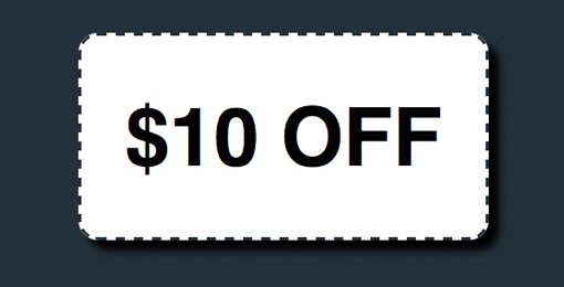
CSS Coupon
This one is helpful for those online retailers that want to offer promotions, sales, online coupons, etc. The typical border treatment that you see on most websites is just a solid line, but you can alternatively apple dashed or dotted lines to a border.
Combine this with some CSS3 rounded corners and a box-shadow and you’ve got yourself a nice little CSS coupon graphic!
The HTML
<body>

    <div id="container">
    	<h2>$10 Off</h2>
    </div>

</body>
The CSS
body {
	background: #21303b;
	color: #000;

}

h2 {
	font-size: 80px;
	line-height: 70px;
	font-family: Helvetica, sans-serif;
	font-weight: bold;
	text-align: center;
	text-transform: uppercase;
}

#container {
	background-color: white;
	height: 200px;
	width: 400px;
	margin: 100px auto;
	border: 3px dashed #21303b;

	/*shadow*/
	-webkit-box-shadow: 10px 10px 10px #000;
	-moz-box-shadow: 10px 10px 10px #000;
	box-shadow: 10px 10px 10px #000;

	/*rounded corners*/
	-webkit-border-radius: 20px;
	-moz-border-radius: 20px;
	border-radius: 20px;
}
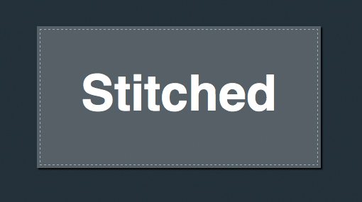
Stitched
While we’re on the subject of dashed border treatments, here’s an alternate trick you can use to give a box a subtle sewn-on illusion.
This time instead of a border we use an outline. An outline can be easily inset using a negative value on the outline-offset command.
The HTML
<body>

    <div id="container">
    	<h2>Stitched</h2>
    </div>

</body>
The CSS
body {
	background: #21303b;
	color: #fff;
}

h2 {
	font-size: 70px;
	line-height: 190px;
	font-family: Helvetica, sans-serif;
	font-weight: bold;
	text-align: center;
}

#container {
	/*stitching*/
	outline: 1px dashed #98abb9;
	outline-offset: -5px;

	background-color: #556068;
	height: 200px;
	width: 400px;
	margin: 100px auto;

	/*shadow*/
	-webkit-box-shadow: 2px 2px 2px #000;
	-moz-box-shadow: 2px 2px 2px #000;
	box-shadow: 2px 2px 2px #000;
}
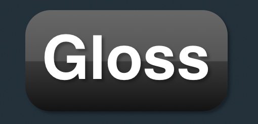
Gloss
This popular and perhaps overused web 2.0 effect used to require at least one image to pull off. Now using CSS3 and a little background gradient know how you can recreate that shine using only code.
Complex CSS gradients can be hard to build so I recommend utilizing the Ultimate CSS Gradient Generator or something similar to help automate the process.
The HTML
<body>

    <div id="container">
    	<h2>Gloss</h2>
    </div>

</body>
The CSS
body {
	background: #21303b;
	color: #fff;

}

h2 {
	font-size: 120px;
	line-height: 190px;
	font-family: Helvetica, sans-serif;
	font-weight: bold;
	text-align: center;
	text-shadow: rgba(0, 0, 0, .3) 5px 5px 5px;
}

#container {

	/*gradient*/
	background: #666666; /* old browsers */
	background: -moz-linear-gradient(top, #666666 4%, #545454 50%, #3A3A3A 51%, #131313 100%); /* firefox */

	background: -webkit-gradient(linear, left top, left bottom, color-stop(4%,#666666), color-stop(50%,#545454), color-stop(51%,#3A3A3A), color-stop(100%,#131313)); /* webkit */

	filter: progid:DXImageTransform.Microsoft.gradient( startColorstr='#666666', endColorstr='#131313',GradientType=0 ); /* ie */

	/*box styles*/
	height: 200px;
	width: 400px;
	margin: 100px auto;

	/*shadow*/
	-webkit-box-shadow: 5px 5px 5px rgba(0, 0, 0, .3);
	-moz-box-shadow: 5px 5px 5px rgba(0, 0, 0, .3);
	box-shadow: 5px 5px 5px rgba(0, 0, 0, .3);

	/*corners*/
	-webkit-border-radius: 50px;
	-moz-border-radius: 50px;
	border-radius: 50px;
}
Stroked Text & @font-face
In this example you get two tricks in one! You’ll see the syntax for adding text strokes in webkit plus that for adding custom fonts in all modern browsers using @font-face.
The font I used in the example below is called Jungle Fever and can be downloaded as an @font-face kit from Font Squirrel.

The HTML
<body>

    <div id="container">
    	<h2>Jurassic</h2>
    </div>

</body>
The CSS
/*Fonts*/
@font-face {
	font-family: 'JungleFeverRegular';
	src: url('JungleFever-webfont.eot');
	src: local('☺'), url('JungleFever-webfont.woff') format('woff'), url('JungleFever-webfont.ttf') format('truetype'), url('JungleFever-webfont.svg#webfontBlD2f3Gz') format('svg');
	font-weight: normal;
	font-style: normal;
}

body {
	background: #222;
	color: #111;

}

h2 {
	font-size: 150px;
	line-height: 200px;
	font-family: 'JungleFeverRegular', Helvetica, sans-serif;
	font-weight: bold;
	text-align: center;
	text-shadow: rgba(0, 0, 0, .2) 3px 3px 3px;

	/*text stroke*/
	-webkit-text-stroke: 2px #fff473;
}
Double Stroked Text
I discovered this tip completely by accident while building some stroked text for the previous example. It turns out if you use RGBa on stroked text and bring down the opacity a bit, you can achieve an awesome double stroke! I’m not entirely sure why it works (something to do with the bleed of the stroke?) but it does!

The HTML
<body>

    <div id="container">
    	<h2>Lobster</h2>
    </div>

</body>
The CSS
/*Fonts*/
@font-face {
	font-family: 'Lobster13Regular';
	src: url('Lobster_1.3-webfont.eot');
	src: local('☺'), url('Lobster_1.3-webfont.woff') format('woff'), url('Lobster_1.3-webfont.ttf') format('truetype'), url('Lobster_1.3-webfont.svg#webfontcOtP3oQb') format('svg');
	font-weight: normal;
	font-style: normal;
}

body {
	background: #731e1e;
	color: #fff;

}

h2 {
	font-size: 220px;
	line-height: 220px;
	font-family: 'Lobster13Regular', Helvetica, sans-serif;
	font-weight: bold;
	text-align: center;
	text-shadow: rgba(0, 0, 0, .2) 3px 3px 3px;

	/*text stroke*/
	-webkit-text-stroke: 4px rgba(0, 0, 0, .6);
}
Conclusion
As I said in the opening statements, feel free to copy and use the examples above however you wish. Leave a comment below if you have any ideas for improving any of these tricks, whether it’s making them look cooler or more cross-browser friendly. They’re far from perfect and I want to see you make them better!