25 Brilliantly Simple Web Page Designs
Sometimes a site can be visually stunning not so much because of the content but because of the lack of content. Though often attractive, this is a tricky style to pull off correctly without just looking like you’ve got a boring page.
Today we’ll look at 25 sites that we think got it right. First we’ll discuss why these designs work well under certain circumstances and then we’ll jump into the examples.
The Ultimate Designer Toolkit: 2 Million+ Assets
Envato Elements gives you unlimited access to 2 million+ pro design resources, themes, templates, photos, graphics and more. Everything you'll ever need in your design resource toolkit.


Beyond Minimalism: The Power of a Focal Point
Minimalism is a huge trend right now. Articles and showcases abound on every design blog either praising its simplicity or bashing its shallowness. This post isn’t about minimalism. I’ll show you why with an example:
This is an excellent example of minimalist design. The design is clean, the content perfectly aligned and the typography simple. However, notice that there is still quite a bit going on in the page design, it’s just organized very neatly.
Though many of the sites below fit into the minimalism schema, our showcase today is more focused on the power of one. Creating a site that has a single strong focal point… and little else. The sites below prove that less can often be more, that great design doesn’t always mean multi-faceted, complicated or even highly structured.
As you look at these sites, think about how the focal point grabs your attention. Is it successful in making you want to explore the site? Does it make the site feel unique? Always consider the psychology of a design and how it makes you both feel and act.
25 Brilliantly Simple Designs
Enough talk! Here are the sites. I’ve put in my two cents on those that I found especially noteworthy.
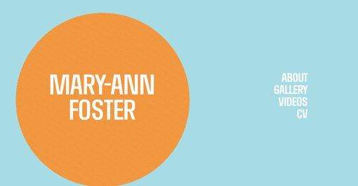
Mary-Ann Foster
You would think a single giant circle would be pretty lame, but I actually love how this site looks. The colors saved the day here and bring in a lot of interest.
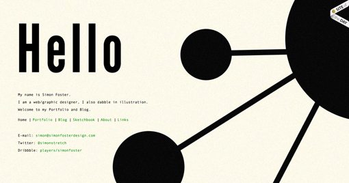
Simon Foster Design
An abstract shape with strong lines and lots of contrast makes for something that you can’t help but stare at.
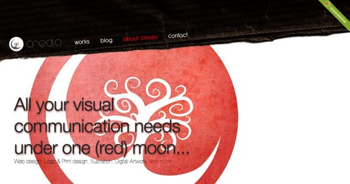
Crealo
The text here is too difficult to read in my opinion, but the large graphic makes a strong statement.
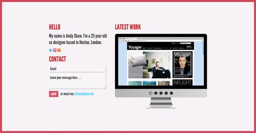
Andy Shaw
Peaxl

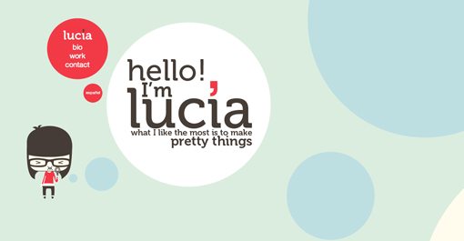
Lucia Soto
You’ll noticed circles used heavily in this type of design. I think one reason we see this is because they’re harder to work into more traditional styles.
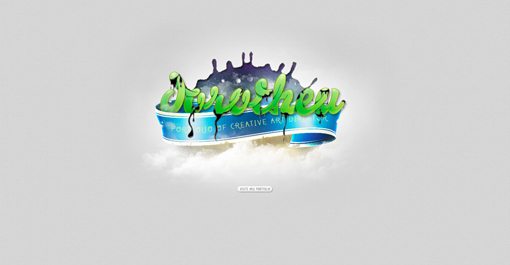
Dorotheu
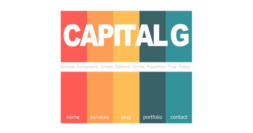
Captial G
I love the simple and fun statement made by the color bars, which double as the site navigation.
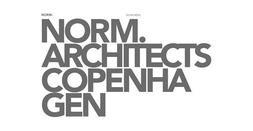
Norm.Architects.Copenhagen
Big, bold type is almost always attractive. Here you’re letting the font artist do all the work by providing you beautiful elements to display.
Martha Kelly

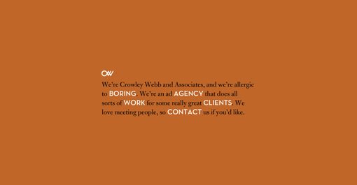
Crowley Webb and Associates
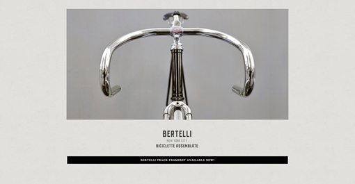
Bertelli • Biciclette Assemblate
A strong photo can be among a designer’s most powerful assets. Floating one nearly all alone on a page can make for a really dramatic design.
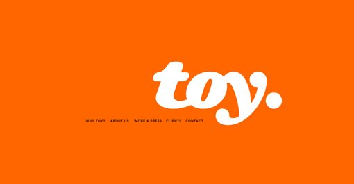
T O Y
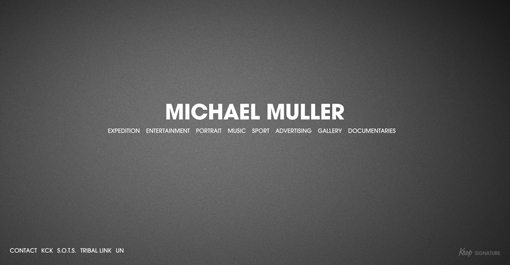
Michael Muller
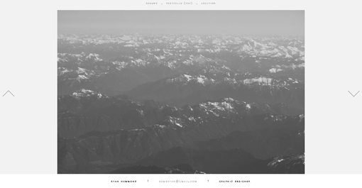
Ryan Hammond
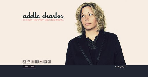
Adelle Charles
Adelle’s site is awesomely clever and really showcases both her personality and style. If you’ve got some really great photography of yourself, go build a personal portfolio using it as the hero.
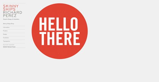
Skinny Ships
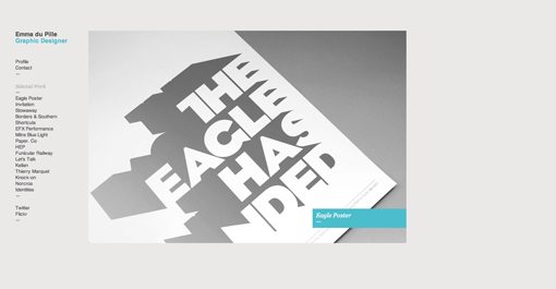
Emma Du Pille
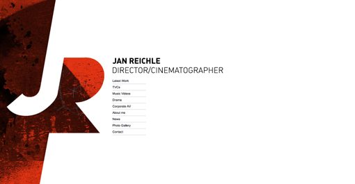
Jan Reichle
Check out that use of negative space. The choice of color and texture is really attractive as well.
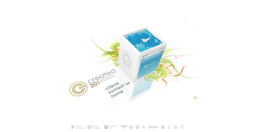
CREATED 201 Studios
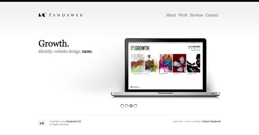
Pandaweb Studio
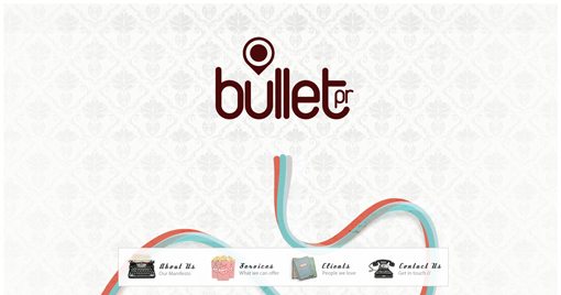
Bullet PR, Brighton PR company
Ricardo Gimenes
Ricardo is a rockstar in my book. His homepage is super simple and just features a fun little self-portrait with a laundry line navigation area.

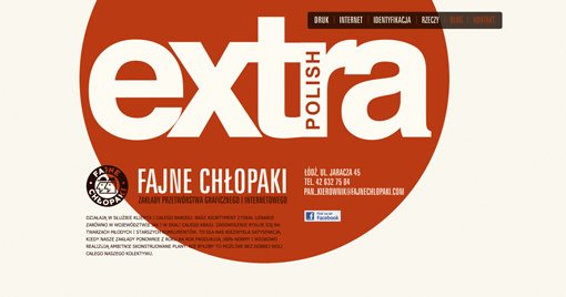
Fajne Chłopaki :: Portfolio :: Studio graficzne
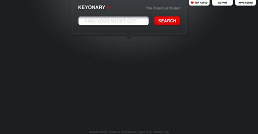
Keyonary+ The Shortcut finder!
Show Us Yours!
Leave a comment below and let us know what you think of the brilliantly simple designs above. Also be sure to leave a link to your own designs so we can check them out.