6 Tips for Designing Signs and Billboards
Your next project assignment: designing a sign for an upcoming event. It will be displayed on billboards around town and printed on smaller yard signs as well. If you are already panicking at the idea, don’t worry — designing a sign is not much different than any other project.
The big difference is scale. It’s going to be a lot larger in size than what you might be used to. Other things to think about when designing signage are location, color, typography, contrast and material the sign will be printed on. Thinking about each of these factors in advance can make for a better sign design experience.
2 Million+ Digital Assets, With Unlimited Downloads
Get unlimited downloads of 2 million+ design resources, themes, templates, photos, graphics and more. Envato Elements starts at $16 per month, and is the best creative subscription we've ever seen.


Think Size and Scale
In most cases, a sign will be among the largest things you ever design. Think of it like this. A standard business card is 3.5 inches by 2 inches; a standard yard sign is 24 inches by 18 inches; a standard bulletin billboard (like those along highways) is 14 feet high by 48 feet wide.
Size and scale can present some interesting challenges. But many of the concepts you use are just like every other project. (Good design is good design in any location.)
Don’t think about the size of the project other than to create a canvas. It is more important to think in terms of scale. Signs have to be read and understood from a distance, often by people who only have a few seconds to look in that direction. So everything should be big and simple for maximum impact.
Consider Location
Just as important as knowing how big a sign will is big knowing where it will be located. While you may not always have a specific answer or physical address, think about it in terms of primary placement.
Will the design be featured in the sky, such as a billboard; on the ground, such as a yard sign; on a moving vehicle, such as a wrap or magnet; will it be indoors? Does the sign have a border (and is it thick or thing)? Then ask what color background is present in this location. It will help you select a color palette that contrasts with the environment.
Location also plays a role in determining other factors about signage. There may be local rules as to the types of messages, images or words on a sign as directed by the local government. Always make sure to check code and regulations in your area before getting too far along in the process.
Designing for location can be tricky if a single design is going to be used in a variety of different environments. Plan your signage for the most visible and highest traffic areas first, and consider multiple versions of a similar design.
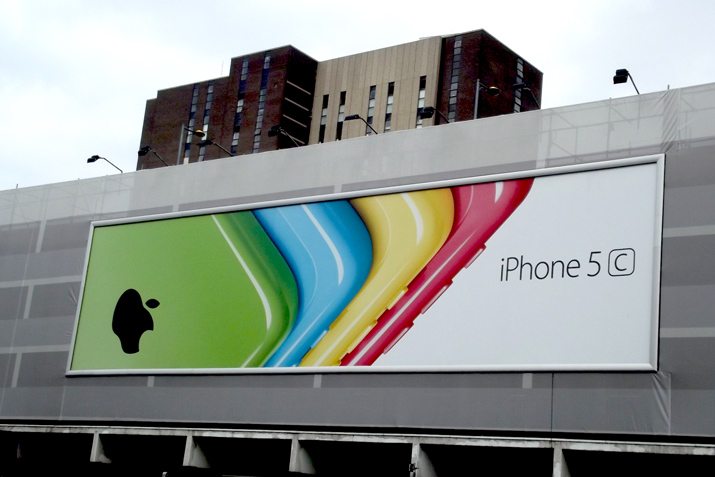
Go Big With Color and Graphics
Color can be one of the most important design decisions you will make when working on a sign project. You need to approach it with two things in mind.
- Branding and identity
- Contrast and visibility
Sometimes these two concepts will get in the way of each other. Generally graphics and color in general should be bright and saturated. Avoid light colors or pastels. Opt for colors that have a lot of contrast, especially between the background and images or text.
In terms of images and graphics, pick a single element and go big with it. Your design has to catch someone’s attention in a second and a single, simple focal point will help.
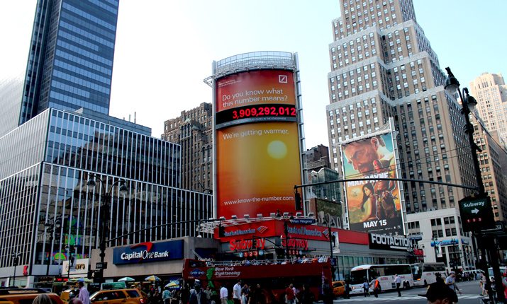
Now let’s combine this with location. Consider this: Your sign is on a billboard nestled in a bunch of evergreen trees along the highway. If the background of the sign is also green, or of trees, how visible will it really be to passersby?
Plan color and graphics accordingly. One of the “old school” rules of billboard design is to “never use a blue background.” That’s a little extreme, but a sky blue background might be a bad idea.
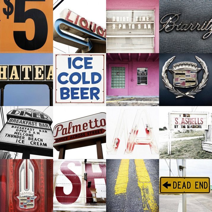
Simple Typography and Message
When it comes to type, keep it simple. Aside from the company logo, pick a single typeface. Opt for a sans serif with uniform and medium to wide stroke widths.
And make it big. Think about lettering in terms to 10 to 100. That is 10 inches of letter height for every 100 feet of visibility.
Then consider the total number of words. The message should be as simple as the typography. For the greatest impact, signs should not contain more than 15 words. The industry formula is typically referred to as the 3 by 5 rule. It breaks down in two ways:
- Three lines of text, up to five words each, or
- Five lines of text, up to three words each
If the words are long, decrease those counts.
Other typography considerations include the use of bold or italics. Bold lettering can help aid in readability from a distance. Just make sure letters are properly kerned so that there is no confusion from a distance. Italics are troublesome and can be difficult on the eye; avoid them on signs.
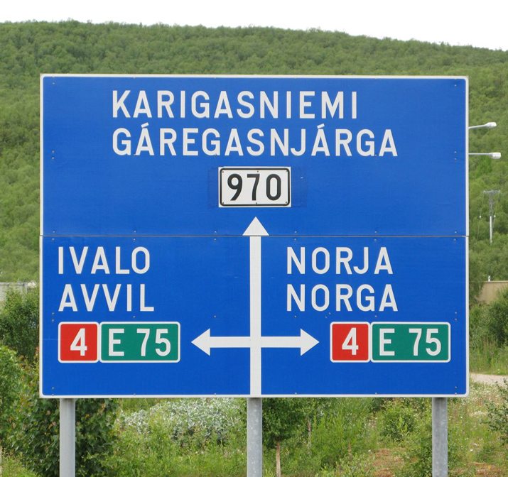
Contrast Matters
While contrast is an important part of any design project, it is especially important when you only have a couple of seconds to catch someone’s attention. Every focal point needs to be clearly distinguishable.
With type, size and simplicity are key factors. With color, it comes back to pairing hues that stand out from one another.
While there is no perfect set of color combinations for signage and contrast, there are a few that stand out as being easy to read from a distance. (You’ll probably recognize many of these combinations on signs all around you.)
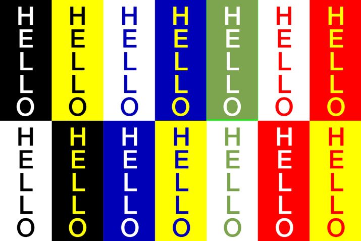
- Black and white
- Black and yellow
- Blue and white
- Blue and yellow
- Green and white
- Red and white
- Red and yellow
To create even more contrast between the sign design and environment, consider a boarder for your design. A simple, thick white or black box encasing the sign image can help set it apart from almost any other condition. In essence, you have created contrast between the environment or sign display enclosure and the message itself.
What Is It Printed On?
Part of the design of a sign should focus on how the sign will actually be printed and they type of material it is on. This can impact every choice you make along the way.
Sign materials often break down into categories based on location (indoor vs. outdoor materials), durability and print vs. digital. Some of the most common sign designs include working on a vinyl banner, billboard (print or digital), corrugated plastic and magnetic. But the sign medium can vary depending on use.
Ask right away what the sign or signs you are working with will be printed on. Get the specs before getting too involved in a project. Ask about file formats and prepress. (You are not going to be able to supply a jpg for a printed billboard, but it might be required for a digital display.) Finding out what your printer needs before getting started will save a lot of headache in the end.
Conclusion
Sign design requires simplicity, contrast and attention to size and scale for the most impact. Designing something on the scale can also be a lot of fun. It’s a design project that you might find yourself driving by each day or that you can share with friends and family.
You should approach sign design like almost any other project, and if the area is new to you, ask plenty of questions before you get started. Some designers feel that sign design can be overly simple with the first couple of projects and want to do too much. Sign design is simple; it needs to have high contrast, be easy to read, visible from long distances and catch peoples’ attention in a matter of seconds.
Image Sources: Elvert Barnes, Oran Viriyincy, Ralf_H, Elliott Brown, Paul Wilkinson and Thor.