8 Image Mistakes to Avoid on Your Website
Big images, galleries and photo-heavy designs are a big trend in web design. To make the most of this aesthetic, you want to make sure every image on your website fits the display and represents your brand well.
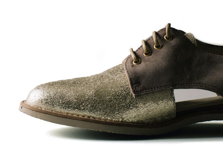
There are a lot of mistakes that designers make along the way, from technical issues to image quality. But you don’t have to fall into one of these traps when working with website images. Here, we will take a look at image mistakes and how to correct or avoid them altogether. (As a bonus in this post, we are featuring a collection of fun and great images from Death to the Stock Photo’s recent objects collection.)
2 Million+ Digital Assets, With Unlimited Downloads
Get unlimited downloads of 2 million+ design resources, themes, templates, photos, graphics and more. Envato Elements starts at $16 per month, and is the best creative subscription we've ever seen.


Mistake: Uploading Huge Files
Full-size images are beautiful (and necessary) when it comes to print jobs, but can case problems when it comes to the web. Large images load slowly; slow load times cause users to abandon your site.
Unfortunately, it is an easy trap to fall into. Many backend programs allow the upload of large images and unless you are paying attention, you might not even know that files are being uploaded at incredible sizes. Different images in different uses require different image specifications. Refer to your brand or website guide so you know what the dimensions of common image areas on your site are.
When thinking of images, file type matters as well. Please don’t use a tiff for the web. The most common and usable file formats are PNG (computer-generated images like charts or logos or when transparency is necessary), JPG (photos) or GIF (animations).
Solution: The simple solution is to size images for the dimension of the frame where it will appear at a proper web resolution. But there’s a little more to it. Save each image for optimal use on your site and for social sharing. (The width of a Pinterest image for example is 600 pixels; if you want the image to be shareable, it should be that size.)
Mistake: Forgetting to Crop

While using huge files can bog a site down, so can using full-frame images that are hidden on screen. Cropping helps showcase the visuals you want users to see by creating a defined focal point that might not be there with a full-frame image.
Lack of image cropping can also create a less-than-dynamic stack of visuals that all have the same shapes and aspect ratios. Using multiple crops and interesting shapes for images can add visual intrigue to a website.
Solution: Crop images to the appropriate size or dimension before uploading so that every image renders as desired.
Mistake: Forgetting About Thumbnails

There are a number of ways to handle thumbnail sizing and resizing. (Many of which depend on your backend capabilities, so we won’t argue the merits of each.) But you do need to remember to update and pay attention to the smallest images on your site.
Too often designers forget that thumbnails, image previews and favicons will need to be updated with changes to website content.
The other major mistake? Using a poor image at thumbnail size because that is as big as it can be. If the image is bad, just don’t use it. No image is better than a poor image.
Solution: Make sure to remove old thumbnails or previews when images change and that your favicon is current.
Mistake: Unsearchable Names and Meta Data
Digital cameras save a lot of information in various meta fields that does not translate to the web. Strip this information from images and swap it for usable data. Search engines can’t read the content of images, so to make them searchable images must include descriptive words in the title, alt tags and surrounding content.
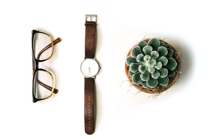
Examples of poor image names:
- picture1.jpg
- DSCN00023.jpg
- glasses%and%watch.jpg
A much better image name includes a few descriptive words such as glasses-and-watch-and-plant.jpg. The alt tag reference for the image should include a similar description, such as “items on a counter glasses, watch and a plant.” (And make sure to spell words correctly.)
Solution: Use strong naming conventions for all website images and pair images with content that relates to each visual. Image names should include descriptive words separated by hyphens.
Mistake: Improper Scaling or Stretching
Nothing looks more strange that a person with a stretched face or an image that is improperly scaled. Stretching or non-proportional scaling of images (which can be especially common when a theme or back end change occurs) is a no-no. Every image need to be scaled with a ratio of 1 to 1, vertically and horizontally. Anything else damages the integrity of the photo.
Solution: Watch all scaling proportions closely and audit your site periodically.
Mistake: Not Planning for Multiple Device Sizes
Responsive design frameworks come with some implications for images. The change in shape or size from device to device or by orientation makes it important to dictate how images will render across devices.
One of the most common practices is to use media queries to plan for these changes by device. The CSS allows for specific styles to be applied to images based on screen dimensions and helps images rend well without “breaking” the design.
Solution: Use media queries for responsive frameworks and test image rendering on a number of devices.
Mistake: Ignoring Retina Screens
There was a time not all that long ago where a standard image of 600 pixels wide at 72 ppi was all you needed for a website. But screens are improving at a rate where that is just not the case any more.
Depending on your framework, every image may actually include multiple images saved for different screen sizes and resolutions, including retina displays. (The resolution of retina displays can vary by device but are significantly higher than standard displays.)
Solution: Include files and media queries that are specifically for retina displays. (CSS-Tricks can help.)
Mistake: Overused or Generic Art

Stock photography can be a great quick fix but can lead to some unintended consequences. Photos that are used on too many websites or that just have a generic look and feel to them will not create a visual that establishes a connection to users. (You don’t want your website to look like every other one out there do you?)
If you plan to use stock photography, consider images that you can edit or work with in interesting ways. Avoid images that look like things you have seen in other places (check out the images for all competitors or similar sites).
Solution: Consider hiring a photographer to create a great image file specific to your website. Include visuals that relate to your company or brand and reflect your site in the right way.
Conclusion
Selecting and creating images for a website project can be one of the most fun parts of the design process. Take care with every image and pixel to ensure that your site runs well and includes images that will engage users.
Do you have any tips or tricks when it comes to using images for website projects? We’d love to know what they are. Share them in the comments.