Check Out the New American Airlines Logo
American Airlines has had the same logo for forty-five years. That’s definitely a pretty impressive stretch! They’ve decided to hang up their Helvetica though and look to not only a new typeface, but a new eagle and even a new livery design.
Read on to see the logic behind the new design and whether or not I think it’s another chapter in a long line of recent brand redesigns gone bad.
The Ultimate Designer Toolkit: 2 Million+ Assets
Envato Elements gives you unlimited access to 2 million+ pro design resources, themes, templates, photos, graphics and more. Everything you'll ever need in your design resource toolkit.


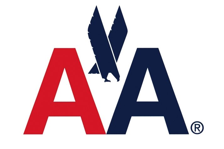
The Old Logo
The American Airlines logo that we’ve known for decades is shown below. This iteration was designed by Massimo Vignelli and has been the core of the company’s image dating all the way back to 1968!
To get a little historical perspective, DesignBoom posted a great logo evolution timeline, shown below. Here you can see the natural progression from a more ornate style to the simplified, streamlined logo that we know today.
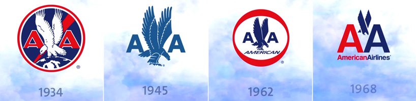
image source: DesignBoom
I’ve actually always liked the ’68 American Airlines logo. It’s simple, attractive, features the three core colors that scream America (really the white is only implied here), and has a unique, stylish eagle to top it all off. It doesn’t get any more American! It’s such a solid logo that I’m not sure a complete redesign was entirely necessary, but they stuck by their brand much longer than most companies so I’ll forgive their desire to scrap it all and start over.
The New American Airlines Logo
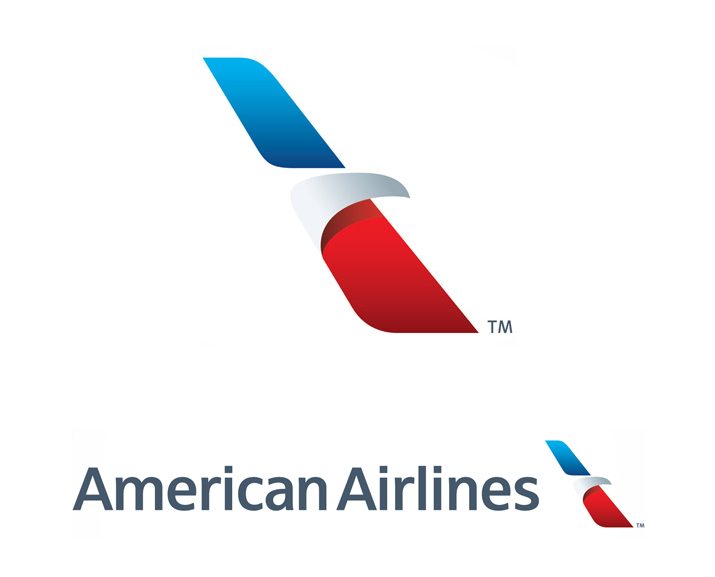
For 2013, American Airlines looked to FutureBrand for a complete redesign of their corporate identity. Here’s the logo that they came up with:
Before we start arguing over whether or not this new design ruins the integrity of the brand, let’s judge it as a standalone piece.
Shape
For starters, the shape (which they’re calling “the flight symbol”) highly suggests the tail of an airplane, which is perfect for an airline. They don’t take the metaphor too far, but it’s blatant enough that few will think of anything else when they see the shape.
Interestingly enough, American Airlines never even mentions this resemblance in all of their discussions of the new logo. Instead, they bring up three other factors about the shape: the eagle, the star and the “A”.
Obviously, the new logo is an abstraction of an eagle in flight, which I think is extremely well done. It’s subtle and sleek. If you’re comfortable in analyzing negative space, the uppercase “A” is a nice little surprise once you get your brain to see it. The star is the trickiest of all. The way I see it, the eagle’s head doubles as the rightmost point of the star.
Colors
Next up, the colors. Thankfully, we’re still showing off that American pride with red, white and blue. All three of these colors have a gradient applied now though, an interesting choice given that current trends are leaning towards flat. The gradients are well done though, they look sleek and attractive as opposed to cheap and trendy. I think they’ll hold up decently over time.

It’s also interesting to note that a fourth color was introduced here as well: the letters take on a different shade of blue not seen in the 1968 logo. It’s a little closer to the color we saw in the 1945 version of the logo.
Type
I’ve seen a lot of people complaining about the new typeface, but no one actually states what it is that FutureBrand is using. I’m going to go out on a limb and guess that it’s some variation of Frutiger (feel free to correct me if you know better). The letter shapes here seem right in line with the new logo. The boldness seems somewhere in between Roman and Bold.
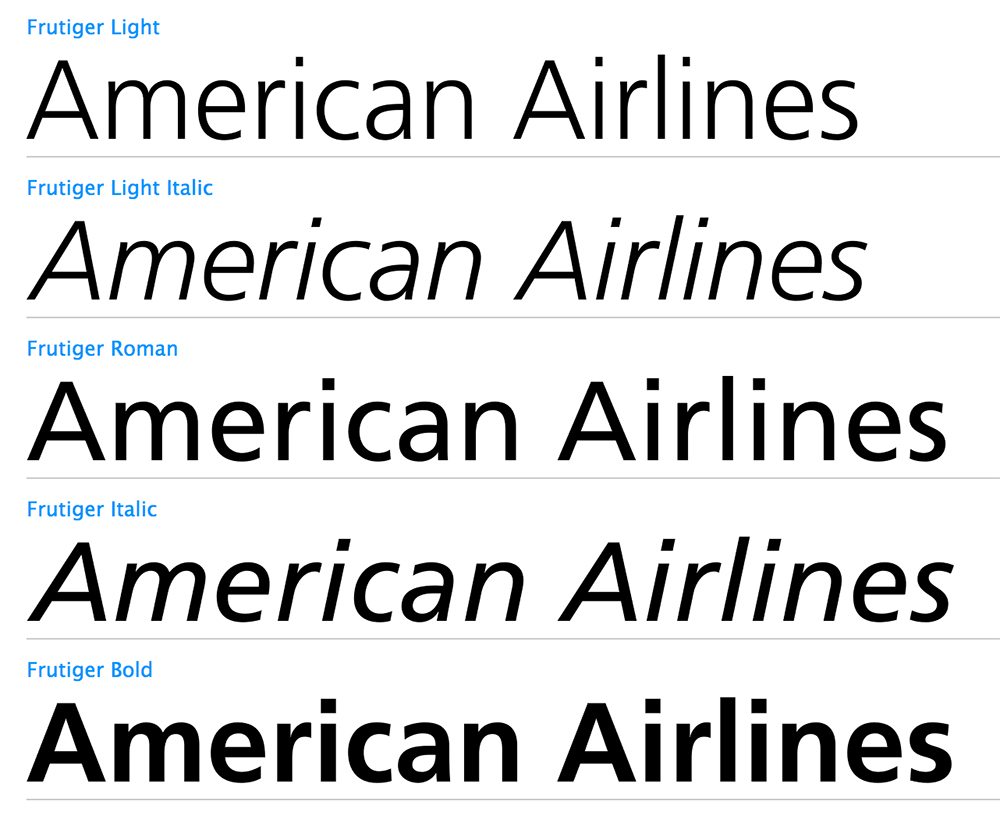
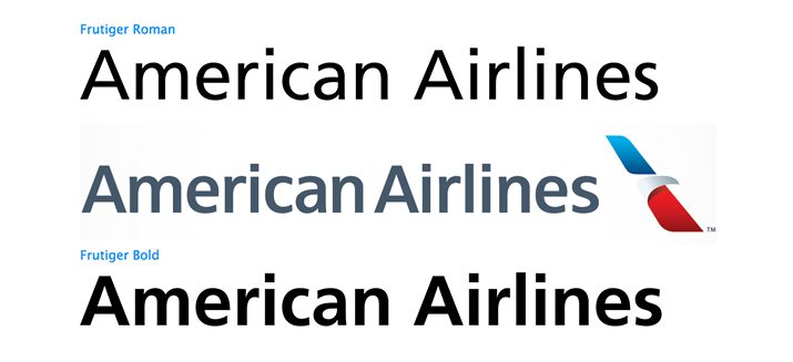
As you can see, the “c” and the “e” aren’t quite right, but it’s the closest typeface that I could find. Personally, I think the type choice is just fine. I’m not particularly excited about it but I’m also not one of these designers who screams for blood as soon as someone decides to not go with Helvetica. Chill out folks, Helvetica is awesome, but it’s also so ubiquitous that there’s absolutely nothing unique about it from a branding perspective.
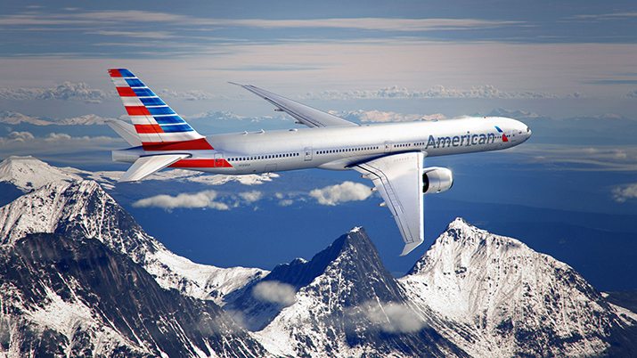
Livery
Along with the new logo comes a new design for the graphics on the side of the plane, which are referred to as the “livery”. Where the older planes simply had the logo on the tail, the new design features an abstraction of the American flag. Many are complaining that it’s not a straight up American flag, but I like this unique spin on the idea and I think it makes the concept more “own-able”.
Did They Ruin Their Brand?
There’s a lot of debate surrounding whether or not this is a successful rebrand. Keep in mind that I write a lot of these rebrand reviews and I’m a pretty fierce critic. I trashed the new Arby’s logo and hated the Florida Marlins refresh. I’ve also chimed and voiced my hatred of a few almost disasters like Gap and Tropicana.
That being said, I like what FutureBrand has done here. Again, I’m not fully convinced that a new logo was even required, but given the request, I think they’ve done a great job. Obviously, hardcore fans of Massimo Vignelli are adamantly opposed to this viewpoint and absolutely hate the new brand. In fact, Vignelli himself openly disdains it.
Personally though, I think a lot of this defense of Vignelli’s design is unwarranted. Let’s put it into perspective by examining the logo that he really created:
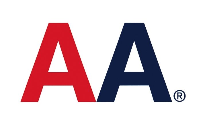
Yep, that’s it. Vignelli actually refused to put in any kind of eagle. All the guy did was type out two iterations of the Helvetica uppercase “A”, make one red and one blue, and call it a day. You can use words like “brilliantly simple” and “genius”, but you know dang well that you’ve cried foul at the million other brands who have tried this recently.
Granted, Vignelli did it before it was cool, but I’m still not going to bow to the genius of anyone who types out two letters in a font that he didn’t design and call it a logo. The eagle is a huge part of what made the ’68 logo work and Vignelli didn’t want it there to begin with.
Ultimately, I think the new logo and livery boldly and proudly communicate the concepts of American pride and freedom wrapped into a shape that instantly makes you think about an airplane. For that, I say “job well done.”
What Do You Think?
As I mentioned above, this redesign is pretty controversial so I’d love to hear your thoughts about it. Do you love it or hate it? Why? What are your thoughts on how it stacks up to Vignelli’s version?