Current Color Trends: Muted Pastels
Of late, you may have noticed a crop of new site designs have a softer and lighter look. After all the rainbow brights and even neon or fluorescent hues that have been so popular of late, it seems that some designers are taking a more subtle approach by using lighter or muted colors.
Although the same basic treatments are still being utilized — like colorized photography or color blocking — the new hues are making for a more refined and understated variation on these themes. Today we’re going to delve into this trend a little more, and explore various design examples and approaches.
The Ultimate Designer Toolkit: 2 Million+ Assets
Envato Elements gives you unlimited access to 2 million+ pro design resources, themes, templates, photos, graphics and more. Everything you'll ever need in your design resource toolkit.


Pastel Color Schemes Around the Web
Muted colors are the perfect solution if your branding calls for some softness and sophistication, but you still want to be able to take advantage of a multicolored palette. At the same time, pastels also look good when they’re layered tone-on-tone, making them an extremely flexible color scheme that works in quite a large variety of website styles.
Flat and Bold

While you often see the flat design trend being carried out in the brightest colors possible, in some contexts this approach can come off as harsh or even a little tacky. If the large fields in this digital security guide were executed in primary colors, the site would look a little too simple and unsophisticated. The pastel tones that were chosen instead help to make the flat design elements look more deliberate and polished.
Cartoonish
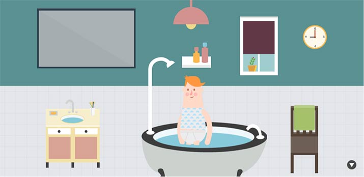
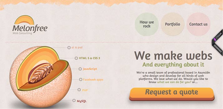
Certain combinations of pastels come off sweet and childlike, which makes them a great choice for an infographic, like the one above, with playful vector illustrations. This example has an unusually complex color palette, but all the various shades work together because they’re all dulled down, and the illustration style is so simple.
Colorized Photography
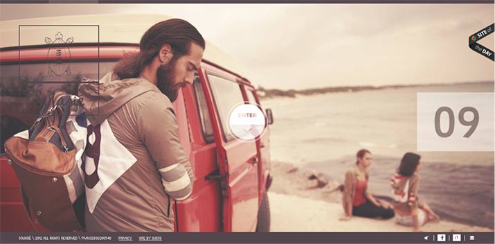
A more elegant application of pastels has been cropping up in sites like the one above, where full-page photos are tinted with warmly subdued hues. These tones evoke a sense of nostalgia and softness, which goes hand in hand with the brand positioning that this company is trying to create.
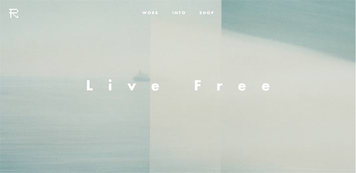
A similar example provided by this portfolio site shows how large-scale photography can work in this context almost like a simple texture; it’s an extreme example of how a washed-out color can carry such a minimalist design.
Offset Primaries
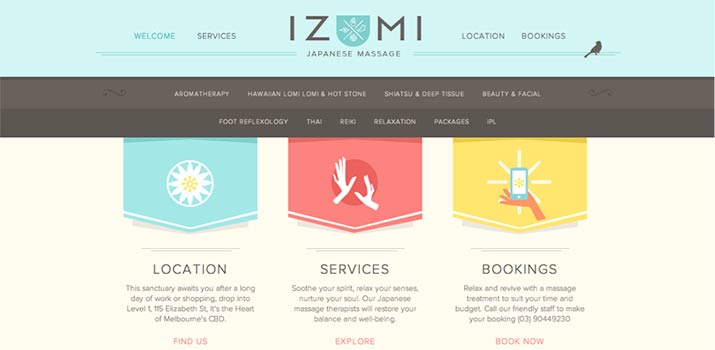
It can also be fun to play around with pastels and their relationship to the color wheel. Any pastel derivative of a basic color usually works just as well when you apply basic color theory principles, except that the look is more unusual, whimsical, and light. This massage parlor’s website uses a color palette of pastels based off of the three primary colors of red, yellow, and blue, and the result is a scheme that is warm and energizing, but doesn’t overwhelm.
Retro

Faded colors are naturally nostalgic, so it makes sense that pastels should figure prominently in a retro design. This bakery’s site relies as much on its palette of plum, pink, and light blue as on its cursive typeface to give it that distinctive retro feel.
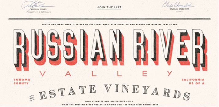
This vineyard’s website shows a very different example of the style by use of a look that is unabashedly a vintage revival. The combination of many different title typefaces along with the imitation of a duotone printing process is quite a specific look, but a good choice for something like a historic vineyard.
Monochromatic
Despite the fact that pastels are perfect candidates for being put into color combinations, they also function really well when in an analogous color scheme. This design studio shows how softly layered orange tones can make just as much of a statement as brightly contrasting hues can.
Minimalist
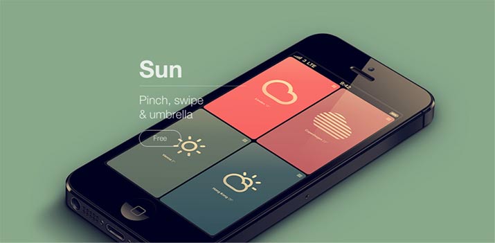
Sometimes all you need for a compelling webpage is a minimalist usage of a beautiful color palette. This weather app’s unusual combination of dull greens and blues with a punch of rich coral keep the site from looking humdrum, and the modern typeface adds just enough interest to intrigue the viewer to explore further.
Color Tools to Help Your Find the Perfect Pastels
As you can from many of these examples, it’s often the color palette that takes a site design from looking ordinary to unexpected and interesting. Should you need some help with pairing pastels, there are a few color choosing tools on the web that are well worth exploring.
Palettes
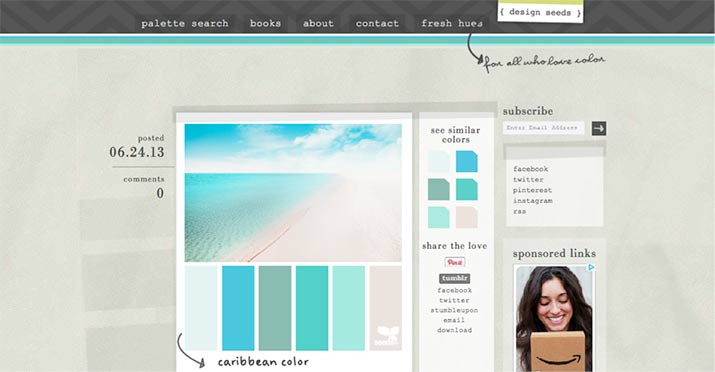
There are quite a few inspirational color palettes to be browsed through on Design Seeds. If you take a look at the site, it’s interesting to note the prevalence of muted pastels in all of its recent posts; yet another example of how this trend is picking up speed.
Imagery
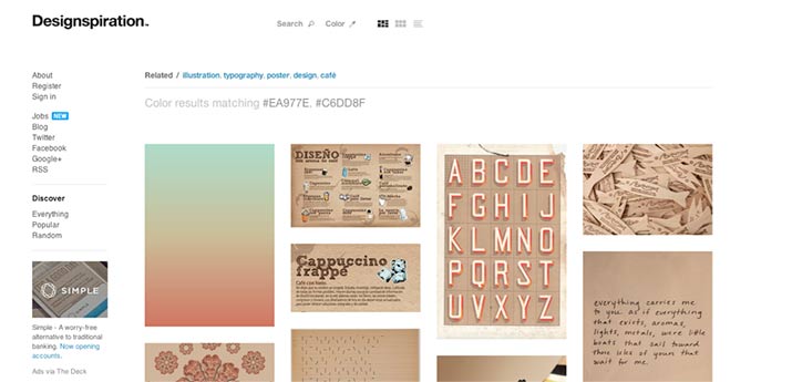
Try doing a color-based search on Designspiration to find tons of examples of that color combination working in a design. You can choose up to five hues from their color palette, so it’s easy to pinpoint examples of even very complex combinations.
Photography
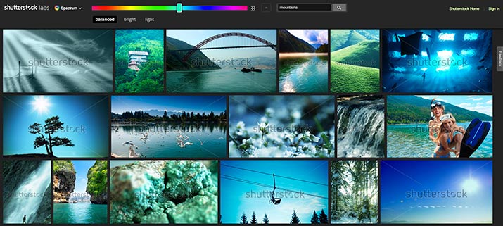
If you need some good photography to complement your design, you can also browse through Shutterstock Spectrum, which sorts through a huge image library by color, in way that’s similar to, but more specific than Designspiration.
Of course, a pastel color scheme isn’t the best choice for many types of sites. If you want an edgier look, then neon mixed with dark tones might be the right combination. For a site that needs to feel opulent and luxurious, burgundy and cream could be the way to go. But if you’re trying to find a palette that adds a quiet energy and warmth, adding interest without overwhelming the rest of the design, then a pastel color palette might just be a good pick for your project.