Designing Web Interfaces Scaled for Touchscreens
Gone are the days of convoluted javascript notation and countless plugins includes in your header. Layout design has taken a large step forward as we’re seeing designers creating some extravagant concepts. Touch screen devices currently hold the highest interest from a designer’s and developer’s point of view.
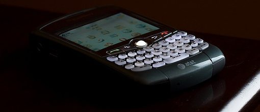
More people are using touchscreen enabled devices now than ever before. This includes tablet PCs and the entire list of mobile phone operating systems. These devices are all mobile and allow for access from most any remote location.
The Ultimate Designer Toolkit: 2 Million+ Assets
Envato Elements gives you unlimited access to 2 million+ pro design resources, themes, templates, photos, graphics and more. Everything you'll ever need in your design resource toolkit.


Designers are scaling their credibility back to keep up with high demand. But what is vital when changing between a standard web design and a touch screen app? There are many emerging trends among the design community which can be used to scale any idea into futuristic touchscreen technology.
Current State of Adaptation
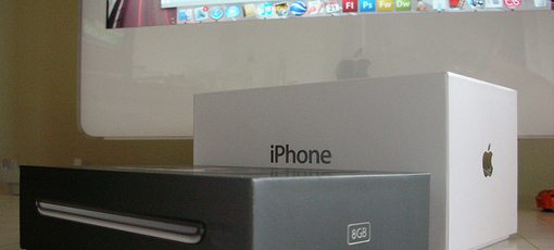
Although Apple’s iPhone and iOS are frequently discussed amongst mainstream media and tech gurus, they are not the only market capital in touch screen devices. Many portable laptops and tablet PCs have been released by 3rd party manufacturers including Hewlett-Packard, Samsung, and Microsoft.
Currently developers must look at touch screen interfaces as new devices aside from the standard keyboard and mouse. Traditionally this has been completed with JavaScript calls or media queries resulting in complex return data. There has to be a better way towards adopting these new trends.
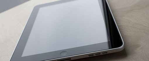
As an example we can compare an Apple iPad with any netbook running Google Chrome to immediately notice differences. Although their screen sizes may be similar they operate on two completely different levels. Even the operating systems themselves are vastly different and support new computing standards.
The Gains and Losses
With touchscreen interfaces we are gaining a lot of flexibility. Designers are able to place buttons and scroll wheels anywhere in the page since it’s all accessible with a touch or flick.
Developers are also able to fully control the functionality of applications. The Cocoa SDK for iOS development offers many classes reflecting touchscreen interactions. Developers can check for multiple fingers and even pressure sensing between each interaction.
However we are also losing many key design credentials we’ve all grown to love. As an example there is no need for hover states when dealing with a fully touchscreen-based interface. This could be replaced with an action state whenever a user is actively pressing an element, though the purpose is vastly divergent.
The lack of any mouse also presents a problem for input. Scrolling and flipping between pages must be smoother and easier than most apps since there is a reduction in functionality. Keyboards are also built into the tablet or handheld screen which offer a radical new feel to the user experience.
Group Common Elements Together
Clustering elements is a good practice in layout design for touchscreen apps. By cluster I don’t mean cram all the buttons and elements on a page into the top right corner. In actuality design a map for each view and calculate which information is best suited for which view.
This reduces frustration and confusion on the user’s end. When looking for settings to update account information it would be easiest to find all of these in one screen panel. This is often the case with web apps as well, though the interface is usually set up for mouse interactions.
Instead of creating one long scrolling collection of data mobile OS’ offer unique advantages. With most touchscreen devices you can create tabs within each app view. These offer a simple way for users to switch between settings and other data without too much effort. This tab bar could be compared to a navigation bar full of page links in a classic web interface.
Plan for Countless Mobile Systems
It’s great to consider your website works with full HTML5 and CSS3 specs, but this doesn’t solve many common issues among touchscreen interfaces. Provided whichever browser is parsing your page runs with the most common DOM standards, you’ll be fine.
Though Google Chrome for desktop runs a parsing engine heavily varied to that of mobile BlackBerry or Opera Mobile. In fact for each of the major mobile carriers we are seeing many new browsers.
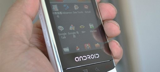
iOS comes with Safari by default but many more are contained in the App Store. All modern software browsers for mobile platforms contain the ability to check for HTML5 notes and attributes. If possible you should consider testing out each layout version of your site on the major touchscreen cases. Browsers between Android, Microsoft Mobile, and BlackBerry will all differ and require thorough planning.
Of course it’s impossible to please everybody all of the time, but majority is certainly a goal worth reaching for. Implement an installation of Google Analytics or another statistics app onto your site which will parse each visiting device.
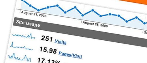
Google offers incredibly detailed report data such as which mobile browsers access your website the most frequently and how many pages each visits on average.
Leave no Stone Unturned
This can also be coupled as general design knowledge, but ensure every element is on track for each touchscreen layout. When looking back on a prototype or mobile interface we as designers often try changing and re-positioning things to death.
It is important to realize with touchscreen interfaces there is much less room for free movement. Thus it is important to find a layout which works best and still provides the easiest user experience – and then stick to it!
It can be difficult, but trust your gut and design sense for knowledge of when to call it a day.

Consider testing out your design on a few of your friends or family members. A quick demo or run through of the application and user interface from an outside perspective will usually garner helpful feedback and offer critiques from a fresh set of eyes.
Conclusion
As touch screen devices continue their invasion we will notice a surge in app development. This is a huge market not just including Apple’s iOS devices, but Google and Microsoft are also launching campaigns to gather their share of the mobile web.
The comparison between each of these devices varies and will prove different from every designer. If you’d like to check out more ideas on this topic consider expanding your thoughts on touchscreen websites to see what is out there. Touchscreen web interfaces are evolving and as the design community evolves with them we’ll see innovative UI inspiration like never before!