Designing With Circles: Tips and Advice
Once shunned by designers, circles seem to be making a comeback. The perfectly round shape – and its oblong counterparts – can be difficult to work with. The shape does not stack as well as the more standard rectangle and creates a much different overall feel.
The circle is a perfect shape, meaning that it is the same no matter how you look at it. It is complete and in harmony with nature – consider how many natural elements are circle-based. So, as a designer, how can you make circles work for you?
2 Million+ Digital Assets, With Unlimited Downloads
Get unlimited downloads of 2 million+ design resources, themes, templates, photos, graphics and more. Envato Elements starts at $16 per month, and is the best creative subscription we've ever seen.


Basic Circles
Circles are familiar and safe. What’s inside a circle is “protected” from the outside and what’s outside a circle can be restricted from getting close to a circle’s contents. The shape is interesting and a point of attraction.
These are all great reasons for considering the use of circles in design. But circles can also be tough to handle because they can create odd spaces and may not work well with other design elements. The use of a circular theme must be well-planned, designed and executed.
In addition to the traditional circle, we are also beginning to see more rounded shapes in general in design projects. Oblong shapes, almost-rectangles with dramatically curved edges – these elements all take on meanings of their own. So we will focus on the perfect ring and its recent popularity in design projects.
Meanings of Circles
There are many associations connected to circles. They are fluid, and connected to movement and mobility (think about the wheel). Because circles are a part of the natural world – the shape of the moon, flowers, fruit – the object is considered real and represents life.
In addition the curves of a circle can be comforting and are associated with energy, power, harmony and infinity.
As designers, we are all very used to seeing the color wheel, one of the most recognizable circles in the design world. It works because it combines all the traits above to create an object that communicates information in a simple, powerful, harmonious way. Circles are complete and create emphasis.
Circles in Web Design
Circles, once seldom used in web design, are becoming a more popular option. (Years ago it was difficult to create rounded shapes in CSS, but that is no longer the case.) So what are some attributes of a great website design featuring circles?
They are often used in one of five ways:
As a dominant shape or frame.
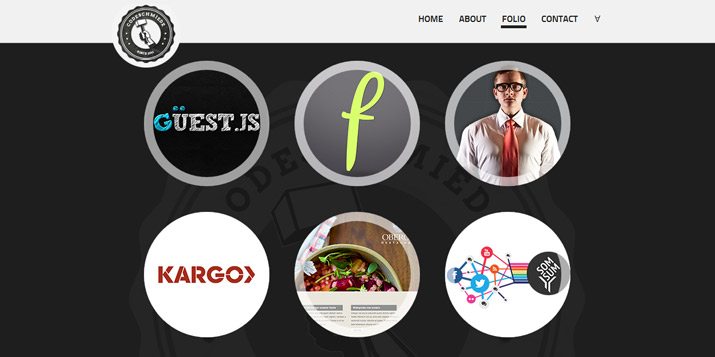
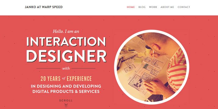
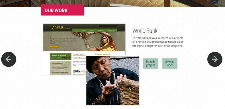
Rather than rectangle for images, some designers are using circles. Circles may also be used for logos or buttons. While a circle can create interest, it can create a dilemma when it comes to cropping and space. Does the image fit inside the circle? (Cameras don’t take round photos.) Do the circles have enough room to stand on their own so images are not jumbled? Circles as frames are most popular in portfolio design, to show a “slice” of work without showing the whole thing.
As user interface elements.
A round button is a familiar thing. You know to push (or click) it to make a selection, making circles a popular choice for calls to action. Circular UI elements are most popular when used sparingly.
As a background.
Because of the innate harmony associated with the shape, circles are easy to use as a background pattern. They create a sense of flow and calmness. Circular backgrounds can also help bring focus to the elements they surround, such as an icon that lives within a circle.
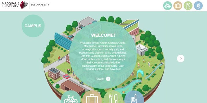
As a graphic information tool.
Circles are a common tool to show how things are both different and similar based on the notion of where shapes overlap. This is a common tool for showing different types of data and information.
To create interest.
Sometimes the whole idea behind using a circle is just to be different and make something stand out from the crowded landscape. Circles are a great way to create visual interest. But be careful, using too many circles can create a look of instability or chaos because every element is begging to be seen.
Circles In User Interface Elements
As user interface tools, circles seem to work best when used as part of an overall minimalistic design scheme. They need room to breathe, be identified and make sense to users. When used in this way, circles can be a nice alternative other types of navigation.
Take Gravitate Design, for example. Circles are used for one distinct purpose – to navigate left and right. All of the other buttons are rectangle. What the circles do here is show that you interact with the site in a way different than you might expect. (In this case the site scrolls up and down but also panels side-to-side.)
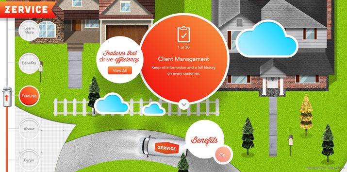
Zervice also uses circles for buttons and navigation but in a much different way. Left-hand navigation uses “push-buttons” to get you from one page to the next. In addition the site features circles to house all of the text against a busy backdrop, so you know exactly where on the screen to focus.
Circles in Apps and Mobile Design
Circles in apps can be a lot of fun as well. I am currently addicted to Hundreds, which is a game of nothing but circles. And the game has practical application for designing with circles – they need space to work well. In the game, circles of different sizes move on the screen; if they touch, you lose. It’s the same idea with design. Circles need their own space to be most functional.
Using circles on smaller screens though can present a challenge. They have to be big enough to read or see with ease and if a circle doubles as a button, it must be large enough to tap.
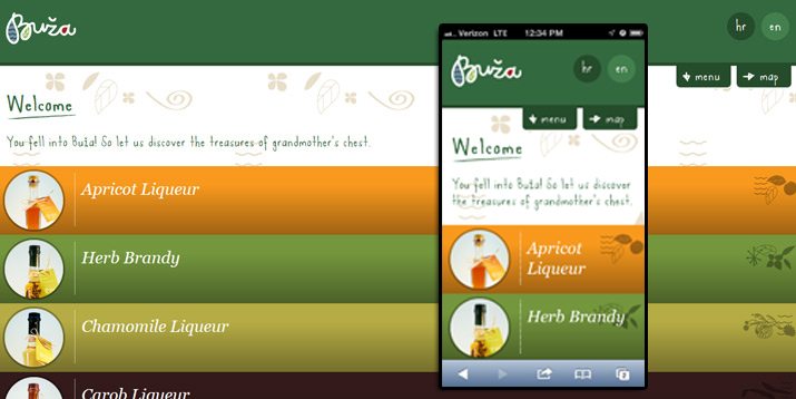
Buza uses circles as buttons for sales. They are large and isolated, making them an easy place to click (or tap).
Circles in Other Projects
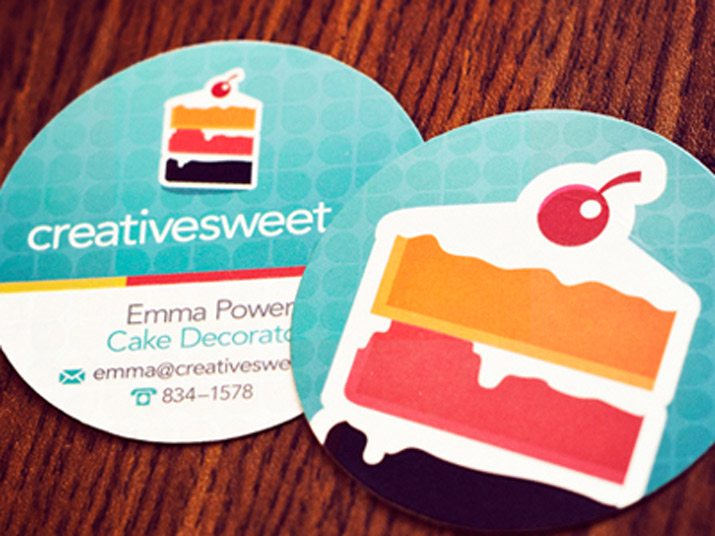
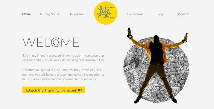
Circles are also a popular choice for logos and shapes on business cards. (This is not surprising since we see many of the same trends concurrently in digital and print design.)
The same reasons for using, or not using, circles apply to printed projects. But there is one additional consideration… printing. Unlike digital projects that are confined within a rectangular screen, you can actually create and design for a circular medium.
Flyers, stickers, cards and other materials that are cut to shape have the extra value of being different when used in a more unconventional way. This can bring extra attention to the project at hand.
Just be aware of what is inside the circle. Remember the shape is designed to contain something. Make sure the shape and visual imagery and words all create a unified message. This works in very much the same way as using circles as frames for images in digital projects.
Conclusion
So how do you get started with circles? There are a ton of great resources out there to help you imagine the possibilities, including one of my favorites, Creative VIP.
Not only does Creative VIP use plenty of circles in its design and interface, it is a gateway to great tools for designers. Right now, you can find great collections of circular icons, templates for app design featuring circles, landing page templates using rings, round sliders and even a few badges. (I am a member and love this resource, even if for nothing more than inspiration.)
Good luck getting started in circular design!
Image Sources: Life in My Shoes, Project Green, Janko at Warp Speed, We Love to Code and Creative Sweet Business Cards.