How to Choose Effective and Attractive Icons in Your Designs
Icons can be considered one of the universalities of web design; almost any website benefits from the addition of at least a few of them. So it’s tempting to assume that if you sprinkle in a handful of these little pictures, your job is done. But there’s a lot more to it than that: good icons should feel like they’re visually integrated into the group of images that they’re in, as well as into the site design as a whole. They need to have a conceptual clarity and purpose that goes beyond being mere eye candy. Any icon that doesn’t serve a stated purpose, or doesn’t convey the right concept in its imagery, is one that needs to be reconsidered.
Of course, there’s room for interpretation and generalization with any kind of imagery, but icons are not mere illustrations that are used purely to break up space and add interest: they’re visual metaphors that can invest meaning into a subject at a single glance; and as such, they’re a powerful tool for improving user experiences.
How Should You Use Icons?
Iconography can be a slippery subject, because it encompasses so many types of imagery, and can fulfill so many roles. Icons can be used for many purposes, but the two most common and important tend to be:
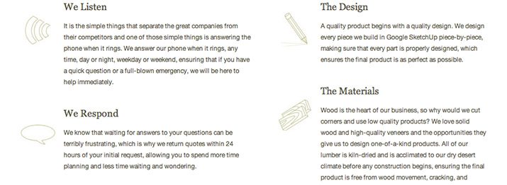
- Visual breaks in content: making it more appealing and readable. This application is often used in the body of the website, in lists (as seen above) or other text-heavy elements.
- Quick visual reference for a concept: This usage most often shows up in navigational elements (as seen above), and some—such as the magnifying glass icon that signifies a search—are so common that they don’t even need a text identifier.
It’s obvious that even just these two categories make for a myriad of ways and reasons to use icons, so you’re likely to see them in almost every element of web design: headers, footers, navigation bars, lists; practically any part of a design can be improved by the addition of well-chosen icons.
What Makes a Good Icon?
While it’s not difficult to see how icons are an essential component to almost any good website design, it can sometimes be hard to recognize when they’re not performing as well as they could be. Even a poorly-designed set of icons is usually preferable to a wall of text, but a beautiful set of meaningful icons, like the ones above, can do so much more.
Even though icon design is a complicated topic that changes with every new situation, there are still a few essential rules that apply to effective icon design across all applications: the two critical things to consider in any icon system are how to make icons both visually and conceptually effective.
How Do You Make Icons Visually Effective?
Icons do a better job of grouping related content and leading the eye to important information if they have consistent and considered relationships to the other icons in the set and to the site design around them.
Icon Sets Should Have Visual Unification
A group of icons that doesn’t have enough cohesion looks wrong, no matter how great they might be when considered individually. There are a lot of tricks that can create a sense of unity, including:
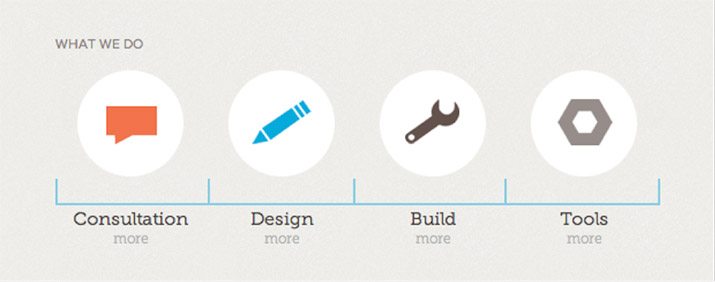
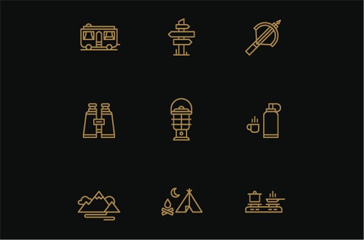
- Using the same color or color scheme, as seen above.

- Fitting all your icons into the same shape, as seen above.
- Styling your icons with or without lines or other border attributes, as seen above.
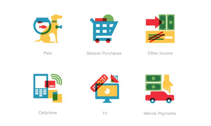
- Adding effects, such as gradients, transparencies, or drop shadows, as seen above.

To this end, it’s important to consider how you’ll adapt the style of your illustrations to fit the subjects. For example, you might want to represent your icons with a 3D effect, on an angle. But what if one of the icons in the example above needed to represent a gift card? An icon representing a card would almost certainly need to be two dimensional and so would ruin the effect that you’re going for.
The Larger the Set and Scope of Icons, the More Diversity They Should Have
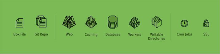
Although icons within one set should have a close conformity, you can bend and even break the rules when it comes to large sets of images. This website, seen above, is an excellent example that deals with the same-dimensionality issue, as they decided to embrace the different dimensionalities of its icons. The differences aren’t jarring because the two types are separated, making them into related icon systems that work well together without looking exactly alike.
On top of these small changes, the site diverges even more in the other icons you encounter, with some that have larger and more intricate shapes, and others that replicate the 3D effect, but in an entirely different style. However, these all still work well together because they preserve a few common elements, and they’re presented in instances that are separated enough to not overwhelm the viewer.
Icons Should Harmonize With the Rest of Your Site Design
Of course, there is an endless number of methods you can use to make your icons work with your other design elements. But on a basic level, the two most effective ways to go about it are:
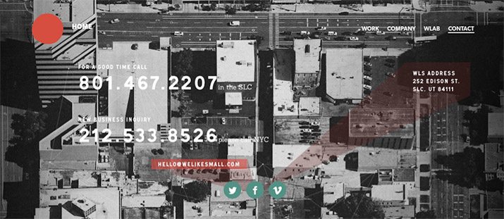
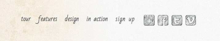
- Icons as a point of contrast against the rest of the site: This approach is particularly effective if the icons are navigational, like these social media links (seen above), because the contrast calls a lot of attention to them.
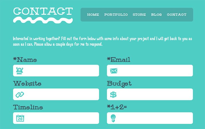
- Styling icons so they’re integrated with and similar to other design elements: This is a good option for images that are more about providing visual respite and clarity, and don’t need the extra emphasis that navigation elements might, as seen above.
How Do You Make Icons Conceptually Effective?
It’s important that icons play the right role in directing attention and adding to the aesthetic of a design, but it’s equally important that they are also logical and consistent in terms of the concepts that they communicate.
Icons Need to Be Easily Understood
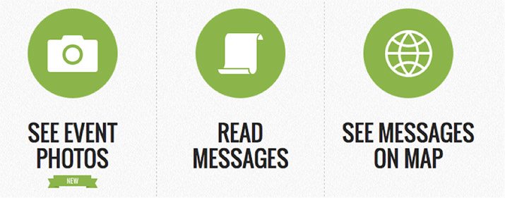
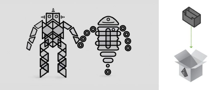
On the one hand, imagery can be difficult because interpretations are never absolute. But on the other, they’re far more manageable than words, because if they’re clear enough they can transcend language. The simple directives in which web design abounds are the perfect vehicle for universal communication, as seen above.

But sometimes designers try to put more complicated concepts into iconography, and the effect is confusing rather than clarifying, as seen above. In these circumstances, it’s good to take a step back and really try to distill the content down to its basic essence. If you can’t, that means an icon isn’t the right solution for that content. One of the best resources for finding clever iconography that pushes the boundaries of pictorial communication is infographic design, where the goal is often to make an icon out of every piece of information possible.
As web design grows and matures exponentially, so does icon design. Concepts that were once impossible to depict through iconography are rapidly becoming standardized, and being added to the web designer’s communication tools. With this push towards universality, it’s a safe prediction that icons will become an even more important part of design than they are already. And keeping these essential methods of use in mind, you’ll be able to take them on with all the artistry and clarity that’s needed to create beautiful, functional, and effective designs for any project.