Say Hello: 50 Simple and Effective Website Greeting Messages
Placing a large greeting message at the top of your site is a great way to create a welcoming environment and provides the perfect opportunity to clearly state your purpose for being.
Today we’ve rounded up over fifty such messages for inspiration on both the message and visual appearance fronts. The greetings has been divided up into clear categories so you can analyze the different popular techniques being used by designers today.
2 Million+ Digital Assets, With Unlimited Downloads
Get unlimited downloads of 2 million+ design resources, themes, templates, photos, graphics and more. Envato Elements starts at $16 per month, and is the best creative subscription we've ever seen.


Well Hello There
The greeting message is often the first thing that people see on a website. These types of messages are especially popular on personal portfolios but can be found across all genres of sites. The typical strategy is to create a large, attractive and attention-grabbing headline, often mixed in with some sort of graphic.
The tone can be friendly, comical, serious, or even self-righteous. Remember that in writing this message, you’re making your first impression on your visitor about the personality of your company. Needless to say, you don’t want to screw it up!
I’ve noticed several trends in how these messages are structured and have created a collection for you to browse through to find ideas for your own welcome message. It’s up to you to decide what you think will and won’t work with your visitors, but each of the categories below represents a tried and true method, usually structured to make visitors feel instantly welcome.
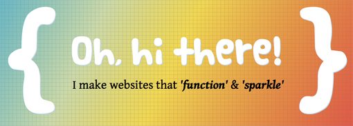
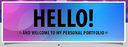
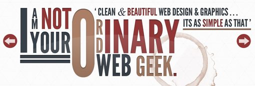
Hello
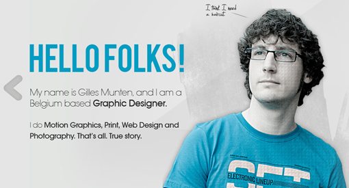
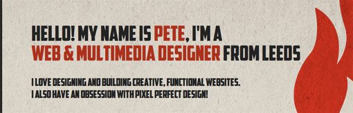
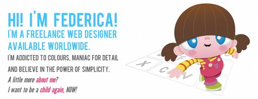
What’s more friendly that a simple “hello”? This is probably the most common trend that I come across and is simply everywhere in designer portfolios these days. The idea is of course to make the site seem that much more alive and friendly, as if it’s a person welcoming you in. This is often effective when combined with a photo or illustration of the designer so it’s clear who the message is coming from.
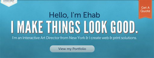
World of Ehab Aref Design
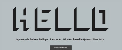
Andrew Zellinger
CMYK08
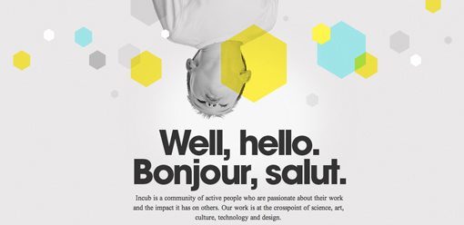
InCub
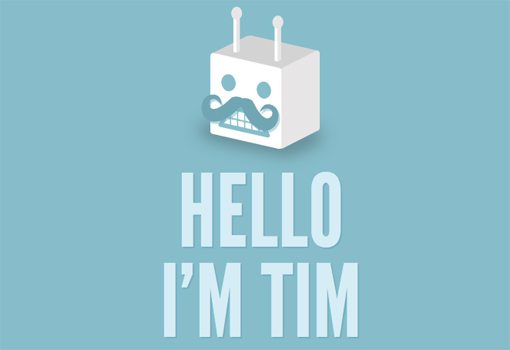
Tim Potter
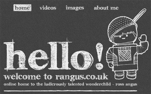
Rangus
The City Is Burning
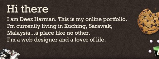
Deez Harman
Farrkling
Web Effectual

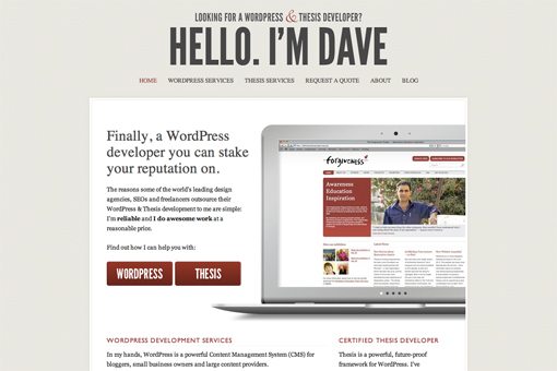
Dave Wilkinson
Federica Cau
Masswerks

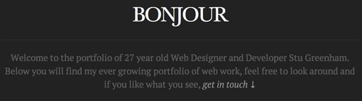
Stu Greenham
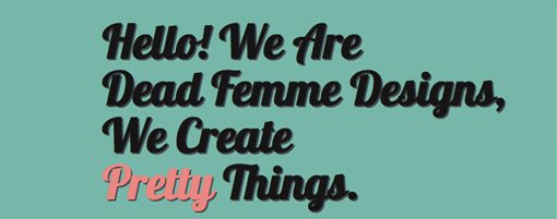
DeadFemme
RockstarWorking
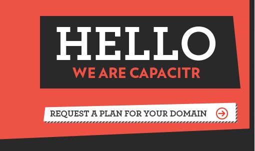
Capacitr, Inc.
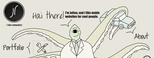
Julian Laval
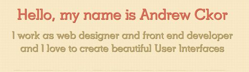
Andrew Ckor
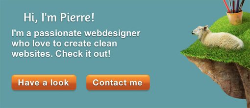
Pierre Saikali
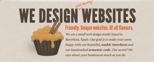
We Make
Another popular headline to slap on the homepage skips the formal greeting and goes straight into the information you need to know: what the company does. For portfolios, this is often a message about what the company makes, designs, creates, etc.
This helps you effectively target your customers right off the bat. For example, if you’re looking for a UI specialist and the site header says “we make gorgeous and functional interfaces”, you immediately know that you’re on the right track. This helps you carve out a little niche that other sites might cover but don’t specifically target in the verbiage.
Karmon French
Swwweet
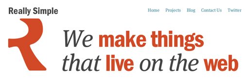
Really Simple
Rimits

Zhng Design Studio

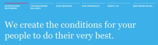
Bestwork Consulting inc.
383 Project
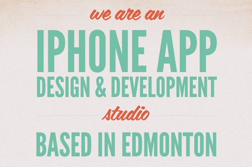
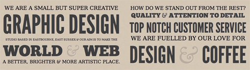
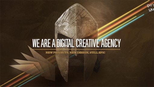
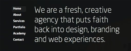
We Are
This section uses a very similar technique to the last one. Here, the identity is a bit more personalized though. Instead of stating what the company makes, these headlines state who the company is. It’s a subtle difference but an interesting one that may come off as slightly friendlier.
Tapp3 Media
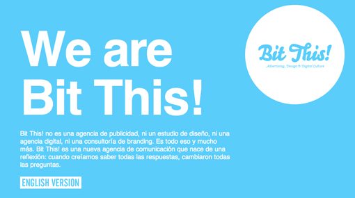
Bit This!
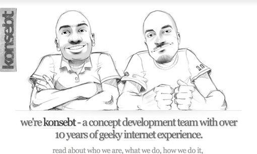
Konsebt
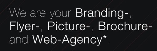
Wopro
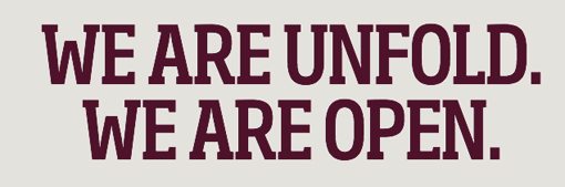
Unfold
Simple as Milk
WebzGuru

TH= SUM
Every Pixel Counts
Make Me Believe
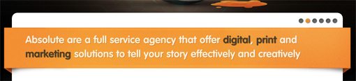
AbsolutMedia
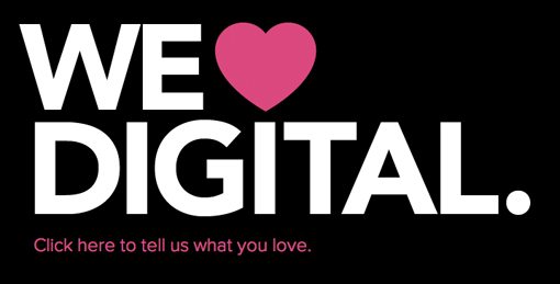
We Love
This one is a little more rare than the others so I only have a couple of examples, but it’s definitely worth noting. The famous “I love NY” campaign with the heart symbol has made this phrasing extremely popular in all industries. Instead of directly saying who they are, these companies tell you what they love, which instills a sense of passion that makes you confident that they enjoy and take pride in what they do enough to get the job done right.
Piccirilli Dorsey
Safarista Design

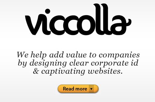
Other
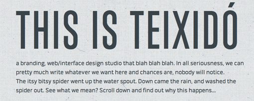
Remember as you look through these examples that you don’t have to follow the crowd. Make your greeting message your own and strike off in an unexpected direction. Make it friendly, playful, sarcastic; whatever genuinely reflects you or your client. Here are a few examples for inspiration.
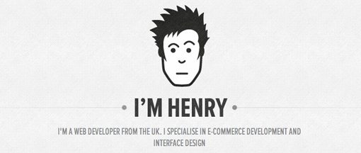
Henry Brown
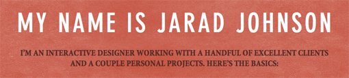
Jarad Johnson
Coreymade

Andrew Lebowitz

Ashfall Design
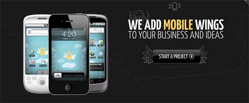
Mobilezr
This Is Teixido
Viccolla
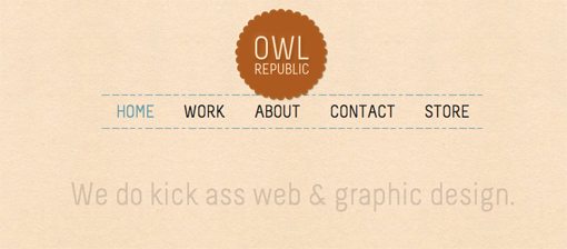
Owl Republic
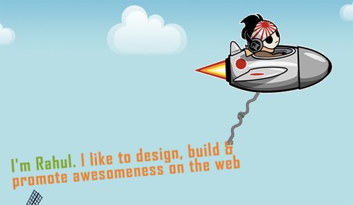
Rahul
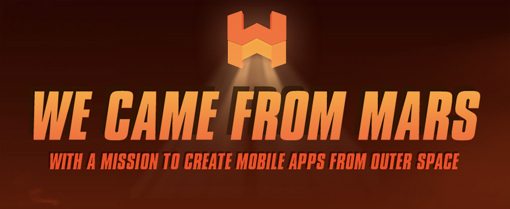
We Came From Mars
Show Us Yours!
Do you have a uniquely awesome greeting message on your site? Leave a comment below with a link so we can check it out! As always, thanks for reading Design Shack.