The Designer’s Guide to Taking Better Photos
I’ve mentioned several times before that photography is one of the most natural complements to your skills as a designer. We designers are in constant need of very specific imagery and this can and does lead to hours of searching, unnecessary stock fees and ultimately the use of imagery that has a high likelihood of being found on the projects of countless other designers.
Becoming a decent photographer can save you time and money and provide you with a serious competitive edge in the form of truly unique imagery that no one in the world possesses but you.
2 Million+ Digital Assets, With Unlimited Downloads
Get unlimited downloads of 2 million+ design resources, themes, templates, photos, graphics and more. Envato Elements starts at $16 per month, and is the best creative subscription we've ever seen.


The principal problem of course is that you simply don’t have the time or budget to become a professional photographer in addition to the career you’re pursuing as a designer. Fortunately, you don’t need years of professional training or ten grand in equipment to pull off that professional grade photography look; just a modest budget and a little familiarizing with how to properly use a digital camera.
The Equipment
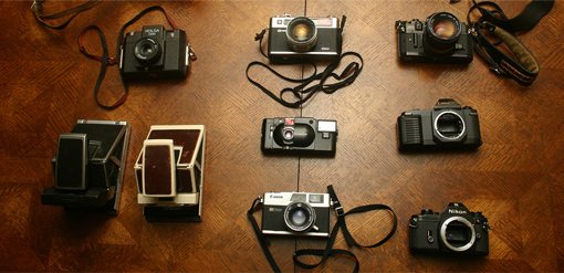
I’ll get the most unpleasant part out of the way first: the initial expense. Ideally, in order to take photos that are of high enough quality to use in professional design, you’ll be in possession of a decent digital camera. Though the quality of consumer-grade pocket-size cameras is quickly reaching astounding, a true digital SLR is definitely the best way to go.
Now before you skip this section, you might not need to spend as much as you think. If you’re not going to pursue a dedicated career as a professional photographer anytime soon, there’s no reason to rush out and buy a $3,000 Canon 5D MkII.
Instead, you can get by just fine with something like a Canon Digital Rebel T1i for less that $600. This camera, and others in the same category, are of stellar quality for the price. You get 15MP, HD video in addition to still shots, and almost all the bells and whistles you’ll find in cameras three times the price.
The Lens Dilemma
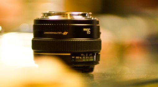
For a bit more money, you can get a “kit” that includes both the camera and a standard lens. These are almost always fairly low-grade starter lenses but can do quite well for your purposes.
However, after you’ve had long enough to absorb the shock of the camera expense, buying a quality lens is the single best investment you can make, and I have only one suggestion for what to get. I recently wrote an article for PhotoTuts on the wonders of a 50mm prime lens and I’ll stress here as well that you simply can’t go wrong with making this your first lens purchase.
A good 50mm lens in the f/1.4-1.8 range is extremely affordable and will effortlessly provide that beautiful blurred background look you’ve no doubt wondered how to achieve without Photoshop (read the PhotoTuts article for more info). Essentially, I fully recommend dropping the $389 to get the 50mm f/1.4 but also understand that not everyone’s budget will stretch that far and therefore point out the amazing quality of the $99 “Thrifty Fifty” lens.
Ditching Full Auto
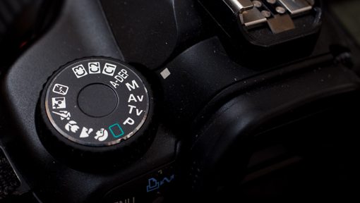
Once you’ve got a camera that doesn’t fit in your front pocket, the next step is to forget that auto mode exists. If you already own a digital SLR and are baffled by all the settings, odds are you turn that dial to the green rectangle and fire away, letting the camera make all the decisions for you.
To put it harshly, this is a waste of the money you spent on the camera. You’ve made the monetary investment to buy the thing, now take a few minutes to learn to use it. Auto mode is a crutch for beginners and though it does have value in rare situations for professionals, you should be familiarizing yourself with shooting on full or at least partial manual if you want to get serious about taking good photos.
A Story of Light
First of all, this article is for designers, not professional photographers. Consequently, I will favor simplicity over technicality here. If you know enough about cameras to make arrogant remarks regarding proper jargon and find yourself constantly whining about how no one understands what “bokeh” really means, go read something more advanced.
Now for all the people left that are scared of anything but full auto, let’s proceed. Basically what you need to know is that there are three primary settings to adjust on your camera, each of which makes the resulting picture either brighter or darker (perhaps oversimplified but ultimately true). These three settings are shutter speed, aperture and ISO.
To use your digital camera properly you must learn a juggling act with these three variables. It all plays into how much light you’re currently getting and how much you want to get. If you’re letting in either too much or not enough light, you must know how to adjust these three settings to solve the problem.
How Do I Make my Photos Brighter?

In order to get a brighter picture, you can manipulate any or all of your three variables. If the shutter speed decreases, the shutter stays open longer, more light is let in and the photo gets brighter. So if your shutter speed is 1/200 and the photo is too dark, drop it to 1/125. Notice that as the denominator gets smaller, the shutter speed decreases.
Unfortunately, the longer the shutter is open the easier it is to take a blurry photo. As a quick and dirty rule of thumb, when shooting handheld (no tripod), try not to go too much slower than 1/100 if you’re a beginner and around 1/80 if you’re a little more experienced and have a nice steady hand. Obviously, the more your subject is moving, the more likely you are to get a motion blur and the more you’ll have to increase that shutter speed.
Aperture
Next up is aperture. This is the one that the jargon fiends love to jump all over but again, we’ll keep it simple. To dumb it down as much as humanly possible, f/1.4 will make for a much brighter photo than f/22. The smaller that number is after the “f/” (you’ll only see the number portion on your camera), the wider the hole letting in light will be.
In low light situations, you want to bump that number down as much as possible. As you do this your depth-of-field will decrease. This is both good and bad. A shallow depth of field is what gives you that beautiful blurry background. However, it gets really hard to shoot with a shallow DOF as you can often unintentionally blur out important parts of the image. Just be sure to zoom in on your photos to make sure the focus is solid where you want it to be. If not, up that number.
ISO
The finally variable is ISO. The higher the ISO, the brighter the resulting photo. An ISO of 3200 will produce a much brighter image than an ISO of 100.

Unfortunately, as always, there’s a tradeoff. Here you sacrifice quality as you increase the ISO, especially on cheaper cameras. An ISO of 3200 will give you lots of ugly color noise (shown in the image above) while an ISO of 100 shouldn’t give you any.
How Do I Make My Photos Darker?

Obviously, to darken an image, use the inverse of all the statements above. Decrease your ISO, increase the speed of your shutter (1/500 is faster than 1/100) and increase the number corresponding to the aperture (f/11 instead of f/1.8).
If you have the choice, don’t shoot in an area that is either too dark or too bright. For instance, many beginners think that they need lots of light and therefore rush out into the midday sun to shoot. This gives you harsh shadows, overblown highlights and squinty subjects. If you can choose anywhere, choose open shade during the day such as you’ll find under a large tree or awning. This will give you plenty of light to work with and you won’t suffer all the problems of direct sunlight.
If you can choose anytime, an hour or so before sundown usually provides awesome lighting scenarios as long as there are a few large buildings or trees to block the horizon enough to avoid direct sunlight.
How Do I Know The Proper Settings?
The question that inevitably follows the information above is “How in the world am I supposed to know if an image is too dark or too bright?” Obviously, eyeballing it will take you only so far. This is where we will have to get the tiniest bit technical.
First, consult your camera’s manual for how to bring up the histogram. This is a scary graph that will no doubt have you wanting to forsake this entire article rather than learning to interpret it. Don’t worry though, I could easily teach a third grader what you’re about to learn.
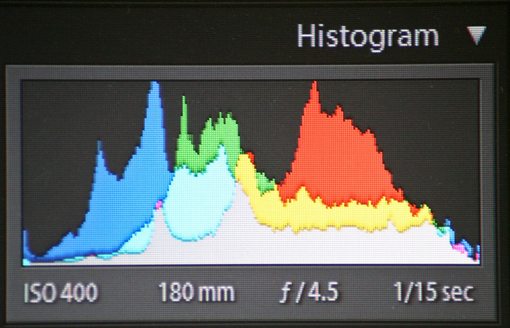
There is in fact a lot going here but ultimately what you really need to focus on as a beginner is each extreme: shadows and highlights. The leftmost edge corresponds to the shadows in your image and the rightmost edge corresponds to the highlights. If the information in the graph is pushing off either edge, you’re “clipping” detail.
For instance, if the graph is going off the right edge, your image is too bright and you’re losing detail in the highlights and need to follow the steps above to make your image darker. Similarly, if the graph is going off the left edge, you’re losing shadow detail and need to follow the steps above to make the image brighter. The sweet spot is when neither edge is clipping. Ultimately this gives you the most information to work with when post-processing and image in Lightroom, Aperture or Photoshop.
You might also want to learn how to use your camera to meter the available light before the shot. For this, consult this article, but remember that the histogram is the best indication for whether or not you’re taking usable photos (at least as far as light in concerned).
Cropping
If you’ve made it this far, congratulations. You should now be armed with enough information to get much more out of your digital camera. My final piece of advice pertains to how to actually take a photo that’s usable in your designs.
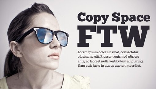
As a designer, always always always consider the ultimate use of the photo before taking the actual shot. Nothing is worse than the realization that you took 200 horizontal photos for a vertical ad space.
Also take into consideration the layout of the information that you want to add to the photo. If you’re going to take shot to use as a textured background for a website, by all means fill the frame with your subject. However, if you’re going to need room for other content, sketch out the layout first and decide how much empty space you’ll need for copy and other items.
Armed with the knowledge of exactly the kind of shot you need, you can much more efficiently make use of your time shooting the photo. Even further, take a few shots with more empty space that you need. It’s much better to have too much photo to work with than not enough. This can save you hours of Photoshop cloning and repairing when you realized you didn’t add enough empty landscape to the right of your subject.
Conclusion
Ultimately, I want you to know that shooting your own photos for design projects isn’t rocket science and doesn’t have to cost you several thousand dollars. I hope the information above has emboldened you to dust off that camera, crank that dial to full manual and take some amazing photos.
Unfortunately, you won’t be a professional right away. Shooting real life is much more complicated than presenting the basic theory. It will take plenty of practice but I assure you that if you just play with the three variables explained above enough, it will all start to make sense and you’ll be adjusting setting on the fly without a moment’s pause.
Leave a comment below and let us know if you learned anything about photography and whether or not you’ll be trying out the techniques outlined above. Be sure to share any tricks you’ve learned along the way and leave a link to anything you’ve designed where you used a photo you shot yourself!