10 Expert Tips for Designing a One Page Portfolio

by on 28th November 2009 with 93 Comments

Once upon a time, designers would lug unwieldy physical portfolios from interview to interview to showcase their work. This tactic is steadily being replaced with sending out emails containing links to an online portfolio. A portfolio website is becoming an essential marketing tool for every designer and can be the single biggest impression upon which you will be judged and hopefully, hired.

This article contains several tips and examples to help you create an amazing single page portfolio.


Pictures Speak Louder than Words

screenshot

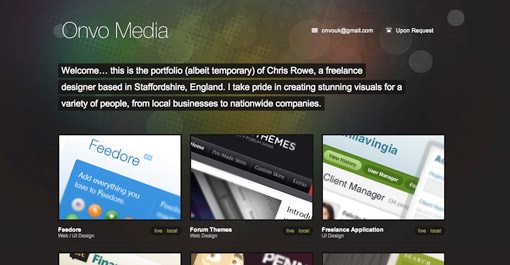
Unless you want to showcase your copywriting skills, focus more on showing off your work than conveying your life history. Displaying only one or two designs can leave potential clients wondering how much experience you really have. Feel free to pull out all the stops and display everything you’re proud of creating.


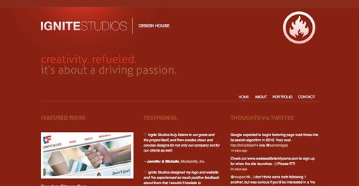
Use Social Media To Encourage Personal Contact

screenshot

Giving social media links prime real estate on your page encourages visitors to make lasting connections with you. This can have several benefits. First, repeated contact builds familiarity and makes you more approachable if the person ever finds themselves in need of a designer. It also have the viral effect of granting you visibility to their other friends and professional connections.


Contrast Is Your Friend

screenshot

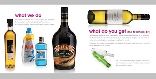
Creative use of contrast will emphasize the beauty of your work. The website above takes bottle designs we see everyday and transforms them into stunning portfolio pieces by making the bottles the most visually appealing item on an otherwise plain page. They could’ve just as easily placed the bottles in their natural environments but the effect would not have been as powerful.


Side Scrolling

screenshot

Don’t be afraid to break the mold of a vertically scrolling site. Side scrolling sites like “We Shoot Bottles” from the previous example can provide an unexpected and welcome impression of creativity. However, keep in mind that users will expect a vertically scrolling site so it’s often a good idea to include arrows and/or instructions to help them along the way. Also be sure to consider popular screen sizes when creating a side scrolling site. The site above did not fit well on my laptop’s 13″ screen and left me scrolling both vertically and horizontally in an awkward scavenger hunt to discover all of the content.


Themes are Cool

screenshot

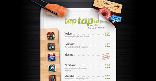
Consider using a theme as a creative method of tying disparate content together. The site above displays a portfolio of unrelated iPhone apps spanning multiple categories. This is ingeniously pulled off through the illusion of a sushi menu, which has nothing to do with any of their apps but makes for a familiar, easy to read format supported by attractive visuals.


One Page, Lots of Content

screenshot

jQuery makes it extremely easy to cram multiple pages of information and graphics into a single page layout. Bite-sized content presented in a click-to-proceed manner can add an interactive feel not found through scrolling and gives the creator greater control over the viewer experience.


Make Contact Effortless

screenshot

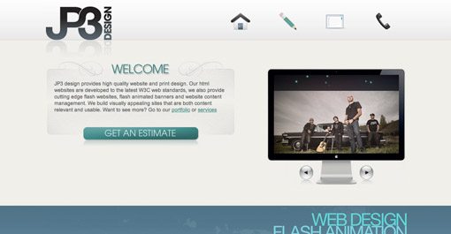
Single page sites can be tricky. You need to convey who you are, what you do and how to you can be reached in as succinct a manner as possible. Contact information and means can quickly get lost in the heap of content or take a back seat to “more important stuff”. However, if making new contacts is your primary goal for the site, then that should be reflected in the layout of the page. Notice how important the “get an estimate” button is in the layout of the site above. This immediately conveys that the site owner is eager to take on new customers and will be open and forward regarding cost (a characteristic many designers lack). Considering cost is often the among the most important concerns of your potential clients, this openness can be an important competitive advantage.


Travelling Navigation

screenshot

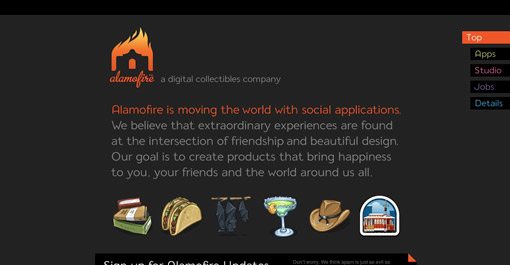
If your single page portfolio contains enough content to require lots of scrolling, consider using a navigation menu that stays with the user as they scroll and provides shortcuts to specific sections. Visit Alamofire above and click on one of the tabs in the top right of the page to see this technique put into practice.


Always Consider Your Target Audience

screenshot
screenshot

Think about the two contrasting examples above. Personally, I love the first. It’s crazy, unique and contains beautiful comic book illustrations (what’s not to love?). However, there are a lot of potential clients who wouldn’t give a second look at this site because it isn’t itself a display of what they would like. The second example, though still very attractive, is fairly boring by comparison. However, a serious professional might spend more time on this site than the one before it. So which is better? The answer, of course, is neither. When designing your portfolio you should consider what type of clients you desire to impress and therefore earn. There are a ton of businesses looking for serious, professional designers but there might be just as many looking for someone fun and creative that thinks outside the box and isn’t afraid to be original.


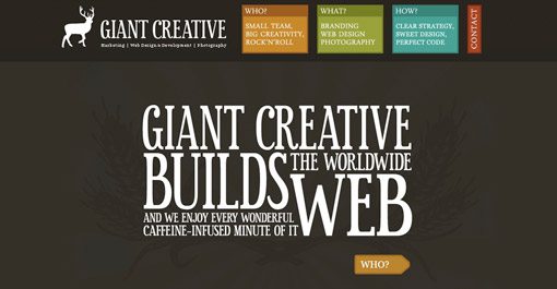
Putting Your Best Foot Forward

screenshot

Think about what makes you unique as a designer. Put more practically, why would someone hire you instead of the million other designers screaming for their attention online? Don’t be afraid to list your huge skill set, but focus on one or two things that you do best and convey those ideas visually. The site above is for a team of web designers and programmers. However, their site and the examples featured on their site communicate one idea stronger than the rest: illustration. Like the comic book art in the previous example, these guys want you to know that they can create beautifully colorful, custom illustrations for your brand. This sets them apart from a huge portion of web designers that are limited to stock art due to their shortcomings as artists. So whether your strongest talent resides in pretty pictures, amazing typography or clean code, scream it loud and proud on your portfolio.

Inspiration

Want to see more examples of great single page portfolios? Here’s where I started:

Conclusion

I hope these ten tips have inspired you to create an amazing single page portfolio (or to revise your current one). Use the comments below and send us links to portfolios you find inspiring, whether they belong to you or someone else.

Comments & Discussion

93 Comments

  • http://www.designfollow.com designfollow

    great collection

    thank you

  • http://designinformer.com Design Informer

    Simple but effective tips mentioned in this post. I will definitely refer to this list when creating a one page site, but even though it is just meant for a one page site, a lot of the advice you gave can be applied to web design in general.

    Thank you!

  • http://www.tutoreffic.com JayRams

    I always wanted to create a web portfolio for myself but I haven’t got a idea how to and what to do. Now after reviewing this post i got much ideas to create a portfolio…

    Thanks to Joshua Johnson for this post

  • http://www.welovethebart.com Bart Welt

    Awesome collection. I actually designed my new portfolio site with jQuery to be a one-page site, and then saw this post. Guess I’m not as original as I thought huh?

    Check it out, http://www.welovethebart.com and let me know what you think.

  • Pingback: Haftalık Derleme – 2 » Müjdat Korkmaz: Blog

  • http://www.ninjacrunch.com ninjacrunch

    Nice collections. Thanks for sharing.

    cheers!

  • http://www.respiromedia.com Respiro Media

    You’re welcome to visit our one-page site: http://www.psdlayout.com

  • http://www.ecoverbee.com andy eaton

    thanks for the collection, will really check these out in great detail

  • http://www.shackleford.org D Burbankle

    Spelling is also important to some of us nerdy clients as a demonstration of a designer’s attention to detail. So how about running a spell checker over this? You’ll find that you’ve spelt previous as pervious.

  • Joshua Johnson

    Nice catch, though your argument is flawed. Pervious is in fact a word (though not the one I wanted) and therefore raises no red flags on a spell checker. You need cheeky commenters to catch such a mistake :)

  • Joshua Johnson

    Thanks for all the feedback everyone! Respiro Media, that is an OUTSTANDING site and would’ve definitely been featured in this post had I seen it.

  • http://dave-lucas.blogspot.com Dave Lucas

    Excellent article – makes me wonder if there’s a way to apply this method to one’s professional resume? Hmmmm…. will think on it and get back to ya!

  • http://www.surcentro.com/en/info/www.designshack.co.uk designshackfan

    Nice article! Author you rocks. Keep it going on. Very helpful sites.

  • Pingback: Link, tutorials, interfacce e tanta altra bella roba - Grafici Creativi

  • Pingback: 10 Expert Tips for Designing a One Page Portfolio | Design Shack :: La Gaceta del Norte

  • http://www.destinyislands.com/ Destiny Islands

    These are some awesome tips, I’ll have to try them with my online portfolio. Keep up the awesome posts!

  • http://www.yo27.com machbio

    great post.. i will follow this from now on.. as i am startup in freelancing world

  • Pingback: links for 2009-11-29 « Mandarine

  • http://prettyscripts.com prettyscripts

    Where most sites just give a list of websites, you give some explanation why they’re good. I find this very helpful.

  • Pingback: Design links for the week

  • http://www.enfold.in/ Shubhhodeep Ghosh

    The link for Giant Creative is wrong. It is pointing to taptaptap.com

    Please correct the same if possible. :)
    Nice Collection.

  • http://www.monocle.info Alex

    great. thnx

  • Pingback: agafonovslava at 11/30/09 04:37:56 | Toyota Prius

  • http://jenniferavaughn.com Jen

    Interesting tips, although as a user I personally find Side Scrolling and to be somewhat annoying. I’m not a designer, but one big tip you’ve missed is to make sure the page renders well on macs and pcs. I’ve seen portfolios that probably look very professional and creative on macs, but very disjointed and unprofessional on my work pc.

  • Pingback: Nerdy Weblinks #1 « one-for-win

  • wsvap

    Ok, just take a look at the “Side Scrolling” page in IE6 :D
    That’s a wrong homepage!

  • wsvap

    Same with “Make Contact Effortless” :D
    It’s a shame!

  • http://www.squiders.com Web Design Maidstone

    some very cool portfolios, thanks for putting the list together

  • Pingback: Montag, 30.11.09 – Web Tweets | abtwittern

  • http://denton-divorce-lawyers.com Denton divorce lawyer/attorney

    Great sites. Loved looking through these.

  • Pingback: links for 2009-12-01 | Starving Designer :: Be Awesome!

  • Pingback: links for 2009-12-01 « toonz

  • http://www.oxzenmedia.com Oxzen

    great list of sites and site designs. Very inspirational.

  • Pingback: Mes favoris du 30-11-09 au 2-12-09

  • http://bucabay.com/ bucabay

    Good points. Very well done portfolios.

  • Pingback: Do you have a portfolio website?

  • Pingback: 10 tips para diseñar Portafolios de una sola página | Recursos - Eressëa Solutions

  • Pingback: Portfolio in un a pagina » Giostra Multimediale

  • Pingback: dot Blog. The week in links 07/12/09

  • http://www.sjlwebdesign.co.uk Sam Logan

    Thanks for the great set of tips, have been looking for some inspiration and advice for a new portfolio.

  • http://EMAIL royatomot

    Cinedence
    ywed

  • Pingback: Mr. Tweet: Your Personal Networking Assistant!

  • http://www.norwichdesigner.com Lee Seaman

    I’m currently building my portfolio and have found it difficult to come up with something I can live with, so this will be very useful. Thanks!

  • http://www.discountwebdesign.co.uk Imroz

    Vey nice tips for the design of a portfolio page. i will take them into consideration when building my portfolio page.

  • Pingback: Don’t Forget The Small Stuff This Year - Smashing Magazine

  • Pingback: Don’t Forget The Small Stuff This Year « Designers' Digest

  • Pingback: How to Make Money as a Freelance Designer | Design Shack

  • http://www.taptapdesign.com Igor Ivankovic

    It’s true, what is written here, but still, you can make a succesful portfolio without being a slave to world trends! Be yourself is the most important message, If You stay true to yourself, and don’t lie about you’re capabilities, you are allready succesful!

    i also make 3D web comic for DesignersCouch now because of being true to my style! Check it out : http://designerscouch.org/show_article/173/tap-tap-adventures-comes-to-designerscouch.html

  • Pingback: How to Make Money as a Freelance Designer | A Player on the Field of CSE

  • Pingback: Online Portfolios | Interactive Design Lab

  • Pingback: PEDRO GOICO. New Media Developer´s Blog. » PORTFOLIO WEB PAGE.

  • http://www.thegetpr.net pagerank

    nice catch Joshua Johnson Keep it going on. Very helpful site

  • Pingback: Smashing Magazine – we smash you with the information that will make your life easier. really. * Smashing Magazine * Smashing Network Better User Experience With Storytelling – Part One * By Francisco Inchauste * January 29th, 2010 * Design * 55 C

  • Pingback: אתרי פוטרפוליו מבוססים על עמוד אחד | Dizzy Blog

  • http://www.poundforpoundhub.com/ MMA Fighters

    great list, well done and nice tips for the designs.

  • Pingback: One-Page Portfolios: Trends and Showcase | pro2go Designs Blog

  • http://www.neotericuk.co.uk Website design

    I liked the 1st one but it should have some tab which should define the requirements for the designs.. we are reconstructing ours will be back with some idea..

  • Pingback: Portfolio Internetowa Teczka Artysty Gdzie Szukać Inspiracji | znaker

  • Pingback: Best of the web – week #49 | Photoshop Tutorial and effects

  • http://gazinginto.wordpress.com/ reading glasses

    This design tips are really great and examples beautiful.

  • http://www.allwebservices.co.uk Website Design

    Some very attractive designs in this list. I like the 3rd one (good use of images)

  • http://www.web-assessments.com web assessment

    inspirational links

  • http://www.conceitodigital.com Paulo

    Nice tips!

  • http://theglobetech.blogspot.com Seo Pakistan

    Thanks for sharing all of these great tutorials. I will definately bookmark this post to come back and get some inspiration from all of these. Thanks again.

  • http://creativeglofish.com tim

    These are so helpful!
    I used these as a guide to design my one page portfolio!
    http://creativeglofish.com

    Thanks
    Tim

  • Pingback: One-Page Portfolios: Trends and Showcase | Vandelay Design Blog

  • http://www.wheelchaircarhire.co.uk Wheelchair Accessible Vehicles hire

    For all those new, this tut will definitely help to design a 1 page portfolio.

  • http://www.mauriclick.com Mauritius Holidays

    You have listed some nice ideas for a one page web design portfolio.

  • http://www.webpagemasters.co.uk cheapwebdesign

    Great tips, thanks for sharing.

  • http://www.i4visualmedia.co.uk Essex Website Designers

    10 Very good tips there, it’s allways good to come across new tips for designing.

  • http://www.redchillimedia.com Web Design Company USA

    Excellent tips for designing portfolio.

  • http://www.appealingweb.com Steven

    Good work, thanks for these examples.

  • http://www.thegetpr.net pagerank

    Nice tips for design portfolio main page.

  • http://www.cheapleafletprinters.com Cheap Printing

    good tips, this site is great for resources.

  • http://ladydyan.com/ lybid hotel kiev

    Very good article, thank you for this. I think I will use a similar layout with mine. Good to see you are getting some visits here too, but the responses are a little strange. Anyway, cheers!

  • http://www.wsibusinessmarketing.co.uk Web Design Preston

    The Social Media comment is particularly true, and in fact one of the most important features of page design in the last 12 months. Designers of websites ignore this at their peril (or their client’s!)

  • http://www.appealingweb.com creative web design

    These are very beautiful examples, I have picked a few tips. Thanks a lot.

  • http://www.srikanthportal.com srikanth portal

    Awesome design collection..Thanks for sharing….

  • http://www.vibegraphics.co.uk web design

    Excellent with the moss texture for land. At a first glance I thought this would be a super long and hard tutorial but you used some really smart techniques.

  • http://www.absolutewebdesign.co.uk/ Web Design

    This is an inspirational post will really help with any future design work I do!

  • http://www.vekta.co.uk Vekta

    As a freelancer, it’s a good idea to have a one page portfolio as most companies and agencies just want to see your work. Using Flash or jQuery can allow you to keep things simple but add loads more content, and make it more interactive and fun for the end user.

  • http://www.uitmuntend-webdesign.nl J. Hendrix

    Nice post! Some great material for inspiration.

  • http://www.uterinefibroidsx.com Alex of Uterine Fibroids

    Very good resources and great layouts. Will check out the Single Page Designs as well.

  • http://www.dotagency.co.uk Web Design Agency London

    Thank you for the post. Great list of websites. Having so many of them here really helps with the with the web design research and also helps with inspiration. Thanks for that!

    David

  • http://current.com/users/kevinayers49.htm Alease Zirkind

    This reminded me of an old chinese proverb. But can not recollect the way it went.

  • http://www.orangeup.co.uk greeniteycom

    Thanks For resources n layouts

  • http://www.freestuffspot.com freebies online

    Thank you for these ten amazing design tips.I will definitely come back to check the news.

  • http://bestmenssunglassesguide.com/ Best Mens Sunglasses

    Thanks a lot for these 10 tips. They helped me a lot for my work so I really appreciate your efforts for all things you do.

  • Pingback: 14 Creative vCard/Single Page Portfolio Photoshop Tutorials & Tips | Tutorials Share | Photoshop RoundUps, Vector RoundUps, Code RoundUps, Funny RoundUps

  • http://www.webdesignsinspiration.com/ quality web design

    Yes, I am one of those designers that forgot to use an image button for the request estimate regarding costs.
    Thank you very much for reminding this absolutely important detail.

  • http://www.newiphone5online.com new iphone 5 online

    I have often wanted to create a webpage portfolio, but didnìt have any clue. This is a very good collection to get some inspiration.

  • http://www.bdimedia.com Web Design Liverpool

    Thanks for sharing this. I will need to get into dreamweaver and start working on my own portfolio and take my time over it this time !!! :(

  • Pingback: 14 Creative vCard Photoshop Tutorials & Tips | Latest design news, articles, tutorials, photoshop tutorials and photoshop tricks written by designers and developers from all around the net.

Subscribe
Membership
About the Author