10 Useful Tips for a Captivating Contact Form

Written by , Published On 23rd December 2009.
Filed in Inspiration.

screenshot

The “Contact Us” form too often gets thrown in as a quick afterthought rather than an element that sets the tone for the communication. Today we’ll take a look at several easy techniques you can use to take your contact forms from boring to brilliant.

Along the way we’ll see several examples of great contact forms along with resources on how to recreate the effect on your own site.

1: Design It

screenshot
screenshot

You’d think this goes without saying, but I looked at tons of “contact us” pages and forms to prepare for this post and 90% or more of them used the default browser UI forms (white, square corners, boring). This isn’t necessarily a bad thing, but if you’re looking for a way to spice up your contact page the form fields themselves are a great place to start. Try changing the color of the fields to match your site better, rounding off the corners, or adding strokes like the examples above. A little bit of styling goes a long way towards giving your forms a custom-built look.

Helpful Resource:
If you need help, check out this post of 40 CSS Web Form Style Tutorials For Web Developers.
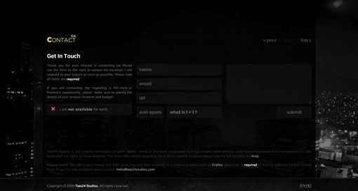
2: Give It Focus

screenshot

Visit the site above and start filling out the contact form. As you do so, the site dims so that the contact form is the sole focus of your attention. This is a beautiful way to ensure users don’t start to contact you only to get distracted by other content. It’s also a great way to make your visitors say “ooooh.”

Helpful Resource:
Stop by Build Internet to learn how to dim content with jQuery.

3: Make It Goofy

screenshot
screenshot

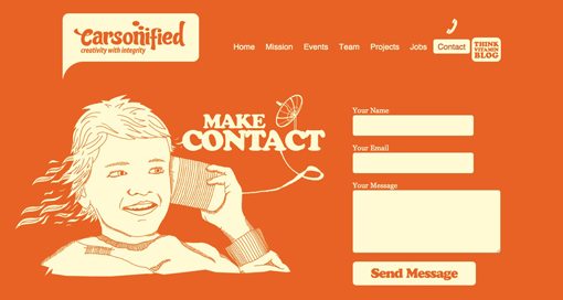
If you really want to encourage users to contact you, make the environment around the contact form friendly and inviting. This makes your company seem more approachable and will subconsciously make your visitors expect a friendly response (be sure to deliver one!). The examples above use bright colors and silly illustrations to accomplish this task but feel free to get creative with typography, icons or anything else you can think of to reduce the tension someone might feel from approaching you with a question or comment.

Helpful Resource:
Here’s a few super cheap, goofy characters from Graphic River to get you started.

4: Give It a Map

screenshot
screenshot

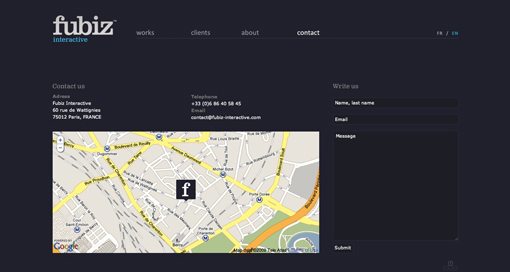
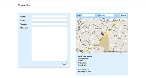
If your site is for a “brick and mortar” store or any kind of physical location, integrating a map into your contact page is an absolute must so that potential customers can actually find you. This can be as simple as a stylized illustrated map or as fully featured as an interactive Google Map. The examples above take the interactive approach (in my opinion, the better way to go), the second of which even integrates custom driving directions, displayed prominently at the top of the map.

Helpful Resource:
If you need help, check out this Free Google Map Generator for Your Homepage.
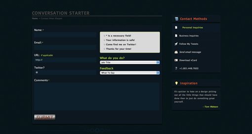
5: Make It Smart

screenshot
screenshot

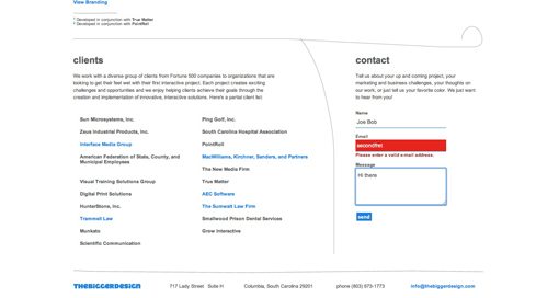
To see what I mean by “smart,” visit the two examples above. The first checks the content users type into the field to make sure it’s correct (ie. form validation). For instance, if you type “joe” into the email address field, the form tells you to enter a valid email address. The second example simply implements form highlighting creatively. By making the user’s current field stand out in some big way, you help them keep their focus and position in the form. It’s a small usability touch that can really help out anyone that might have trouble seeing which field they are in.

Helpful Resources:
No idea how to make you forms smart? Here are a few form validation resources for you to choose from:

6: Walk Them Through It

screenshot
screenshot

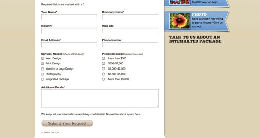
If there is specific information you require from the user, such as budget requirements or area of interest, don’t count on the user including it, even if you make it explicit that the information must be there. Instead, use checkboxes, radio buttons and dropdowns as a way to ensure they don’t leave it out. These tools not only help users remember everything to include, but generally make the contact process a lot easier by eliminating a lot of the writing work.

Helpful Resources:
Check out this complete list of UI elements broken down by browser and operating system.

7: Animate It

screenshot
screenshot

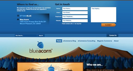
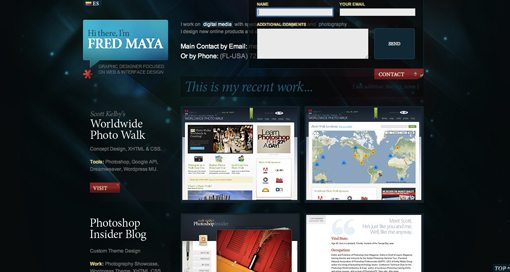
Both of the sites above use an animated drop down menu for their contact form. Placing this menu right on the homepage makes it really easy for visitors to get ahold of you without scrounging for contact information. The dropdown aspect lets it accomplish this task without adding clutter to your homepage. Notice that the Blue Acorn menu actually pushes the site content down while Fred Maya’s slides over existing content. Both ways work just fine, but I prefer the Blue Acorn method as it doesn’t obstruct anything and is easier to read without the transparency.

Helpful Resources:
To achieve a similar effect on your site, check out Noupe’s tutorial on creating Sexy Drop Down Menu w/ jQuery & CSS.
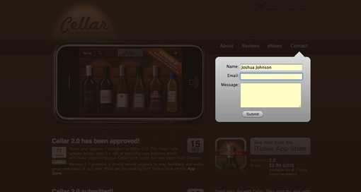
8: Theme It

screenshot

My standard answer for all things creative: just come up with a clever theme! Making an interface reflect something that people are already familiar with can not only provide great design ideas, but can increase your usability as well (it can also decrease your usability if you aren’t careful). The example above uses an iPod touch as the interface for the contact form. Try to think of something unique for yours! Possibilities include anything from a post-it note to a business card.

9: Make It Conversational

screenshot

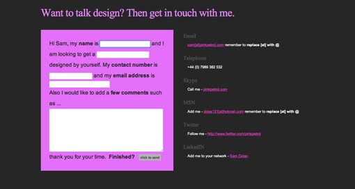
The example above was one of the most unique ideas that I came across. Sort of like contact form Mad Libs, the user is given a few sentences and asked to fill in the blanks. This insures you get the information that you want but is presented to the user is a much friendlier format than plain old fields with labels. Sure it’s arguably less usable because it involves more reading on the part of the user, but it gets a gold star in fun!

10: Make It Oversized

screenshot

One simple way to get a user’s attention with anything you design is to make it a lot bigger than they would expect. After using a bunch of normal-sized contact forms, the one on the site above seemed downright huge. The surprise was a pleasant one though as I loved the oversized feel of the forms and text. I’m not exactly sure why, but for some reason big feels friendly!

Conclusion

You should now be bursting with fresh ideas for how to make your own contact form a point of pride. Go forth and create amazing contact pages and tell us about them in the comments below. Also be sure to let us know which of the above examples was your favorite along with your own great ideas for how to improve them.

Discussion

  1. Edgar Leijs says:

    Thank you! You collected some really useful examples!
    The ‘conversation’ one is a nice touch!

    Cheers!

  2. Steve Bell says:

    This is great advice. I must admit I rarely actually design the contact form. I just apply some simple css to it, and that’s it.
    However, this article has got me thinking about this very important but often neglected area of a website, and I’ll definitely start thinking more about it’s design in the future.

  3. Theunis Groenewald says:

    Cheers for that. The one contact form I feel you’ve left out is on the Fantasy Interactive site (http://www.f-i.com/contact). First off, the user selects a tab to choose what kind of message they’re sending to Fi. Then a simple form with some great conversational copywriting guides the user through the process. The beautiful thing about the form (apart from the elegant design) is that the user immediately feels like their message will get delivered to the right department – it’s a tiny feature that gives off an organised and efficient tone while still being inviting and friendly.

    For me, the most important thing about a contact form is that the user leaves that page feeling that their messages will be responded to, but also that a person (and not some automated response) is at the other end receiving their message.

    Something else to add to your list might be the confirmation page, once the form has been submitted. Provide a rough timeframe as to when you’re likely to answer their messages (is it within 24 hours, or within a week?). That sets a definite expectation that will ease user’s minds (not waiting impatiently on your email for days on end). Also give them a direction to head to on your site to keep them there. Just because they’ve completed a task, it doesn’t mean that their journey on your site is over with. Show them something that might be relevant to their browsing history, or some featured content they might be interested in …

    Well, that’s my 2 cents. Thanks for a great article that’s got me thinking about what I need to do for my contact form.

  4. $hekh@r says:

    Mind blowing tutorial dude.
    Attention Required !
    A resourceful web design community, http://www.cssjunction.com is coming on 1st Jan 2010.
    thanx

  5. Great Tutorial,

    I find I always leave the contact form to last and by that stage are running low on inspiration, this really helped maybe I should look at the contact form in the beginning.

  6. viettel adsl says:

    Great Tutorial, You collected some really useful examples!

  7. Rob Allport says:

    That’s weird, big/oversized contact forms do feel user friendly! :)

    That form focus effect actually got me a new client that week. They were totally in awe of it.

  8. Arnold says:

    Wonderful Tips, I like form designs. Next time i will use it.

  9. Niubi says:

    Thanks for the post! I really liked the conversational one, since it feels a lot less impersonal than many of the contact forms available on the web. I also really like the contact form which DubLi has, which kinda fits between steps 5 – 6.

  10. Valerie says:

    What do you do about theming when you have forms with dropdowns, bullets, etc? In my experience browsers are very limited and inconsistant when it comes to those, and from a design perspective I find it odd looking when all but 1 or 2 of the form elements are themed to match. Is there any workaround for this?

  11. Great source for ideas.
    Thanks

  12. Great Tutorial,

    I was looking for this from a long Time..

    I owe you big time. Its Lots of Vital Information…

  13. Multi Value says:

    Great showcase of forms. contact form is one of the most important functionality for any website.

    Now our designers can refer to this article for better form design.

    For sharing, this is the contact form design on our website:
    http://www.multivalue.com.sg/main/contact

  14. Hi all,

    Here is the link to our contact form. It is clear, efficient and green!

    http://www.fightforfuture.org.sg/about/contact-us

  15. Andrew Keir says:

    Love the Kinetic Shadows site.

  16. Nice websites, simple and elegant. More like the “Design It” site number one in this list. Thanks!

  17. Smith says:

    Really great ideas. Thanks for sharing knowledge. Designervalley Thanks again.

  18. I like the controversial one ;)

  19. Waasys says:

    My contact for is pretty usual, but I can’t apply any of these ideas to it (

  20. Inspirational list indeed !

    what do you think of our contact form:
    http://z-indexmedia.com/contact-us.html

  21. Joshua Johnson says:

    Hey everyone, thanks for all the great feedback and for sharing your own contact forms. Keep it coming!

  22. jutas says:

    A very-very great article! Thanks!
    Just a short idea related to the last point “size matters”: I think bigger size makes the users confident that their message will be really important for the site owner. A subconscious thing: “if it is so big, they surely will observe it and give it attention”.

  23. Simple and Awesome..

    Thanks For sharing. Great INFO..

    I am gonna use these for my works for sure.. if you don’t mind.

    Thanks in Millions..

    PS: Happy New Year Every One

  24. This is great! Thanks!

    I just realized how bad my design was after looking at those pictures! If you don’t mind, I will post it on my webdesign site. http://www.designil.com But don’t worry that I will steal your article. I will just translate a bit and link to your site.

    Happy New Year by the way!

  25. Jason Walker says:

    Thanks for including my site with all these other great examples. I tried to create a contact form that flowed with my site and didn’t take the traditional approach.

  26. freetutorial says:

    Don’t forget SVG Web, a JavaScript library that brings SVG to Internet Explorer without extra downloads by the end user: http://code.google.com/p/svgweb

  27. Thanks for including Kinetic Shadows in the article amongst some thoughtfully designed contact forms.

  28. Nice post there. After having seen some millions of contact forms, I’ve grown slightly tired of them. So anything that looks off the beaten track is a refreshing change.

  29. denbagus says:

    wow… i like when contact form with maps

  30. SMiGL says:

    Сontact form is always required. Good article. Thanks!

  31. Alain Rious says:

    One of the very attractive and beautiful contact form I saw was here …

    http://www.ewp.eu/contact-us

    I think that should be in this list too.

    Great list btw. :)

  32. pinkpetrol says:

    Thanks for including and giving my ssite a nice and pleasant write up. Shows that hard work does pay off.

    Thanks

    Sam Dolan – pinkpetrol.com

  33. Thanks for the showcase. I was personally inspired to create a landscape type contact form. Check it out and comment at http://stonelab.osu.edu/contact/

    The form is in the middle of the fold.

  34. Christine says:

    Great post,thanks a lot, a lot of inspiration.
    I definitely find contact forms with a map and javascript validation the best ones.
    A big Send button helps too!

  35. These are a collection of really great tips. I like how you included examples of the tip being implemented as well. Thanks for sharing.

  36. Personally, I think it’s best to have a simple contact us form, one that contains information about every way of contact and a map. It should be consistent so that it is familiar with other contact forms. Some of the ones you list in your example above I feel are not ‘obvious’ that they are contact forms. Don’t make your visitors think I say.

  37. Brian says:

    Great List, Thanks

  38. Muchas gracias por los tips,…felicitackiones por su web

  39. Jenni says:

    They’re all nice design contact forms.

    Thank you for putting it together here.

  40. thestoryhome says:

    Wow!great tips,This article is a benefit match for me and it helped me a lot. I will continue to follow your blog. Thanks for the article.

  41. erin says:

    Web forms always give a professional edge to a site, and some of these are definitely up that alley, good information to know, thanks

  42. adslvnpthn says:

    Great Tutorial, You collected some really useful examples!

  43. adslvnpthn says:

    thank for great turorial

  44. Turnike says:

    Eyvallah canım sağol. Turnike sistemleri sitemizde kullanabiliriz.

Leave Your Reply