10 Website Background Ideas for Your Next Project
One of the most frequently asked questions we receive is a variant of what kind of background someone should use for their site. These designers have the basic content and the layout pretty much nailed down, but the background is either too boring or too busy and they don’t know how to fix it.
Today we’re going to take a look at a few live sites to grab some inspiration on how to effectively add interesting backgrounds to a web page. Bookmark this article and come back to it the next time you’re stuck on a background decision.
The Ultimate Designer Toolkit: 2 Million+ Assets
Envato Elements gives you unlimited access to 2 million+ pro design resources, themes, templates, photos, graphics and more. Everything you'll ever need in your design resource toolkit.


#1 Sketch It
This kind of background became popular a few years ago and still persists today. It springs from the idea of a notebook full of doodles, like that of your typical teenager during English class. Everything has a rough, quickly sketched appearance and the page is a fairly random looking collection of ideas that are all scattered around and placed at various rotations.
NotchStudio pulls this idea off nicely and in a fairly subdued manner.
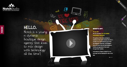
Even if you can’t draw, this look is fairly easy to pull off as the doodles are generally super basic. If you have a Wacom or iPad, it’s quite easy to trace some of your own photos or printed text in a manner that reflects this style. There are also plenty of free fonts like Pointy that will help you pull off awesome sketched text with zero effort.
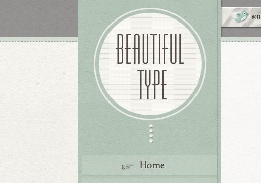
#2 Subtle Parchment
Paper textures have always intrigued designers and we’ll likely be using them for ages to come. The current trend isn’t so much the intense grunge of a few years ago but rather a much more subtle effect that you could easily miss if you weren’t looking for it.
Notice how the texture used on Beautiful Type’s site below isn’t distracting or exaggerated but instead merely brings a nice finish to a site that would already look perfectly good without it.
Check out Lost and Taken for tons of great textures that you can use in all your designs.
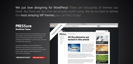
#3 A Radial Gradient
Gradients have been getting a bad rap lately from designers who think they are overused. I personally think that they are easily misused and poorly executed, but can’t ever see a time coming when all designs everywhere use purely solid colors with absolutely no gradations. Since gradients reflect reality (we never see pure, unadulterated solid colors in the natural world) designers will continue to use them to make their designs feel more real.
With gradients, it’s often best to just keep things simple. Don’t go mixing crazy colors and creating muddy transitions, opt instead for a simple gradient. One of my favorites is the good old gray to black (or darker gray) radial gradient. It’s clean and easy to implement and looks really classy.
You can see this in practice on the 177themes website shown below.
#4 Two-Tone It!
Another solution that I find to be particularly elegant or bold (depending on the execution) is to put a hard transition right through the page. This is most often done horizontally but can feel more unique and eye-catching if done vertically.
The idea here is to utilize the magic of contrast. Our eyes are naturally drawn to contrast, we simply can’t help but look! The key to pulling this method off then is to make sure your two colors really contrast. Don’t pick anything that conflicts or clashes, instead try one really dark color and then a really light shade of the same color.
My favorite tool for building these types of combinations is 0to255, which allows you to quickly and easily grab web values for variations of any color.
#5 Full Screen Photographs
I mention this idea so much you’re probably sick of it, but I’ll continue to drill it into your head for as long as I can: great photography makes for great design. It’s plain and simple. We all love to look at a good photo so working one into your design makes for a website that everyone loves to look at. Easy right?
Photos provide inspiration for the entire site design. You can grab colors, textures and even typography inspiration from a photograph and create a nice coherent theme.
Check out how the dark nature of the designed elements in the site below reflect the look and feel of many of the photos used on the homepage slideshow.
If you’re wondering how to code a site like this, check out our recent article, Easily Create a Full Screen Photography Slideshow Website Without Flash.
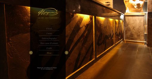
#6 Texture to Color Fade
One trick that I really like that I’ve been seeing a lot lately is to use lighting effects or something similar to throw in just a little bit of texture at the top of a page, which quickly fades to a solid color.
Textures can easily reduce the readability of your text and add unnecessary visual noise to an otherwise usable page. Hinting at a texture in one location allows you to reap the benefits of the extra eye candy without sacrificing the overall aesthetic and/or readability on the site.
We too often feel like choosing a texture means we have to flood the background with it using a CSS background image repeat. Try to be more selective with where your texture goes and you’ll find your designs immediately looking nicer.
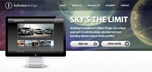
#7 Look Up
The sky is a constant and fantastic distraction for humans. Clouds, rays of sunlight, stars, planets, the moon; all of these objects hold a sort of magic place in our minds that makes them irresistible to the eye.
Be really careful when incorporating these elements into your background, it’s super easy to create something ugly and/or cliche. This technique should only be used by designers who have a real feel for aesthetics and how to take an idea like “space” and not make it look like something from an old Windows screensaver.
The site below is a great example of a really beautiful sky scene being used as a strong website background. The planets are rendered beautifully with a vintage color vibe and a subtle texture provided by diagonal lines. This is the kind of attention to detail you should be familiar with before throwing a sky background on your site.
#8 Argyle
I can hear you now, “Argyle? Are you nuts?” Before you go off on me in the comments, diamond patterns can yield some really attractive results. But, as with the previous tip, they shouldn’t be attempted by anyone but experienced designers who know how to use a crazy pattern without creating a really ugly website.
Check out the really nice use of this idea in the website below. The modified argyle-style pattern is only there enough to add some nice colorful accents and doesn’t really go out of its way to grab your attention.
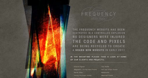
#9 Abstract & Crazy
Are you sick of my suggestions to “be careful” and “take it easy” with subtle design touches? Well then this tip is for you. Sometimes the best background is something crazy and bold that doesn’t have to make sense with the content on the page, it just draws and holds your attention.
I thought both of the websites below pulled this off really nicely. Notice how the second one particularly looks like a painted watercolor piece. This is a very popular technique that you can find lots of resources online to mimic.
Go search iStock with the term “abstract watercolor” to see what you can find. There are a lot of cheap images in this category that will really boost the visual interest of your page.
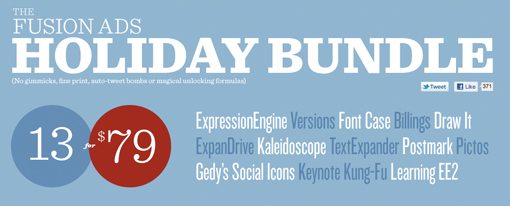
#10 Don’t Be Afraid of Solid Colors
All of the advice above is meant to meet your demands for great website background ideas. However, it’s very important for you to understand as a designer that there’s absolutely nothing wrong with solid-colored white space. It’s a key ingredient in many of my all-time favorite designs and learning how to properly wield it is an important part of becoming a designer.
Check out the gorgeous Fuzion Ads website below. The design is really a typographic feast and both holds your attention and communicates effectively despite the fact that the background is just a plain old boring solid color!
Be sure to check out Piknik, a free tool that you must add to your design arsenal. This site makes it super easy to preview and select colors to fill your screen with. You simply move your mouse around and the background changes color.
Conclusion
The background you choose sets the tone and personality for your entire site. I was working with a designer just the other day who wanted to have his site featured in our gallery, but had simply chosen a really poor background image. The design and layout of the site were great, but I just couldn’t get past the ugly background. After I pointed it out, he agreed and switched to something much simpler that really brought the site to a whole new level.
As I said in the opening paragraphs, the next time you’re stuck in a design rut and can’t choose a good background for your site, come back to this post and try some of the ideas I’ve laid out here. Sooner or later you’re bound to land on one that’s just perfect for your project.
As always, thanks for reading! If you enjoyed the article, give us a tweet, Stumble, Like or anything else you’re into!