Designing Without Images: Making Typography Work for You
You don’t need a great image for every design project. In fact, you can create a great design with no images at all. It’s a trend that is gaining a lot of momentum as typography-focused projects can be used to stand out against a crowded sea of hero images, video and animations.
All you have to do is think like a typographer. Designing without images takes focus, vision and a clear understanding of design and typography principles to create a piece of art that is totally comprised of text.
2 Million+ Digital Assets, With Unlimited Downloads
Get unlimited downloads of 2 million+ design resources, themes, templates, photos, graphics and more. Envato Elements starts at $16 per month, and is the best creative subscription we've ever seen.


Don’t Settle for Regular
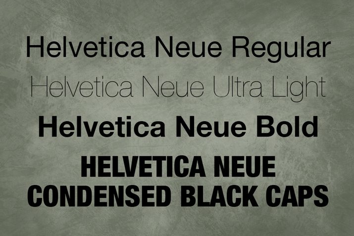
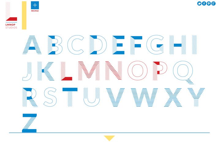
Average typefaces are not enough to carry a design alone. But you don’t have to have a specialty typeface to create something spectacular with lettering.
Consider some of the more high-drama elements and options to use with type families you select. When you are working on a project without images, the typography should be anything but ordinary.
- Stroke width: For the main type elements, get away from the regular version of a typeface. Look to variations with super thick or thin stroke widths for more impact. Consider mix and matching those styles.
- Type category and style: Add a typeface with a lot of flair to the mix, such as a novelty or script font. A typeface with a custom feel to it will add immediate drama to the design.
- Caps, bold or italics: Use effects to add emphasis on specific words or phrases.
- Size and scale: Type that is very large or incredibly small will draw the eye. Avoid standard or expected type sizes to draw the attention of users.
- Alignment and orientation: Text is often aligned to the left and top, but with typography as an art element, you can experiment a little more. Play with various alignment options and even the orientation of letters. Consider a multiple alignment and orientation positions.
Focus on Color
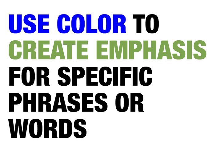
When it comes to a type-based design color should be carefully planned. The amount of color and contrast used in the palette can set the mood, impact readability and contribute to the overall success of an image-less project.
When making color choices, ask yourself these three questions:
- Will color be used for lettering or as part of the canvas?
- Is the purpose of color for contextual emphasis or visual flow?
- Will color contribute to the mood or organization of the design?
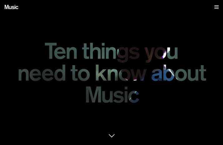
The other consideration when talking about color is whether the actual focus on color actually means a lack thereof. Type can be just as effective with no color use at all. Black type on a white canvas or white on black is easy to read and a major part of the minimal design trend.
Create Drama with Space
Space is a lot like color when it comes to how it contributes to the impact of typography. Space can create organization, emphasis, provide direction or even result in chaos. Space falls into two distinct categories in the context of designing with typography.
- Space surrounding the main text.
- Space within the main text
Space surrounding the main text is the first impression you provide to people viewing the design. It helps direct where to look and the flow of the design. It creates an immediate sense of organization and mood. Space can also create visual interest, especially when used to extremes. The halo around a block of text can mirror or be quite different from the text block within that space.
Space within the main text can be tight or loose. But it should always be organized and have some framework behind it. Individual or similar groupings of text should have a consistency when it comes to space surrounding the type. This is true in terms of kerning and leading as well. The way these spaces – no matter how small or large – are used can create or completely disrupt visual harmony and readability.
Incorporate Shapes and Lines
Just because you don’t have images for a design project does not mean you can’t take advantage of other design elements. Add shapes or lines to the design that compliment the typography.
This can work in a variety of ways:
- Use shapes and lines to create texture or a background with type.
- Place text inside shapes or lines for emphasis.
- Use shapes and lines to create a flow from one group of type to the next.
- Create organization with shapes and lines.
- Add drama to typography by extending strokes with shapes or lines.
Tug and Twist Lettering
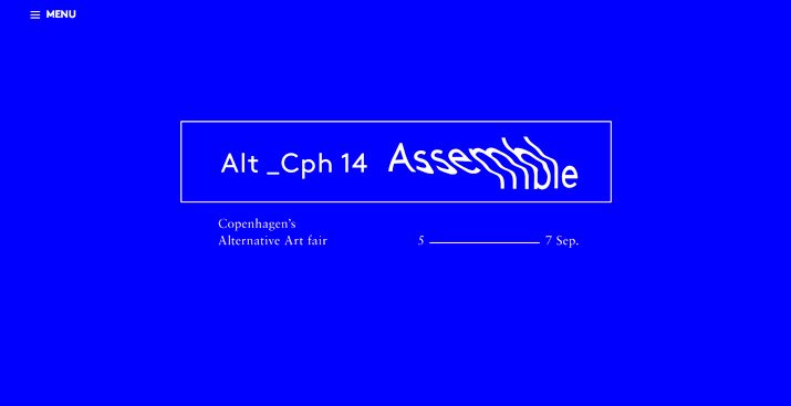
It’s not something that is commonly accepted: Tugging, twisting or otherwise altering a typeface off the baseline. But you should consider it.
There are many ways that you can adjust, warp and wrap text so that it creates a shape to fit your design concept. They important thing to remember, as with many of the concepts mentioned here, is to do it with intent. This is not a technique to try in a subtle way because it may end up looking like a mistake.
Go for high drama when altering type. Create a distinct shape or arch or frame for type. Then test it out and make sure your intent or what you are trying to create or show is clear to others as well.
Tugs also cover the idea of animating or making type moveable in digital projects. A simple typeface with moving parts can have a strong presence and entice users.
Break Some of the Rules
This is where it gets tricky. When you are dealing strictly in type, you might want to break some of the rules … well, maybe just one rule in a big way.
By breaking a design rule, you will create more interest for a specific bit of the text. But this rule-breaking needs to match the context and tone of the design project and is not for everyone.
- Allow letters to overlap.
- Mix more than two or three font families.
- Use “too much” color.
- Alter standard typefaces.
- Think about visuals first and readability second.
- Crop letterforms out of the canvas.
- Forget capitalization and punctuation rules.
- Create a “trapped” space.
- Split words or phrases.
- Try a taboo trick such as adding a texture or gradient.
Pay Careful Attention to Details
Here’s the catch to it all. None of the ideas, tricks or tips above will be successful if you are not carefully attuned to the details.
When it comes to typography, every single pica or pixel matters. It takes precision, and even consistency in your inconsistency, for the final design to work in a way that relates to others.
There’s a fine balance between art and readability that you need to master. What use does type have, after all, if you can’t tell what the words say? Start with the basics of good typography first, and then try variations on those concepts.
Conclusion
Great typography can make or break almost any design project, especially those that do not include images. It’s a trend among designers right now to create projects that use only typography for visual interest.
It’s a design framework and plan that can be both rewarding and tricky. But with planning, a grasp of good design and typography fundamentals and a flair for thinking outside the box, you can create an effective design project without any images.