E-Commerce Website Design: 10 Interesting Examples
E-commerce design is one of the most common – and sometimes most overlooked – types of design project. Just think of how often you click “buy now” on a website.
But what makes it work? Of utmost importance in e-commerce design is user experience and the purchase flow, but more and more sites are also beginning to develop awesome design schemes as well. Here, we’ll look at ten e-commerce sites that function well, and also look fantastic.
2 Million+ Digital Assets, With Unlimited Downloads
Get unlimited downloads of 2 million+ design resources, themes, templates, photos, graphics and more. Envato Elements starts at $16 per month, and is the best creative subscription we've ever seen.


Ditto
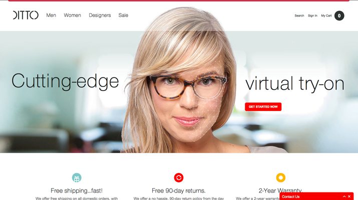
The Ditto landing page features a giant image and parallax scrolling for a unique web experience. The shopping pages are easy to find, and feature clean images in a minimal style that showcases their product – glasses. Each item is clearly visible and priced. Search-ability works with ease and this site features a fun added bonus: submit a photo and “try on” glasses virtually.
Lesson for designers: E-commerce design can feature trendy user interface effects such as parallax scrolling or other fun technology in simple ways.
Neronote
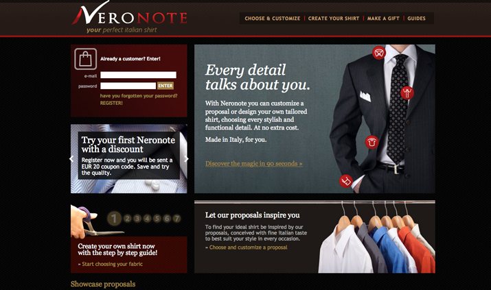
At first glance, you get the feel that Neronote features a premium service or product, from the color scheme to classic feel of the images. The site works with that premium feel as well, with simple navigation and ease of purchase. You can select everything from fabric to color to fit as you use the site to create a custom Italian shirt. Added bonus: Every image features hover text that explains the item you are seeing in detail.
Lesson for designers: Match the look of your site to the feel of what you are selling. A site that features premium merchandise should have a top-shelf feel and presentation.
Glass Tables Online
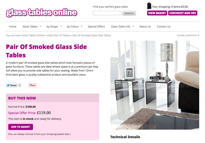
How would this table look in my house? That’s the question any consumer asks when looking at a new piece of furniture. Glass Tables Online is able to answer that question by showing their line of tables in actual environments. In addition the interface is amazingly simple, featuring a flat design style and high color that makes you want to click “Add to Basket.”
Lesson for designers: Great photography paired with simple design is a good way to showcase any product.
47 Brand
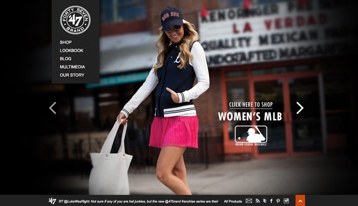
Are you on trend? Hanging with the cool crowd? 47 Brand plays this up beautifully with large scrolling images that both showcase their product in ways that make you feel like you are part of the “crowd.” The landing page also does a great job of integrating social media, another piece that makes you feel like part of the product line. The shopping experience is equally fun. Items are clearly featured in a grid-style layout with hover effects that show available sizes and information. One-click ordering without navigating away from the product list.
Lesson for designers: Social integration can help consumers feel like part of the brand, making them want to buy from a certain company or website.
My Own Bike
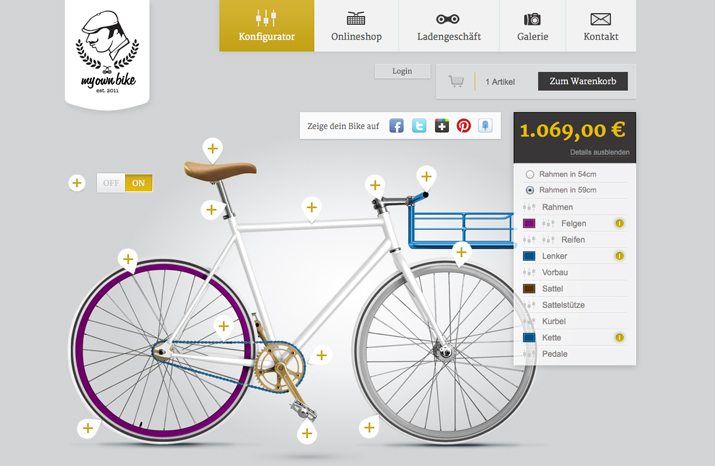
Build it, buy it. My Own Bike allows you to create a custom bicycle and share in the brand love with a variety of clothing and accessory options. The build process is straightforward, add a feature and see it build right there on a virtual bike. (Plus the price changes automatically so you aren’t surprised later.) This is one of the most user-friendly custom build sites out there and the design is simple and engaging.
Lesson for designers: A simple design paired with strong user interface tools and options is a powerful combination.
Skinny Ties
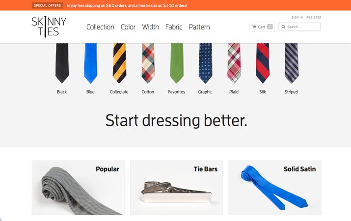
Responsive e-commerce design is the new best practice. How many potential customers are lost when they can’t access the functionality of a site or buy directly from a mobile device? Skinny Ties is not only easy to look at, it works on a variety of devices with a card-style design that displays beautifully at any size. The minimal style makes each product easy to see at smaller sizes as well and prices and styles are labeled clearly.
Lesson for designers: Responsive design is becoming a vital tool for online sales.
Nuts.com
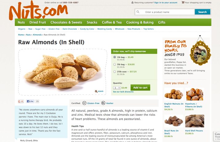
Nuts.com is fun. From color choices to the little “talking” nuts on various pages, users will want to engage with the design, which combines sales and stories. As an added bonus almost every descriptive word on the landing page is a link to that product. Plus the site offers multiple options for adding to the cart, in the small list view and as an expanded more information view for each item, great for shoppers who know what they are looking for or shoppers who are just browsing.
Lesson for designers: Offer multiple opportunities for clicks, especially clicks that can lead to sales.
Jenier World of Teas
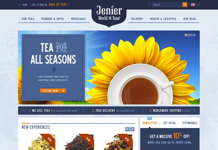
When you think of tea, what comes to mind? I often associate tea with soothing and calming properties. Jenier World of Teas site combines that idea with use of color – blues – and simple, happy imagery and typography. This works especially well for this product line since images of tea is not an easy selling point. Sorting options are nice, allowing shoppers to find teas based on flavor, desired effect or package size.
Lesson for designers: Create a distinct vibe and visual association about products that are more difficult to sell with images using design tools such as color, images and typography.
Inkefx Clothing & Apparel
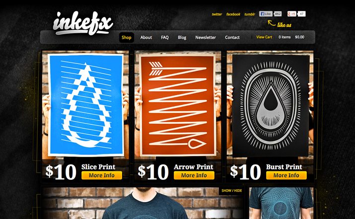
Every image on the Inkefx site includes a link to buy or learn more about a product. Not only are the images super sharp and clean, the buttons and surrounding text are created in a style that creates distinct contrast, drawing you to them. Once you do click through the descriptions are nice and easy to understand. The sizing information is especially nice, noting the size of the item and the size of the model wearing it. For example: “Model is wearing a LARGE. 6’0’”/165 pounds.”
Lesson for designers: Every image is an opportunity to convert a user into a buyer. Strong text and buttons with “pop” can draw the eye from a product to desired call to action.
White House | Black Market
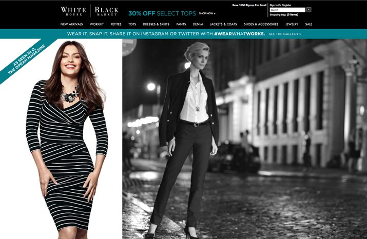
“As seen on TV.” “As seen in Glamour magazine.” Wearing these clothes will make you fashionable. Women’s retailer White House | Black Market does an exceptional job of communicating how popular their clothing line is on the website, showcasing items that are featured in television commercials (which you can watch from the site) or magazines, making it easy to buy the clothes you saw somewhere else and wanted.
The landing page also features a fun user interface with interesting scroll and hover effects. Click into the item gallery and the minimal style perfectly highlights items, shows pricing and includes plenty of sorting options.
Lesson for designers: Use the same imagery and highlight mentions and accolades to help sell items.
Conclusion
The ultimate goal of e-commerce is design is to turn a click into a sale. Great function and design is one way to get there.
From snazzy user interface tools, to images that are impossible to ignore or bold color and type choices, fantastic design is rapidly becoming a consideration with sales sites, which may have focused primarily on interface and interaction tools in the past.
A site can look trendy and encourage sales as well. What other great e-commerce sites have you stumbled on? Share them in the comments.