The New Wendy’s Logo: What Went Right
Logo updates are a precarious business. One wrong move and you’ll have an angry mob calling for your head. This is especially true with brands that people have literally interacted with for the majority of their lives.
Today we’re going to take a look at just such a brand. Wendy’s, the self-proclaimed old fashioned hamburger joint, has a brand new logo. Spoiler alert: it’s great, especially when compared to the recent Arby’s update. So what went right here compared with what we saw with Arby’s? Let’s take a look.
The Ultimate Designer Toolkit: 2 Million+ Assets
Envato Elements gives you unlimited access to 2 million+ pro design resources, themes, templates, photos, graphics and more. Everything you'll ever need in your design resource toolkit.


Wendy’s
First, a little history for those of us unfortunate enough to have never come across a Wendy’s. It’s a fast food burger chain started in 1969 by Dave Thomas, a lovable old man (at least eventually) who was a prominent feature in their commercials until his passing.
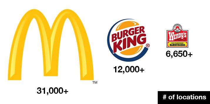
Wendy’s differentiates itself with square burgers, baked potatoes and of course, thick soft serve Frostys. It is the world’s third largest burger chain, behind McDonald’s and Burger King.
Data Source: Wikipedia
Wendy’s hasn’t touched their logo since 1983. If this logo were a person, it would be a long-time college graduate working its way up through middle management. Sure, sometimes they cut off the bottom or merely show the type, but the logo as a whole has remained static for 29 years. Translation: doing anything major to it is going to piss off some people.
The Lesson of Arby’s
If you think about it, it’s perfectly natural for people to get upset over a logo change on this scale. If you have fond memories of your grandpa taking you for a burger twenty years ago to a place with a very specific logo, then suddenly someone changes it, they’re messing with your past.
We saw this to some extent on an article that we ran recently on the new Arby’s logo, a company whose corporate history is actually fairly intertwined with Wendy’s.
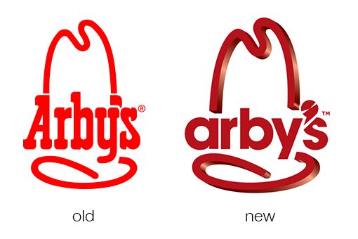
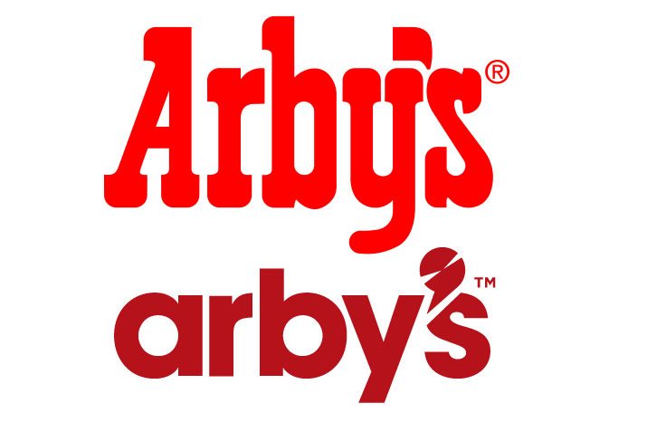
This update was met with quite a bit of negativity. I don’t like it, the Design Shack commenters don’t like it, and these results are repeated around the web on all of the articles that I found discussing the new logo.
As I outlined, in my piece though, there’s a lot more at work here than nostalgia. This is genuinely a pretty rough piece of work with plenty of questionable visual decisions. For starters, they killed the custom cowboy type that defined the brand in favor of a Futura clone, which has no business appearing next to a cowboy hat. Further, the cowboy hat has been skewed into 3D while the letters remain flat. Finally, the spinning blade apostrophe is distracting and awkward.
In short, this is a swing and a miss. They’ve killed a lot of the personality driving the brand’s image. It needed a fresh take, but in my opinion they simply went in the wrong direction.
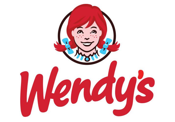
The New Wendy’s Logo
As you can see in the image below, Wendy’s has kept their brand identity fairly consistent stretching all the way back to the original iteration of the logo in 1969.
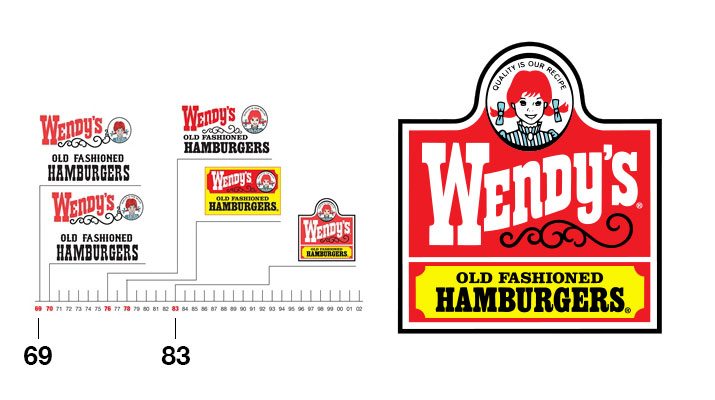
Timeline Source: AboutWendys.com
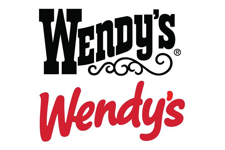
The two primary features here are the face of Wendy, freckled and pigtailed, and the cowboy style slab serif typography. There’s also a curly ornament that has been fairly prominent in each version of the logo. With all of this in mind, here’s the 2013 version:
As soon as I saw this logo, I liked it. It feels fresh and attractive and is just the visual boost that Wendy’s needed for a new century. As designers though, we can’t stop there in our logic. I have to ask myself why I like it. Why did I have such a negative response to the Arby’s logo while having a positive response here? Am I being inconsistent?
Logical Simplification vs. Arbitrary Change
The differences between the Arby’s brand update and that of Wendy’s are actually quite stark in my mind. Wendy’s found a way to intentionally and tastefully simplify their logo while simultaneously injecting a fresh personality. The direction that they’re headed feels like progress.
By contrast, the Arby’s update seems more like change for the sake of change. They didn’t simplify the logo, they complicated it. The changes feel completely arbitrary: Why 3D? Why use the same type that swedish furniture stores use? I’d be surprised if the designers had answers to these questions beyond, “we tried to make it look newer.”
Simplified
To fully appreciate the simplification that’s taking place here, let’s take a good, hard look at the old logo. If you really stare at it for a while, you can see that it’s a pretty complicated beast:
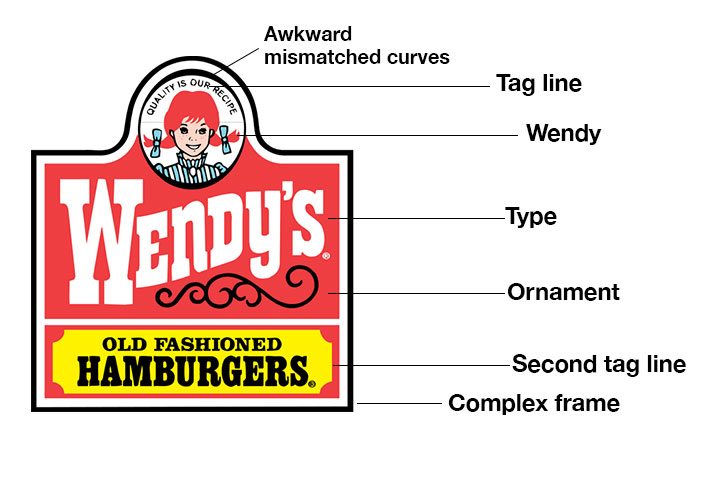
Now let’s compare this to the new iteration. By comparison, there’s just a whole lot less here, which actually makes for a much stronger brand icon that’s focused heavily on Wendy.
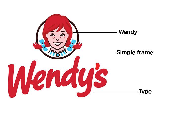
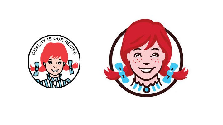
Especially with Dave gone, Wendy is the face of the company, and pushing this idea is the best thing they could’ve done in the logo. She was a fairly minor piece of the previous version, but now she takes center stage with her big, friendly smile.
The illustration style was gracefully updated as well. The new Wendy gets a closer crop, subtle shadows for depth (look at the hair), a nose job, and a eyelash clipping.
Also notice that she now bursts out of her containing ellipse, a nice touch that makes it feel a little more modern. Overall, the direction here reminds me a lot of the simplified Starbucks logo that released recently:
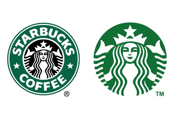
What Starbucks did is ditch the superfluous and cut to the core of the logo, a fairly ubiquitous symbol known well by coffee lovers worldwide. Wendy’s followed a similar technique by cutting out all of the complexity and making Wendy the driving force of the visual.
Type
Here’s the part where I tear into the designers right? One of my biggest insults for the new Arby’s logo was that the type was a shot to the head of the brand. Why would they ditch the cowboy type? Here we can see that Wendy’s has made the same decision:
There’s a big difference here though. The Arby’s type was such a big part of what made the logo work. Sure, it’s a little goofy, but it really fit with that crazy huge cowboy hat. Switching to a boring sans-serif typeface really just stripped out the character:
With Wendy’s though, they went for a friendly, handwritten style that feels custom and actually seems to fit better with the big image of a smiling, young girl. Where Arby’s added disparity, Wendy’s increased consistency.
A Note on Kerning
If I had to choose something to question regarding the new Wendy’s logo, it would have to be the kerning of the type. The “We” and “nd” letter pairings are too close together while the “en” and “dy” pairings are too spread apart.
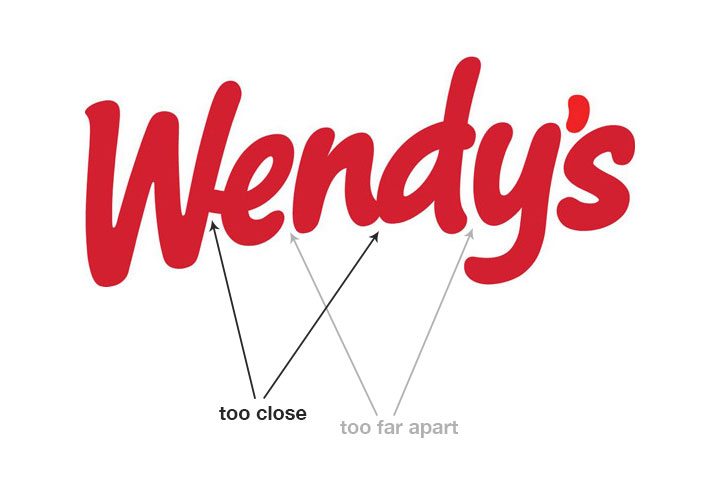
Now, the one thing that might get you a free pass here is that this type is actually meant to look handwritten. This characteristic gives you a license to be a little sloppy because it actually adds to the effect. My thoughts on the Wendy’s kerning issues are thus: if it’s intentional, I’ll allow it, though I would’ve still done some further tweaking. I don’t think it’s quite there yet. On the other hand, if it’s completely unintentional, then it’s just poor type placement and the designer should get a hand slap for not being thorough.
Personally, I love a nicely kerned logo, so I fully admit that the concept of intentionally bad kerning is difficult for me to accept. I’m far more obsessive about this stuff than most people though, the average viewer won’t even think to look closely at the space between the letters.
What Do You Think?
There’s my argument for why the Wendy’s logo update went so well while the Arby’s refresh went so poorly. Strategy and consideration are the first steps in any logo design, whether you’re designing from scratch or making updates to an established brand. The Wendy’s designers seem to have really thought through this step while the Arby’s folks seem to be forcefully pushing the brand forward without clear logic (for all I know, the two used the same design firm, but my argument stands).
Now it’s time for you to jump into the conversation. What do you think about the new Wendy’s logo? What do you like about it? What do you hate? How does it compare to the Arby’s refresh project?