vCard Websites: 15 Tips to Make Yours Stand Out
While you may not be exchanging actual paper business cards as much these days, chances are your digital business card, or vCard, can see a lot of traffic. A vCard-style website typically contains very little content other than a few professional details.
vCard websites are not the same as a portfolio. They tend to be more streamlined with a focus on point of contact, not showcase of professional accomplishment. This style of website can be useful to help users or potential customers find you online and help you promote your professional presence online. When it comes to designing a vCard website, think beyond the paper business card format, or email attachment style cards that have been around for years and make yours stand out.
2 Million+ Digital Assets, With Unlimited Downloads
Get unlimited downloads of 2 million+ design resources, themes, templates, photos, graphics and more. Envato Elements starts at $16 per month, and is the best creative subscription we've ever seen.


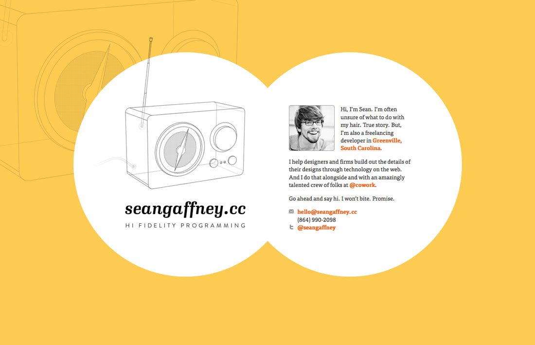
1. Design a Card on Canvas
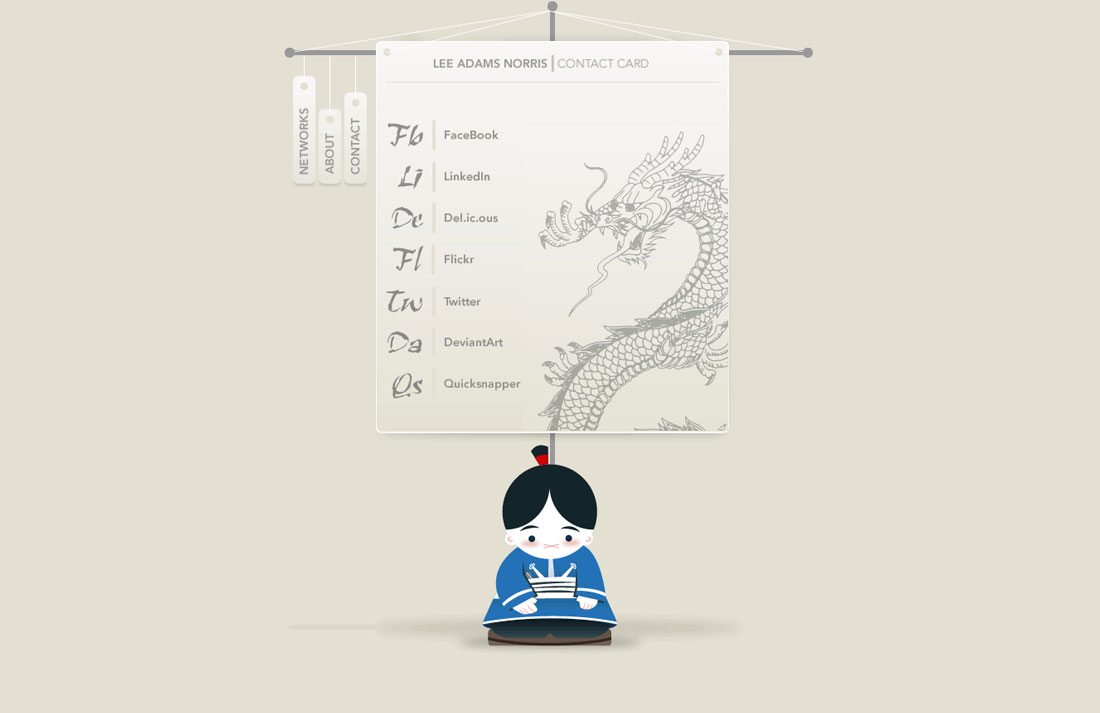
It does not have to look exactly like a paper business card – you are not constrained by aspect ratio here – but you can apply that concept to the website site with a card layered on a canvas. This is an especially popular option because it visually conveys exactly what the site is and how it should be used. Get creative with the style. Consider shapes and layering that work well with the digital medium. Consider a card style that is more square or vertical.
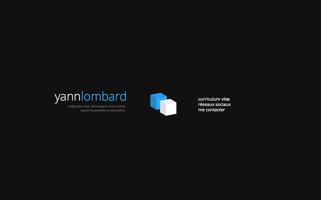
2. Integrate the Card and Background
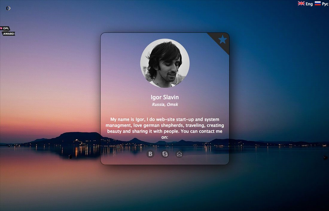
Make the card and the background a singular element. This site by Igor Slavin is beautifully done. You can see the card but it is part of the background. The overall effect is elegant and interesting.
3. Add a Touch of Animation
Animation is the “it” design tool of the year. Incorporate an animated effect for surprise that users will engage with. Because vCards are business-type tools, keep the animation super simple; opt for something that you almost don’t see or a hover or click action that will add that extra something when users engage.
4. Link Everything
Every element of your vCard should be clickable and linked. This includes social media, email and phone numbers should be push-to-dial on mobile phones. The key to a successful vCard is providing all the information people need to get in contact with you, so make it easy for them. (While you are thinking about linking and contact information, only include links to public profiles, unless you want strangers “friending” you on Facebook.)
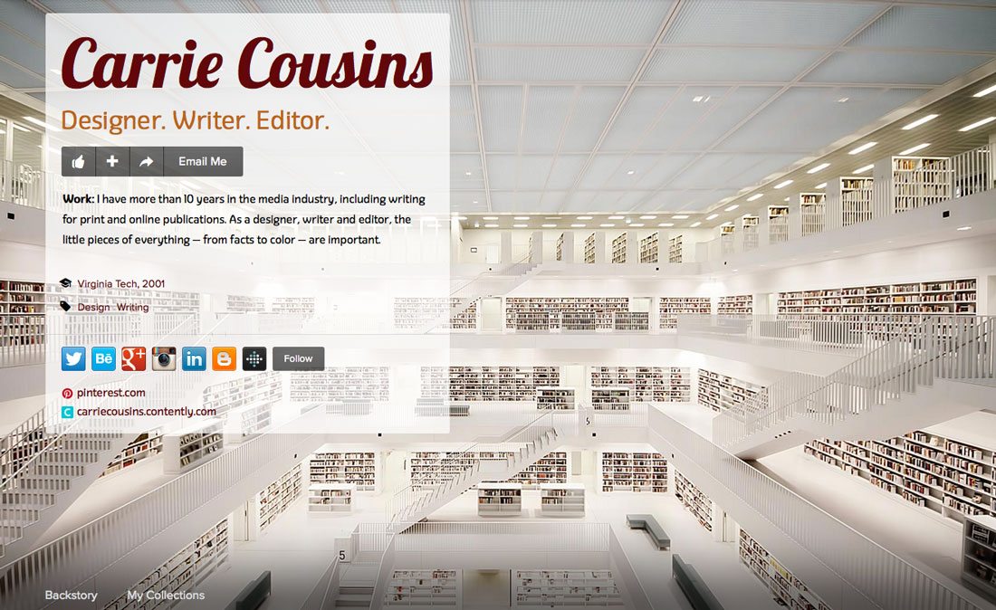
5. Make it Full Screen

Your card can encompass the entire screen. Consider using extremes when it comes to size and scale with this type of format as well, such as the full-screen head shot used above with small text or try oversized text with a smaller image. Contrast can help users focus on the right elements and make the site easy to use.
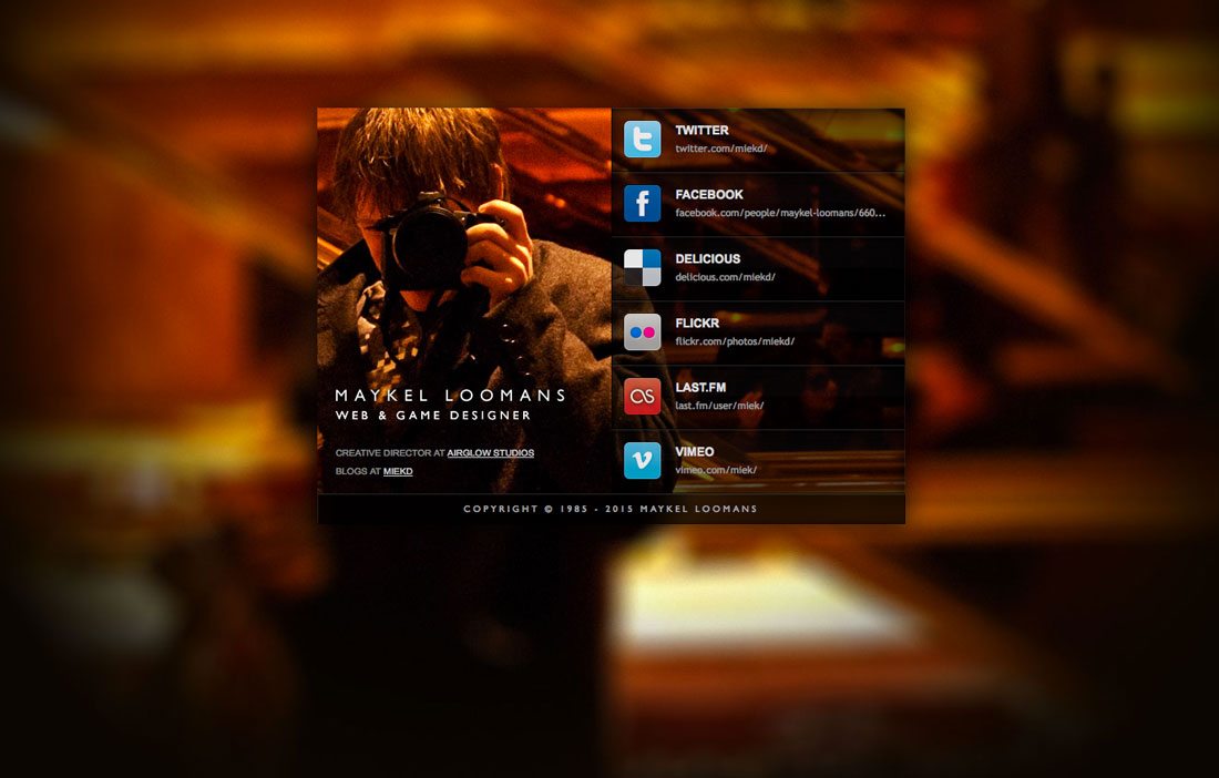
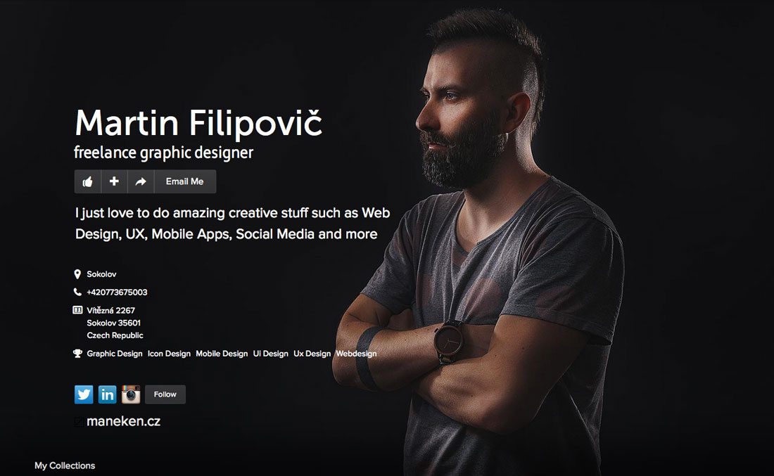
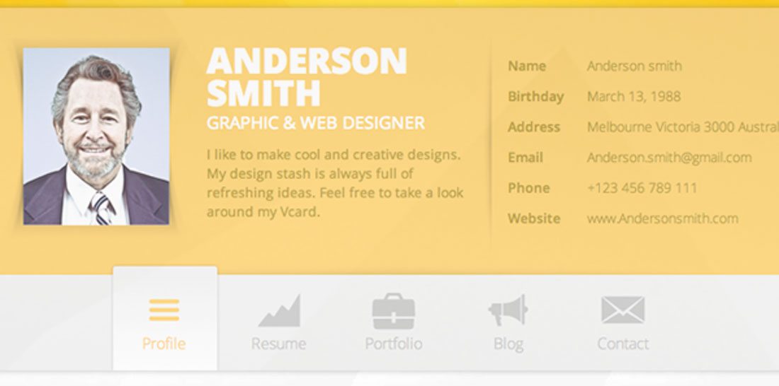
6. Add Your Photo
Carry your personal/professional brand across multiple channels visually with a great head shot. Once taboo for many business professionals, adding a head shot to your business information can help create a connection to users across all the channels where you provide information. Any old photo won’t do. Get a professional head shot – it can show your personality – and use it everywhere that you interact with potential users or customers, including social media channels and on your vCard website.
7. Don’t Forget to Make it Responsive
It almost goes without saying, but don’t forget to build your vCard website on a responsive framework. Take it another step and make sure all elements are usable across devices as well. Make it easy for people to get in touch with you.
8. Be Yourself
Your vCard website should be an extension of who you are professionally. It’s OK to show that life and personality. Some of the better vCard sites showcased in this article show some of the personality of the website owner. If you have a quirky, fun style, be that person online as well. But if you are more formal in your business style, consider a vCard with a more polished and professional appearance.
9. Use Color
Be colorful. Use color with intent. It’s one of the basics of design theory and it applies to vCard websites as well. Interesting, bold color choices can help users move through the right bits of information on your site:
- Your name
- Brief bio
- Contact information
- Links
10. Go Big With Your Name
It is not boastful for your name to be the biggest text element in the vCard website design; it’s just good business. This is particularly true if you work as a self-branded entity, such as a freelancer or if you are trying to find employment. You want people who land on your vCard website to see and remember your name immediately. (In addition to size, make sure it is in a highly readable typeface.)
11. Use Imagery that Tells Who You Are
Not sure what type of image best fits your vCard? Tell site visitors what you do with a visual that connects to your work. Consider something from your portfolio, or a custom photo or illustration or a self-portrait in your perfect style of work environment.
12. Try a Known Platform
There are some great platforms and tools available to help you create a vCard site quickly and with prompts to help you include all the necessary information. (Personally, I have been an about.me user for years and love the flexibility and customization options that come with this free tool.)
13. Don’t Get Too Personal
Most vCard websites are designed for professional purposes. Keep it that way. Don’t get too personal with the site content. Some things to think about include social media profiles – public vs. private – and especially images. Website designers don’t need a vCard website showing off their car or kids; and do you really want those images available to anyone looking to hire you for a project?
14. Select Great Typefaces
Typography choices for a vCard website design are vitally important. This type of site design is unlikely to contain a lot of text, making words that are on the screen that much more important. Stick to typefaces that are easy to read and stand in contrast with the background. Choosing two typefaces is a good idea, one for headline style type (your name) and a body text element for everything else. Sans serifs with uniform stroke widths are an easy bet if you are not sure where to start.
15. Try a Trendy Technique
Because a vCard website is small, it’s a great place to test out trendy techniques and change as frequently as you like. Plus, using a trendy design shows that you are up-to-date with trends, techniques and what’s going on in the industry. Here are a few things to try right now:
- Background with a blurred image
- Minimal style with geometric shapes
- Material design format
- Handwriting-style, graphic typography
- Custom icon sets for links
Conclusion
If you don’t already have a vCard website, there’s no reason not to get started right now. This is a great tool for designers and developers as a portfolio accent. (I can’t tell you how often I am contacted or “found” thanks to my vCard site.)
This is also a small project that can be a lot of fun to design and create. So get out there and make something. I’d love to see what you come up with. Share your links with me on Twitter.