Create an Awesome 3D Slideshow With Cu3er: Part 1
Today we’re going to build a simple web page with an amazing and free tool: Cu3er.
Cu3er is a really neat 3D image slider with crazy visual transitions and lots of customization options. Though it’s built with Flash and JavaScript, you don’t really need to know either of these to use it.
In this article, we’ll get the page built and the slideshow up and running. Next time we’ll return and see how to customize some of Cu3er’s many features and variables.
2 Million+ Digital Assets, With Unlimited Downloads
Get unlimited downloads of 2 million+ design resources, themes, templates, photos, graphics and more. Envato Elements starts at $16 per month, and is the best creative subscription we've ever seen.


What We’re Building
To see how easy it is to incorporate Cu3er into a design, we’ll build a simple web page that contains a header, footer, paragraph copy, and a navigation area.
Before we get started, you might want to check out the demo and download the source files.
Note: In my own testing, cu3er works great in Safari and Firefox but has some troubles in IE (surprise). Due to this as well as the little bit of CSS3 we’ll be using, be sure to view the demo in Firefox or Safari.
To keep things interesting, we’ll also be using a little CSS3 and learning how to setup a “sticky footer” that stays anchored to the bottom of the page. Let’s get started!
Step 1: Grab Cu3er
The first thing you’ll want to do is stop by the Cu3er website and hit the download button. When you open up the .zip you should see the following files:
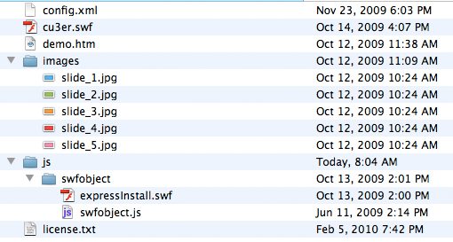
The first thing you’ll want to do is to copy this entire folder and put it in a safe place so you’ll always be able to revert back to the original versions of any or all of the files.
Once you’ve done that, open up demo.htm in your favorite IDE or text editor.
Step 2: Customize the Demo Page
When you open up the demo page, you’ll see that it’s pretty straightforward and already contains a centered div with a working version of cu3er. I told you this would be easy!
We need only to add content and restyle this page and we’ll be all finished. To begin this process, replace the Step 1, Step 2, etc. comments in the head portion of the document and add something more descriptive. Also delete any inline styling and insert a link to an external stylesheet. You should have something like the following.
<!DOCTYPE html PUBLIC "-//W3C//DTD XHTML 1.0 Transitional//EN" "http://www.w3.org/TR/xhtml1/DTD/xhtml1-transitional.dtd">
<html xmlns="http://www.w3.org/1999/xhtml">
<head>
<meta http-equiv="Content-Type" content="text/html; charset=utf-8" />
<title>CU3ER - demo!</title>

<!--  Path to SWFObject JavaScript -->
<script type="text/javascript" src="js/swfobject/swfobject.js"></script>

<!--  Configure SWFObject JavaScript and embed CU3ER slider -->
<script type="text/javascript">
		var flashvars = {};
		flashvars.xml = "config.xml";
		flashvars.font = "font.swf";
		var attributes = {};
		attributes.wmode = "transparent";
		attributes.id = "slider";
		swfobject.embedSWF("cu3er.swf", "cu3er-container", "600", "300", "9",
		"expressInstall.swf", flashvars, attributes);
</script>

<!--  Path to CSS -->
<link rel="stylesheet" href="style.css" type="text/css"

</head>
Next, go into the body of the HTML and throw the cu3er-container into a “slideshow” div.
<body>

	<!--  Cu3er -->
	<div id="slideshow">
		<div id="cu3er-container">
			<a href="http://www.adobe.com/go/getflashplayer">
			<img src="http://www.adobe.com/images/shared/download_buttons/
			get_flash_player.gif" alt="Get Adobe Flash player" />
			</a>
		</div>
	</div>


</body>
</html>
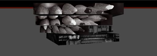
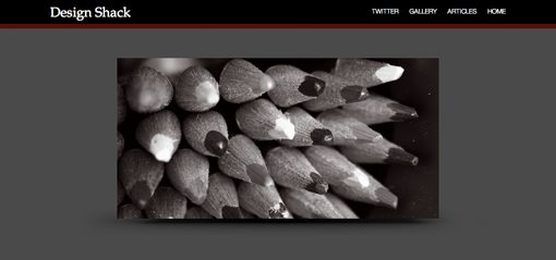
Customizing the Pictures
Before we go any further, you might want to customize the slides in the “images” folder. To do this, simply open up the jpgs, drop in your own artwork and save over the files.
You can use whatever you like, but in case you’re curious, I just stopped by Flickr and grabbed five photos:
- Misty Lepelenburg, Utrecht – black & white
- Esso Black & White
- Pencil Crayons Black & White
- Rainy Day Black & White
- Hamburg Fair 1 black & white
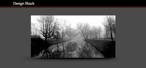
Step 3: Add a Header
Next we’re going to throw everything into a single page wrapper and add a header. The wrapper will serve as a way to center everything on the page and easily define a width for the content. The header will simply be a little text with a CSS background.
<!--  Begin Page Wrap -->
	<div id="page_wrap">

		<!--  Header -->
		<div id="header">
			<p>Design Shack</p>
		</div>

		<!--  Cu3er -->
		<div id="slideshow">
			<div id="cu3er-container">
				<a href="http://www.adobe.com/go/getflashplayer">
				<img src="http://www.adobe.com/images/shared/download_buttons/
				get_flash_player.gif" alt="Get Adobe Flash player" />
				</a>
			</div>
		</div>

	</div>
The Header Graphic
The header will be fairly basic and could easily be done with CSS, but to keep things simple we’ll use a repeating background image. In Photoshop, make an image with a thick horizontal black bar and a thin red bar (#5c0000) like the one below.

My final file was 15px wide by 55px high. Yours can be as wide as you want but if you’re following along make sure you get the height right so everything will line up.
Step 4: Start Some CSS
Create a style.css file and add in the following CSS.
/* Reset */

* {
	margin: 0px;
	padding: 0px;
}

/* Float Clear */

.clearDiv {
	clear: both;
}

/* Body Styles */

html, body {
	background: #4a4a4a url(images/header_repeat.jpg) repeat-x;
	text-align:center;
	font-family: "HelveticaNeue-Light", "Helvetica Neue Light", "Helvetica Neue", Helvetica, Arial,
	"Lucida Grande", sans-serif;
	font-weight: 300;
	height: 100%
}
Let’s go over these chunks of code one at a time. First off, I added a simple margin and padding reset just make sure various browser defaults don’t screw up our layout. Next is a trick I learned from Chris Coyier at CSS-Tricks for clearing floats (so yell at him if you don’t think it’s semantic). We’ll be floating a few things in this design and now that we’ve setup this CSS we can just throw in a .clearDiv class to make sure the content following that section will be reset back to where we want it.
Next, I’ve assigned a few text styles such as font-family and font-weight. I’ve also set the background to a dark gray and inserted out header graphic. Make sure you set the header slice to repeat so you get a bar that stretches all across the page. Finally, I’ve set the height at 100% and made sure these styles applied to both the html and body portions. This has to do with the sticky footer trick we’ll be setting up later. For now just make sure these styles are present.
Your file should be coming along nicely now and look roughly like the image below.
Step 5: Style the Page Wrap and Header
Next up, add the following text to your CSS:
#page_wrap {
	width: 850px;
	margin: 0 auto;
}

/* Header Styles */

#header {
	color: #fff;
	float: left;
	margin-top: 10px;
	font-family: "Palatino Linotype","Book Antiqua",Palatino,FreeSerif,serif;
	font-size: 25px;
}
Here we’ve set our page wrap to 850px (a little unorthodox, but it just seemed right) and our margin to auto. This centers all of our content nicely within the browser window.
Next I’ve set the text to white, floated it left, set it apart from the top and assigned a font family and size. This should position the “Design Shack” text nicely in your preview.

Step 6: Position the Slideshow
Before we add the navigation into the header, we need to get the slideshow out of our way. To do this, first place the clearDiv class we talked about earlier after the header and before the slideshow in your HTML.
<!--  Header -->
		<div id="header">
			<p>Design Shack</p>
		</div>

		<div class="clearDiv"></div>

		<!--  Cu3er -->
		<div id="slideshow">
Now that we’ve cleared the float from the header, we can go into our CSS and add some styles for the slideshow.
/* Slideshow Styles */

#cu3er-container {
	width:600px;
}

#slideshow {
	background: url(images/cube_shadow2.jpg) no-repeat;
	background-position: top center;
	height: 350px;
	margin-top: 70px;

}
Here we’ve added most of the styling to the wrapper around the slideshow. This is so we can keep the cu3er-container div at 600px (the width of the slideshow) while having a shadow graphic that extends beyond this boundary.
You can either make your own shadow in Photoshop or just grab mine from the source files.
Now your slideshow should be positioned perfectly on top of a nice shadow graphic to give it a sort of floating illusion.
Step 6: Add the Navigation
Now that the slideshow is out of our way, we can add in the navigation area. We’ll keep this pretty basic and just use an unordered list of links. Like the header, the navigation will use a float so place the navigation HTML after the header and before the clearDiv.
<!--  Header -->
	<!--  Begin Page Wrap -->
	<div id="page_wrap">

		<!--  Header -->
		<div id="header">
			<p>Design Shack</p>
		</div>

		<!--  Navigation -->
		<div id="nav">
			<ul>
			<li><a href="https://designshack.net/">Home</a></li>
			<li><a href="https://designshack.net/articles">Articles</a></li>
			<li><a href="https://designshack.net/gallery/">Gallery</a></li>
			<li><a href="http://twitter.com/designshack">Twitter</a></li>
			</ul>
		</div>

		<div class="clearDiv"></div>
Now we’ll need a large chunk of CSS to style everything involved with the navigation. We need to cover the navigation div as a whole, the unordered list, list items, list item links, and list item link hover effects.
#nav {
	float: right;
	color: #fff;
	text-transform: uppercase;
	font-size: 12px;
	margin-top: 15px;
}

#nav ul {
	list-style: none;
}

#nav ul li {
	float: right;
	padding-left: 20px;
}

#nav ul li a{
	color: #fff;
	text-decoration: none;
}

#nav ul li a:hover{
	color: #fff;
	text-decoration: underline;
}
Everything here is pretty straightforward. The navigation is floated right (this sets it to the right side of the page and puts the elements in a line), set to white, positioned into place and transformed to uppercase. We’ve set the list-style to none to ditch the bullet points and eliminated any link text decoration except on hover, where we applied an underline.
And with that our navigation is finished. Now all that’s left is some superfluous text and the footer and we’ll be all finished!
Step 7: Add the Text Below the Slideshow
Just to round off the design a little, we’ll add a heading and paragraph under the slideshow. Just a few lines of html is all we’ll need:
<!--  Text Under The Slideshow -->
	<div id="tagline">
		<h1>Cu3er Slideshow</h1>
		<p>A Design Shack Tutorial</p>
	</div>
Then we’ll style both the h1 and the paragraph tags individually. Notice I used the letterpress technique we learned in the Google Fonts article. This uses a CSS3 text-shadow that’s lighter in color than the background to give the illusion of inset text.
/* Tagline Styles */

#tagline h1{
	font-family: "Palatino Linotype","Book Antiqua",Palatino,FreeSerif,serif;
	font-size: 70px;
	font-weight: bold;
	color: #272727;
	text-shadow: 0px 2px 3px #555;
}

#tagline p{
	font-family: "HelveticaNeue-Light", "Helvetica Neue Light", "Helvetica Neue",
	    Helvetica, Arial, "Lucida Grande", sans-serif;
	font-size: 20px;
	font-weight: 300;
	color: #272727;
	text-shadow: 0px 2px 3px #555;
}
That brings us to the end of most of our design. You can even stop there if you wish but I’m going to press on and show you a neat sticky footer trick I learned this week.
The image we use below for the footer is the exact same as the header image, only rotated 108 degrees so the red is on top and the black is on the bottom.
Final Step: Add the Footer
If you’re wondering what a sticky footer is, it’s simply a footer that adheres to the bottom of the page as you resize the window. This can be tricky to implement but Ryan Fait has created a pretty ingenious method of accomplishing it with very little code; see that method here.
The basic idea is that you can use negative margins and a “push” to keep the footer at the bottom of the page. The first thing we need to do is insert the push and footer divs into our html. Place the push div inside of the page wrap and the footer div outside of the page wrap (so it will extend to the edges.)
		<!--  Text Under The Slideshow -->
		<div id="tagline">
			<h1>Cu3er Slideshow</h1>
			<p>A Design Shack Tutorial</p>
		</div>

		<!--  For the Sticky Footer -->
			<div class="push"></div>

	</div>
	<!--  End Page Wrap -->


	<div id="footer">
	</div>
Now go into your CSS and insert the following code:
/* Footer Styles */

.push {
	height: 55px; /* .push must be the same height as .footer */
}

#footer {
	height: 55px;
	background: #4a4a4a url(images/footer_repeat.jpg) repeat-x;
}
Notice that the height of the push has been set to the exact height of the footer. This is very important and the trick will not work without it. I’ve also placed in the background image that I mentioned above (just rotate the header image).
Finally, we’ll add one more snippet of CSS into our page wrap:
#page_wrap {
	width: 850px;
	margin: 0 auto;

	min-height: 100%;
	height: auto !important;
	height: 100%;
	margin: 0 auto -55px; /* the bottom margin is the negative value of the footer's height */
}
The height and min-height have both been set to 100% and the bottom margin has been set to the negative value of the footer height (55px). This creates the effect of keeping the footer at the bottom of the page. The height: auto !important; bit is an IE hack to get around min-height issues with that browser.
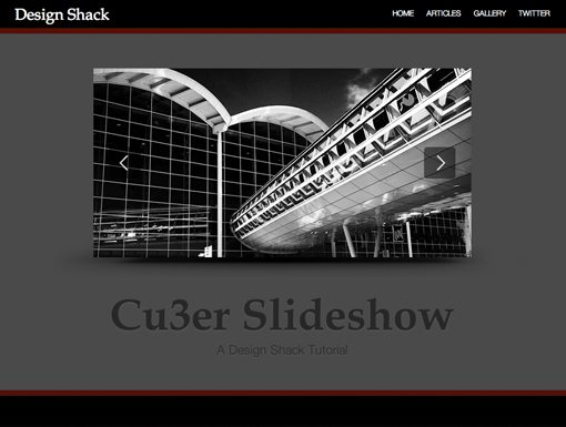
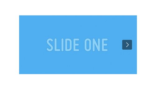
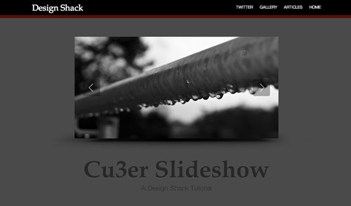
Final Result
Our page is complete! If you’ve done everything right your page should look like the one below. You might notice that my version auto-starts when the page loads, don’t worry if yours doesn’t, we’ll deal with this in the next article.
Now you have an awesome page with a mind-blowing 3D flash image slider to begin building a portfolio site.
Conclusion
Notice that virtually all the work involved was setting up the website. Cu3er was actually running just fine in the very first step! Check back soon for part two where we’ll learn to tweak some of the basic features, add text and links and more.