Next up, we style the photo divs. The most important thing here is that I set the float of the smallPhoto1 to left and that of smallPhoto2 to right. This will ensure that they flow correctly and bump right up against each other (if you still have layout issues, experiment with a clearfix div). I also added in height values for each. Long-term these don’t seem to be necessary but I was having some layout issues at this stage without them.
Step 2: Preview
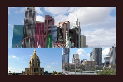
After the CSS above, your page should look nice and clean with a dark background and a tight photo grid as shown in the preview below.
Step 3: Third Party Tools
Now that our page is basically finished as far as layout is concerned, it’s time to get ready to make the page more dynamic. To do this, we’ll need to load in two JavaScript tools.
The first is a library that requires no introduction. jQuery is everyone’s favorite JavaScript extension that generally makes life easier whether you’re creating complex animations or simply want a better way to target specific elements.
To make sure I have the most current version of jQuery, I always jump over to ScriptSrc, where you simply click a button to copy the latest build’s link to your clipboard.
<!-- include jQuery library -->
<script type="text/javascript" src="http://ajax.googleapis.com/ajax/libs/jquery/1.5.2/jquery.min.js"></script>
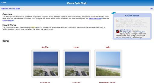
The real engine behind our slideshows today will be jQuery Cycle a plugin that makes it super easy to build jQuery slideshows on the fly.
We’ll see how to implement this in the next step. For now you can include the following script in your header.
<!-- include Cycle plugin -->
<script type="text/javascript" src="http://cloud.github.com/downloads/malsup/cycle/jquery.cycle.all.latest.js"></script>
Modernizr
If, like me, you like to use HTML5 and CSS3, you’ll want to also toss in Modernizr just to make sure everything stays as compatible as possible with IE.
Step 4: Bringing the Slideshows to Life
Implementing jQuery Cycle is super easy. There are tons of options and effects but for today’s purposes we’re going to use a bare minimum of the available functionality.
To get started, let’s refine our HTML a little. jQuery Cycle will look for anything with the class of “slideshow” and create a slideshow from its children. To accommodate this, we add the slideshow class to our three image divs and add two more images to each. This will make is so that each image cycles through three iterations.
<div id="container">

	<div id="bigPhoto" class="slideshow">
		<img src="http://lorempixum.com/800/300/city/1" />
		<img src="http://lorempixum.com/800/300/city/2" />
		<img src="http://lorempixum.com/800/300/city/3" />
	</div>

	<div id="smallPhoto1" class="slideshow">
		<img src="http://lorempixum.com/400/200/city/4" />
		<img src="http://lorempixum.com/400/200/city/5" />
		<img src="http://lorempixum.com/400/200/city/6" />
	</div>

	<div id="smallPhoto2" class="slideshow">
		<img src="http://lorempixum.com/400/200/city/7" />
		<img src="http://lorempixum.com/400/200/city/8" />
		<img src="http://lorempixum.com/400/200/city/9" />
	</div>

</div>
Next, we want to define some specific functionality for each of the three slideshows. This is done by targeting each ID with jQuery and then applying a few specifications. Below I’ve set a delay, speed and effect for each section, feel free to play with these so that you have something unique.
For now, the only property I’ve changed between the three is delay. I did this to create a sort of staggered effect with the image changes. By default, each slideshow would progress at the same rate, as with the photography site we saw at the beginning of the article. However, I thought it seemed a little more interesting to have the slideshows offset.
$(document).ready(function() {
$(‘#bigPhoto’).cycle({
delay: 300,
speed: 2000,
fx: ‘fade’
});
$(‘#smallPhoto1’).cycle({
delay: 3000,
speed: 2000,
fx: ‘fade’
});
$(‘#smallPhoto2’).cycle({
delay: 5000,
speed: 2000,
fx: ‘fade’
});
});
[/code]
Step 4 Preview
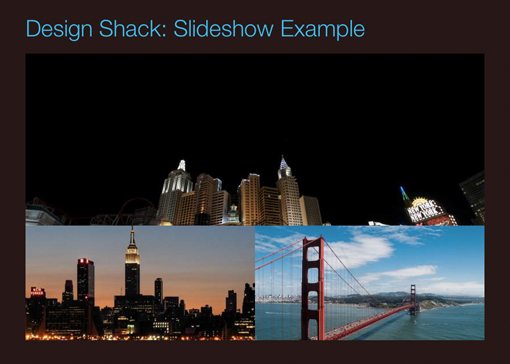
With that, your triple slideshow should be up and running! Click here or on the image below to see a demo.
Step 5: Finishing off the Page
With that, we could be finished, but our page is looking a little plain so let’s add a little bit of interest shall we? The first thing I want to do is add a simple headline.
Headline
For the headline HTML, all we have to do is throw in an h1 right above our bigPhoto div.
<h1>Design Shack: Slideshow Example</h1>

<div id="bigPhoto" class="slideshow">
	<img src="http://lorempixum.com/800/300/city/1" />
	<img src="http://lorempixum.com/800/300/city/2" />
	<img src="http://lorempixum.com/800/300/city/3" />
</div>
Next up, we throw in some basic CSS to style the headline. I wanted to make the font as thin as possible so I threw in CSS-Trick’s Better Helvetica setup along with a text-shadow.
The text-shadow is my own trick for creating thinner typography. It turns out, if you apply a text-shadow that’s the same color as the background, the result is a slightly thinner looking font. If it only works in a few browsers, no biggie, the other styles are still enough to make the type look nice.
Below you can see the result of our efforts. It’s not much, but when combined with the next step it will definitely help create a more finished-looking product.
Photo Tag
The next thing I want to do is add a label over the top of the slideshow. This is an important exercise because jQuery Cycle has some weird effects on the page hierarchy that make this a bit difficult.
The first step here is to create a new div that will serve as our little tag. This requires only a single line of HTML right under the h1 that we just set up.
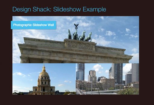
Design Shack: Slideshow Example
Photographic Slideshow Wall
[/code]
Now let’s add some styling. We’ll make the background the same color as the the headline for consistency and add some padding to give it some weight. Also, I set the position to absolute and gave it some negative margin so that it will stick out from the slideshow a little on the left side. Finally, I added a basic box shadow to help it show up on different colors.
The problem here is that, even though the tag is higher in the HTML hierarchy, it ends up getting covered up by the slideshow. You can only catch a quick glimpse of it between slides:
This is easy enough to fix with a little z-index magic. Simply set the z-index of the tag to “1” and that of the bigPhoto div to “-1”. This will make is so that the tag sits on top of the slideshow.
Finished Product: Live Demo
With that, we’re all done! Feel free to have a look around the live demo to see our creation in action.
Conclusion
Hats off to the designer behind Jessica’s site for the cool idea of combining multiple slideshows. Duplicating this effect made for a great tutorial on using HTML, CSS and JavaScript to create simple but stunning slideshows.
Be sure to push beyond the example above and experiment with different layouts and effects. Obviously, as you add more slideshows the more your page will get bogged down but otherwise you’re limited only by your creativity!