Create a Stunning Wooden Website Template in Photoshop
Today we’re going to build an awesome website template in Photoshop utilizing a number of advanced techniques.
I’ll take you through the entire process in ten easy steps and provide you with a link to download the finished template. Let’s begin!
2 Million+ Digital Assets, With Unlimited Downloads
Get unlimited downloads of 2 million+ design resources, themes, templates, photos, graphics and more. Envato Elements starts at $16 per month, and is the best creative subscription we've ever seen.


Preview & Download
Before we get started, here’s a look at what we’ll be building. You can download and use the PSD however you like, just be sure to give credit for the background as indicated in the article below.

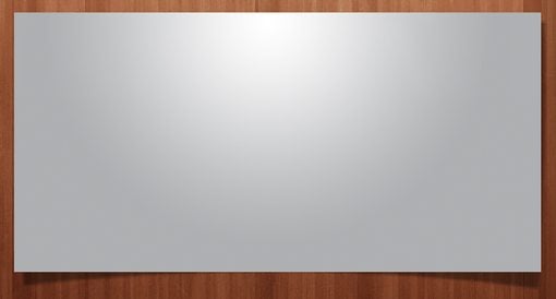
Step 1: Create a New Document
First, create a new document in Photoshop. Make the canvas 1200 pixels wide by 1700 pixels tall. Don’t worry, our content won’t be anywhere near that wide, we just want to give ourselves plenty of room to work.

To define the content area, draw a box that’s 960 pixels wide, center it horizontally in the canvas, then drag out guides to the left and right edge and delete the box. Your blank document should look something like the image above (color doesn’t matter at this point).
Step 2: Grab The Background Image
The inspiration for this design comes from an awesome free resource from Matthew Skiles. Matthew created a beautiful Wooden background texture and distributed it freely on Dribbble. Just remember that if you’re going to use this texture, you must provide a link back to Matthew.

Grab the wooden texture from the link above and scale it down so that it is the same width as your PSD. It will only stretch about half way down the site vertically but that’s perfect at this point.
Step 3: Add Background Gradient
The wooden background looks great in Photoshop but it’s going to give us some trouble on the web because of the endless browser canvas. Our two basic options are to convert it to a seamless background pattern or gradient it out to a solid color.
In this case I chose the easy way out and decide to apply gradients to the left and right side of the background. To do this, create a new layer and set your foreground color to #421a0e or any other dark color that you like from the wooden image. Next set your gradient to go from this color to transparent and stretch the gradient from the lef side towards the middle, then repeat the gradient on the right side.

This gives us a nice, smooth transition to a solid color. If we were coding this site, we would set this image to the background and set the background-color in CSS to #421a0e. No matter what screen size the viewer is on, the site’s background will look perfect.
Step 4: The Logo
The logo at the top of the site is simply text written out in Ballpark, an awesome free font designed by Mickey Rossi. Type out a word, make it black and set the fill to around 25%. Next, apply an inner shadow and a drop shadow to give it that letterpress look. Here are the settings that I used:

Notice that the drop shadow is very different than the default settings. This is because we’re actually using drop shadow as a bit of a hack to create an outer bevel. Be sure to set the color to white and change the blending mode from Multiply (default) to Screen (works with white).
The trick to the inner shadow is to not overdo it. Go easy on the distance and make sure the opacity isn’t too dark. These settings should give you the awesome effect seen below:

Next, type some subtext to go under the logo and apply the same effect. I used a simple Helvetica Bold and typed in all caps.

Step 5: Add Some Lights
To add the lights at the top of the template we’ll use a super simple trick. Grab a nice soft white brush and click once on your canvas to create a fuzzy white dot. Now hit Command-T to use the Free Transform tool to stretch the dot out as seen below.
To get the skewed effect, hold Command-Shift-Option while while clicking and dragging on a corner control. This should move both corners equally.

Once you’ve got a light shape that you like, duplicate the layer twice and spread the lights out. Then throw them all into a layer group and set the blending mode of the group to Overlay. You can also play around with adding an outer glow to each light to tweak the effect.

Step 6: The Featured Content Box
Under the logo we’re going to create a big box that will serve as a placeholder for any content that you want to feature. This will be an awesome spot to include a jQuery image slider.
To start, simply draw out a rectangle and fill it with a gradient or a solid color, it really doesn’t matter since the idea is to place content over it. Make sure that you stay well within the 960 guides that you setup earlier.

Next we’ll add one of those trendy curved shadows that are so popular in web design right now. To do this, add a typical drop shadow from the layer effects menu. Once you’ve applied the drop shadow, right-click on the little effect icon on the layer and select “Create Layer” near the bottom. As the name implies, this will turn the shadow effect into an actual shadow layer.

Now use Warp Mode inside of Free Transform to curve the bottom edge of the shadow as shown in the image below.

The overall effect makes the corners look like they curl up a bit while keeping the actual content box a standard shape that’s easy to fill with images in the development stage.
Step 7: Navigation Area
Just above the featured content box, type out a few sample navigation options. I used Museo, a free font that can easily be used with @font-face in CSS.

As you can see, the template is coming along nicely. We’ve finished the top portion and can move down to the next section.

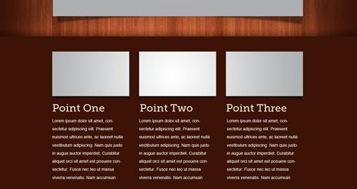
Step 8: Color Bar
Just below the featured content area should be about where the wood texture ends. Create a layer and fill from this portion down to the bottom with #3c1306. Then throw in some placeholder content. I chose a three column layout that repeated the box treatment from before and used Museo again for the headers.
The trickiest thing here is setting the color bar apart from the wooden background. If you look closely in the image above, you can see that I stretched a gradient upwards from black to transparent so it looks like the box is casting a shadow on the wood. To add even more contrast here, I painted in some white with a big, soft brush, reduced the opacity of the white to 75% and set the blending mode to overlay. This is a great trick for lightening up dark areas of a texture.
Step 9: The Quote Box
Near the bottom of the color bar I included an inset box to hold a client quote. This is a three step process. First draw out a rounded rectangle that’s a little darker than the background color. Then apply the same inset technique that we used on the logo above (white drop shadow set to screen + inner shadow). Finally, drop in some text. I used an italic version of Georgia.

Step 10: The Footer
To finish off the template, I brought down a little bit of the wooden texture and repeated many of the steps seen above. First, I added gradients on the side just as we did at the beginning. Then I added another shadow on the bottom of the color bar just like we did on the top. Finally, I repeated the same inset effect that we’ve used three times before to include some basic social media icons and the attribution link for the background texture.

Conclusion
With those final touches you’re all finished! Among other things, we learned how to fade out a textured background to a solid color so it works on the web, how to create a letterpress effect in wood and apply it in a number of ways, how to create some awesome lighting illusions, and how to use the Overlay blending mode to lighten dark areas of a texture.
I hope you learned a lot from the tutorial, don’t forget to download the PSD! If you use it in a project, leave a link in the comments below so I can check it out (optional but appreciated).