Practical Tips for Utilizing Columns of Text in Your Layouts
Designing around large blocks of type can be tough and more designers are taking the “fewer-is-better” approach when working with columns and large blocks of text. When using a mass of type, such as in a book, text-laden website or print project, much of the emphasis is more on the readability than the actual look of the type.
Typefaces are important but even more important can be the number of columns used in combination with the words. The number of columns you use in a project can vary depending on a number of factors such as typeface and style used, type of project, font size and gutter width and proportion of other elements.
The Ultimate Designer Toolkit: 2 Million+ Assets
Envato Elements gives you unlimited access to 2 million+ pro design resources, themes, templates, photos, graphics and more. Everything you'll ever need in your design resource toolkit.


Like the article? Be sure to subscribe to our RSS feed and follow us on Twitter to stay up on recent content.
Typeface and Style
The first thing to take into consideration when considering how many columns to use is font selection and how much type the project includes. Think about extras that you want to use, such as drop caps, indents and line and paragraph spacing.
The type style is also a factor. Serif and sans serif fonts are the most commonly used in blocks of type because of their excellent readability at varying sizes. Projects using Old English, script or novelty typefaces seldom used multiple column layouts or large blocks of text.
Many print and web designs you see today employ a simple, single column design for the main text element. Most printed books use one column of text per page, although this was not always the trend. Many older hardcover books featured two columns of text per page; multiple column formats are still commonly used for books such as dictionaries and almanacs. Using a single column for type on websites is preferred so that type is easy to read as you scroll down the page.
Multiple column layouts are best reserved for applications that can be viewed all at once, such as in print projects or for e-readers. Multiple column layouts are most commonly used by newspaper and magazine publishers and in newsletters.
Type of Project
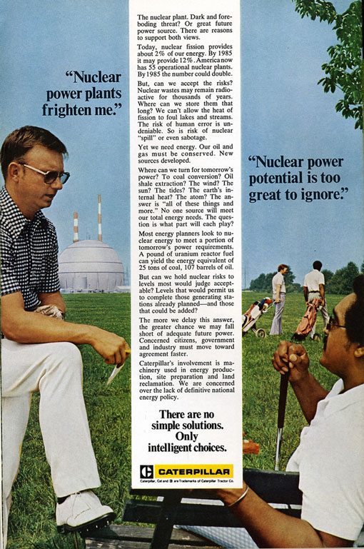
Use of columns in print projects can vary widely and how you use columns can convey a certain feel. Single column designs tend to feel more open and inviting, such as this 1970s advertisement from Caterpillar. Note that most of the space is used for an image and not the text itself.
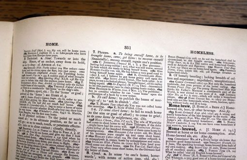
Using multiple skinny columns can feel overwhelming and crowded, such as a page from a dictionary but has a distinct purpose. The text is not intended to read as a whole and is used for skimming short pieces of information.
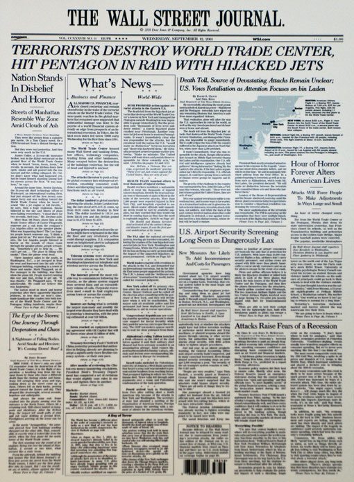
Newspaper and magazine layouts also use multi-column layouts with lots of text. The Wall Street Journal has used the same six-column layout for decades with only slight tweaks to the layout, such as the addition of color and photos. The columns keep small type (typically only 9 to 11 points) organized in a way that is easy to read and adds order to a page with lots of text elements that may not relate to one another.
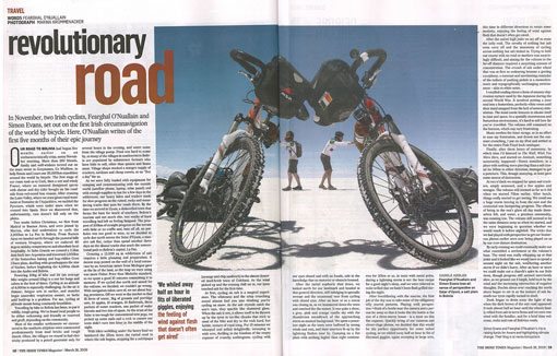
Magazines also use multiple column layouts but tend to use larger column widths and type sizes, such as this layout from The Irish Times Magazine.
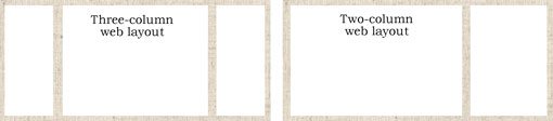
In web projects, think about the space available for text. Many web layouts are divided into two or three columns before you even bring text into the mix. The largest of these columns is reserved for the body of the website and this the space you have to actually work with. Think about the elements below the banner: Is there a column of ads that run down one side of the page? Did you include navigation elements in a column as well?
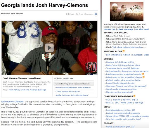
Once the norm, the three column template has been set aside by many websites that are now using a two-column model, including here at Design Shack and ESPN. This model allows for a wider column for the main column of text but leaves little room for multiple column text layouts, which are reserved for even wider spaces.
Font Size and Gutter Width
Although most modern book publishers opt for a single column format, note though that the size of the type tends to vary widely between hardcover, paperback and e-edition books. This variance in type size accommodates the one-column style because the text is proportionate to the column width. The most notable exception is in dictionaries and almanacs, where very small font sizes are used with massive blocks of text in multiple columns per page.
Columns that are too wide can strain the eye, making text hard to read. Columns that are too thin can cause odd breaks and excessive hyphenation of text. The Kindle application for Apple’s iPad has solved this issue by switching from a single column format when used vertically but uses two columns when the iPad is turned for easier reading.
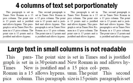
As a rule of thumb in print projects, the width of each column (in picas) should be as wide or wider than the font’s point size. In large blocks of text, the font size should not exceed the column width.
There is not as clear cut of a rule for web design. Many designers opt for 12 or 14 points for body copy regardless of column width. If you have a narrow column for copy (500 pixels or less), opt for the smaller size. Wider columns can handle 14-point type nicely, without too many awkward line breaks. If you’re looking for something more concrete, check out Pearsonified’s Golden Ratio Typography.
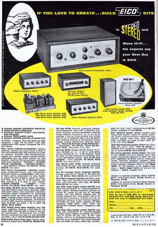
The space between each column can determine the readability of text. Note the emphasis on gutters in the advertisement from Eico Stereo above. The wide spaces between columns containing large amount of text make the columns less intimidating to the eye and easier to read. On a standard newspaper page, columns of text are between 10 and 13 picas wide and have a 1 pica gutter. Magazines also use similar specifications. This space separates columns so that it is easy to read across each line to the end and then and down to the next without jumping across to the next column, causing confusion. Larger font sizes and larger column widths require larger gutter widths. As with columns, a consistent gutter width should be used throughout a project.
Proportion of Other Elements
When deciding how many columns work best for a project, think about more than just text. Non-text elements surrounding the copy can be just as important.
Think about the other items that will touch each column of text. Do you plan to add in small photos or text breakouts? Consider the size and weight of other objects as well. In print projects, the size, weight and color of other text surrounding each column can impact your text. In web projects, the same is true of items on either side of the main copy, plus take animated effects into consideration. The more that you have going on around each column of type corresponds to the importance of using streamlined and simple type in each column. The extra effects in the workspace can also dictate the font size used. So that body text maintains its own identity, set it in a size and font that contrasts with other elements.
With any project, pick a width for columns and stick to it. Setting type in varying column widths within a single document can be jarring. Try to avoid wrapping text around too many large objects that change the visual size of the columns; this can make text difficult to read, causing bad breaks and excessive hyphenation.
Conclusion
Print designers are taking a lesson from the web and beginning to work with fewer, but wider columns in their layouts. This is apparent in book publishing, magazines and even some newspapers. Opt for using a single column on more vertical projects width is a concern or in most web applications with large blocks of text.
Multi-column layouts work best for smaller typefaces in design situations where an entire project or block of text can be seen at a glance, making multi-column layouts less common in web design because of the scroll. Keep in mind your audience, how type will be read and font size when planning a layout that uses a multiple-column format.
Image Sources: nesster, nesster, quinn.anya, cliff1066 and fearghalonuallain.