Tips and Ideas for Designing With Blurred Images
“The supreme accomplishment is to blur the line between work and play.”
– Arnold Toynbee
The topic of today’s discussion is blurry photos. No, not the kind that you accidentally take because your kids won’t sit still. The intentional kind, the use of which can serve several practical purposes in design.
We’ll learn all about how to use blur effects to help make text more legible, direct the viewer’s attention, and just make backgrounds more fun. We’ll also take a look at some different types of blurs and how to properly apply selective blurring.
The Ultimate Designer Toolkit: 2 Million+ Assets
Envato Elements gives you unlimited access to 2 million+ pro design resources, themes, templates, photos, graphics and more. Everything you'll ever need in your design resource toolkit.


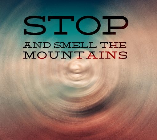
Blur to Make the Text Readable
Whenever you have a fairly busy image, it can be quite difficult to incorporate text into. The photographic background might give your design a much greater appeal, but you’re sacrificing too much if you’re willing to kill your readability for the sake of aesthetics.
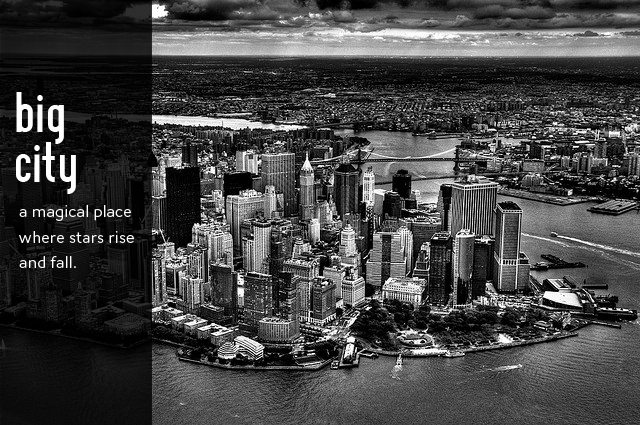
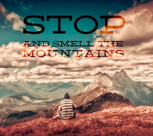
Consider the following design:
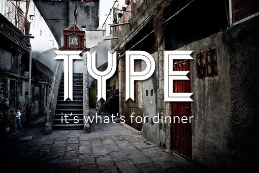
This is a nice looking piece. The background is very striking and the text provides a nice focal point. Unfortunately, the two form a somewhat competitive relationship where the presence of the former is hurting the readability of the latter.
There are a lot of ways that you can approach this problem. As you can see, I added a drop shadow, which helped, but not to the extent that I’d really call it a finished product.
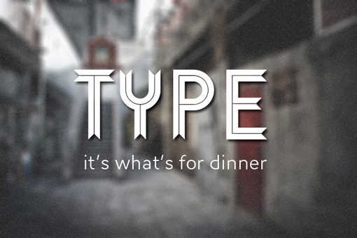
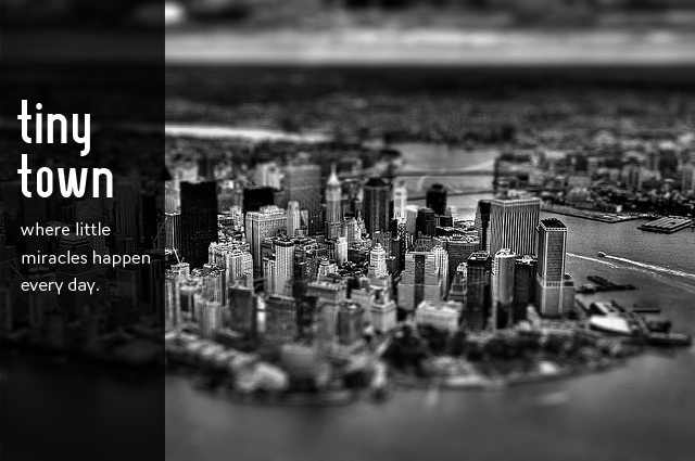
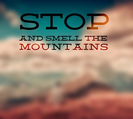
Next let’s try adding a blur. This is a tough decision because it means you’ll be killing all the detail in this beautiful image, but as a designer you have to be open to making radical changes!

Here we can see that this completely solved our problem. The text is now quite readable and really draws in your focus while still allowing the background image to add a lot of interest. You can still make out the basic scene so you’re still benefiting from the beauty of the image, you’ve simply modified that aesthetic to better suit your needs.
Resources:
Image: Eneas De Troya
Font: Ribbon
Create a Frosted Glass Effect
We can take this effect even further by thinking about a sort of frosted glass metaphor. To achieve this, in addition to a blur, we might toss in a white overlay and a noise layer.
Create a solid black layer in Photoshop and then go to Filter>Noise>Add Noise. Make sure you select the “Monochromatic” option. This should give you something like this:
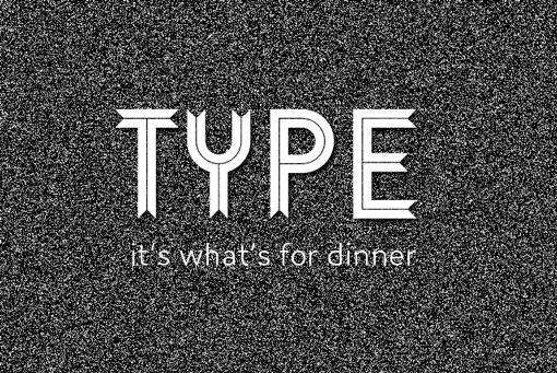
Now set that layer to screen and bring the opacity down to around ten percent. Then create a white layer and bring it’s opacity to around 15 percent. The result will be another unique take on the original design.
Localize The Blur
Keep in mind that you don’t have to blur everything. You can still help out the readability of your text without killing the story told by the image. Consider the following example:
Here once again we have a case where the background image is great, but really trashes our text. With a little bit of selective blurring though, we can keep the awesome photo and make our text a little more readable.

Tips for Localizing Blur
The great thing about this technique is that you often don’t even have to fake it. Many photos provide a completely natural separation of focus and blur, try keeping text and other elements confined to the blurry area for an effect similar to the one above.
If you are selectively blurring a part of an image, be careful about reducing the opacity of your blur layer, whether uniformly or gradually through a mask. Generally, this will give you some pretty ugly results. Try this instead:
- Step1: Make a quick blur layer.
- Step 2: Apply a mask and use a gradient on the mast to fade out the blur.
- Step 3: Convert the mask to a selection.
- Step 4: Go back to the original image and now apply the blur using the active selection.
This process may seem like a pain, but it will usually provide much better results than simply masking out the blur layer.
Resources:
Image: Dave Conner
Font: Homestead
Create a Tilt Shift Effect
In the past couple of years, tilt shift photography has really taken off. More often than not, it isn’t a case of the photographer using a tilt shift lens so much as it is an afterthought in the post-processing step.
As an example, let’s say we were working on the following design. There’s nothing wrong with it, but the image isn’t quite as eye-catching as it could be.
If we toss in a tilt shift effect, suddenly the primary group of buildings in the center really draws our eyes in. Overall the image feels easier to look at and we instantly get a feel for where the designer is directing our attention.
Resources:
Blur For Color
It’s often the case that I use a photo purely for the nice color scheme that it offers. I’m not necessarily interested in the content, just the natural palette that often results from good photography.
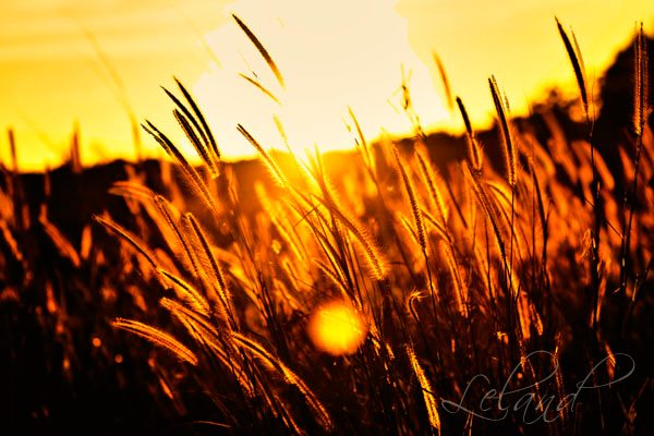
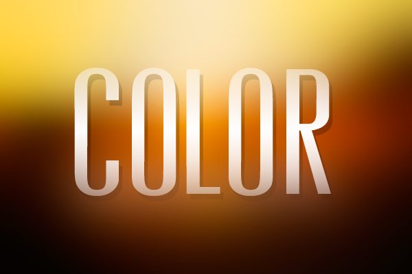
Take the following image as an example. The warm colors are very intense and there’s a lot of great contrast to work with. The photo is so beautiful that you might think it’s a shame to ruin, but not every design calls for a photo of a field at sunset.
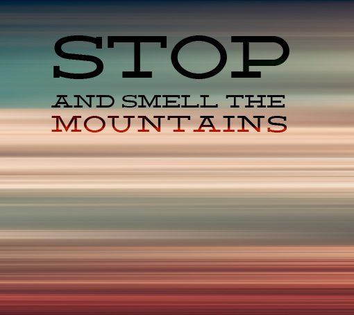
Just like in our first example, we’ll go in and blur the entire background. However, this time we want to crank the strength of the blur way up so that any and all detail is lost. The result is a nice, unique background image that took very little effort to create.
Resources:
Image: Leland Francisco
Font: Vevey
Try Different Blurs
While you’re experimenting with using blur in your design, don’t get caught up in the trap of sticking to a single technique. Photoshop and other image editing programs offer lots of different functionality when it comes to blurring filters.
Try every different blur you can find to see how they effect the image differently, even mix blurs together to see what happens. Here are a few of the main types of blurs you’ll typically want to play around with:
Original Image
Gaussian Blur
Lens Blur
Motion Blur
Radial Blur
Resources:
Image: Dave Morrow
Font: Deming
Conclusion
I hope this brief discussion on blurring tricks and techniques has you thinking about how to creatively apply blurring in your designs. The next time you’re in a tight spot with some unreadable text on a busy background, come back to this article and take a look at the examples above to help you out.
Have you spotted any examples of intentional blurring being used in design recently? We want to see them. Leave a link below in the comment section and tell us what you think of the example.