Photo Effects and Manipulations: Do These Tricks Work?
Are you looking to add a little something extra to a photo on your website? Did you purchase new photo editing software and feel the need to use some of the bells a whistles? Don’t get too pulled in by all the photo manipulation gimmicks out there. Typically the best images are those that are composed and shot well, not a bad image with tricks added to it.
There are, though, some manipulations that can benefit your project when used in moderation. But there are many more so-called photo tricks to avoid if you want to produce professional-looking work.
2 Million+ Digital Assets, With Unlimited Downloads
Get unlimited downloads of 2 million+ design resources, themes, templates, photos, graphics and more. Envato Elements starts at $16 per month, and is the best creative subscription we've ever seen.


Color
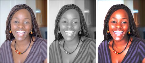
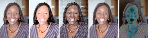
The first choice you have to make when it comes to images is the use of color. Photos with color are more “alive” and vibrant while black and white tends to have a cooler yet more dramatic feel. Further, you can experiment with monotone or sepia effects that add some highly saturated hues.
For most projects, the color option works best. Photos do not require a lot of manipulation and have a true feel. There are plenty of ways to edit color photos. Think about the effect you want: Should the image be true or more dramatic? Be wary of over-modified color, such as those with unnatural skin tones or super-white teeth.
Going the black and white route is also fairly popular and is a simple effect with photo editing software. Both types of images tend to be sharp and are commonly seen and used.
Monotone and sepia (an effect similar to black and white only using shades of gold and brown) can be more difficult to pull off. Monotone and sepia photos tend to have a softer look and feel than color or black and white images. Coloring effects may also cause readers to stop and think more about an image: Why was it colored? What hidden messages are being expressed?
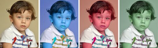
New filters and digital camera add-ons also incorporate effects such as rainbow filters over an image and lens flares. Get your image first without the special effects. You can always add an effect to a strong image in editing software later. You can’t remove an effect that is “developed” into the image.
Borders
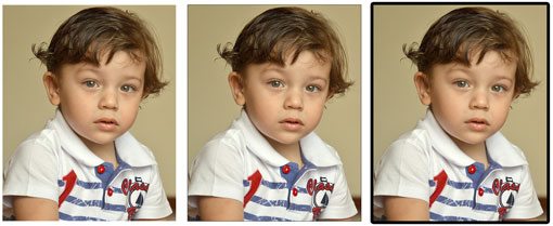
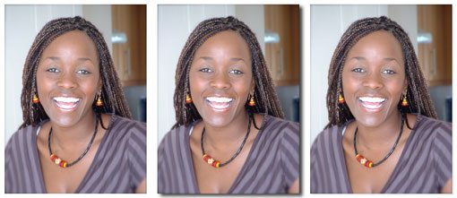
Most print and digital applications use some type of border around images, although in some instances the borders may be so unobtrusive that they go unnoticed. Other borders may have the exact opposite effect, and are intended to complement an image and even enhance it.
This site, for example, uses two simple effects for each borderless image – a slight curving of the image corners and a faint drop shadow to almost lift each image off the page.
Thin and Thick Lines
The most common borders are thin and thick lines that surround a photo. Borders are often white or black and a used in equal weight on all sides of the image. Some designers prefer color options, but colored borders can be difficult to use without looking somewhat cheesy.
Hairline borders are less than one point wide and provide a simple frame for images. (Most hairline frames are 1/2 a point wide.) Any border wider than a hairline should be sized based on the desired effect. Borders will look larger based on the size and composition of an image. Small frames can be weighed down with thick borders and the impact of landscapes can be less dramatic when paired with heavy lines. A thick border, though, can bring emphasis to a photo of a tight face or simple image.
Borders can also be used to create other effects, such as using borders of varying widths on the same image to create a polaroid-style frame. (The top and side borders would be of equal weight while the border along the bottom would be much thicker.)
Shadows
In most instances, you should not notice a good shadow. Drop shadows are used to lift items and add emphasis, not overpower them. The best shadows look natural (hence the term shadow) and should mirror patterns of natural light.
Be wary of colorful shadows and photo editing software presets. Out-of-the-box Adobe Photoshop will give you a 75 percent black shadow, which can be too harsh for most applications.
Odd Shapes and Corner Effects
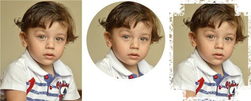
We are all used to the aspect ratio of a 4-inch by 6-inch photo. Other rectangular and square crops are also pretty easy on the eye and can add emphasis. Other shapes, however, may be jarring. Circular and triangular photo frames can result in odd and jarring crops and leave difficult spaces for you to work with within your design (though the designers at Path are sure pulling them off nicely).
Remember most design projects are built, printed or published within a series of rectangles – books, business cards, the shape of web browsers – and adding odd, unmatching shapes can create design problems.
If you plan to use odd shapes in your design, develop a way to keep them connected in a rectangular frame.
Keep corner choices clean and consistent. Use unobtrusive effects that do not extend away from the image itself because these can present a host of design problems when you begin adding other items to the mix.
Square corners are the most common – again think about design in a series of rectangles – but soft corners can also be impactful. Gimmicks, such as frayed edges, scrolls and thought bubbles popping out of frames should be used in moderation.
“Artistic” Manipulations
Just because Photoshop has hundreds of photo filters (and thousands more available), does not mean you need to use them. Distorting images, solarization, turning a photo into a van Gogh-esque piece and adding pixilation and blur will not make an image better. A good image should stand alone.
If you are trying to work with a poor image, adding these effects will only emphasize the lack of quality in the image. If you feel an image will not work without multiple effects, it might be time to look at new images. Manipulations are never a substitute for quality.
Animation
Dancing frog and blinking photos are so 1999. Animating images can be distracting. Save the 3D effects or movement for slideshows or transitions between items on your site.
Be wary of complicated animations in general. How many times have you seen flying stars between scenes in a movie? The most professional animations are simple and will go almost unnoticed.
Conclusion
Keep it simple. Try to select and use strong images when possible so you don’t feel the need to add tricks. If you are using photo manipulation tools, think about how often they are used and the purpose for them. Do they add something to your project? Is the image still strong? Does the manipulation take away from the image?
You will always get the most impact on your site by playing it simple. Too many effects can be distracting and take away from the message you are trying to convey. Think of gimmicks as one-time-use tricks and once you have used something like a rainbow border, toss it from your toolkit.
Image Sources: bIzzard, and Adriano Aurelio Araujo.