10 Fresh Mac Apps With Beautiful Interfaces (And What We Can Learn From Them)
Interface design is a valuable skill to possess. Every decision you make, be it something as major as a color scheme or as minor as a stroke width, can potentially have a huge impact on whether or not people decide to use the application, website, etc. We designers know this better than anyone because we tend to be interface snobs, meaning we flat out refuse to use an app with poor design, even if the functionality is stellar.
The next time you’re faced with the task of designing an interface, why not learn from those who have already succeeded? Below we’ll take a look at the interfaces of ten beautiful and fairly new Mac applications and discuss what went right.
2 Million+ Digital Assets, With Unlimited Downloads
Get unlimited downloads of 2 million+ design resources, themes, templates, photos, graphics and more. Envato Elements starts at $16 per month, and is the best creative subscription we've ever seen.


Wunderlist
The wizards at 6Wunderkinder are quietly taking over the productivity app industry with a killer combination: great design, simple functionality and an unbeatable price tag (free). Both their iPhone and desktop app look just excellent.
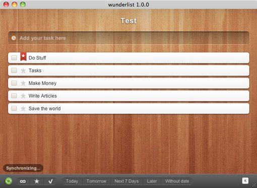
The key to the awesomeness of the Wunderlist interface is something extremely simple that we just don’t see enough of in Mac application interfaces: customization. Wunderlist comes built in with a whole bunch of gorgeous backgrounds like the wooden one shown above. Since the UI elements are actually fairly minimal, swapping out the background changes the entire personality of the application!
Why spend hours scratching your head wondering what your users will like the most when you know that every user is different? Providing your users with a number of equally attractive but very different options is a solid way to increase customer satisfaction. One important hint: make sure it’s easy to switch between the options. As a rule of thumb, if you have to write a tutorial on how to do it, it’s too complex. Wunderlist simply provides a row of icons at the bottom of the window. When you click on one, the background changes. It’s that simple.
The one killer feature that I think would make this even better is if users could use their own images as a background. Sure, plenty of your users will choose something hideous but there will also be a ton of users who come up with something that’s actually better than the built-in options.
I’m making a prediction that lots of developers will follow in the footsteps of 6Wunderkinder and begin offering users the ability to personalize their application interfaces to fit their unique personalities.
Reeder
Reeder for Mac is making a big splash in the Mac design community. Most of us have used NetNewsWire for ages and are definitely sick of the stagnant and boring interface. By contrast, Reeder is a breath of fresh air offering a notably clean and non-cluttered looking interface for an RSS reader.
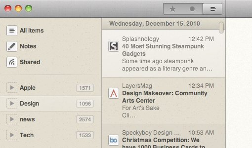
The awesome thing about Reeder is that it represents another growing trend you can expect to see on the rise in the next few years: Apple iOS design on the desktop (Reeder began life on iOS). The iPhone lit a wildfire under interface developers who began churning out buttery smooth interfaces unlike anything we’d ever seen. This fire has recently been lit anew with the arrival of the iPad and innovative new interactive experiences like Flipboard.
Gradually, we’ve been seeing these design trends trickle back to the Mac. Even Apple has realized the benefits of iOS-like interfaces and is incorporating many of these benefits into OS X Lion, the next major release of Apple’s legendary desktop operating system.
Sparrow
I hesitated to add Sparrow because it is quite controversial among designers. The reason for this is that it represents a shameless ripoff of the UI of another popular application: Tweetie for Mac.
On one side of this debate you have legitimate claims that Tweetie has been stagnant in development for quite a while now and will likely stay that way because of its acquisition by Twitter (who really just wanted the iPhone app). Designers on the other side claim that it’s pretty uncool to rip off another man’s interface no matter the circumstances.
Regardless of which side of the debate you’re on, Sparrow is an interesting example for one important reason. It took a format that we were used to in one category (Twitter apps) and sought to apply it in a completely different context (email). This type of thinking is a stellar source of innovation. Take a look at all the apps you use every day, now take a look at the competing apps in that category. Chances are, they’re all about the same because someone innovated the category and everyone else simply followed. If you want to create something truly different, ask yourself how you could take the concept of that app and fit it into the structure of an app from a different category. You might just revolutionize an entire category.
Kiwi 2
Though the functionality still doesn’t feel quite as smooth as Tweetie, Kiwi has to be one of the most attractive desktop Twitter clients on the market.
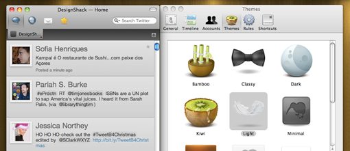
As with Wunderlist, the key element here is customization. Kiwi offers users a number of themes to choose from that radically alter the appearance of the application. Wunderlist takes the simple route and offers different backgrounds, but in Kiwi, everything in your stream changes. This includes the shape and color of the tweets, the background and the appearance of the icons. Even the functionality alters pretty dramatically from one theme to the next. For instance, one theme simply shows you a list of usernames and hides the actual tweets until you click on a user to see what they said.
The execution here is very important. Kiwi doesn’t require you to choose a specific theme or walk you through some advanced setup process. The app has all the default settings worked out for you. In fact, if you never poke around in the preferences menu, you could use Kiwi for quite a while before even finding the customization options. They’re not exactly hidden, power users will find them in the first place they think to look. However, users who want a simple experience aren’t being hit over the head with intimidating decisions that they’re not prepared to make.
The lesson here is that customization should be both simple and optional. Don’t force your users into it or they’ll close the app and turn elsewhere. Let your users love your app for what it is and work their way up to making it look how they want as they become more familiar with how everything works.
DaisyDisk
Daisy Disk is the most attractive hard drive storage visualization I’ve ever seen. The retro futuristic charts look so good you’ll want to print them and use them as office art.
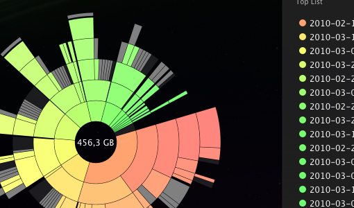
The important question to ask here is whether or not you have to sacrifice usability in your quest for aesthetics. The crazy pie chart shown above looks quite complicated and is probably enough to scare away a lot of users. However, the implementation is actually quite solid. Next to the graph is a simple list showing the types of data on your hard drive and how much space is being eaten up by them. All the information you need is in this list. It’s simple, straightforward and easy to understand. The visualization is there for visual thinkers like us designers who are crazy enough to favor this representation over a list.
Most importantly, the two representations of the data are linked in an interactive way. When you hover your mouse over the “Applications” line item, that part of the chart begins to glow. So even if you don’t remotely understand the chart at first, it will suddenly begin to make sense as you hover over each item in the list and see how the proportion of glowing space relates to other sections.
The lesson here is that eye candy isn’t for everyone. If you want to set your application apart as the one with crazy beautiful visualizations, go for it. But don’t neglect the users who would rather use Excel than Photoshop. Make sure your attractive graphics have a strong foundation in easy-to-use controls and understandable communication methods.
Transmit 4
Transmit 4 is the latest update to the reigning patriarch of Mac FTP clients and represents one of the most significant aesthetic boosts to the application to date. I never thought I would drool over an FTP client but Transmit now has a ton of really nice screens, animations, buttons and more.
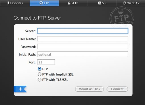
The most noticeable tactic used here is increased contrast. FTP clients are notably bright and white; every screen, every list of files, nothing but white and, if you’re lucky, a little gray and/or blue. The folks at Panic decided to tackle this monotony with a number of really beautiful dark screens for setting up servers, navigating favorites, etc.
The important lesson here is that they really didn’t mess with the meat of the app too much. The file lists are still on a white background and function just like they always have. Anyone familiar with FTP software will be able to pick the app up and run with it immediately. Any time you want to update a UI to give it some visual flair, don’t be afraid to be extremely choosey about what parts do and don’t get updated. If you’re working with a product made popular by its simple functionality, keep it that way. Instead, take the time to focus on all the little details that really polish off a UI and make it feel like a major step up from the competition.
Courier
Courier has to be the most beautiful tool on the planet for quickly sharing multimedia files using social media. Would I ever pay $20 for a Facebook image uploader? No way. Has this one made me seriously consider changing my mind? Yep.
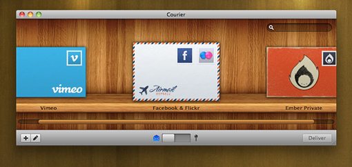
The lesson here is one I’ve discussed countless times in a web design context: visual metaphors rock. The first thing RealMac did was focus on core functionality. They made sharing files to all kinds of networks at once a ridiculously easy task powered by the drag and drop experience Mac users know and love. With an unbeatable workflow in place (always make sure to focus on content first!), they were able to wrap the whole thing in a beautiful and appropriate theme: the daily mail. This takes a fairly technological task and brings it into a very real and familiar experience for the user. Suddenly the mundane task of uploading files looks and feels like a virtual mail-sending video game where you can choose what envelope you want to use and where to send it.
1Password
Open up Keychain Access on your Mac. This is a typical password manager, designed by none other than Apple inc. It’s quite usable but also quite boring. Now take a look at a very different visual approach to the same basic functionality in 1Password.
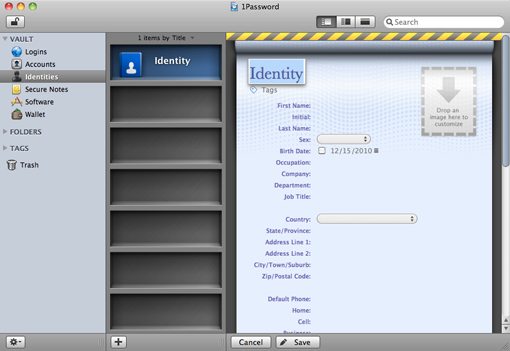
Quite the difference no? 1Password possesses a simply outstanding interface for managing your logins, passwords, form data, etc. I don’t know about you but this makes me question every single database application on my hard drive. Why has the norm become to make such plain presentations of database information? What if applications like Evernote (already one of the more attractive database apps out there) looked a little more like 1Password or Bento? Would that be so bad? I submit that it would not.
Great aesthetics don’t complicate usability, they improve it. Believe it or not, you can present tables, rows, cells and fields of information in a really attractive manner without adding so much superfluous fluff that it ruins the functionality. If you don’t believe me, download 1Password and give it a shot.
SweetFM
In contrast to all this discussion of adding visual interest to your your interfaces, SweetFM, a wonderfully simple Last.fm client, does the exact opposite. Just take a look at how compact and attractive it is!
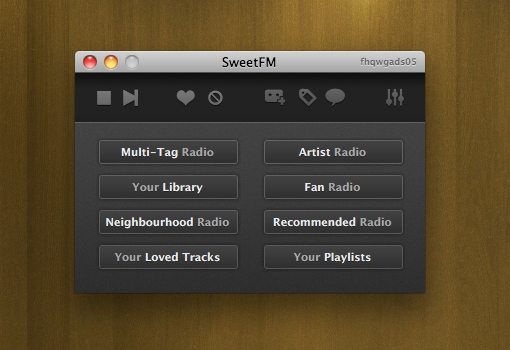
Now, compare that screenshot you just saw to the official Last.fm client for Mac:
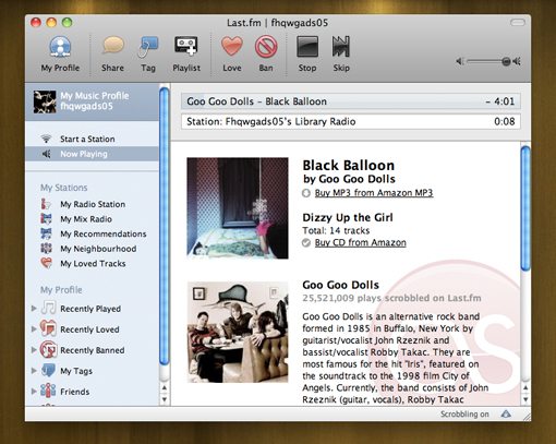
Admittedly, many people will like the official client better. It seems more robust and puts everything in front of you at once (a highly efficient approach). However, there’s definitely something to be said for drastic simplification. Back to a point that we made earlier, blindly following the UI conventions of a given category is no way to innovate. Sometimes you can snag a ton of users that no one else is targeting simply by stripping out everything but the absolute bare necessities. Take a page out of Chocomoko’s book, sometimes less really is more.
Cockpit
Cockpit is an awesome menu bar app that you can use to control all kinds of stuff on your Mac. It’s not only super functional though, it also happens to look pretty stellar.
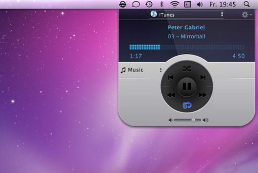
In this case, I’m not sure where the developers are drawing their inspiration from. The typical textures are here: metal, glass and rubber. Yet, the iTunes controller above doesn’t look anything like iTunes and it sure as heck doesn’t look like any other menu bar app I’ve ever seen (it looks more like a Dashboard widget). There’s a lot to be said about drawing inspiration from all of the examples you’ve seen today, but always remember that there’s no substitute for blazing your own path and intentionally trying to be completely different than anything else you’ve seen before.
Pull up Photoshop, crank some music and spend a few hours dishing out ideas as they come to you. Instead of focusing on what’s been done elsewhere, try to discover what hasn’t been done and explore the possibilities with that goal in mind.
Conclusion
I hope the ten awesome applications above have both provided you with a few new apps for your Mac and taught you a thing or two about interface design. Mac developers and designers continually wow me with their ability to continually push the envelope for the level of beauty we expect from desktop applications. You guys are my heros.
Leave a comment below and let us know what you think of the interfaces above. Also be sure to point out any other new Mac apps you’ve come across that serve as an excellent example of UI design.